





Nobody Comes to a Trading Platform to Learn: Designing Gamification That Teaches





For product teams in fintech, trading, and gamified finance – a case study in one design problem: how to make users practise financial reasoning without the product feeling like homework.
Crypsters gave every new user a fake bank account with $100,000 in it. Users traded real crypto assets with virtual capital – opening long or short positions, writing a justification for each one, then closing when they chose. No real money moved, but the trades were real enough to win actual prize money in tournaments against other traders.
Officially, Crypsters was a contest platform. Functionally, it had to teach people to read a financial market without ever making them feel like students.
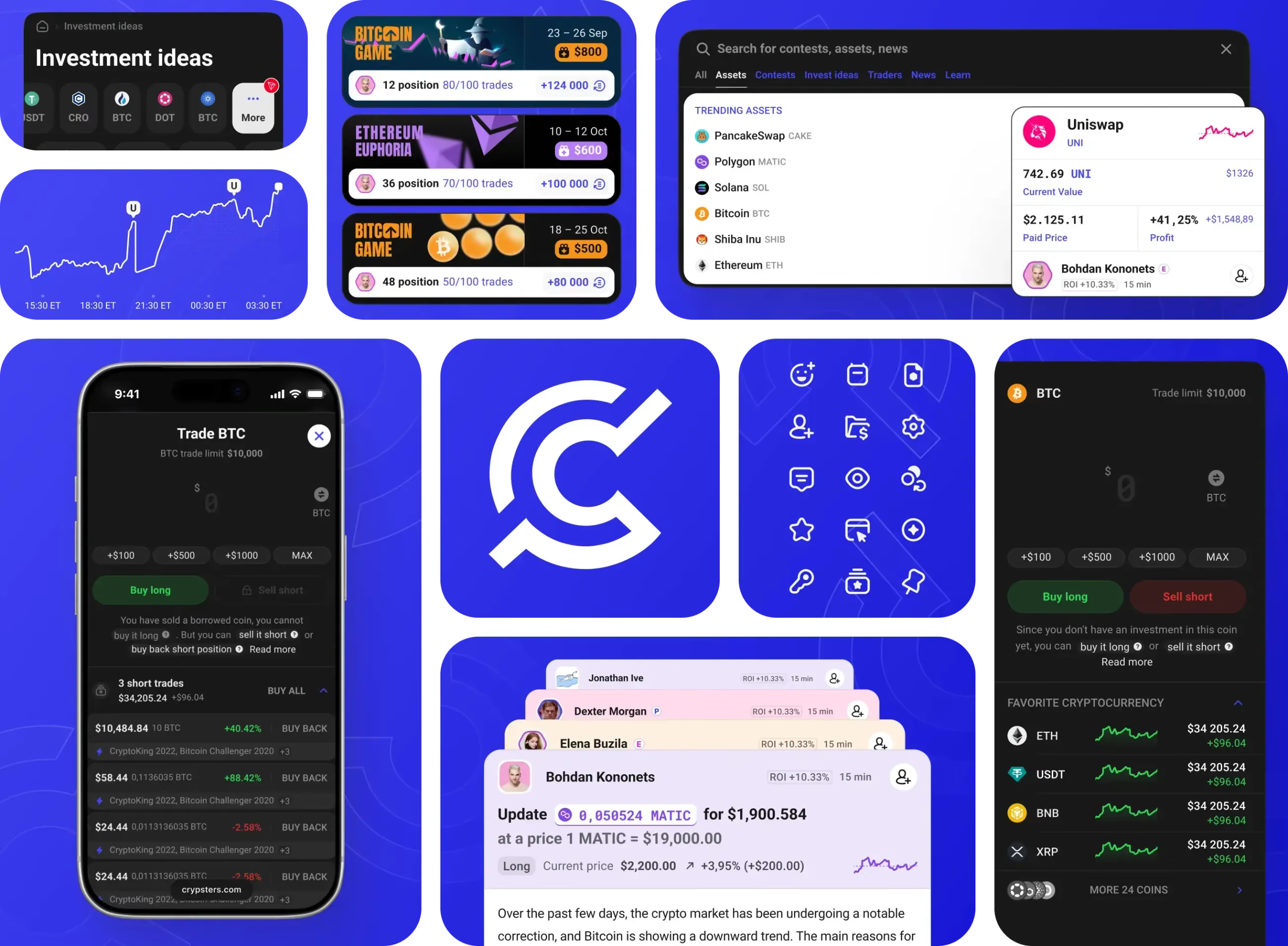
That tension shaped the brand and product we designed in 2022, over a 2+ year dedicated product team engagement: 17 sections across web and mobile, 8 modal windows, and a full interface built around competition, status, and written reasoning.
How trading contests became a financial literacy system
The brief for Crypsters described a trading platform with tournaments. It also described a structured method for learning financial analysis. It just never called it that.
The mechanics made the hidden brief visible. Every trade required a written justification, so users had to state a thesis before committing virtual capital. Progression from Trader to Pro to Expert also depended on reasoning, not just outcomes: administrators manually assessed the quality of justifications before users could advance.
At Expert level, the system went further. Experts could use their Crypsters track record to attract investors and manage third-party portfolios. Good paper-trading analysis became a possible credential for real capital.
The user still didn't need to think of themselves as a student. They could think of themselves as someone competing. The product did the teaching quietly.
Does gamification in trading encourage overtrading?
The standard advice for retail investors is consistent: hold positions and trade infrequently. Tournament mechanics run directly against this.
On Crypsters, a user who opens a position and holds it for three weeks generates no leaderboard movement for three weeks. To rank, they need to close trades with realised gains, which means trading more actively than a conservative strategy would suggest.
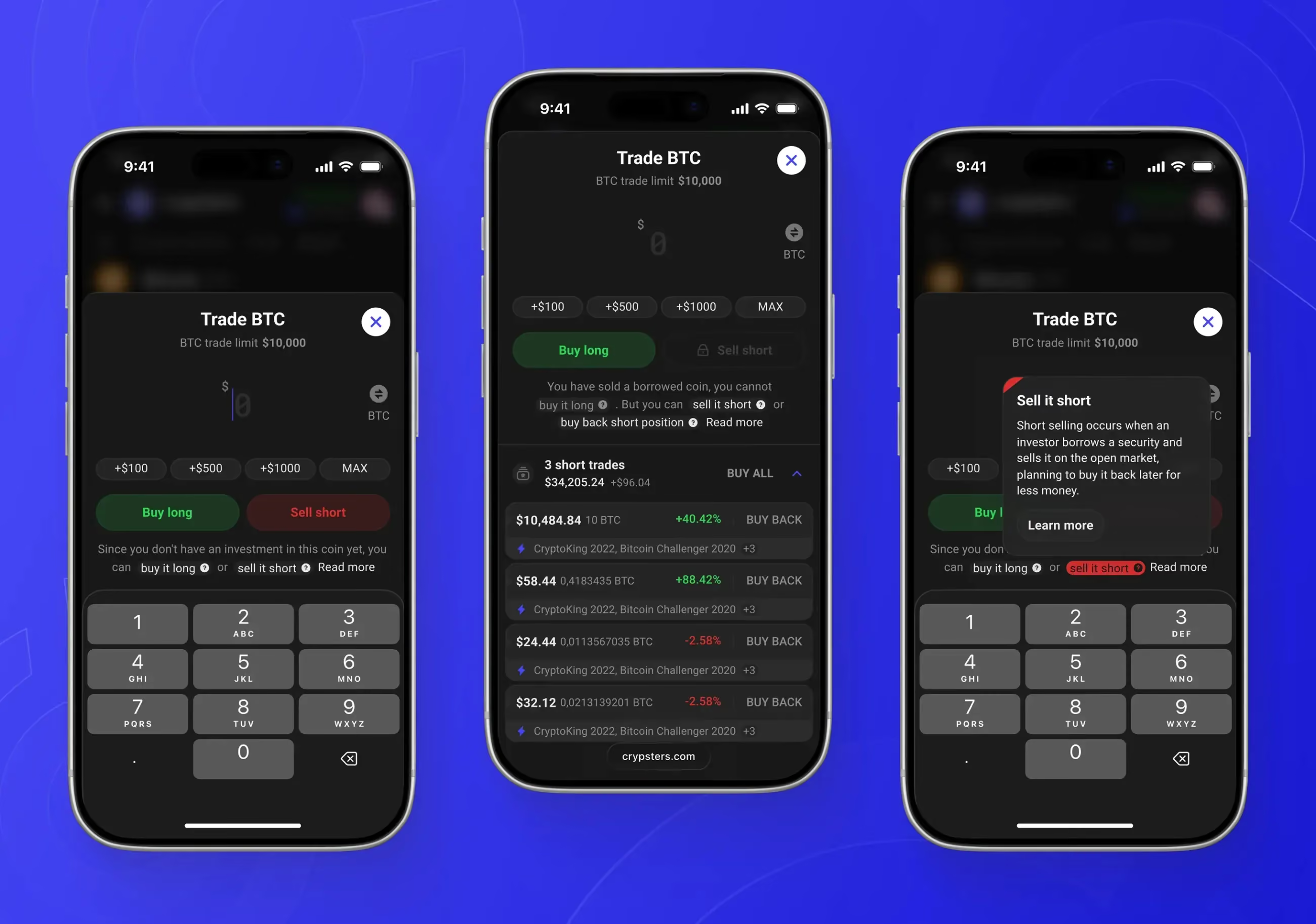
Andrei, Flatstudio’s UX product designer on the project, raised this while working out how Crypsters’ mechanics fit together. Trading was a new domain for the studio, and the brief described the mechanics in general terms without specifying how they would interlock — so the work ran in both directions at once: learning how markets, positions and returns actually behave, while deciding how tournaments, trades and status progression should connect. The conflict between what the leaderboard rewarded and what a beginner would conventionally be advised to do surfaced inside that work, and was put to the client as an explicit product question rather than resolved quietly inside the wireframes.
The decision was to leave the mechanics as they were. The platform’s purpose wasn’t to model ideal long-term investment behaviour. It was to get users who had never thought seriously about financial markets to make decisions, explain them, and see what happened next. More frequent trading produced more feedback loops than passive holding could.
Structurally, Crypsters sat closer to competitive prediction products than to a finance course. Like Stavka, it asked users to make a call, wait for the outcome, and compare performance against others. Crypsters applied that loop to crypto markets instead of sport: users committed virtual capital, tracked the result, and explained the reasoning behind each trade.
The information density was closer to Prediction Edge. Market data, rankings, user decisions, status, and analysis all had to coexist, but the interface still needed to work for people who were new to financial markets.
No financial advisor would tell beginners to trade more just to stay visible on a leaderboard. For Crypsters, the extra activity created more decisions, more written explanations, and more data for both the user and the platform.
That priority shows up in the feed design as well: the All Trades view shows only open positions. Closed trades are excluded.
When one trade belongs to multiple tournaments
Much of the design complexity in Crypsters came from a single constraint: a user can enter the same open trade into multiple tournaments at once.
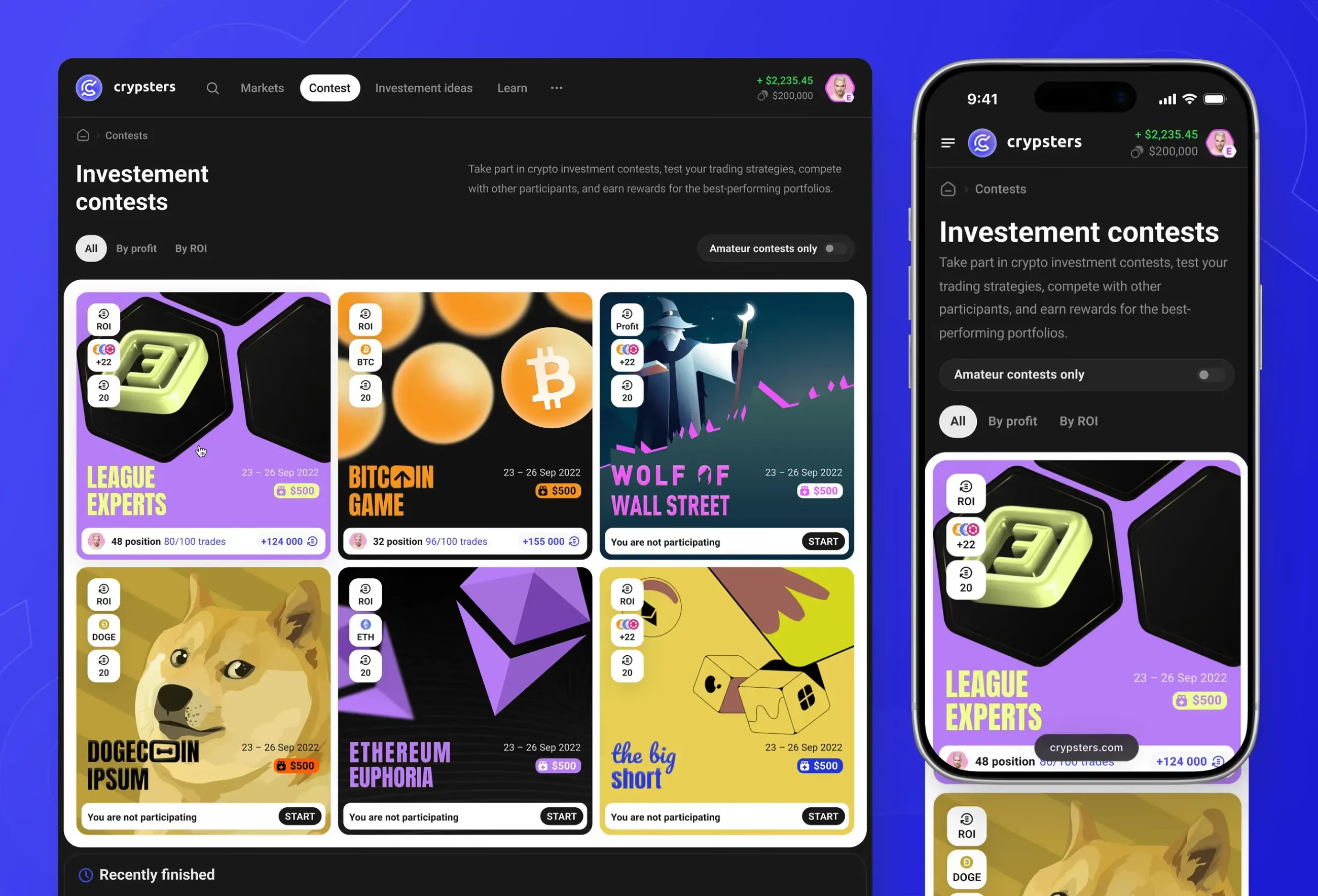
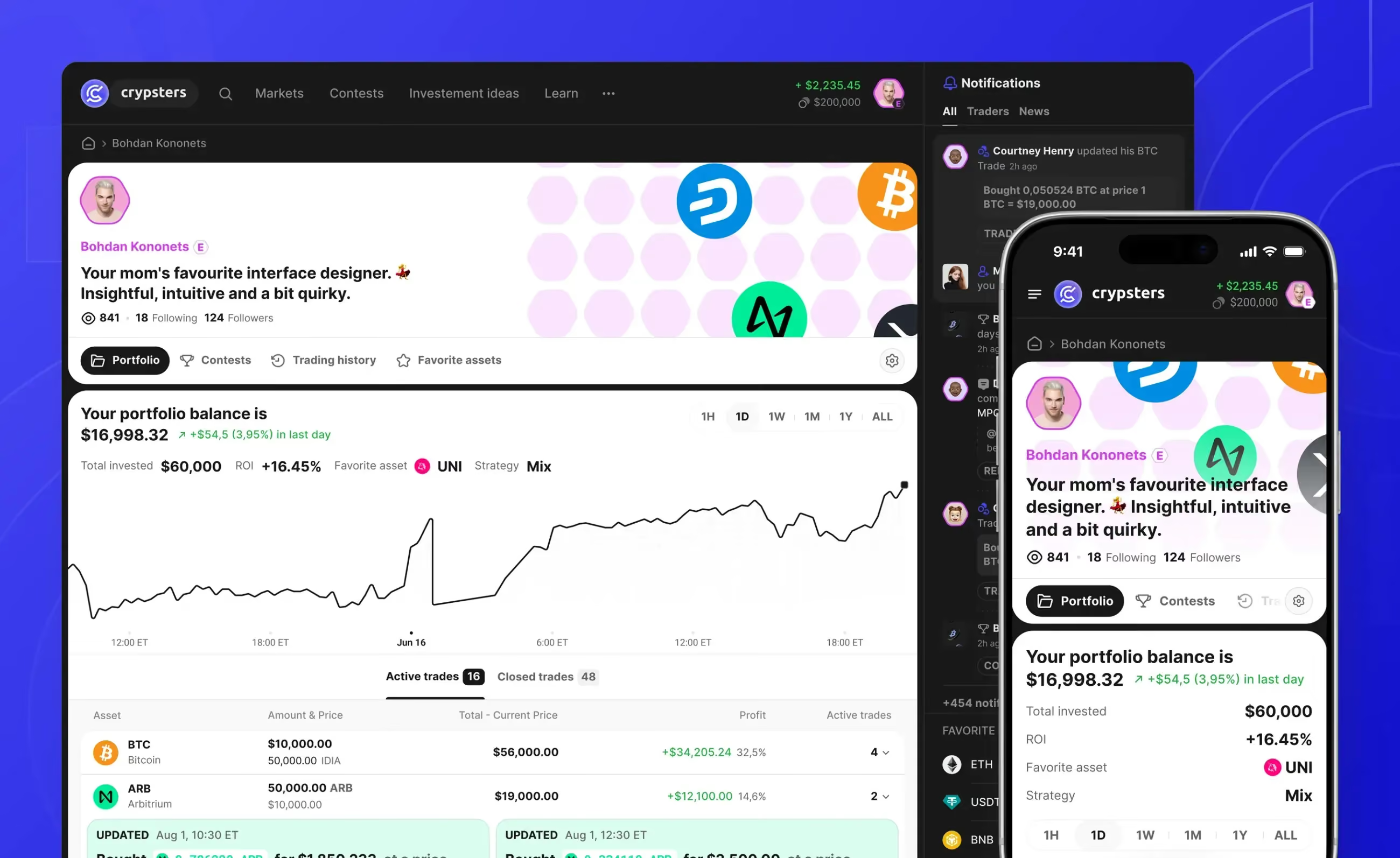
Each tournament has its own leaderboard and tracks participant performance separately. Users commit a trade to a tournament at the moment of opening, via checkbox. A single BTC purchase can count toward Tournament A and Tournament C simultaneously – two concurrent contests, each with its own rules and leaderboard.
The problem surfaces on close.
A user opens a BTC position and enters it into both tournaments. They later decide to close the position, thinking of it as a Tournament A action. But the underlying asset is gone from their portfolio. Tournament C has to register the closure too, automatically, even if the user had no intention of affecting their Tournament C standing.
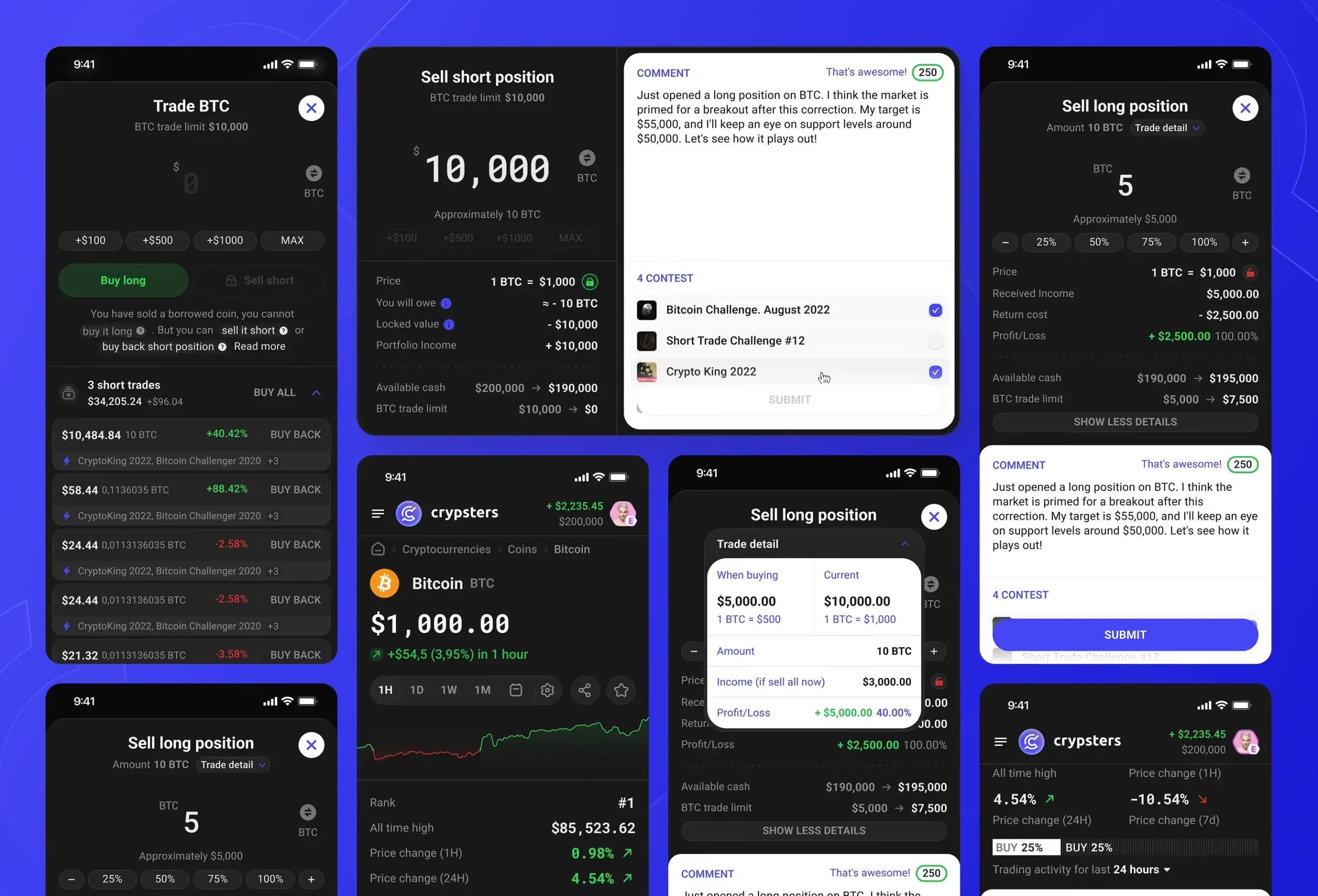
A trade is one object. The contest entries don't split it into independent instances.
This meant the full list of contests attached to a trade had to stay visible throughout its lifecycle, not just at opening. It also meant the form sequence needed reconsidering. An earlier version placed contest selection toward the end of the opening flow, after the user had already set position size and price. Some contests restrict which assets and position sizes qualify, so committing to a size before selecting contests could create a backward loop – set the size, pick the contest, discover the size doesn't qualify, start over. The revision moved contest selection earlier.
The contest taxonomy added another layer of complexity: contests differ across time period, permitted assets, prize pool, leaderboard format (profit vs. ROI), and user status restrictions. Expert-only contests are visible to lower-status users, so that Traders can see what they're working toward and whose analysis is worth following.
Why the asset page had to work before login
New users were unlikely to meet Crypsters in the order the sitemap implied. Many would arrive through an asset page from search, before registration or login.
That changed the job of the page. For a logged-in user, market text was supplementary context before opening a position. For a search visitor, it was the reason to stay.
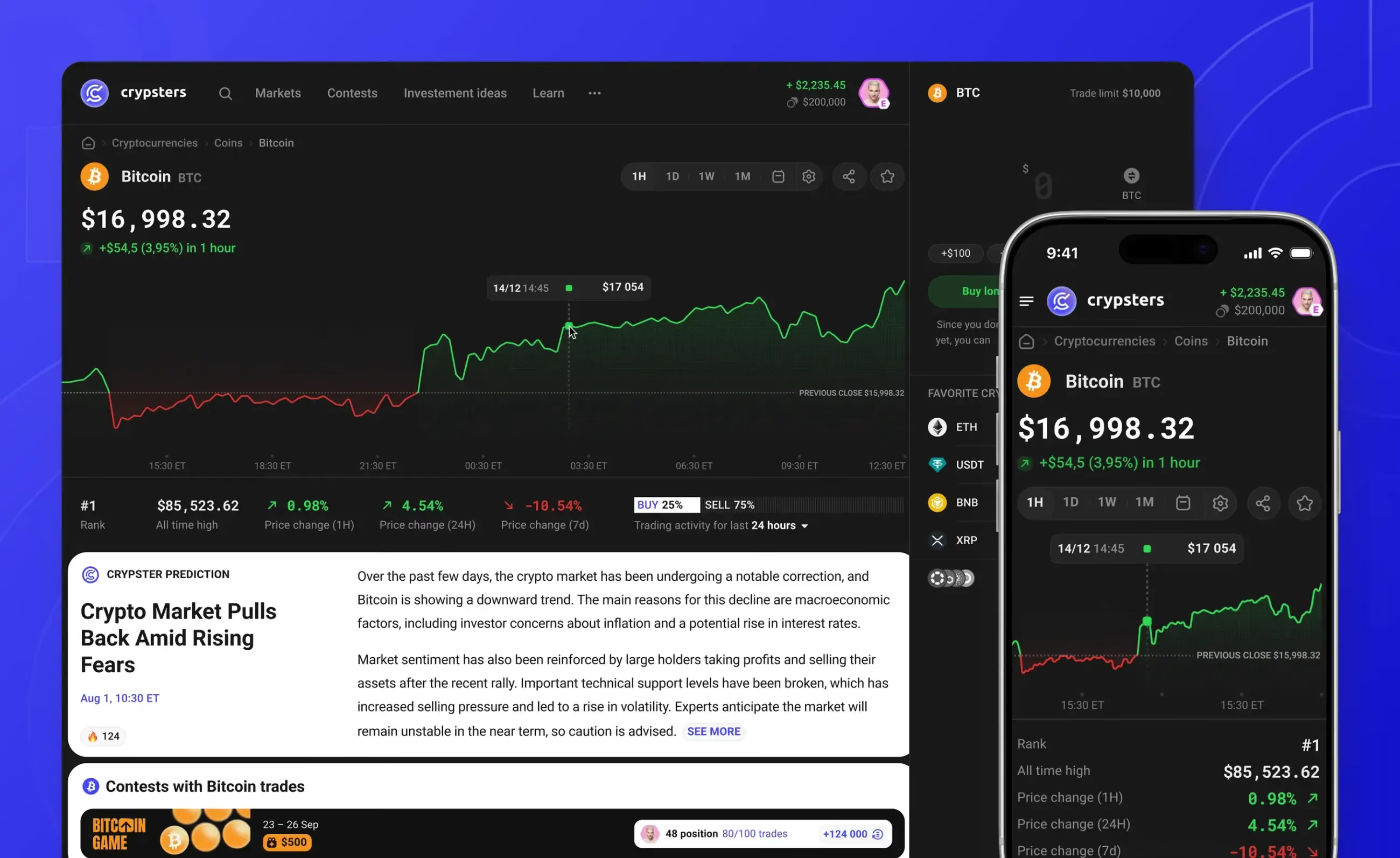
The wireframe stage began with the mechanics the product could not function without: the trade form, the portfolio view, the contest entry sequence, and the logic connecting trades to tournaments. Logged-out states came in the block of work after that — variants of screens whose structure had to be settled first. When those states were being worked through, Bohdan, Flatstudio’s art director, made the case that the asset page didn’t belong in that category at all: for a visitor arriving from search it was the product’s main entry point, and its effect on conversion made it a page to design on its own terms rather than a state to derive from the authenticated view. It was reworked on that basis, with new product decisions behind it.
Two decisions followed. The SEO content block had been sized too small in the initial wireframes and was expanded. The asset page also carried two promotional blocks at the top: one showing prices across exchanges, and a lower block with broader market data. The two were redundant enough that one was cut; the lower, more informative block stayed.
The platform automatically translated user-generated trade analysis, so Expert justifications appeared in the visitor's own language. For someone arriving from a non-English search query, the analysis was immediately readable – before they had registered or seen any other part of the product.
This is a sequencing detail, not a delivery failure. The logged-out state was resolved before handoff. It’s worth naming because the mechanics carry most of a product’s unresolved logic and are the natural place to begin, which leaves unauthenticated views to be picked up later as variants of what already exists. Some of them aren’t variants. They are often where the product first meets the user.
A brand for people who are scared of finance
In 2022, most crypto products still looked like they were designed to make beginners feel underqualified.
Dark backgrounds, neon accents, information density as a signal of sophistication: that visual language worked for experienced traders. For someone with no financial background who might be convinced to try a paper-trading contest, it signalled a space not designed for them. The platform had to feel serious, but not like a finance terminal guarding the door.
Three brand directions were developed: monochrome, colour, and gradient. All three were built around a single mark, a stylised C formed from concentric rings, suggesting orbit and movement rather than the hard geometry common to the category.
The UI took the same direction. Two concepts were presented: a fully dark theme with strong contrast, better suited to chart reading; and a mixed theme with white cards on a dark background. Victor, Crypsters' co-founder, noted during the design review that trade justification text reads more clearly on the white cards. The mixed theme was selected. Most traffic was expected to come from mobile, which shaped how card layouts were prioritised: readable at 390px first, desktop sidebar secondary.
One proposal that didn't reach the final design: adapting the header's accent colour to match whichever coin a user was viewing. The problem Bohdan identified was that most coins share similar colour associations. A system intended to create visual variety would produce visual monotony in practice. The approach was replaced with coin silhouettes and status indicators as asset-specific graphic elements.
Crypsters didn't need to tell users they were learning. That would probably have made the product worse. The better design move was smaller: make every trade ask for a reason. Competition brought users in. The justification field made them think. That small interaction was where the real product sat: not in the prize pool, and not in the chart, but in the moment before a user had to explain a market decision.
Flatstudio designs complex digital products – from UX structure and interface systems through to shipped UI. See our product and interface design work →
- Full case with screens: Crypsters on Flatstudio
- Related: How we redesigned the Bookmaker.xyz interface

Frequently Asked Questions
What is gamification in trading platforms?
Gamification applies game mechanics – contests, leaderboards, status levels, rewards – to trading products to drive engagement. On Crypsters, users traded virtual capital in tournaments with real prize money, and progression depended on the quality of written trade justifications, not only on profit.
Does gamification encourage overtrading?
Yes – leaderboards reward frequent closed trades, which contradicts conservative investing advice. On Crypsters we flagged this during design and kept the mechanics deliberately: more trades meant more decisions, more written reasoning, and more feedback loops for users learning to read a market.
Can a paper trading platform teach real financial analysis?
It can, if the design forces reasoning rather than clicking. Crypsters required a written justification before every trade, and administrators assessed justification quality before users advanced from Trader to Pro to Expert. Competition brought users in; the justification field made them think.
What did Flatstudio deliver for Crypsters?
User research, information architecture, UX/UI design, and a full design system across web and mobile – covering markets, contests, trade flows, articles, and profiles – delivered as a deployed web app over a 2+ year dedicated product team engagement.
Can this approach work outside crypto?
The core pattern – virtual capital, competition, and mandatory reasoning – applies to any product where users must learn to make decisions under uncertainty: sports prediction, prop trading evaluation, investing education. We used the same decision-feedback loop in sports prediction products before applying it to crypto markets.
