





75 Findings in Three Weeks: How We Run a Product UX Audit





Written for founders, product managers, and CPOs of live products – SaaS, fintech, iGaming, betting – who need to decide what to change before they spend money changing it.
Most product audits end their life as a PDF in a drawer. A consultant walks through the interface, writes sixty pages of observations, attaches a checklist, and leaves. Three months later nobody can say which observation became a shipped fix. A good UX audit leaves your team with fewer things to wonder about rather than more things to read.
We recently finished a competitive UX audit for an Italian-licensed betting and casino operator: six user flows, three platforms tested in parallel on live, funded accounts, 75 findings – every one recorded as an individual, prioritized task the client's team could import into Jira the same day.
The example comes from a regulated betting product, but the methodology is the same for SaaS, fintech, and any other live digital product: define the journeys, observe real behaviour, collect evidence, benchmark where useful, and turn findings into prioritized work. This article uses that engagement as proof for how a Product Audit & Discovery works: who we test with, what counts as evidence, how findings become tickets, and which of the three tiers fits which situation.
TL;DR
- We recruit people who match the product's real users, give them missions on live accounts, and record everything. Behaviour is the evidence; opinions are context.
- Every finding passes the Proof Test: if we cannot show where it came from, it does not enter the report.
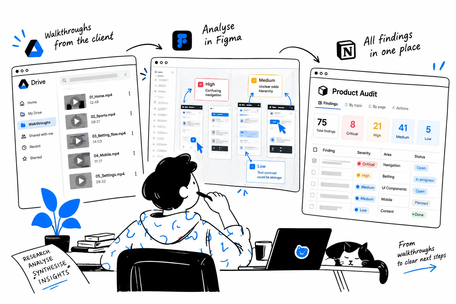
- Three linked artifacts: Drive shows what happened, Figma shows where it happened, Notion explains what to do about it.
- A recent Discovery-tier audit produced 75 findings across 6 flows in roughly 3 weeks: 8 Critical, 21 Serious, 41 Medium, 5 Cosmetic – benchmarked journey by journey against two direct competitors.
- Three tiers: Express (~1 week, from €3,500), Discovery (~3 weeks, from €5,500), Enterprise (4+ weeks, scoped and quoted after a discovery call).
What Is a Product UX Audit?
A product UX audit is a structured diagnostic of a live product: real people walk the critical journeys, every friction point is recorded and evidenced, and each finding becomes a prioritized, developer-ready task. The output is a backlog your team can start working from immediately, with severity, rationale, evidence, and enough context to turn findings into implementation decisions.
Underneath the method, an audit is a decision-making tool. It helps a product team answer three questions: where users struggle, which problems deserve attention first, and where design or product investment is likely to have the highest return.
The strongest audit candidates are live products with enough real-world usage to observe, and a reason to make better product decisions. Sometimes that reason is a metric – conversion, churn, stagnation. Just as often it is a moment: a redesign before major investment, a new market, a merger or acquisition, competitor pressure, unexplained support volume, or a product that has outgrown its original logic. Pre-MVP products fit a Pitch & Product Concept engagement better, because there is no real behaviour to audit yet.
UX Audit vs Just Redesign: Why Audit First?
A redesign answers "what should we build?" An audit answers "what is actually wrong, what matters most, and what should we change first?" The audit exists to reduce uncertainty before you invest in change.
Imagine a checkout with a 35% drop-off. A redesign would likely propose a new layout on day one. An audit first asks whether the layout is the problem at all: payment errors, unclear pricing, missing feedback after a click, an account requirement nobody expected, weak trust signals at the card step, or a broken hand-off between two screens. Each of those has a different fix, a different owner, and a different cost.
The sequence is deliberate: audit first, which produces evidence; evidence becomes priorities; priorities get 1–2 visual concepts as proof of direction; and only then does a redesign begin, with a scope that came from observed behaviour instead of a stakeholder's guess. Teams that skip the first step tend to redesign the screens that were most visible rather than the ones that were most broken.
How Does a UX Audit Work? Real People, Real Accounts
A UX audit works by recruiting people who match the product's real users, giving them missions on live accounts, recording every session, and turning observed behaviour into evidenced findings.
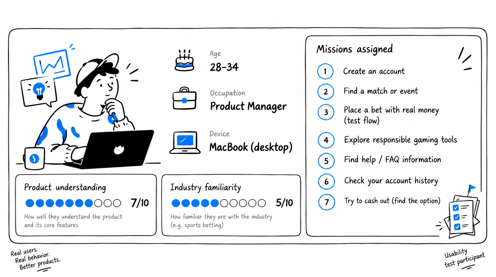
We start with people who have never seen the product. For each audit we define personas – age, gender, occupation, and two self-assessed scores from 0 to 10: how well they understand this type of product, and how familiar they are with the industry. Then we recruit real people matching those personas.
Existing customers are useful for understanding established behaviour. For discovering first-use friction, we deliberately work with people who have no learned workaround for the product. They experience the interface the way a new customer does, which is where conversion is won or lost.
We recruit for behaviour rather than opinions. We are looking for people who behave like the product's actual users, not for people who can give sophisticated UX feedback. A participant never needs to tell us a form has poor information architecture. If they stop, reread a label three times, open another tab, or ask what happens next, the behaviour is already evidence.
Participants get missions, never instructions: register, pass identity verification with your own documents, make a first deposit, play a game, withdraw the money, read every email the platform sends you along the way. Every session is screen-recorded end to end, and personal data is blurred before anything is shared. For the operator audit, testers created and funded live accounts on the client's platform and on two direct competitors in parallel – same missions, same devices, same days.
During every session we look for:
- hesitation and rereading
- errors and how the product recovers from them
- backtracking and repeated attempts
- abandoned actions
- misunderstood labels and naming drift
- unnecessary steps
- missing feedback after an action
- trust concerns at high-stakes moments (documents, payments)
- accessibility issues
- gaps between what the user expected and what the product did
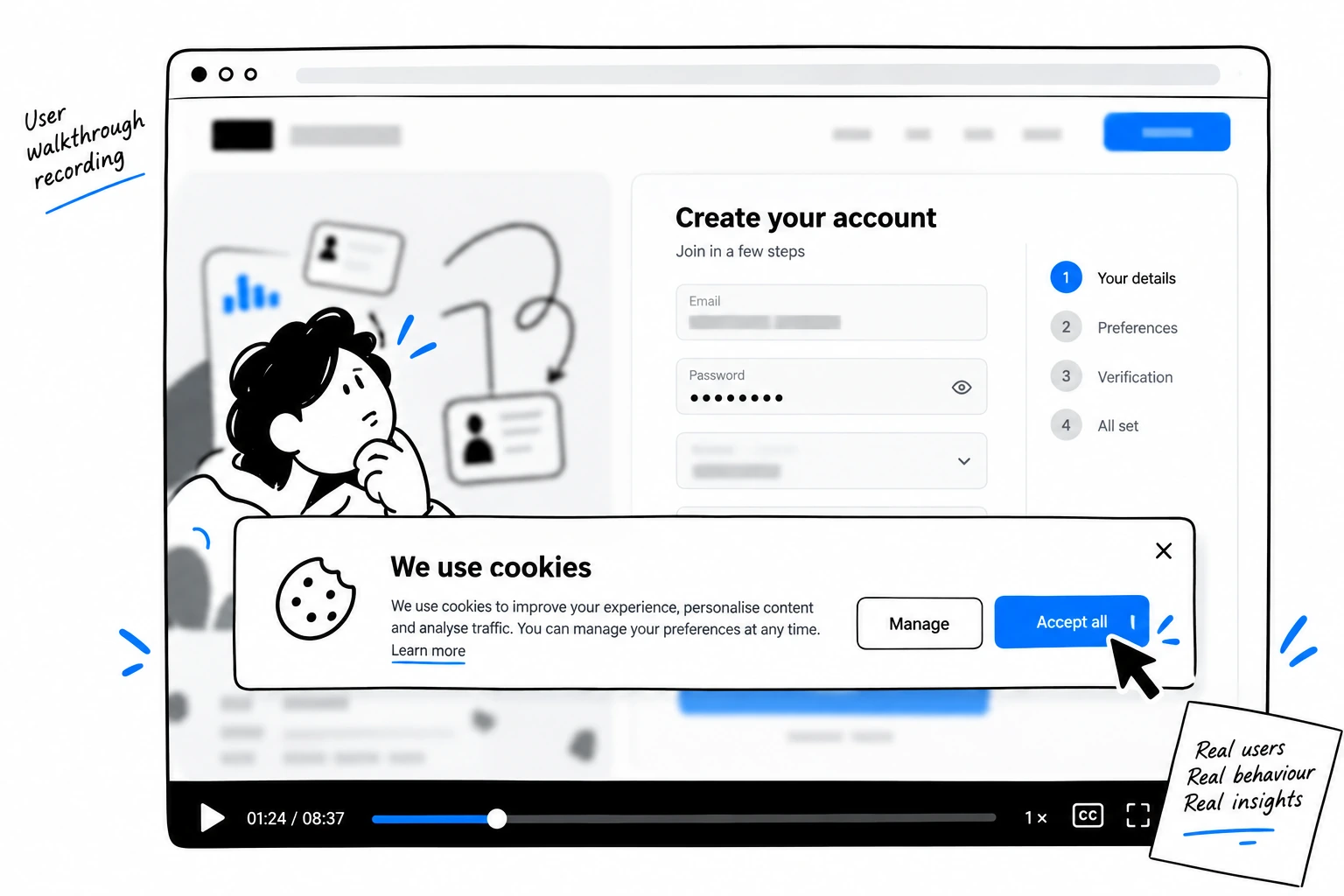
The recordings caught things a checklist never would. A cookie-consent banner that, if touched mid-form, reloads the page and wipes ten-plus sections of already-entered data. A final review screen rendering its text white on white, asking users to confirm identity-document details they physically cannot read. A withdrawal flow where every request was rejected with zero explanation anywhere – no reason on screen, no email after.
The Principles Behind Our Audit
Evidence over opinion. We recruit participants to observe behaviour rather than to collect design suggestions. Nobody is asked what they would redesign.
Impact over volume. A finding matters because it affects a journey, a business outcome, trust, or usability – rather than because something looks visually wrong. A visual inconsistency rarely earns a Critical.
Journeys over screens. We evaluate complete tasks and flows, including what happens between screens and in the emails around them. Competitor patterns are assessed in the client's context, never copied because they differ.
Action over documentation. Every important finding ships with a recommendation, evidence, severity, affected outcome, and implementation context. A sixty-page PDF with no owner-shaped output fails this principle by definition.
The Proof Test. If we cannot show where a finding came from, it does not become a finding. Every recommendation is connected to a recording, a screenshot, a benchmark number, or another identifiable piece of evidence – and that link ships with the task.
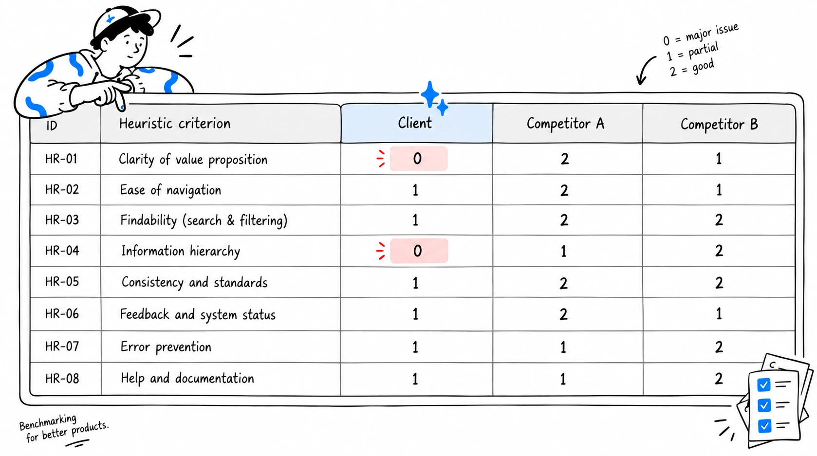
Heuristic evaluation is part of the method, as a structured lens rather than the source of truth. Each flow is scored against a criteria set – Nielsen plus industry-specific criteria – on a 0–2 scale per platform. Heuristics help us classify what we see. Real users tell us whether it actually matters. On that 0–2 scale, the three products in the operator audit scored within 0.14 points of one another overall. The session recordings showed much larger differences at specific high-stakes moments: two criteria hit zero for the client exactly where a first-time visitor decides whether to trust the product with an ID and a card, and neither competitor scored zero there.
How Do We Scope a UX Audit?
We scope a UX audit around decisions and user journeys rather than a fixed number of screens.
A sportsbook typically needs registration, KYC, deposit, betting, withdrawal, and the emails between them. A SaaS product needs onboarding, first value, collaboration, and billing. The number of personas follows the same logic: as many as the analysis needs to separate a one-off stumble from a pattern.
We usually scope around four kinds of flow:
- Business-critical flows – where money, conversion, or retention is decided.
- High-risk flows – KYC, payments, authentication, security.
- High-friction flows – where analytics or support data already points at a problem.
- Strategic flows – the parts of the product that will define the next version.
This is also why pricing is quoted per scope rather than per page: two products in the same industry can need very different audits.
UX Audit vs Competitor Analysis: Do You Benchmark Competitors?
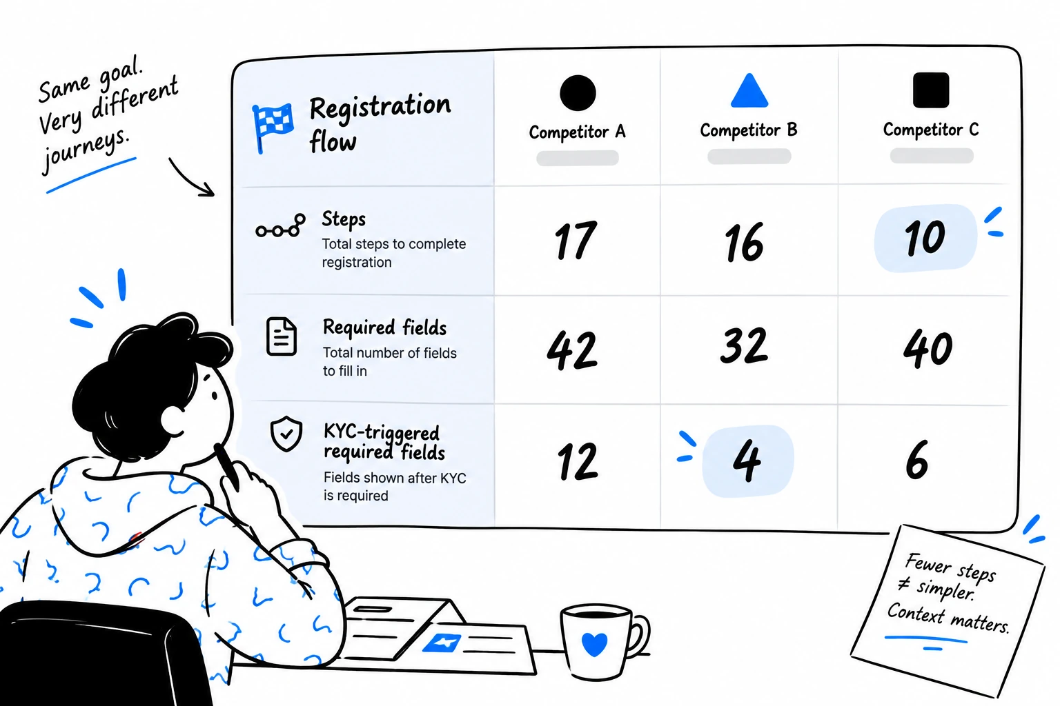
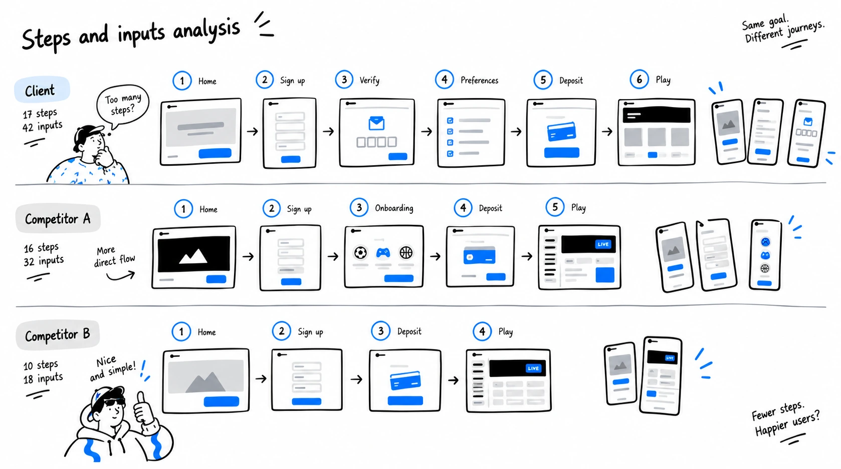
Yes. The same personas run the same missions on 2–4 direct competitors, and every flow gets a comparison table: steps, required fields, friction points, heuristic scores. We benchmark journeys rather than screens.
In the recent audit the client's registration form itself asked fewer fields than one competitor; the weight sat in the verification step, which demanded 12 required fields against the competitors' 4 and 6. That distinction changes what gets fixed first.
Competitors also expose assumptions. When the same task is completed in another product, it becomes clear which constraints are regulatory and which are historical decisions nobody has questioned. We record what competitors do well as adoptable patterns, each with the reason it works – and, just as deliberately, what the client does better than anyone in the comparison.
The clearest example was SPID, Italy's public digital-identity system, which can be used during registration. The operator already offered registration through it; neither competitor did. Choosing it skipped the personal-data, residence, and document-upload steps entirely: 19 required fields instead of 42 in the worst-case standard path. The product presented it as one option among several, next to the long form. Our recommendation was to foreground it rather than fix around it. The shortest path through the funnel already existed; the product's own presentation hid it.
What Does a UX Audit Include? Three Linked Artifacts
A product UX audit can include recorded user sessions, heuristic evaluation, journey analysis, competitor benchmarking, technical health checks, evidence-backed findings, prioritization, visual concepts, and an implementation-ready backlog – delivered as three artifacts that reference each other. Which of these are in scope depends on the tier; the three artifacts below describe a full Discovery-tier delivery.
01 – Evidence. Google Drive. What users actually did. Every recorded walkthrough, split by flow and by persona, with the persona profile attached. The client's team can watch exactly where a specific person hesitated, misread a label, or abandoned.
02 – Reconstruction. Figma. Where it happened. Every recording broken into frames: each screen of each flow, laid side by side across the client and competitors, desktop and mobile, with annotations on every step. Problem cards carry the same IDs as the task database, so a designer jumps from a card straight to the ticket.
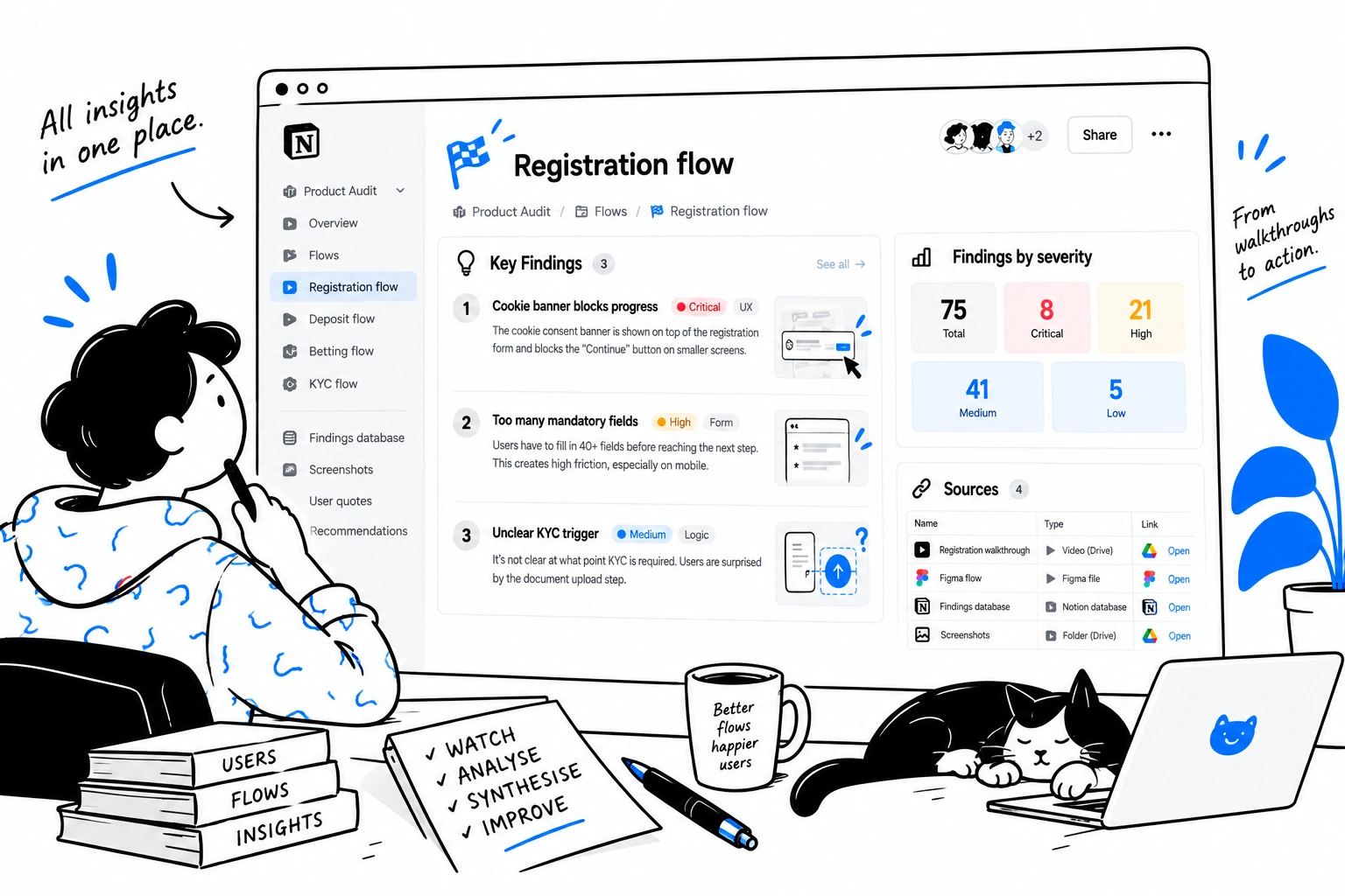
03 – Decision layer. Notion. What should happen next. One hub page states what was purchased and why, and how to navigate the material. Each flow gets its own page: key findings, worst-case metrics tables, heuristic scores, honest limitations of what could not be tested, and open questions that need a client-side decision. Underneath sits the findings database – the single source of truth.
Drive shows what happened. Figma shows where it happened. Notion explains what to do about it.
From Finding to Ticket
Every finding is recorded individually, as a task: ID, name, severity, flow, description, why it matters, affected outcome, recommendation, and evidence. Related low-impact findings can then be grouped into implementation batches when they share the same underlying fix – one systemic visual-QA pass instead of six separate tickets. The database columns map one-to-one onto Jira or Linear import fields, so the client's team never has to translate the audit into tickets. Here is the anatomy, using a real Critical finding from the operator audit:
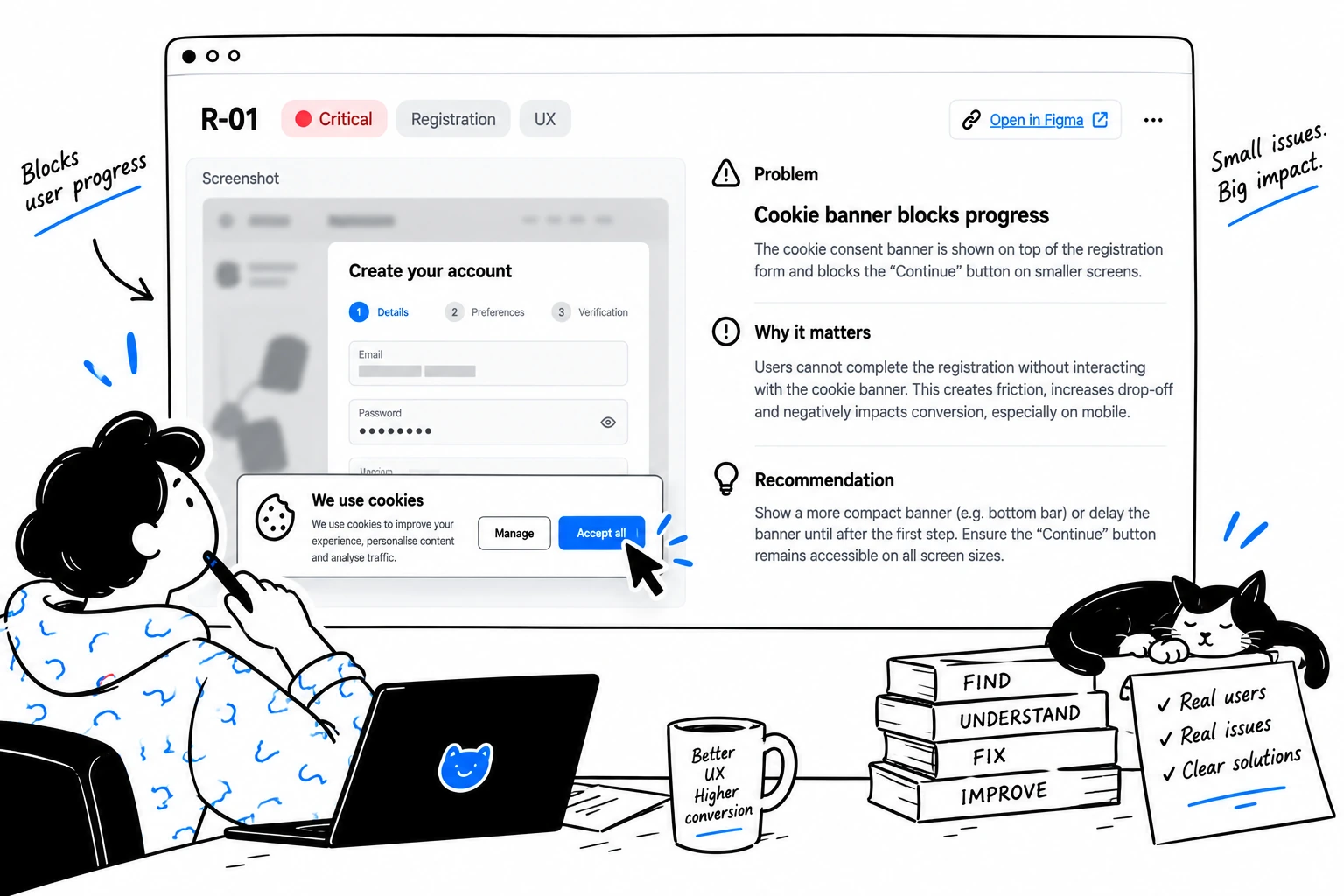
Severity has four levels: Critical (can independently stop completion or poses a compliance or trust risk), Serious (causes drop-off for a meaningful share of users), Medium (adds friction), Cosmetic (visual nitpick).

What Makes a UX Audit Actionable?
An actionable UX audit meets four criteria: every finding has observable evidence, explains where in the journey it happens and why it matters, tells the team what needs attention first, and contains enough context to become real product work.
01 – Evidence. Every important finding has observable evidence behind it.
02 – Context. The finding explains where in the journey it happens and why it matters. 0
03 – Priority. The team knows what needs attention first, and what can wait.
04 – Implementation. The finding contains enough context to become actual product work.
A report describes problems. An actionable audit reduces the distance between discovering a problem and deciding what to do about it.
What Real-User Audits Usually Reveal
01 – The interface works. The journey doesn't. Individual screens can be fine while the flow breaks between them. Every withdrawal in the operator audit was rejected; the rejection screen was well designed, and the reason for rejection appeared nowhere in the product or in email.
02 – The shortest path is often hidden. The feature exists, but the hierarchy stops users from finding it. SPID registration was the fastest on any of the three platforms and the least visible option on the client's.
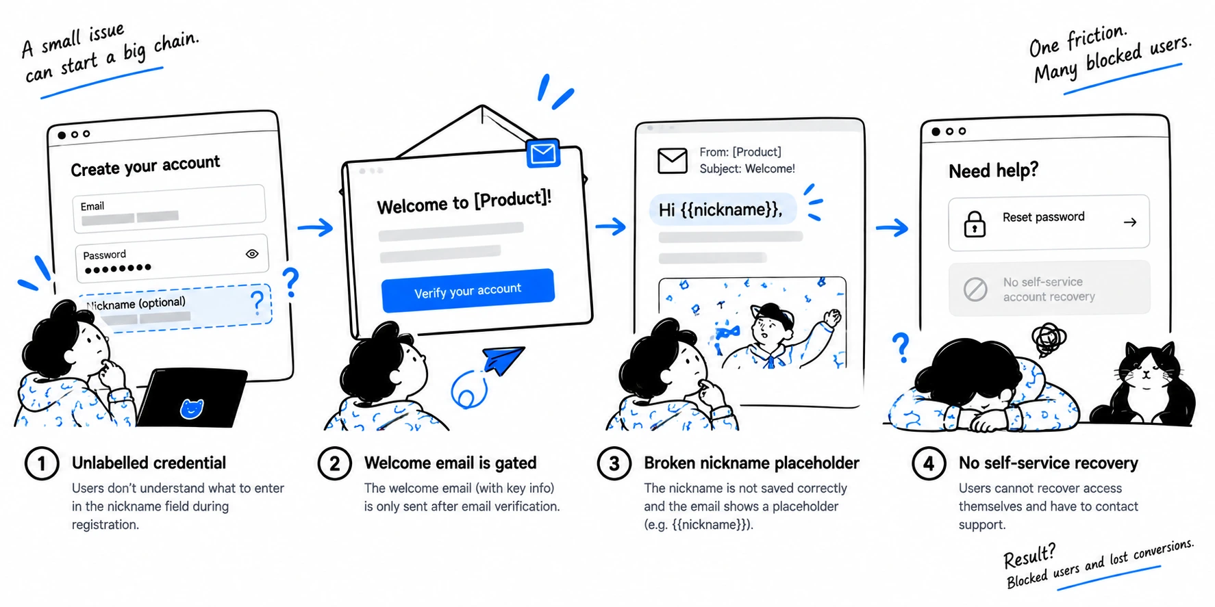
03 – Small defects compound. Four survivable defects stacked into one permanent lockout: a login credential labelled in a way that gave no signal it must be remembered; a reminder email that arrived only after a verification step that itself required logging in; that email rendering the credential as a broken template placeholder; and no self-service recovery path. No single flow page shows a chain like that. It only appears when someone walks the whole journey on a real account.
04 – Competitors expose assumptions. Once the same registration is completed on three platforms, "the regulator requires it" and "we've always done it this way" separate cleanly. Several fields the client asked users to type were already present on the identity document they uploaded two steps later.
How Long Does a UX Audit Take? The Three Tiers
A UX audit takes one to four-plus weeks depending on tier: Express in about a week, Discovery in about three, Enterprise in four or more.
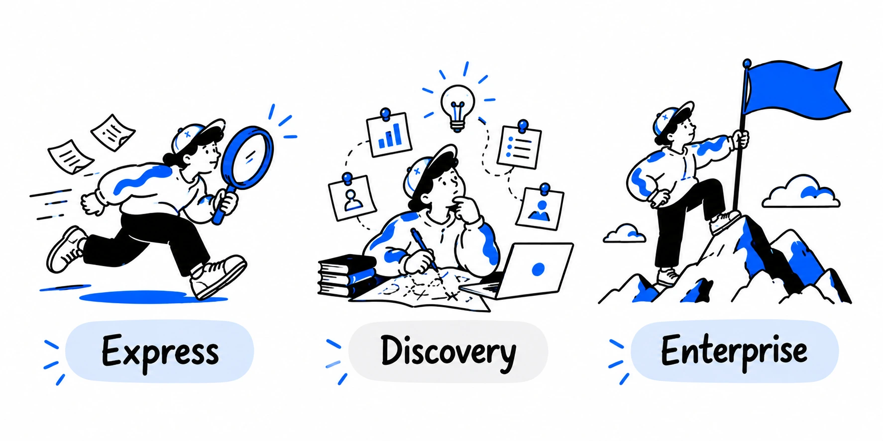
The operator audit ran on the Discovery tier. Two things stay constant across all three: we never touch code, backend, or databases – interface and analytics access is all we need – and every deliverable is reviewed by senior leads before the client sees it.
How Much Does a UX Audit Cost?
Pricing follows scope: the tier, the number of journeys, the number of personas, and whether competitors are included. Express starts from €3,500. Discovery starts from €5,500. Enterprise is scoped individually – cross-platform coverage, accessibility, and design ops vary too much by product to price before that conversation – and quoted once we know what needs to be covered. A single high-value journey can be audited on its own when that is where the business problem sits.
The Audit Is Designed to Be Used
An audit is successful when the document stops being the deliverable and becomes the team's working backlog. The typical rhythm after delivery: the audit lands in week 0; Critical items are triaged in week 1; quick wins ship in weeks 2 to 4; and the strategic items open the next planning cycle. The delivery call covers the three or four findings that matter most; open questions that need a business decision are pre-listed as the follow-up agenda.
When the findings justify systemic change, the audit roadmap becomes the backbone of a Product Rebuild & Redesign – nothing gets discovered twice. When the client's own team ships the backlog, the evidence links travel with every ticket, so nobody has to re-argue a finding six weeks later.
Not Sure Whether You Need an Audit, a Redesign, or Both?
Tell us what you are trying to improve, which journey is causing problems, and what you are planning to change. We will help you identify the right scope before you commit to the work. Start here.

Frequently Asked Questions
What is a product UX audit?
What is a product UX audit? A product UX audit is a structured diagnostic of a live product: real people complete real missions on live accounts, every friction point is recorded and evidenced, and each finding becomes a prioritized task with severity, rationale, and an evidence link. The deliverable is a backlog your team works from, with the report as supporting material.
What does a UX audit include?
What does a UX audit include? A UX audit can include real-user testing, heuristic evaluation, journey analysis, competitor benchmarking, technical health checks, evidence-backed findings, prioritization, visual concepts, and an implementation-ready backlog. The exact scope depends on the product, the business problem, and the audit tier – Express covers the first two and quick wins; Discovery and Enterprise add the rest.
How does a UX audit differ from usability testing?
How does a UX audit differ from usability testing? Usability testing is one input into the audit. We add heuristic scoring per flow, competitor benchmarking on the same journeys, technical health checks, and cross-flow analysis that catches failures spanning several screens. The findings are then prioritized by impact and converted into implementation-ready tasks, which standalone usability testing rarely produces.
How long does a UX audit take?
How long does a UX audit take? Between one and four-plus weeks depending on tier. Express covers critical flows and quick wins in about a week. Discovery adds recorded user sessions, competitor benchmarking, visual concepts, and a strategic roadmap in about three weeks. Enterprise extends to cross-platform coverage, accessibility, and design ops over four or more weeks.
How much does a UX audit cost?
How much does a UX audit cost? Express starts from €3,500. Discovery starts from €5,500. Enterprise scope varies too much by product to price upfront, so it is quoted once we have mapped what needs to be covered. A single-journey audit is possible when the business problem sits in one flow, which lowers the entry point considerably.
Do you need access to our code or production database?
Do you need access to our code or production database? No. We audit the interface on staging or production plus your analytics, such as Google Analytics or Mixpanel. Code, backend, and user databases stay untouched. This is a standing rule rather than a case-by-case decision, and it removes the main security concern regulated operators raise before an audit.
How many users do you test with
How many users do you test with? As many personas as the analysis needs to separate a one-off stumble from a pattern – defined per audit around the journeys in scope. In the operator audit, three testers walked every flow on all three platforms, with a fourth added where a re-verification pass was needed. Persona count is part of scoping.
Do you audit mobile products?
Do you audit mobile products? Yes. Every flow in the operator audit was recorded on desktop and on mobile, and the Figma reconstruction shows both side by side. Native iOS and Android apps are covered in the Enterprise tier as a cross-platform audit, alongside web.
Can you audit only one flow?
Can you audit only one flow? Yes. An audit can focus on a single high-value journey – registration, checkout, onboarding, withdrawal – when that is where the business problem sits. It follows the same method: real users, recorded sessions, evidence-linked findings, and a prioritized backlog, at a smaller scope and cost.
Can our team implement the fixes without you?
Can our team implement the fixes without you? Yes. The backlog is written so an internal team executes it directly, with evidence linked from every task and related low-impact items grouped into batches. Most clients continue with us afterwards, through a rebuild or a dedicated team shipping the roadmap sprint by sprint, but the deliverable stands on its own.
