


Rebranding a Sports Platform: How We Built a Brand System Across 10+ Touchpoints


This article is part of the Flatstudio × Stavka.tv case study. Stavka is a sports predictions aggregator with over 3 million monthly visits. CEO: Viktor Titov. Head of Design at Flatstudio: Bohdan Kononets. Written for product teams and founders building or rethinking a digital product brand. Main article in the series — here.
Most rebranding articles follow the same script: here's the old logo, here's the new one, here's why the new one is better.
This one is different. Because the Stavka rebrand wasn't about the logo. The logo was one of twenty things we were solving at the same time. The real challenge was harder: build a single, coherent brand system for a product that lives simultaneously on a website, a mobile app, YouTube, Telegram, Instagram, push notifications, ad banners for 22 bookmaker partners, and investor presentations.
All of it needs to look like one thing. And still work in each environment on its own terms.
Why the Rebrand Happened at All
Before 2020, Stavka didn't have a system — it had a collection of decisions. The logo was a red-and-blue rectangular block, typical of Russian sports channels from the early 2000s. No variants for different sizes, no scaling rules, no compact version for favicons or app icons. No brand guidelines. No system.
But there was a more important reason. In 2020, Stavka was going through a structural shift: a startup growing into a full media product — with its own editorial team, an independent audience, and a business model built on bookmaker partnerships. Monthly traffic had crossed one million visits and was still climbing. The partner count kept growing.
Every time a new touchpoint appeared — a YouTube channel, an iOS app, a Telegram channel, a banner for a new tournament — someone had to figure out "what should this look like?" From scratch. Without a system.
When a product is small, that's manageable. When it scales to a million monthly visits and 22 partners, each with their own brand guidelines, a fragmented identity starts costing real money. Users don't recognize Stavka outside the website. Partners receive materials that don't match each other. The team spends time answering "what should this look like?" instead of pulling a ready answer from a system.
The rebrand wasn't about looking better. It was about building something that could scale.
We started in February 2020. By November 2020, the new system was approved and live.
First: Mission and Values
The first decision we made: no visual decisions until we understood what the brand actually meant.
- Brand mission: prove that betting is, first and foremost, entertainment. Give people the emotional experience of the game itself. Teach betting through play — without spending real money.
- Brand character: Stavka TV is a friendly and energetic companion — young, but experienced and trustworthy. Calm and measured when things get tense, but also a genuine motivator.
This mattered because every visual decision — color, type, illustration style — had to feel like that character, not contradict it.
The Foundation: Color Logic
The first and most consequential decision: drop red as the dominant color.
Red on Stavka was inherited, not chosen. It didn't carry meaning, and it conflicted with what the product actually is: analytical, structured, built on data and trust in expert tipsters. Red signals urgency and risk. Blue signals competence and reliability.
The new palette is built around four named colors — each tied to a brand value:
- Equality — #161613 (near-black, primary background and text)
- Growth — #0161DA (primary blue, the core of the brand, Pantone 2728 C)
- Freedom — #F7F8FA (near-white, light surfaces)
- Passion — #FD213A (accent red — for wins, records, important notifications, Pantone 185 C)
Plus six accent colors for gamification elements, sport categories, and UI accents.
Red didn't disappear. It found its place: records, wins, important alerts. Where emotion is appropriate, it's there. But it no longer competes with the primary blue for attention.
A rule we build into every brand: 70% primary, 30% accent. That ratio keeps the interface clean and focused, while leaving room for energy where it actually counts.
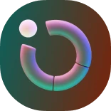
Logo System: 5 Variants, One Identity
The old logo had one version. The new system has five — each designed for a specific context and minimum size.
- Full horizontal logo — the primary version, minimum 102px / 36mm. Used wherever there's space.
- Shortened logo (ST TV) — for horizontal formats where the full name is too wide, minimum 53px / 19mm.
- Short logo (S TV) — for even tighter formats, minimum 42px / 15mm.
- Emblem (ST TV vertical) — for square formats: avatars, app icons, minimum 36px / 13mm.
- Icon (S) — the most compact version, designed for legibility at 16px. Works as a favicon and represents the brand even at minimum sizes.
The construction logic: the logo is built on a geometric grid with a 10° rightward tilt — the same angle used in the custom typeface and graphic elements throughout the system. The slant communicates forward movement and momentum without relying on literal sports imagery.
Exclusion zones: each variant has a defined clear space of 2x (where x is the height of the horizontal elements of the letter S). Nothing can enter that zone.
In 2023, we brought TV back into the logo as a distinct element. Not decorative — Stavka TV is a platform with video content, live coverage, and editorial predictions. The updated version was chosen against clear criteria: all brand colors in the right proportions, suitable for animation, legible in monochrome on colored backgrounds. A glitch-effect animation was planned as well — a metaphor for real-time sports data.
Typography as a Brand Element
Inter is the primary interface typeface. Neutral, readable, scales cleanly across all screen sizes and densities.
But Inter isn't a brand typeface. For accent headlines, the logo, and brand materials, we needed something proprietary.
Stavka BoldItalic is a custom display typeface developed specifically for the brand by our brand designer Maria Solovyova. It combines sharp angles with rounded details. The 10° rightward tilt — the same angle as the logo — is baked into the typeface's DNA. Bold italic as default parameters isn't arbitrary: sport is motion, momentum, forward lean. A static upright typeface for a sports brand is a contradiction.
The typeface was originally developed for Cyrillic. In 2021, it was extended with Latin characters — for other Stavka startups and international materials.
Recommended for large headlines and decorative elements in promotional and brand materials. Not recommended as body text or at sizes below 62pt.
Graphic Language: 6 Elements
Beyond the logo and color, the brand has a defined visual language with six components.
- Sports motifs as background accents. Photographs and textures of sports equipment — balls, rackets, pucks — used as color and black-and-white overlays.
- Display typeface as decoration. Stavka BoldItalic at large scale as a background graphic element.
- 3D illustrations. Custom illustrations of hands and objects, communicating positivity and energy. Objects are lit from multiple angles; compositions use one or several brand colors.
- Achievement style. A hybrid visual language combining 3D elements with clean flat design — specific to the gamification system.
- Plus pattern. A grid of plus signs — a legacy of the original tagline "Stay always in the plus." A subtle but consistent brand signature.
- Clean, light UI. The overall interface style: light backgrounds, vivid accents, generous white space.
Iconography: Three Sets
- Base UI icons — a set of 150+ icons in a friendly style with rounded forms, thick strokes, and negative space for detail. Used throughout the product UI.
- Accent icons (glass style) — a colored glassmorphism set for highlighting premium or featured content. Used at sizes up to 56px.
- 3D reactions — a custom set of 10 emoji-style reactions in the 3D illustration style. Used as reactions to predictions and as decorative graphic elements.
Touchpoints: Where the Brand Lives
This is the part that tends to get underestimated in rebranding projects. A new logo and new colors are just the starting point. A brand is only alive when it's consistent everywhere a user encounters it. For Stavka, there are a lot of those places.
App
The app icon is the first thing a user sees on their phone. iOS and Android have different technical requirements: Android doesn't support an alpha channel in icons; iOS has its own rounded corner rules. Both versions had to be equally recognizable within different constraints.
The splash screen is the first thing seen on launch — the moment the app is still loading but already communicating "you're in the right place." Two versions were designed: light and dark.
Social Media
Each platform has its own format and logic. Instagram needs square covers and vertical stories. Facebook needs horizontal banners. YouTube needs covers with text that's legible on thumbnails. Telegram needs an avatar that's recognizable at 40×40 pixels.
All of them still need to look like one system — not like materials from different designers.
YouTube Covers
Stavka runs a YouTube channel with regular content across all major leagues: Premier League, La Liga, Serie A, Bundesliga, Ligue 1, KHL, Champions League, Europa League, Conference League, NBA, NHL, Euro, World Cup, UFC.
Each league gets its own cover with the appropriate context. But all of them are one system: the same grid, the same typography, the same principles for working with color and photography.
One important technical detail: covers were built as Photoshop templates (.psd) with dynamic fields — so editors could swap in text and photos for each video without involving a designer and without breaking the system.
Ad Materials
Stavka monetizes through bookmaker partnerships. Twenty-two partners — each with their own brand guidelines. Parimatch is yellow. Winline is green. Leon has its own. BetBoom has its own.
There's a constant flow of materials: site banners, catfish bars, popups, stories, full-screen banners in the app. The challenge: make them simultaneously match the partner's branding and remain part of the Stavka ecosystem. Not "a bookmaker ad on a neutral background" — but "a bookmaker ad in Stavka's visual language."
👉 More on why header banners convert at zero, and what actually works — in the article on promo for bookmakers.
Presentations
A separate layer: B2B materials for investors and bookmaker partners. The same system, different audience and level of detail. But anyone receiving these materials sees the same brand.
Corporate Football Kit
In 2021, the Stavka team asked us to design a kit for their corporate football team. On one hand — just merch for internal use. On the other, it's an exact test of the brand system in an environment it was never designed for.
Field kit: dark navy Pantone 7547 C as the primary color, red Pantone 185 C on the collar, cuffs, and details. The same two colors as the interface — this time on fabric. Goalkeeper kit: orange Pantone 165 C to stand out on the pitch, with the same system details throughout.
One decision in this project says more than anything else: player numbering is set in Stavka BoldItalic — the same custom typeface our brand designer Maria Solovyova developed for headlines and the logo. Number height: 120mm. This wasn't a sentimental choice. The typeface already existed, it was designed for large sizes, and it reads clearly at a distance. It works here too — without any adaptation.
The shirt pattern is a line gradation with a moiré effect in Pantone 185 C. A tonal shift with no gradients — only changing line weight. The same principle as in brand materials: achieve the effect with minimal means.
This is what the case demonstrates: a brand system doesn't need to "adapt for merch." It simply moves into a different environment and stays itself.
Contests and Promos on the Site
Contests are a specific genre. They need to feel celebratory and grab attention — while staying within the brand.
The platform runs dozens of tournaments simultaneously: daily (Toto, Daily Diary), weekly by sport (volleyball, basketball, hockey, tennis), monthly leagues — Pro League, Authors League, King of the Hill, Betting Media League. Each tournament has its own mechanic: by profit, by ROI, by number of correct predictions, by time to reach a goal.
Each format is its own design case. Banners, tournament landing pages, modals, push notifications, stories — all of it had to feel celebratory and draw attention, without leaving the system. The same brand — just with a higher proportion of accent red and more motion.
The Brand Book as a Working Tool, Not a Document
Everything described above lives in one operational document, a Figma file, and a Dropbox folder that the team uses daily.
What it actually delivers: a designer doesn't ask "what color should the button be?" A video editor doesn't ask "what font do I use for the title card?" A new bookmaker partner gets a clear document instead of "make something in our colors."
Over eight years, teams on both sides have changed. But the brand stays recognizable — because there's a system, not because the same people remember everything.
The Main Lesson
Rebranding isn't about looking more modern. It's about building something that holds up as you grow.
A logo with one variant that doesn't scale to 16px is a bad logo. A color palette without usage rules is just a moodboard. A typeface that lives only in the designer's Figma file, but not with the video editor — that's not a brand typeface.
A real rebrand is when every person on the team, across any medium, in any format, can answer "what should this look like?" — without asking a designer.
If you're building or rethinking a digital product brand and want to do it systematically — get in touch. We'd be glad to talk about your project.
← Back to the main article in the series: "Sports Predictions Platform: An 8-Year Case Study with 3M Monthly Visits"
Other articles in the series:
→ From 2.0 to 2.1: How We Rewrote Two Years of Work Without Losing the Client
→ Promo for Bookmakers: Why Headers Convert at Zero and Popups Actually Work
→ Design Systems for Complex Products: Why It's an Investment, Not an Expense
→ How to Measure Redesign Success: Real Metrics After the Migration
Frequently Asked Questions
What is a "Stylescape"?
It's a bridge between a moodboard and a mockup. It shows how your brand feels (textures, colors, typography) in one wide image. It ensures we align on the visual direction before spending time on the logo.
What does a brand identity project include?
A full branding engagement covers brand strategy, visual identity design, brand guidelines, and a production-ready asset pack. Depending on scope, it can also include an investment pitch deck, brand collateral, and a marketing kit. Each deliverable is designed to work as a system — not a set of isolated files.
We are an established company. Do we need a full rebrand?
Not always. Often a "Brand Refresh" is enough. We can modernize your visual language to look current (Web3/AI ready) without losing the brand equity you've built over years.
Can you work with an existing logo?
Yes, with a quick audit first. We need to check that your existing assets are high enough quality for production. If the foundation is solid, we can extend it — new applications, collateral, brand guidelines, or a full asset library built on top of what you already have.
What is the difference between a rebrand and a brand refresh?
A brand refresh updates the surface of an existing identity — it's evolution, not revolution. A rebrand starts from strategy: new or redefined positioning, new visual language, sometimes a new name. We assess which is appropriate during the discovery phase and give you a clear recommendation before any design work begins.
How long does a brand identity project typically take?
A standard brand identity engagement — from discovery to final brand guidelines — typically runs 4 to 8 weeks, depending on scope. A brand refresh can move faster. A full rebrand with strategy, identity, and rollout takes longer. We set a realistic timeline during the initial discovery call.