


Modernizing Lisbon’s Transport Infrastructure: A Scalable Design System for TML


Most government websites look like they were slapped together in 2011 and then forgotten. Navigation is a maze, the language is pure legalese, and the user always feels like an afterthought. When we got the brief from TML (Transportes Metropolitanos de Lisboa), we knew it was a rare chance to build a public sector product that doesn't actually annoy people.
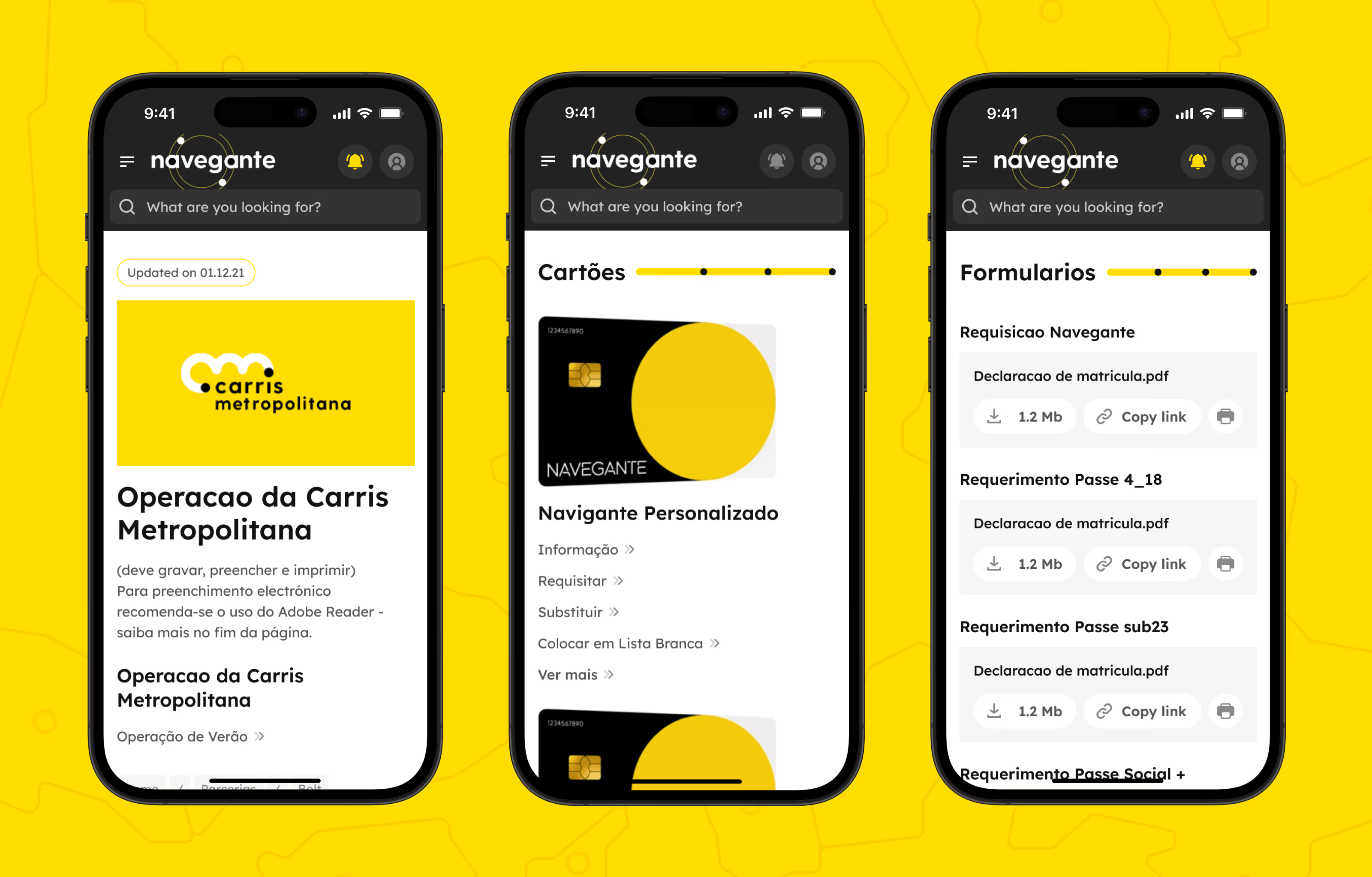
We didn't touch the branding—the logo and colors were already there. Our task was harder: to design the public face of Lisbon’s transport (a city where our HQ is based and which we love so much) and the "internal brain" of the system—an intranet for partners. You can check out the full visual breakdown in our TML case study and TML Intranet case study.
Building a constructor, not just "drawing pages"
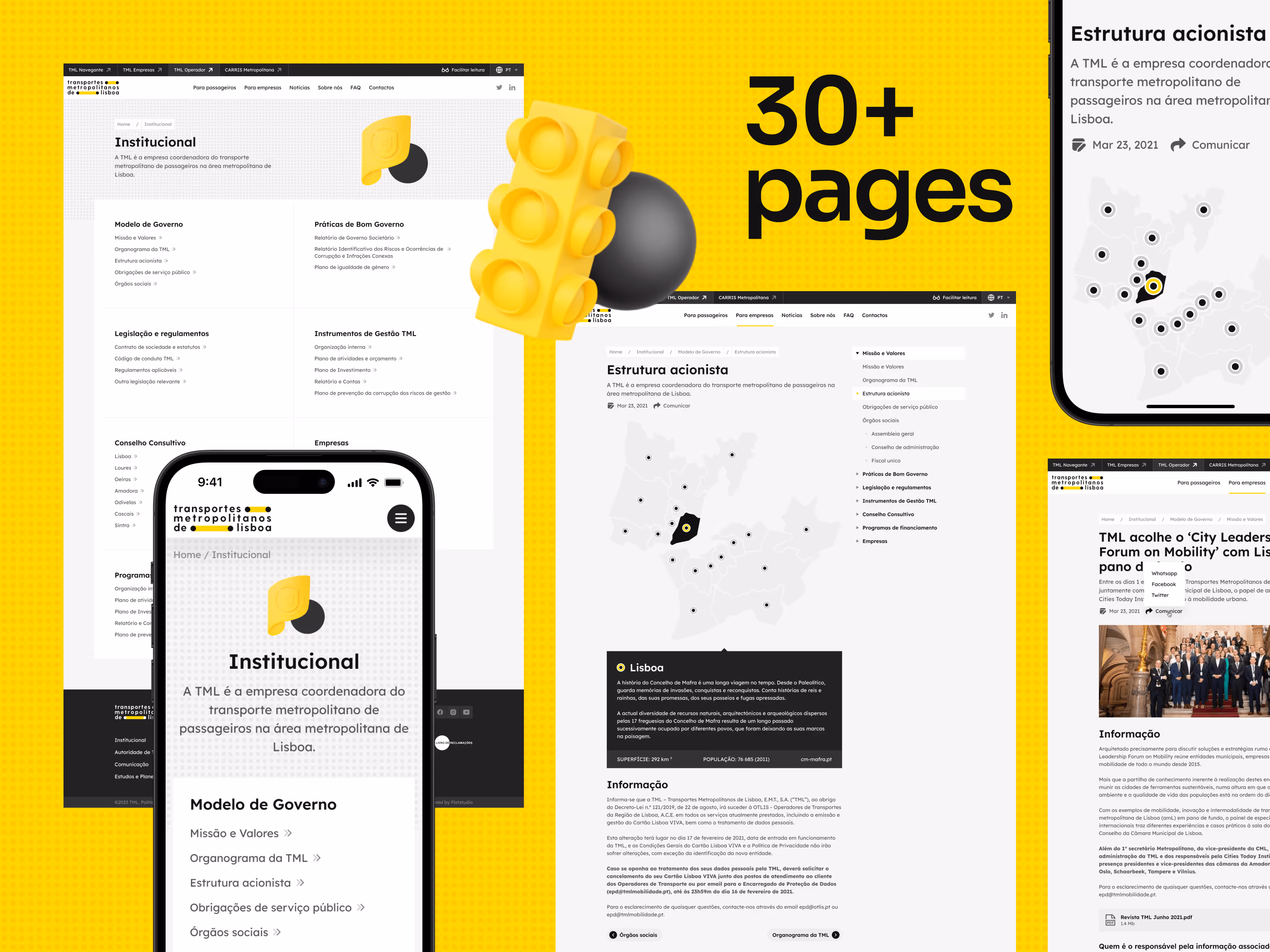
We didn't start with page layouts; we started with a design system. In practice, this means the client received a living constructor rather than a set of static files. Every new page now automatically inherits the logic of the entire system instead of being reinvented from scratch.
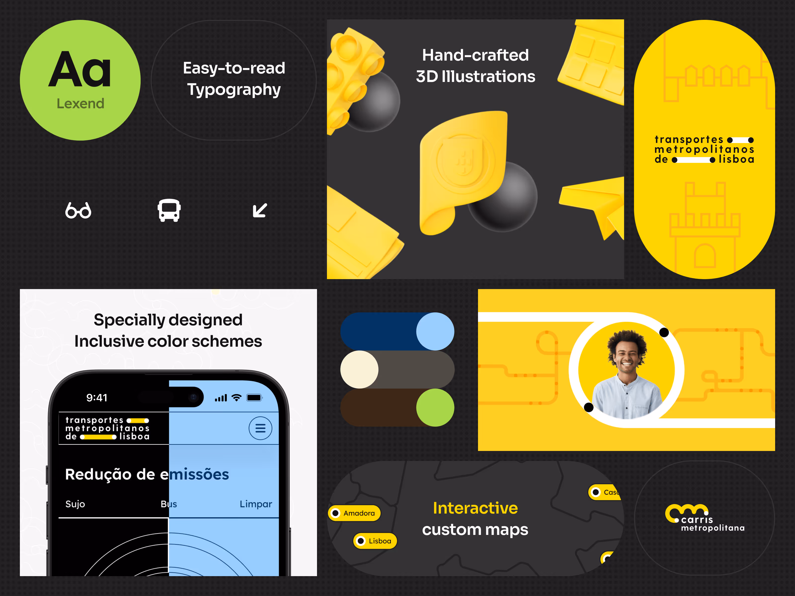
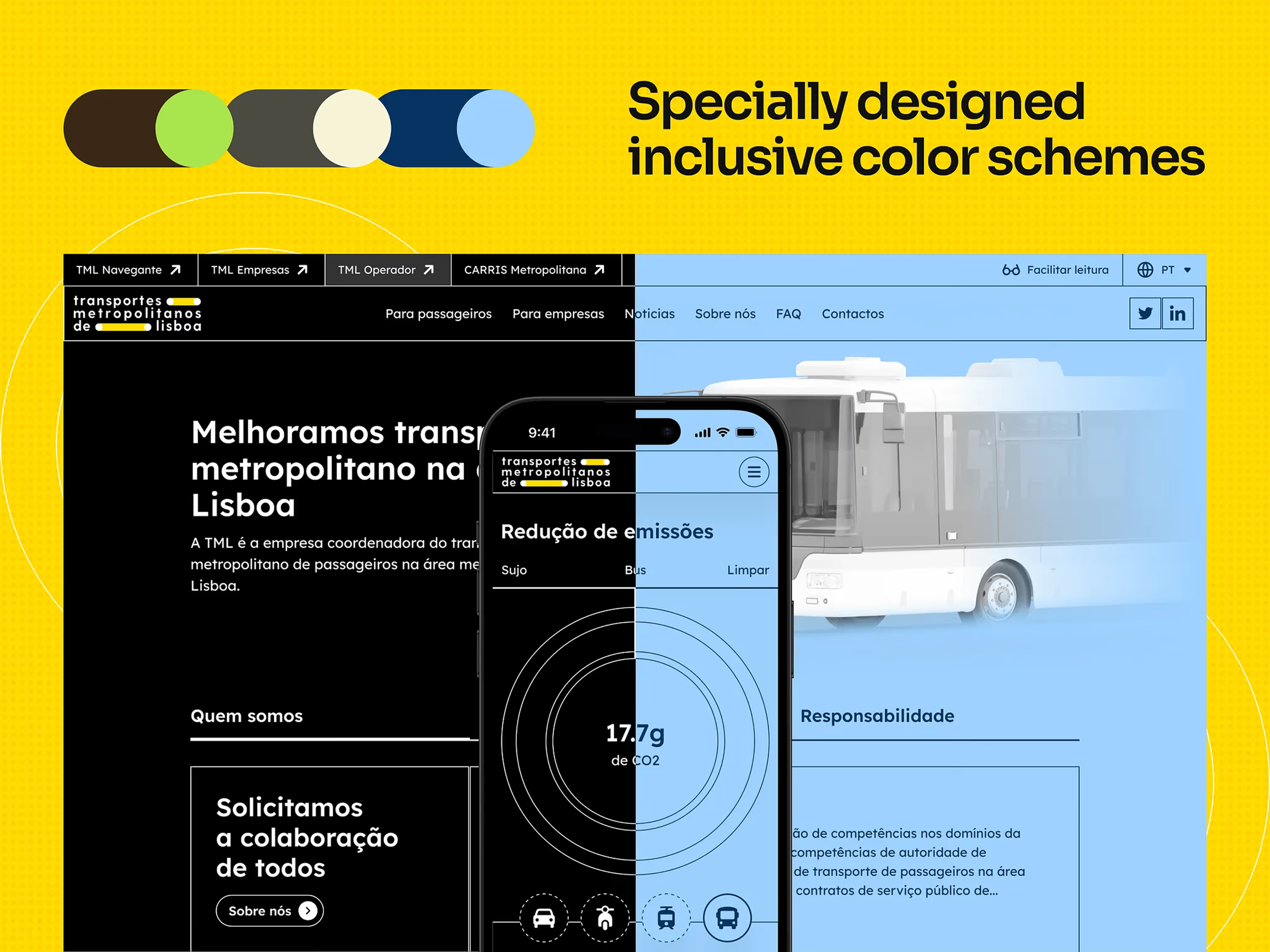
It’s built on yellow, black, and the Lexend font for readability. But the real magic is in the "technical gut": tokens and adaptation rules. Now, the TML team has a tool they can keep using without us constantly holding their hand.
WCAG 2.1 AA: when standards meet reality
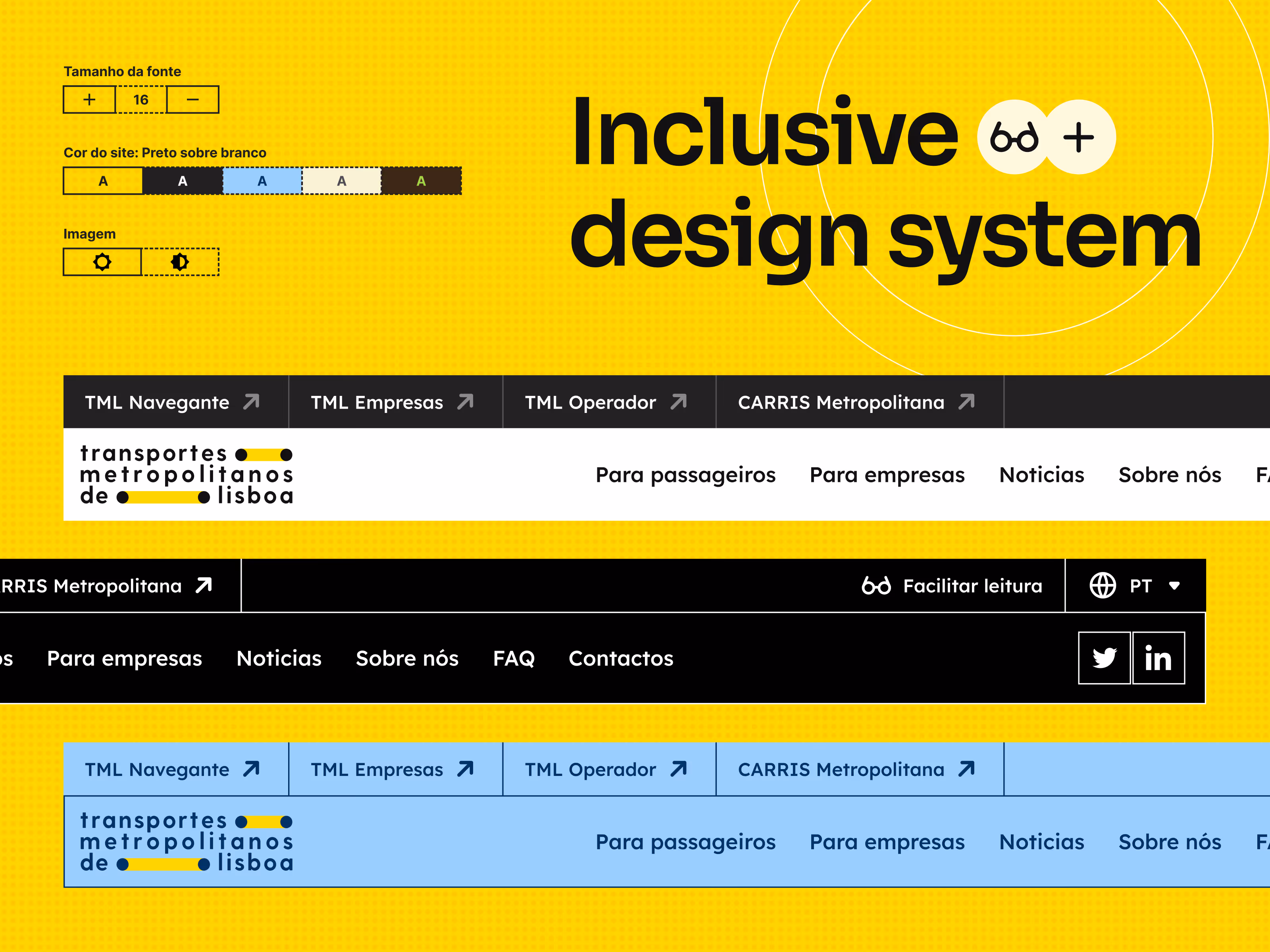
For Portuguese government agencies, WCAG 2.1 AA is a mandatory bar. But in the real world, there’s always a fight between an "ideal inclusive site" and a launch deadline. We went into this project knowing all the nuances: from code semantics (Aria-labels) for screen readers to Tab navigation.
Our approach was pragmatic—build accessibility into the system’s foundation. We focused on what we could actually pull off:
- Compromise-free contrast. We calculated ratios for every single block. If the brand's yellow didn't meet the standard, we adapted the layout instead of ignoring the problem.
- Interface flexibility. Instead of just hoping the browser would handle it, we gave users control tools (font size, contrast, noise reduction) directly on the [public site] front-end.
To be honest, we wanted to do more—like completely ditching standard CAPTCHAs, which are a nightmare for people with cognitive impairments. But in public sector projects, you often have to choose: cover the critical needs now or launch nothing at all.
P.S. It seems in recent updates, the TML team turned this feature off. Too bad, we were really rooting for it 🙃
How to not bore passengers to death
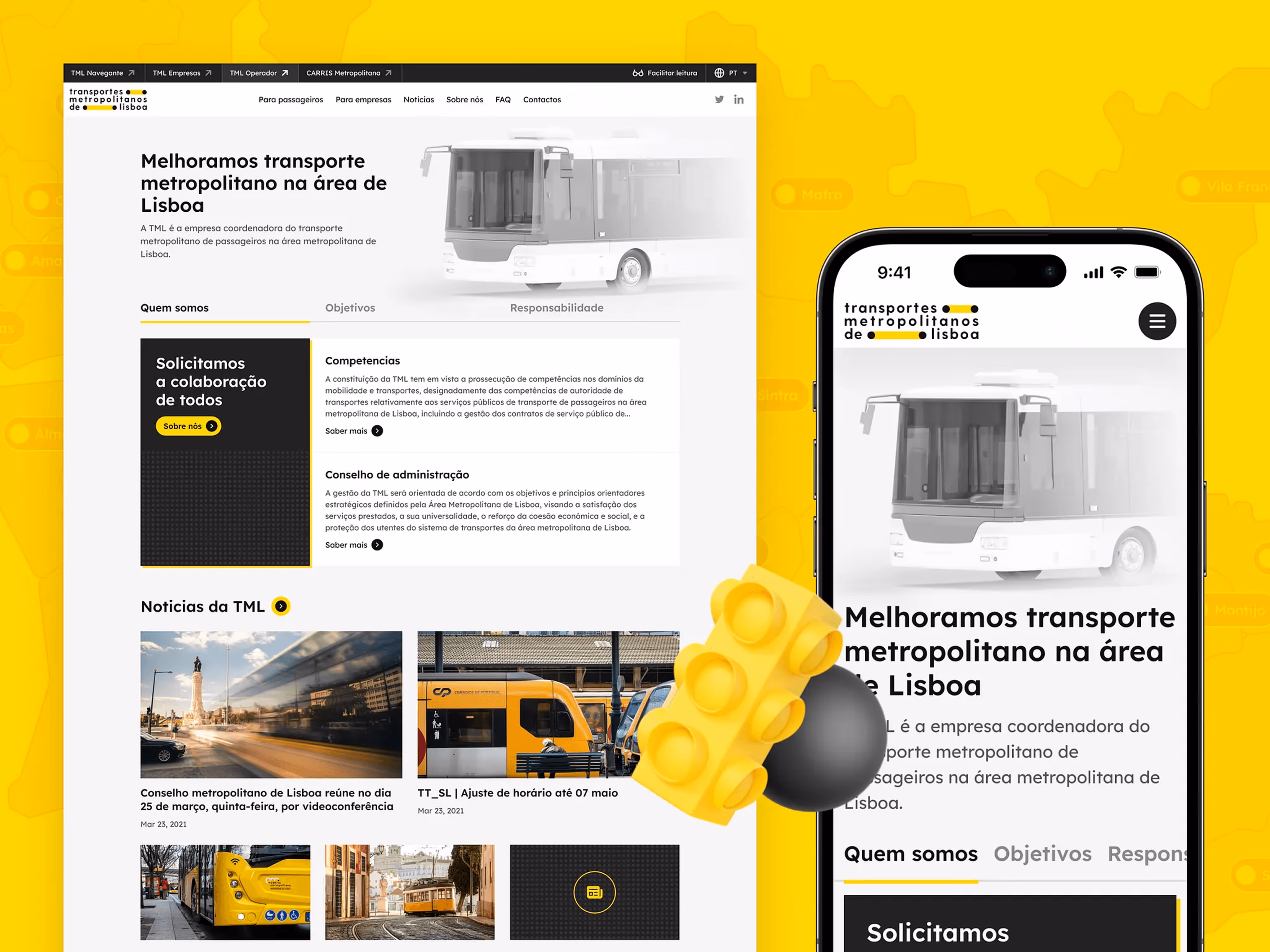
The main challenge for tmlmobilidade.pt was conceptual. TML isn't a bus or an app; it's an authority coordinating 10+ different operators. Try explaining that to a random person in 30 seconds.
We built the architecture around three questions: who is TML, what are they doing now, and what’s next?
- News section. Government feeds are usually a graveyard of press releases. We linked news to TML projects. Now, official documents (PDFs or reports) aren't "trash" in the footer—they are the core content, easy to read on both desktop and mobile.
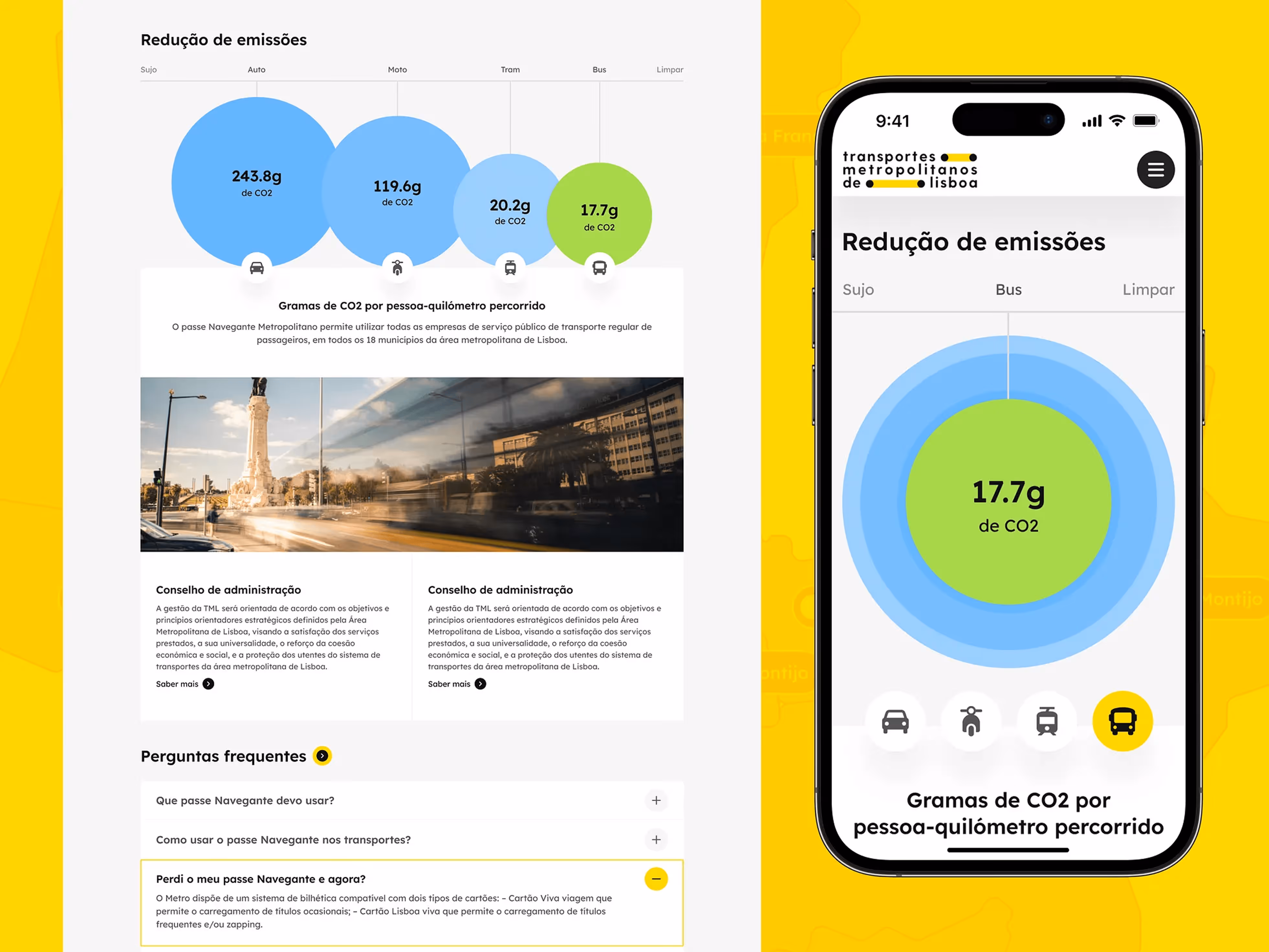
- Interactive charts. We turned complex data on tariffs and CO₂ emissions into visualizations. When you see a side-by-side of car vs. bus emissions (243g vs. 17.7g), the numbers start doing the talking.
- 3D illustrations. To keep the branding from looking "flat," we developed a set of hand-crafted 3D illustrations and icons. They don't fight the brand; they evolve it.
Navegante landing: marketing in the public sector
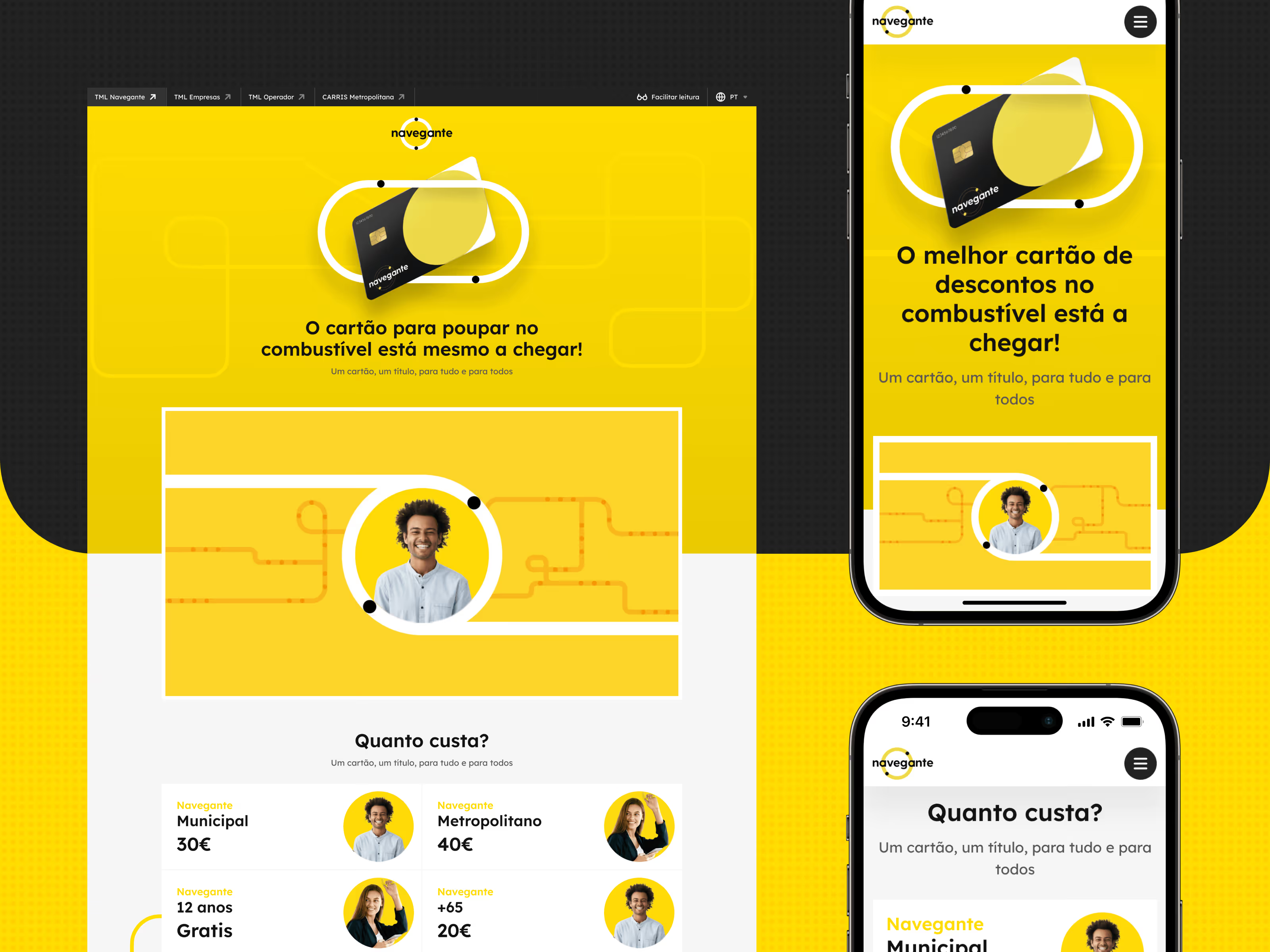
A separate product within the project was the landing page for the Navegante card (a €40/month subscription for all transport in the metropolitan area! By the way, it’s super convenient for hitting the beach after work, though the crowds have definitely grown!). We applied our marketing landing page experience here: bold yellow, clear hierarchy, and zero friction to understanding the price. It’s a product that needs to be understood instantly.
Intranet: when speed saves a shift
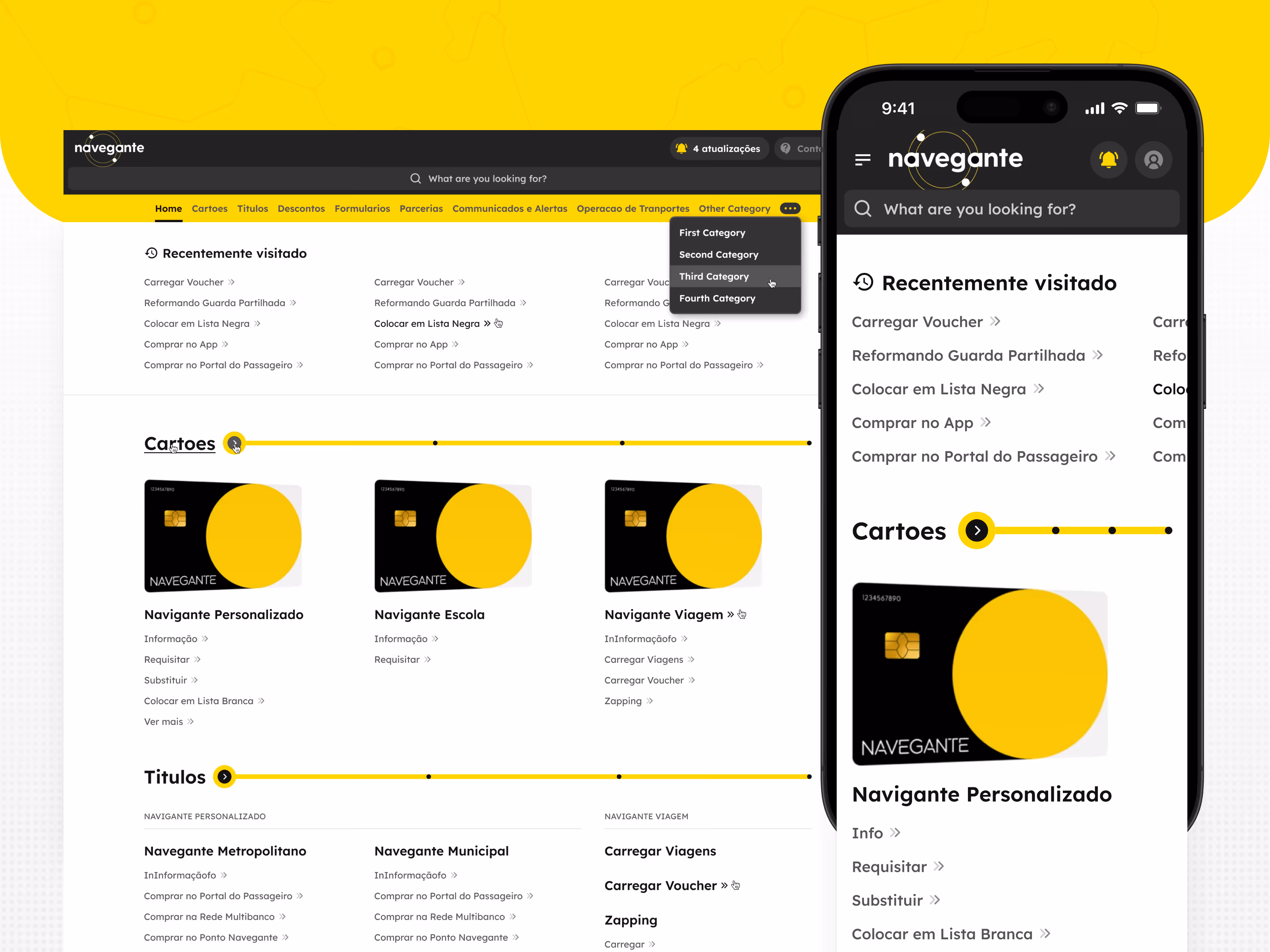
The intranet is the "technical meat" of the project. Before we arrived, TML’s institutional knowledge was scattered across emails and folders. We built a centralized knowledge base for internal teams and partners like Metro de Lisboa or CP.
One principle drove every decision: a person at the depot or an info desk at the train station shouldn't spend minutes hunting for an instruction. We intentionally killed the "decoration" (but it still looks good, right?). The UI is utilitarian. Search and role-based access are king here. Everything has to work without friction. You can check the logic in our case study.
The real price of the project
The hardest part wasn't the coding; it was the rounds of approvals. Aligning the vision of lawyers, IT, and top management on a single page is an extreme sport where we acted as mediators.
Good institutional design is invisible. It just works. When a passenger understands the price in a second, and a partner finds a document without a phone call, we consider our job done. Did we implement everything we envisioned for the users and the agency? Unfortunately, no. The public sector is always a compromise between the ideal and the possible.
The bottom line:
We proved that a government service can be human. Instead of a "business card" site, TML got a scalable design system, an inclusive WCAG-compliant interface, and a functional intranet that actually saves the team time. If you’re looking for a partner that isn’t afraid of bureaucracy and complex systems—we’re ready to talk.

Frequently Asked Questions
Do we need completed designs before starting development?
Not necessarily. Since we are a full-cycle partner, we can start development parallel to the design phase (using wireframes), which speeds up the time-to-market by 20–30%.
What does a UX audit include?
A UX audit is a structured review of your existing product: user flows, information architecture, interface patterns, and usability gaps. We identify where users drop off, where logic breaks down, and where design debt is creating engineering overhead. You receive a prioritised report with specific, actionable recommendations — not a generic scorecard.
How long does a full rebuild usually take?
Timelines depend on complexity, but most full rebuilds take between 4 and 9 months from discovery to launch. We break the work into phases with clear milestones, so you can see progress every 2 weeks and start using parts of the new system before the final switch-over.
What is Flatstudio?
Flatstudio is a full-cycle engineering design unit based in Lisbon, Portugal and Ukraine. We design, build, and evolve digital products for SaaS, Fintech, Sports Tech, iGaming, MedTech, Govtech, Web3, News & Media, Travel, Commerce, and Corporate companies worldwide. We combine product design, UX/UI, web app engineering and brand strategy in one team.
What do I actually get from this retainer?
You get four core deliverables on an ongoing basis: Ongoing UI/UX with new features, flows and weekly improvements; a Design System with a scalable library that continuously evolves; Design and Docs Ops with strict organization and clear documentation; and Full Transparency with detailed reports and budget tracking every week.
How is Flatstudio different from hiring an in-house designer?
Flatstudio brings zero operational load — no HR, onboarding or admin tax. We bring fresh eyes that instantly spot UX gaps killing your retention. We ship a scalable design system from Day 1, work in sprints not meetings, and bring cross-industry intel from SaaS, Fintech and AI best practices. The outcome is a market-leading platform ready for Series A — not a bloated product with a beta feel.