


Modernizing a Music E-commerce store: The Rebuild and Rebrand of Mp3million


There’s a specific type of brief that truly excites a designer: “We have something real, it works, and users love it—but it looks like it was slapped together in 2009. Make it feel like 2018 without breaking anything.” That was the case with Mp3million.
Mp3million is a music download store. Not a streaming service—a store: you pay for an album, and the file is yours forever. It’s a niche that mainstream platforms have quietly abandoned, yet the site maintained a fiercely loyal audience: predominantly men aged 45–65 from the USA, UK, Canada, and Australia who want to own their music library, not just rent it.
The brief was clear: a full rebrand, a complete redesign, and a total UI/UX rebuild. The client loved our Google Play Music redesign concept and wanted something similar, but better. No pressure.
Logo: A Dynamic System instead of a Static Mark
The previous branding was cluttered. The client had one simple request: simplicity. No lions, no hourglasses, no metaphors that required an explanation. Just a clean wordmark that reads instantly.
We developed a typographic logo with custom lettering, but the real magic was hidden in the letter “O” in the word million:
- It became a dynamic slot.
- For New Year’s, Valentine’s Day, or Easter—it changes.
- The brand literally celebrates alongside its users while remaining perfectly recognizable.
Seasonal variations became part of the ecosystem: marketing materials, newsletters, and social media banners all followed the same logic. It’s a small detail, but it makes the brand feel alive rather than frozen in time.
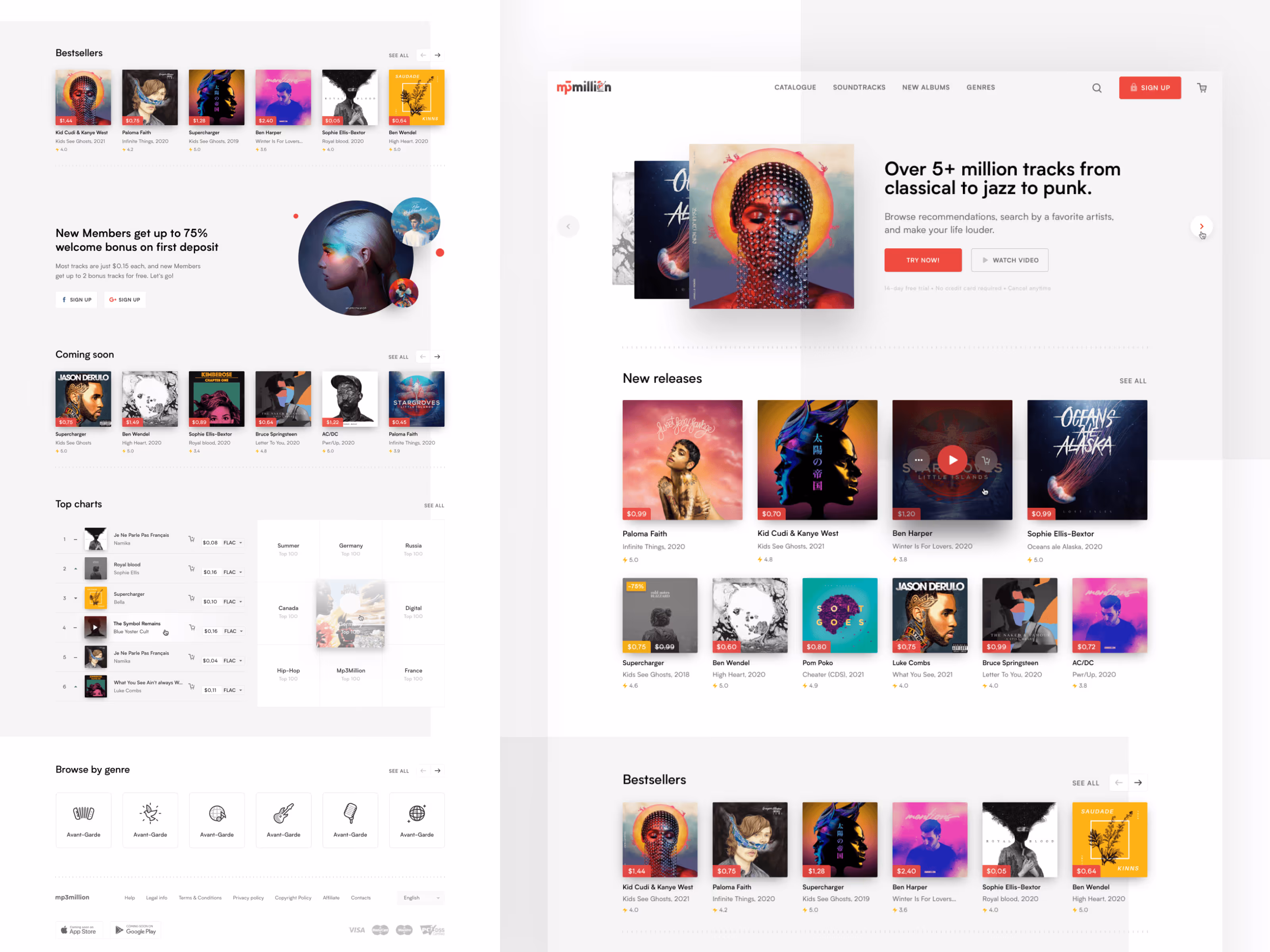
Design System: A Foundation for 175,000+ Artists
Developing a scalable e-commerce design system was crucial for managing a digital music catalog of 175,000+ artists without losing performance. Our philosophy remains the same: we don't start with screens; we start with the system. Every component, token, and state is defined once and inherited everywhere. The result is a product that remains visually consistent whether you are deep in the genre catalog or on the balance page.
Visual benchmarks:
- Stripe — for impeccable readability and information hierarchy.
- Google Play — for its vibrant color energy.
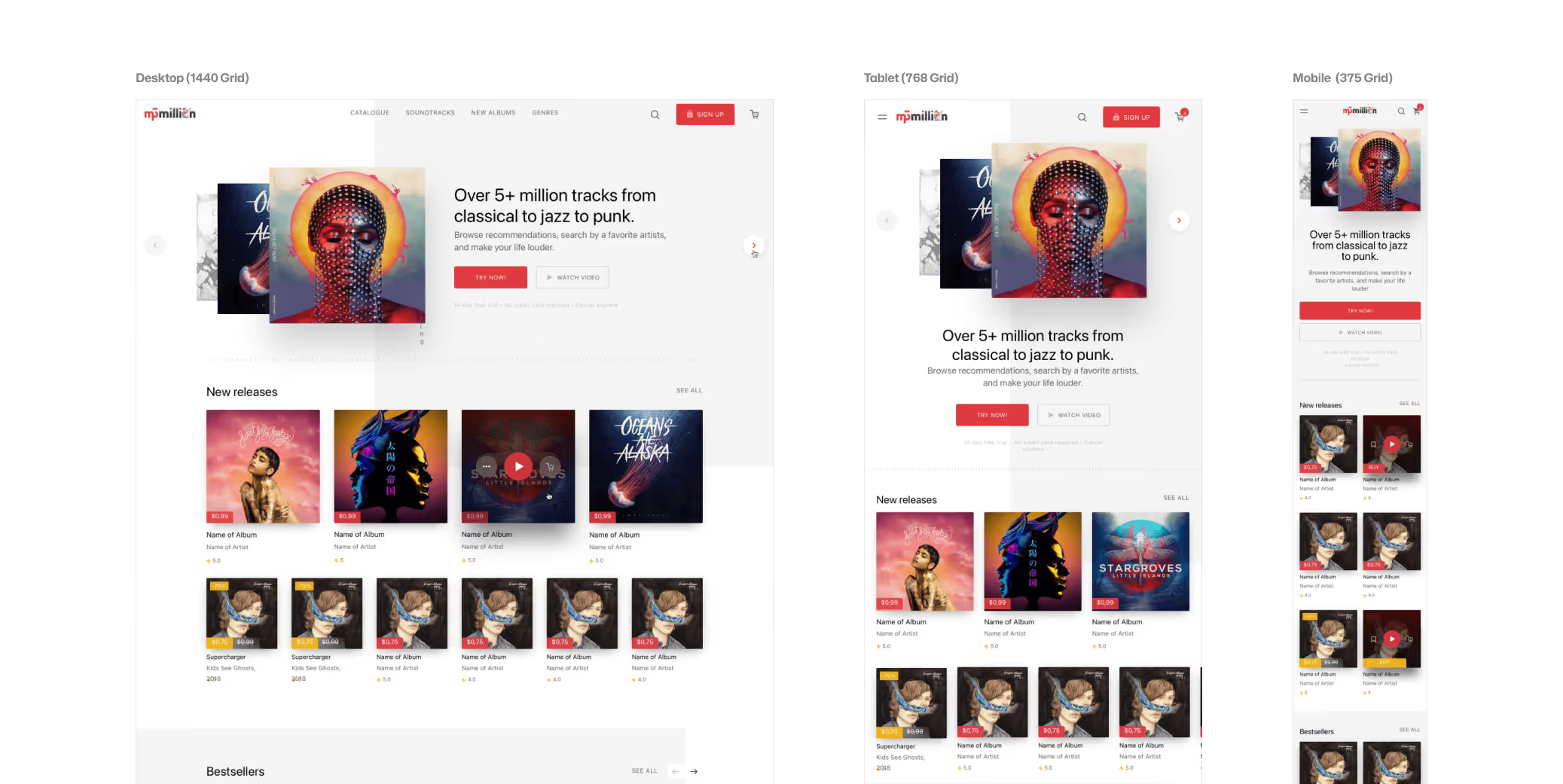
Also we built in full responsiveness (375px, 768px, 1440px) and Retina/4K support from day one. Since the audience is older, the interface couldn't rely on the user "figuring it out." Everything had to be obvious.
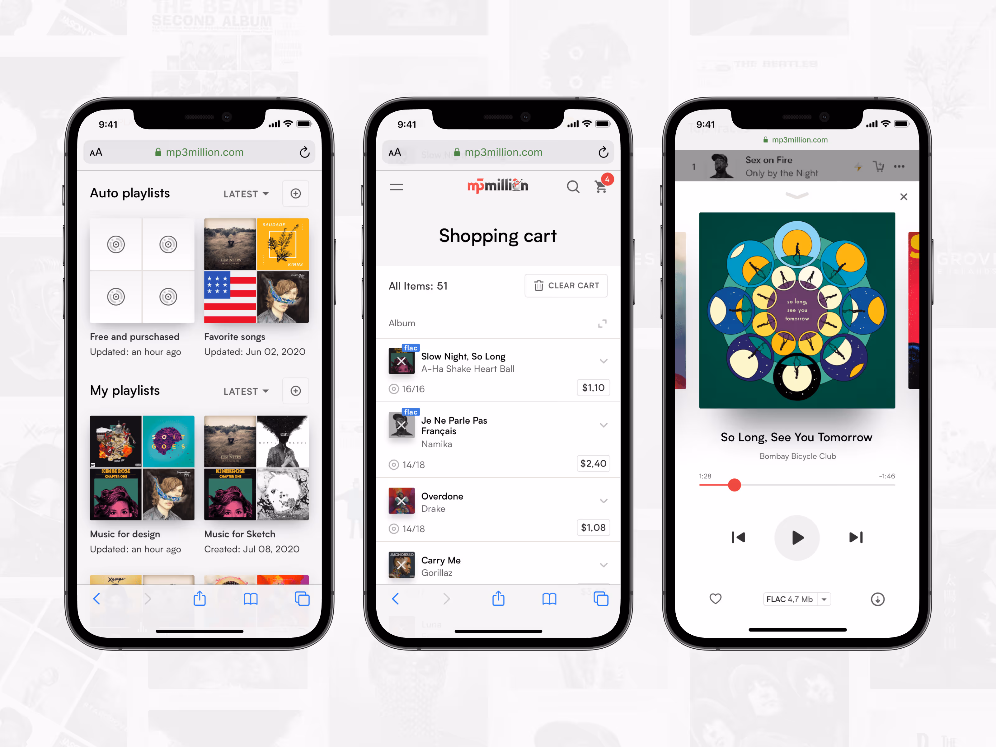
Artist and Album Pages: Where Product Meets Music
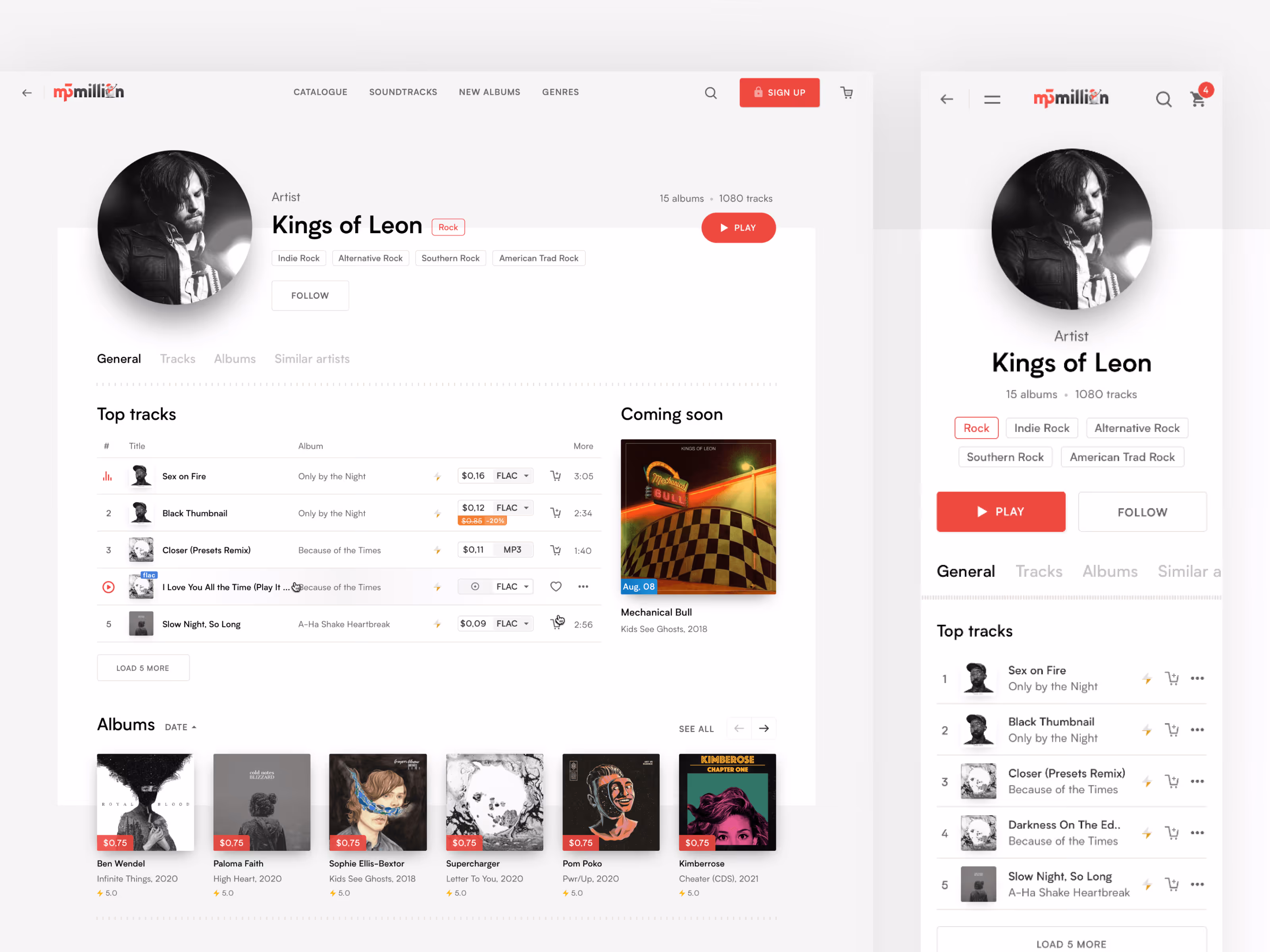
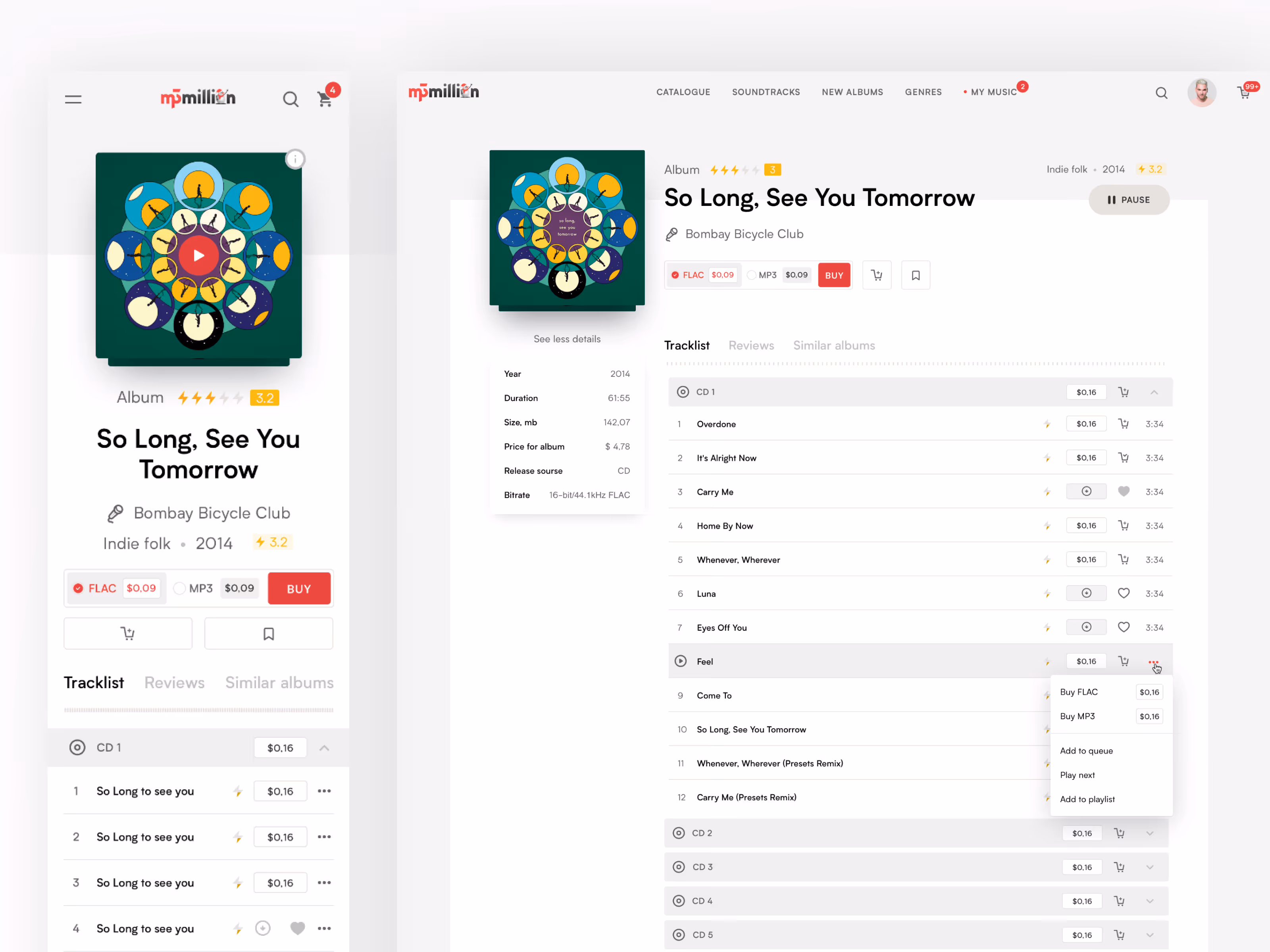
This was the trickiest balance. Streaming services focus on "vibe" (dark backgrounds, moody full-screen imagery), but Mp3million is a store. Here, the user is making a purchase decision.
We designed a structure where:
- The album cover dominates, creating the proper musical context.
- The decision-making architecture is pulled from best e-commerce practices: clear pricing, transparent formats, and an obvious Call to Action (CTA).
We optimized the conversion funnel by blending editorial music aesthetics with high-performance retail UX principles.
Custom Iconography and Graphics
A rebrand wouldn’t be complete without its own graphic DNA. We developed a custom set of icons—rounded, geometric, and full of character. We loved this style so much that we eventually expanded it into a standalone icon pack available for purchase.
Ambitions and Operational Support
We designed the site with a future-proof roadmap in mind. The UI was built to accommodate an integrated web player and cloud-based album creation. Although the client currently remains in the download-to-own model, the architecture is ready for a pivot to streaming at any moment.
Since August 2018, we have provided ongoing operational support:
- Development of marketing materials (banners, newsletters).
- Launching seasonal campaigns (Valentine’s Day, New Year after party).
Thanks to the design system, the production time for new campaigns was cut drastically (and this was before AI—you wouldn't believe what we can do now! 🙂).
Project Stack & Expertise:
- Industry: Music Tech / Digital E-commerce.
- Solutions: UX Audit, Brand Identity, Marketing Materials, Scalable Design Systems, UI/UX Rebuild, Mobile-first Responsive Design.
- Key Features: Music Catalog and Filters, Artist/Album/Playlist Pages, Integrated Music Player, Multi-currency Payment Flows (Credit Cards, Bitcoin), Automated Newsletter Engine, Seasonal Brand Assets.
What Made This Project Truly Interesting
The client found us through our Google Play redesign concept. That was a "spec" project—not for a paid client, just something we published in our portfolio. It brought us a real client with a real budget who said: "I want this quality applied to my product."
This is the loop that interests us: doing work that attracts the right attention, which in turn brings projects that allow us to push quality even further.
Mp3million was a genuine product challenge. Real audience, real commercial stakes, and a clear niche ignored by the giants. The design had to work for a 52-year-old from Ohio who wants to buy a Fleetwood Mac album and own it forever. That user doesn't forgive confusion. The product either works for them—or it doesn't.
Building a music platform or a high-load e-commerce store? Let’s talk

Frequently Asked Questions
How do I choose between Pitch Deck & Product Concept, Post‑MVP Evolution, Product Audit & Discovery, and Product Rebuild & Redesign?
Pitch Deck & Product Concept is for 0→1 founders who need to raise capital before writing production code – we turn your vision into an investable narrative and clickable concept. Post‑MVP Evolution is for Seed / Series A teams with a live product that needs faster iteration, stronger UX and a real design system. Product Audit & Discovery is for products facing churn, stagnation or negative feedback – we diagnose UX and tech friction and give you a prioritised roadmap. Product Rebuild & Redesign is for mature or legacy platforms that have hit a growth ceiling – we modernise brand, UX and code without breaking the business logic that already works. If you’re unsure, we start with a short discovery call and map your current stage to the right model.
We already invested in a redesign before and it didn't move the needle. How is this different?
Most redesigns focus only on looking modern. Our rebuild starts from product strategy, analytics and revenue mechanics. We keep the logic that works, remove features that don't, and connect UX, brand and engineering to concrete metrics like activation, retention and ARPU — not just aesthetics.
Do we have to rebuild the entire product at once?
No. We can focus on the most critical modules first — for example, onboarding, trading flows or admin dashboards — and modernise the rest in later phases. This staged approach reduces risk and lets you see ROI earlier while still moving toward a full relaunch.
How long does a full rebuild usually take?
Timelines depend on complexity, but most full rebuilds take between 4 and 9 months from discovery to launch. We break the work into phases with clear milestones, so you can see progress every 2 weeks and start using parts of the new system before the final switch-over.
How will you work with our in-house team?
We don't replace your team — we extend it. Your PMs and engineers stay in the loop on Slack, Figma and GitHub. We align on architecture, coding standards and deployment so that, after launch, your team can confidently maintain and evolve the new product without vendor lock-in.
Can you keep my database structure during a redesign?
Yes. We specialize in Refactoring. We audit your current logic, keep what works, and update the UI/UX layer to modern standards without disrupting your backend data structure. We migrate your data to the new structure safely.