









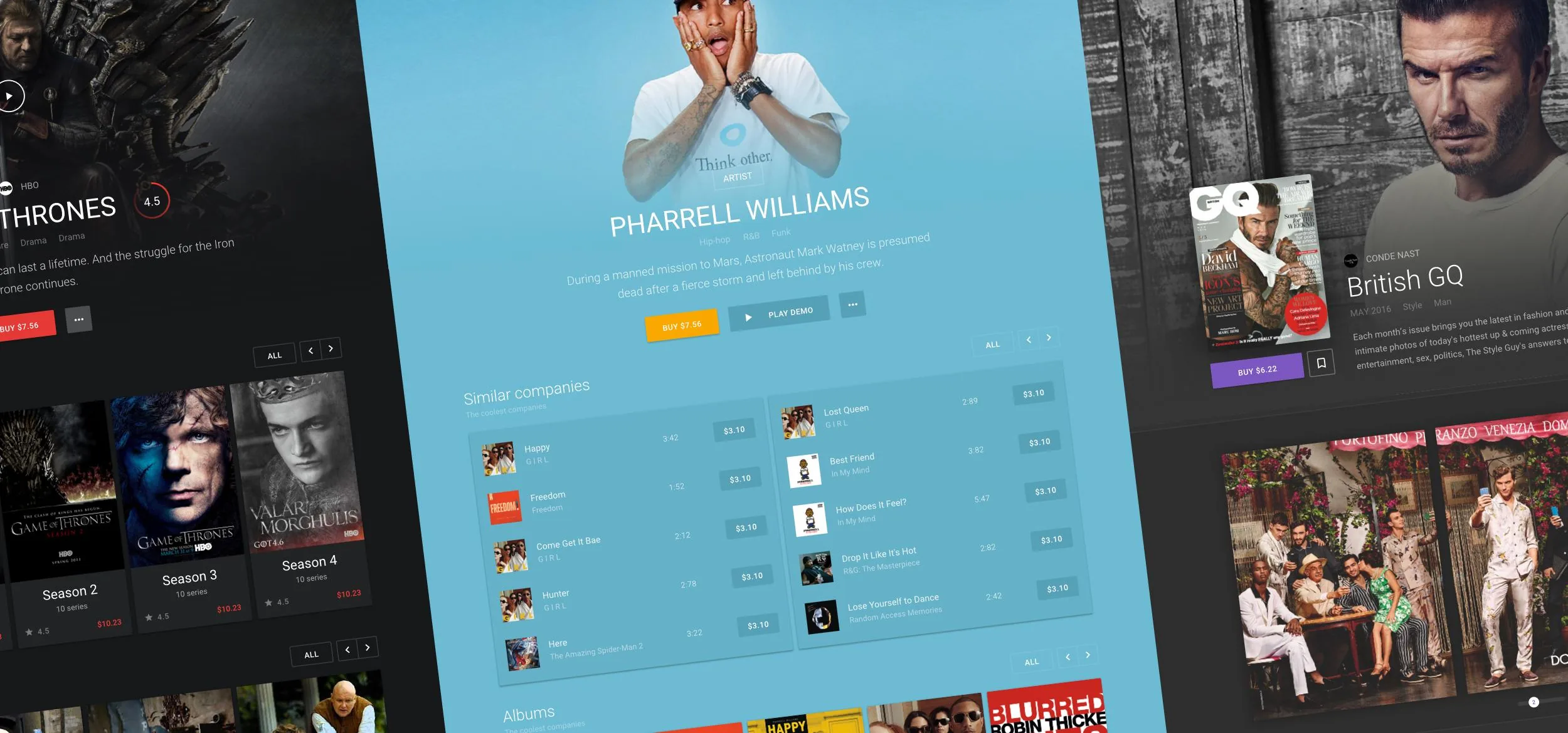
We designed it as an internal redesign concept applying Material Design principles to the Google Play web experience. Different media content types needed clearer discovery and presentation – and the concept demonstrates that structure without a live implementation. Google was not contracted.
Landing page for Google Play's marketplace, unifying movies, music, apps, and books under one navigation. Category rows – surface each vertical on a single screen.
.webp)
The movies vertical inside the marketplace, aimed at users browsing films rather than searching by title. A featured-title hero sits above genre rows – for quick scanning.
.webp)
A single-title view for browsing a film's cast and crew alongside playback and purchase actions. File size, duration, and language sit next to a synopsis, with a horizontal cast carousel below.
.webp)
A TV series view built around multi-season content, distinct from the single-title movie page. Seasons, trailers, and related news sit in separate rows, plus a cross-category teaser linking to Books and Magazines.
.webp)
A publisher-level page for a content partner such as Netflix, one level above individual titles. TV shows and top films are grouped under the channel, with related channels surfaced for cross-discovery.
.webp)
A concept for continuing playback across phone, tablet, and desktop while chatting with other viewers in real time. The mobile mockup shows a message thread running alongside the video progress bar.
.webp)
The music vertical of the Google Play redesign concept, showing genre rows, hot tracks with pricing, and top albums on one page. Track price tags sit inline with genre browsing rather than in a separate store.
.webp)
A single-album view where each track carries its own rating and buy button, instead of one purchase action for the whole album. A star-distribution breakdown and review CTA sit below the description.
.webp)
A performer-level page one step above individual albums, listing related tracks, albums, and concert videos together. Concert thumbnails carry play icons, mixing music catalogue browsing with video content.
.webp)
A playback bar that stays fixed while browsing other tracks or albums, so listening doesn't stop on navigation. It carries shuffle, repeat, and volume controls plus a buy button tied to the playing track.
.webp)
A promotional panel for the All Access subscription, placed inside the music experience rather than on a separate pricing page. Two CTAs – paid buy and a free trial – sit side by side.
.webp)
The apps and games vertical, mixing entertainment titles with recommended productivity tools in the same feed. A franchise-grid hero sits above ranked and recommended rows.
.webp)
A single-app view, showing which device types – phone, tablet, and desktop – the app supports before purchase. The required Android version and app size sit next to the price and review score.
.webp)
A publisher profile one level above the apps listed in it, following a company rather than a single title. Its catalogue is grouped into themed collections instead of one flat list.
.webp)
The magazines vertical, structured around publishers as much as individual issues. A follow row lets users track a masthead while a separate row surfaces trial subscriptions.
.webp)
A single-issue view showing page count and file size alongside the usual price and rating, details specific to print-style content. A review list with named readers sits below the star breakdown.
.webp)
The reader view opened from a magazine's detail page, showing a two-page spread with its own toolbar – comments, contents, search, translate, text size. A progress bar tracks position across the full issue.
.webp)
The books vertical separates prose titles from comics and graphic novels into distinct rows. A "Listen Book" action sits next to Buy, covering audio as well as text.
.webp)
A single-book view for a novel, with a swipeable chapter preview instead of a single cover image. Book size, page count, and language sit beside the synopsis, with named reader replies below the rating breakdown.
.webp)
A personal shelf for books already added to the account, split into My Books, Read, and Saved tabs. One cover shows a circular progress ring at 90%, with a floating button for adding new titles.
.webp)
Working inside a strict design language – Material, Fluent, or your own – and need discovery and content structure improved within it? That constraint-first work is what this concept demonstrates. Reach out.
