





Why StatKing's Filters Work Like a Streaming App's Menu, Not a Trading Terminal






Written for product designers and tech leads building filter-heavy tools for non-expert or time-pressed users.
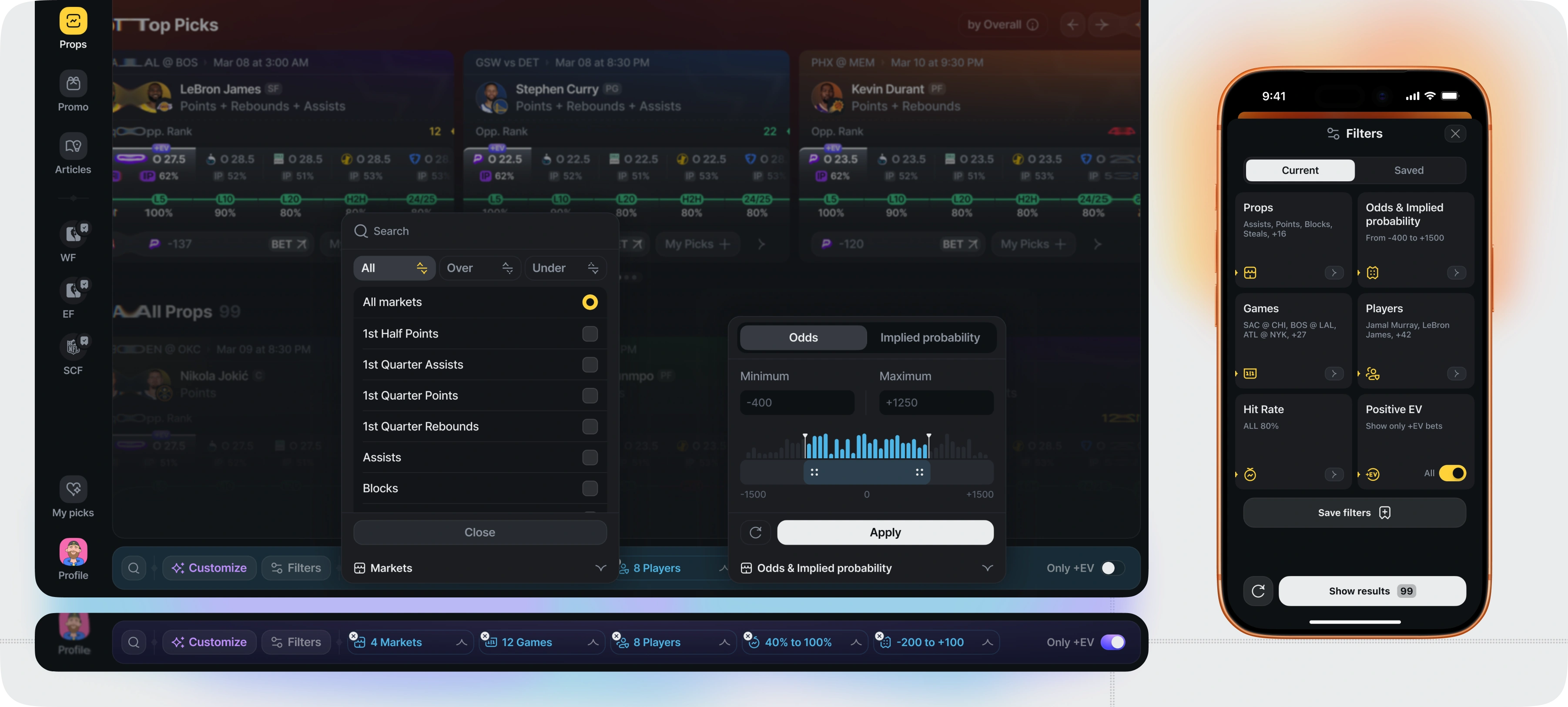
Most analytics tools don't hide their filters — they scatter them. Sport selection lives in one tooltip, odds range in a separate modal, hit-rate threshold somewhere else again, each added by whoever built that feature that week, with nobody asking how the whole set should work together. The result isn't complexity tucked out of sight — it's visible, inconsistent complexity that makes people afraid to touch it. StatKing's brief started from that exact complaint: the client's own users found competing player-prop apps too complicated, and scattered, inconsistent filter controls were a big part of why.
TL;DR
- StatKing's brief came with a specific complaint: existing player-prop apps had filters scattered across inconsistent modals and tooltips, which felt overwhelming rather than simply hidden.
- The filter experience is modeled on streaming and e-commerce apps — every filter type, sort order, and stat category lives on one consolidated screen instead of scattered menus.
- Saved filter presets let a user store more than one filter combination and switch between them, instead of rebuilding filters every session.
- The hardest constraint wasn't the concept. It was iOS's five-item tab bar cap — on desktop, saved presets extend the sidebar navigation as extra entries, but a capped tab bar can't host an open-ended list of user-created presets.
The Brief: "Too Complicated" Was the Whole Problem
StatKing's target user wasn't a professional trader comparing arbitrage across ten books. It was someone who wanted player-prop research without spending cognitive effort figuring out where a specific filter lived. The client had used comparable apps personally and found them overwhelming — too many menus, too many steps between "I want to filter by hit rate" and actually seeing filtered results.
That framing shaped every decision that followed: fewer menus, more visibility, less hunting.
Starting From the App Map, Not the Homepage
Design started with a full app map — every screen, every required block — before a single high-fidelity screen existed. That map exposed the props list and filter screen as the highest-stakes real estate in the product, since almost every user session runs through it.
Working through high-fidelity wireframes of that screen specifically is where the idea for saved filter presets first surfaced — not as a planned feature from day one, but as a natural answer to a problem the wireframes made obvious: users would want to filter the same way repeatedly, and rebuilding that filter from scratch every session was friction with no payoff.
Borrowing the Menu Model From Streaming Apps
Instead of scattering filter controls across separate tooltips and modals, StatKing anchors every filter category — sport, market type, odds range, implied probability, sportsbook selection, hit rate window, and a Positive EV toggle — behind one persistent Filters control in the bottom bar, on both the web app and iOS. Tapping it opens a single window with expandable sections for Props, Odds & Implied Probability, Games, Players, Hit Rate, and Positive EV, instead of sending the user hunting across the product.
It's the same interaction model as browsing genres, ratings, and release years in one filter panel on a streaming app, rather than hunting through separate menus for each. For a user who isn't a professional bettor, that consolidation removes the guesswork about where a given control lives.
This isn't a StatKing invention. Unifying scattered, inconsistent filter controls into one visually simple system — anchored in a fixed position, opening into a single configurable window — is a pattern Flatstudio applies across its data-dense products generally, refined well before this engagement.

From Filters to Presets: How Saved Presets Became a Feature
Once filtering lived in one place, the next problem was retention: a user who spends five minutes building a precise filter combination — specific props, a hit-rate floor, an odds range, a shortlist of favorite players — doesn't want to rebuild it before every session.
Saved presets solve that. A user can name and store more than one filter combination (the product's own test builds show examples like "Winning Formula" and "Edge Filters"), then switch between saved presets directly, instead of reconstructing filters by hand. Switching between a personal preset and the app's own recommendation logic takes one tap instead of a full filter rebuild.

The +EV Toggle: One Switch Instead of a Separate Screen
Positive Expected Value — where the odds and payout for a prop are, based on market data, in the bettor's favor — could easily have been its own dedicated screen. Instead it's a single toggle inside the main Filters panel, with the option to combine it with every other active filter rather than force a choice between "browse everything" and "only see +EV plays."
That decision kept the filter model consistent: every control lives in the same place, regardless of how advanced or basic the filter itself is.
The Real Constraint: iOS's Five-Item Tab Bar
The hardest part wasn't conceptual — it was a platform limit. The desktop sidebar and the iOS tab bar carry the same core navigation: Player Props, Promo, My Picks, Articles. On desktop, saved presets extend that navigation directly — each saved preset appears in the sidebar as its own entry, one click from anywhere in the product, and the list grows as the user saves more.
That's exactly what a capped tab bar can't do. iOS convention limits the bar to five items, and a user's preset list is open-ended — someone might save one preset or five. A navigation element with a hard cap can't host a list with no cap. So on iOS, presets live inside the Filters flow instead — still reachable in one tap once you're in Filters, but not sitting at the permanent, navigation-level position they hold on desktop.
That's the actual trade-off, and it's a platform constraint, not a design compromise: desktop users get presets as part of primary navigation; iOS users get the same presets, one layer deeper.
Building a sports analytics or betting product? Flatstudio has designed player props tools, sportsbooks, and odds platforms for 8+ years — see the sports analytics portfolio or how a dedicated product team engagement works.
This article is part of the Flatstudio × StatKing case study series. Main article — StatKing: How We Built a Free Betting Analytics Product Against $40/Month Competitors.
Related reading: StatKing iOS · StatKing Web — the desktop counterpart sharing the same filter and card architecture.

Frequently Asked Questions
What is a filter preset in a betting app?
A filter preset is a saved combination of filter settings – sports, odds range, sportsbooks, hit-rate threshold, and similar criteria – that a user can name, store, and switch back to later instead of rebuilding the same filter manually every session.
What does +EV mean in sports betting apps?
+EV, or Positive Expected Value, flags a bet where the odds offered are statistically better than the true probability of the outcome suggests. It signals value based on market data, not a guaranteed win – some +EV bets will still lose individually.
How should filter-heavy apps handle limited mobile screen space?
Consolidate filter categories into one expandable screen instead of scattering them across separate menus, and prioritize the controls users touch most often. Open-ended lists like user-saved presets can't live in a capped iOS tab bar the way they can in a desktop sidebar – they need a well-placed home one layer deeper, without losing quick access.
Why do some betting apps feel more complex than others?
Complexity usually comes from filter and setting sprawl – the same controls split across disconnected tooltips and modals, forcing users to remember where each setting lives rather than facing one unified system. Consolidating filters into a single screen, with saved presets for repeat use, is one of the more direct fixes.
