


Beyond the Pixel: The Engineering of Icon and Typeface Integration


In high-performance B2B SaaS and Sport-tech ecosystems, the interface is more than a display—it is a data transmission tool. When typography and iconography exist in isolation, they create visual noise that increases cognitive friction and slows down Time-to-Action.
At Flatstudio, we treat iconography not as an aesthetic choice, but as a matter of Architectural Intelligence. This guide explores our strategic process of synchronizing the Fivo Sans Modern typeface with a custom icon set, utilizing principles of mathematical harmony and cognitive load balancing.
Step 1: Anatomical Typeface Analysis (Fivo Sans Modern)
Before drafting a single vector, we deconstruct the DNA of the interface font. Fivo Sans Modern was selected for its pragmatic clarity and geometric precision.
Key parameters for icon projection:
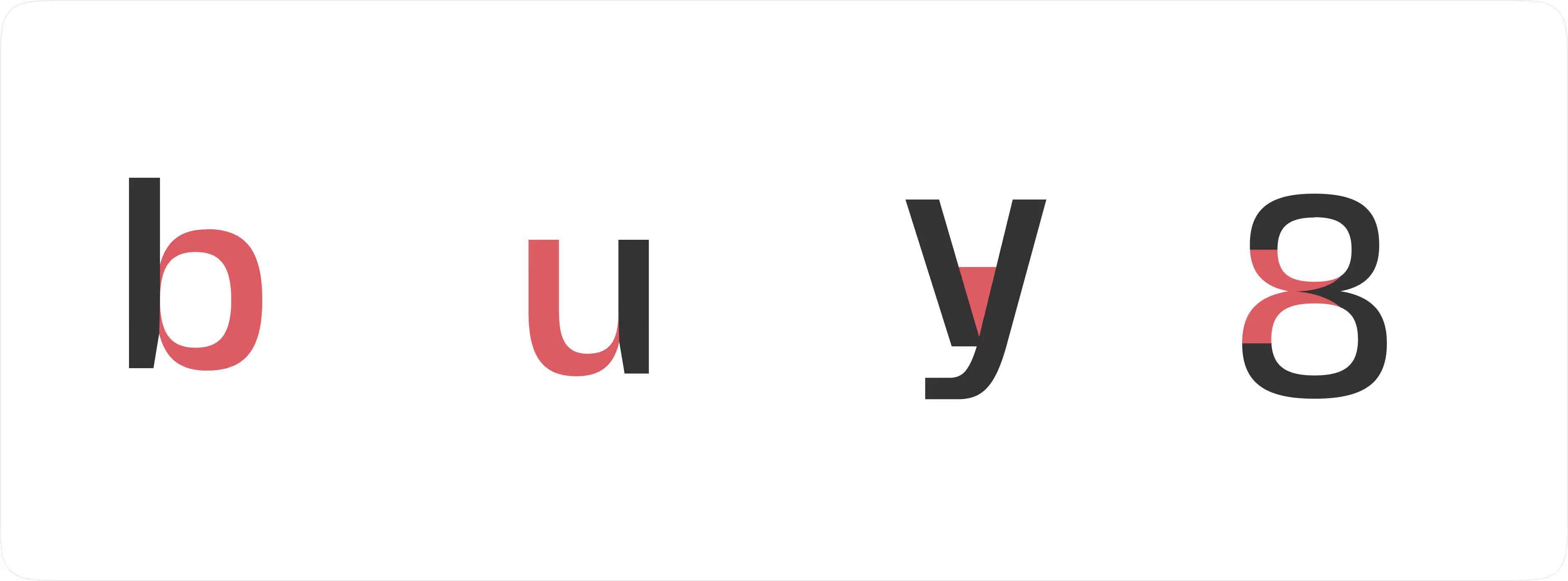
- Geometric Construction: The typeface is built on perfect circles and consistent angles. This mandates an identical Corner Radius in the icon set to maintain brand cohesion.
- Apertures & Terminals: The open apertures of the font dictate a need for "breathing" breaks in icon contours, preventing visual clogging at low pixel densities.
- Visual Weight (Stem Thickness): The thickness of the character strokes becomes the benchmark for the
stroke-widthof the entire icon library.
Step 2: The Logic of Visual Weight Sync
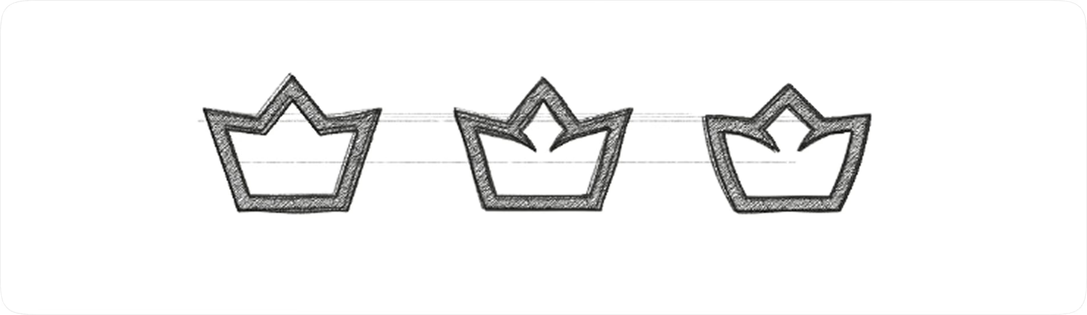
We moved away from subjective "look and feel" in favor of Logic-Driven Design. During the discovery phase, we stress-tested three integration strategies:
- Linear Logic (Outline): Focused on stroke-based shapes that mirror the lighter weights of the typeface.
- Solid Mass (Filled): Creating heavy visual anchors for high-emphasis action zones.
- Hybrid Approach: Utilizing variable stroke widths to create a "custom" premium feel.
The Flatstudio Decision: We opted for a Consistent Line Style using the Width Tool technique. This allows our icons to remain modular—matching the visual weight of the font whether it's set in Light, Regular, or Medium, adapting seamlessly to the content hierarchy.
Step 3: Icon Engineering — From Skeleton to System
To ensure Engineering Synergy, we design icons as system components rather than isolated SVG files.
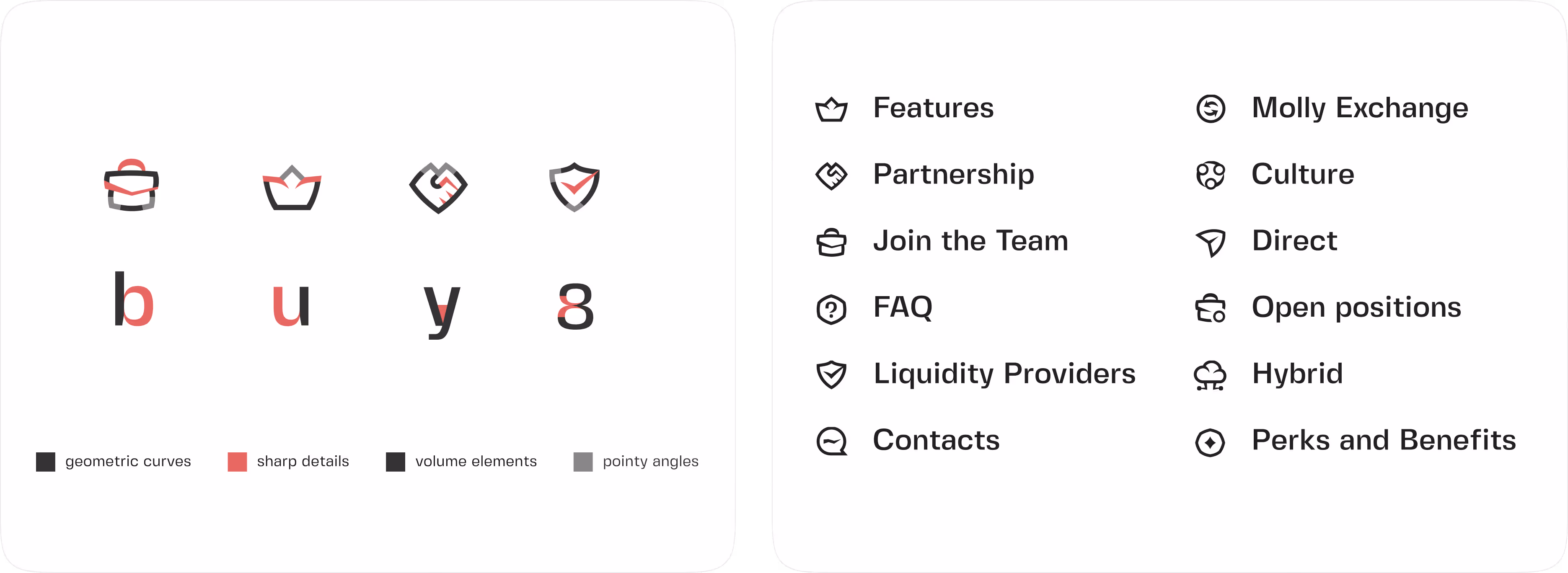
Mathematical Harmony (Grid Alignment)
Every icon is constructed on a pixel grid that correlates with the Baseline and X-height of Fivo Sans Modern. This ensures that when an icon sits next to a text label, they appear as a single, unified string of data rather than a disjointed collection of elements.
Modulation Parameters:
- Stroke Weight Sync: We synchronized the 2px line thickness of the icons with the stem thickness of the font at 14px/16px (the primary body copy).
- Optical Compensation: For complex icons with high detail density, we applied optical scaling to ensure they don't appear "heavier" than adjacent text.
Step 4: Validation in Complex Environments
We validated the iconography within a data-intensive dashboard environment. Why did our specific "Style 1" prevail?
- High Signal-to-Noise Ratio: Outline icons do not overwhelm the interface, allowing the user to focus on raw data points without decorative distractions.
- Semantic Clarity: Each form underwent a Cognitive Load Test. Users can decode the icon’s meaning in <200ms, facilitating rapid navigation.
- Scalability & Performance: By adhering to a component-based architecture, these icons remain razor-sharp on mobile devices and low-resolution monitors, reducing the need for multiple assets.
Strategic Conclusion: The UI as a Business Asset
When your font and icons work in perfect harmony, your product stops being a "tool" and starts being an efficient extension of the user. This level of detail reduces churn, improves user retention, and positions your brand as a premium, high-authority leader in its space.
At Flatstudio, we don't just "match" icons to fonts; we architect a visual language that scales with your business logic.

Frequently Asked Questions
What is Flatstudio?
Flatstudio is a full-cycle engineering design unit based in Lisbon, Portugal and Ukraine. We design, build, and evolve digital products for SaaS, Fintech, Sports Tech, iGaming, MedTech, Govtech, Web3, News & Media, Travel, Commerce, and Corporate companies worldwide. We combine product design, UX/UI, web app engineering and brand strategy in one team.
What services does Flatstudio offer?
Flatstudio offers services across product and interface design, web app engineering with React and Webflow, brand identity, and marketing design assets. These services are delivered through five core solutions: Product Audit and Discovery, Fundraising and Concept for pre-seed founders, Post-MVP Evolution for growing startups, Rebuild Rebrand Reignite for legacy products, and Dedicated Product Team for ongoing collaboration. In short, Flatstudio is a full-cycle partner for product design, development, and long-term product evolution.
How long does a typical project take?
It depends on scope. A product audit takes 2 to 3 weeks. A full redesign typically runs 6 to 12 weeks. Dedicated team engagement is ongoing and scales with your product needs.
How do I start a project with Flatstudio?
The first step is a discovery call where we learn about your product stage, goals, and challenges. You can reach us via the Contact page.
What does "Engineering Design Unit" mean?
A traditional agency delivers visuals. An Engineering Design Unit delivers outcomes. We combine UX/UI design, product engineering, and strategic thinking — not as separate services, but as one team that stays accountable through the entire product cycle: from diagnosing the problem to shipping the solution.
What is an AI-augmented engineering design unit?
An AI-augmented engineering design unit combines senior product designers and engineers with AI-driven workflows to deliver faster, higher-quality digital products — with zero design debt. Unlike traditional agencies, Flatstudio integrates AI at every stage: from UX research and interface design to React/Webflow engineering. The result is a leaner process, sharper output, and a product that scales — built for Fintech, SaaS, iGaming, Sporttech, and Govtech companies.
Who are your services best suited for?
We work with B2B and B2C SaaS, Fintech, GovTech, Sports Tech and iGaming products. Most of our clients are startups and scale‑ups with complex logic, high‑load dashboards, internal tools or betting products that need a consistent design and engineering partner rather than a one‑off creative studio.
How is "Engineering Design" different from a regular creative agency?
Regular agencies optimise for “wow” moments and campaigns. We optimise for systems and product performance. We treat design like code: modular, scalable and logic‑driven. Instead of drawing standalone screens, we build design systems, patterns and documentation that your developers can implement without guessing. That’s why our solutions always combine product & interface design, brand identity, web app engineering and marketing assets into one coherent system.