





Designing a Betting Analytics Product Without a Ready UX Reference





Written for founders, CPOs and product leads building data-dense products without a reliable category template. It shows how Outlier was designed around the object of the user's decision rather than borrowed sportsbook screens – and how that choice shaped navigation, analytical depth, saved strategies and a system able to absorb new books, markets and data. The product reached 20% paid conversion within six weeks of launch and now holds a 4.9 App Store rating across more than 16,000 ratings; the company later raised a $10.7M Series A. The lessons extend beyond betting to any product where users interpret incomplete, fast-moving information and act under time pressure.
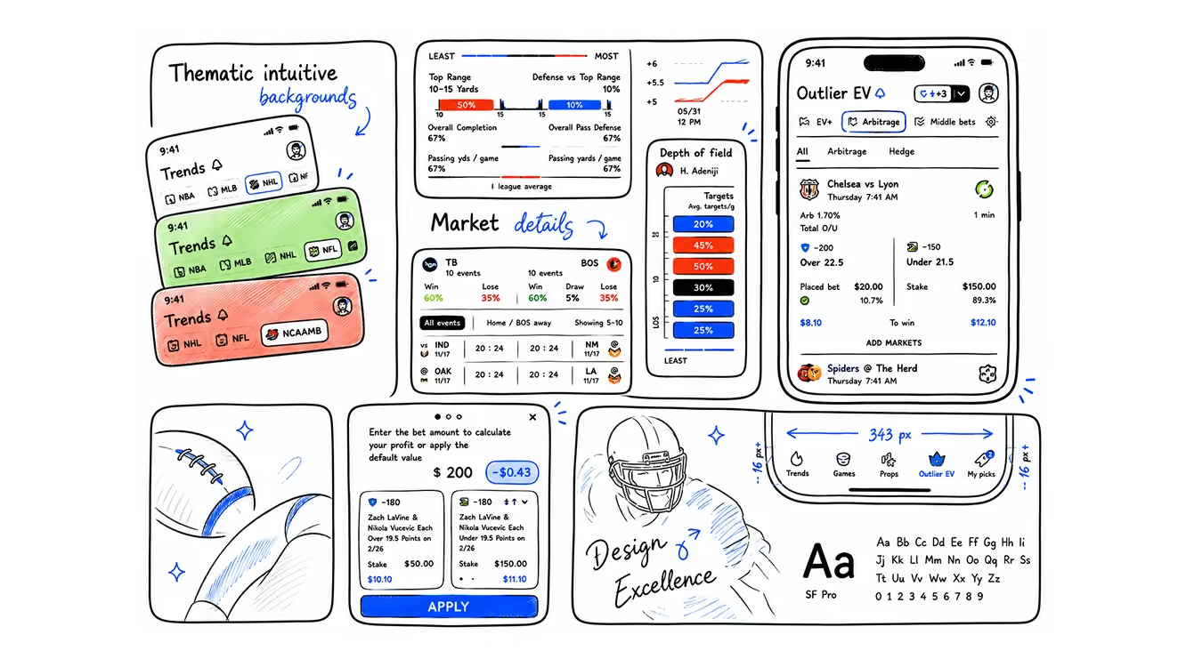
Most new products borrow their skeleton. A new sportsbook copies the sportsbook next door; a new analytics tool starts from whatever dashboard its founders used last. Borrowed skeletons are underrated – they carry years of user habit for free.
But there wasn't one good example to borrow from for Outlier in 2022. The obvious candidates all broke in different places. A sportsbook looked closest, but a sportsbook is transaction- and action-first. It is not built for deep analytics or research. A trading terminal had the right data density but the wrong risk language and the wrong decision frequency. Analytics dashboards had the charts, then politely abandoned the user at the exact moment a decision was required.
None of the packaged interfaces fit, but there was still a working alternative: the bettor's own research routine – a sportsbook tab, a stats site, an injury report, a group chat, a spreadsheet, a screenshot of last week's line. Ugly, manual, held together with focus and bad habits. Also, inconveniently, useful. Sometimes replacing a habit that functions is harder than beating a competitor that doesn't.
Flatstudio joined at day 0 – before any design, while the product idea itself was still being shaped. The first month, from the outside, looked less like design work and more like discussions, research, and shaping what the user should focus on and what the product's main components would even contain.
That sounds cleaner than it felt. At the time it mostly looked like arguing over names, entry points and edge cases that refused to stay in their lane.
The match stops being the container
Many betting interfaces are organised around the match: pick a sport, open a fixture, inspect its markets, place a bet. The match is the box, and everything else sits inside it. That works for placing bets.
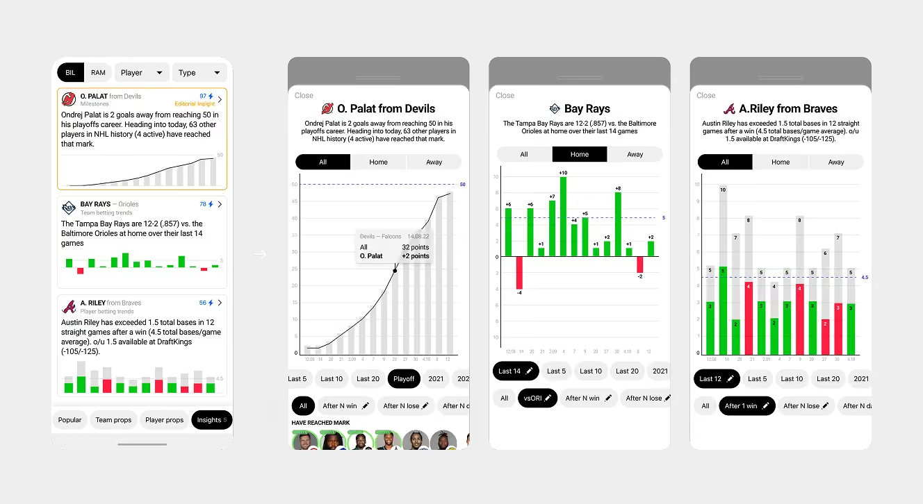
Outlier puts a different model on the surface: the bet, the market, the player, the price movement and the value signal are the things you analyse. A market in Outlier has a history, a current price, alternative prices at other books, related markets, a reason to watch and a reason to reject. It behaves less like a button inside a fixture and more like an asset.
Looking at a single player prop is not the same as checking whether a number will hit. It also means checking the current price against other books, recent form, the opponent matchup, injury status, and whether the line has already moved to correct for public money. The object on screen is technically one bet. In practice, it's a compressed research session.
This is where the early sportsbook analogy started to fall apart. Not dramatically. More annoyingly: one reasonable screen decision at a time.
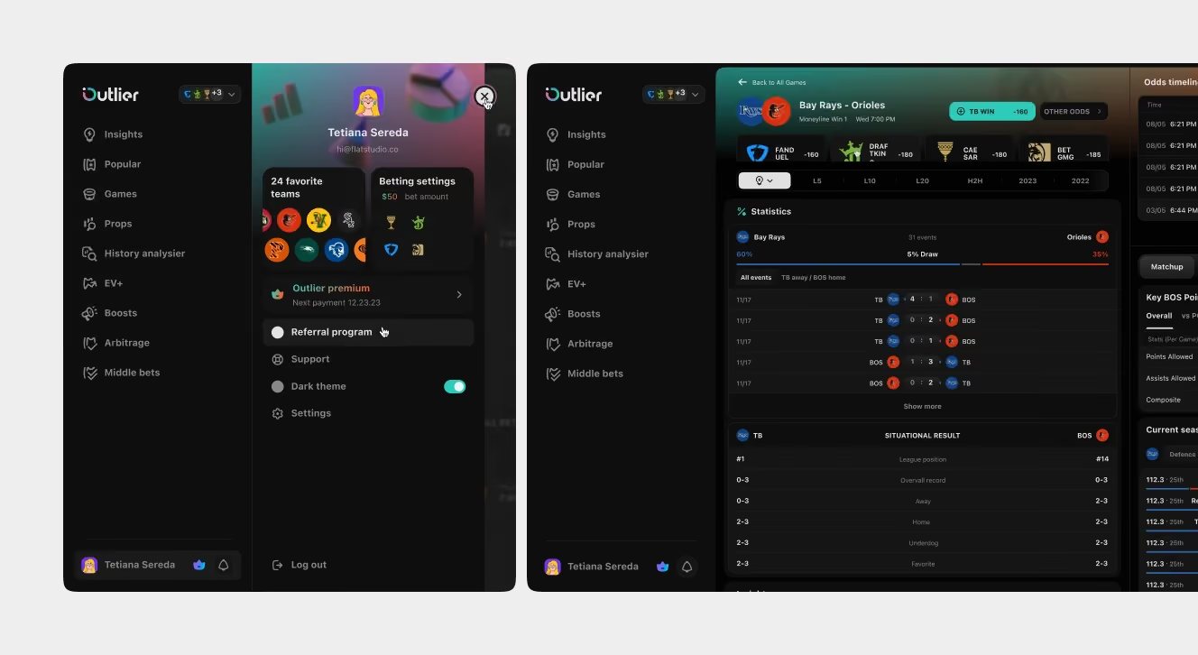
The navigation says this out loud. The main sections are formats of analysis rather than sports or match calendars: statistical insights, player props, positive-EV opportunities, boosts, arbitrage, middles. You could see the product's logic before opening a single market.
That has a practical consequence: a user never needs a fixture to know what deserves attention. They can start from a positive-EV feed, a player prop, a boosted offer, an arbitrage gap or a middle opportunity – five different doors onto the same question: where is the market mispriced, and is there enough context here to act on it? Sport stopped being the organising principle. Betting logic replaced it.
Every user enters through a different door
Once the market is the main object, there is no single path through the product. In Outlier, a user opens a star forward's rebound line because it moved from 10.5 to 11.5 and one book is still showing the old number – the question stopped being "who wins" and became "is this price still usable?"
So every screen has to work as somebody's front door. A market row can't rely on context from an earlier step, because there may not have been one. Each card and each row has to answer on its own: what is this, why does it matter now, where is the best price, and what changed since I last looked.
This is easy to say and slow to earn. It took us a while, for instance, to bring a proper insight summary onto the market page – the section a user might well arrive on first, or reach from insights, having already been following a thread the market page then dropped. Those sections grew at different stages of the product, and the gap only really showed with heavy use of insights. Kudos to Outlier here: they are genuinely good at gathering user feedback, and sometimes it catches more than any QA pass.
The endings vary too. In a sportsbook, the betslip is the finale. In Outlier, a session can end with a few possible actions, or none at all. But the last screen of the betting flow makes that honest: the product hands the finished selection to the user's own sportsbook and stops. Outlier ends where the decision ends, not where the money moves. And even that handoff isn't a clean full stop. A link out to a sportsbook can fail – the app isn't installed, the market has moved, the deep link doesn't resolve – so the design had to treat the exit as a place where things might go wrong, not a door you close behind the user and forget. We hope you never hit that case, but if you do, you'll notice how much the product cares about what happens next. No spoilers.
How do you design for a category you're still learning?
A lot of the work was learning US betting analytics formats that don't map onto standard sportsbook navigation. Player props are a primary surface, where a single athlete's line is the market. Line movement matters as a history and a signal, not just a current number. Expected value reframes a bet from "will it win" to "is this price wrong". Odds comparison across books turns one bet into a small marketplace.
None of this is exotic to the people who use the product. That was the constraint: the audience already thinks in these formats, and an interface built by a team that had only skimmed them would expose itself in five minutes. Category learning ran through the whole engagement rather than sitting up front as a discovery phase – it's what kept the model honest.
Outlier's co-founder, Luis Lafer-Sousa, described what that looked like from his side:
"there was some friction initially as we built up trust."
That friction mattered, because this wasn't a project where design could sit politely downstream from product thinking.
Another source of friction was speed. Product needed to move quickly; fair. Flatstudio kept stopping at the moments where a shortcut looked harmless on one screen and expensive across the system; also fair, if less fun in a weekly review. Some of those moments were about edge cases. A market state, a price movement, a locked view or a filter behaviour could look like UI detail until it quietly changed how someone made a decision. In a product without a stable reference, those weren't secondary questions. They were the product.
That only works when both sides are arguing for the product, not for comfort or process. Outlier pushed when rigour risked becoming delay; Flatstudio pushed when speed risked baking the wrong model into the interface. Flatstudio kept a working note for exactly these moments, and it opened with one line: both sides want the product to launch, succeed, and be loved by users – everything else is details.
One market, several levels of fluency
A product like this is used by people you can't average. Newer bettors need orientation – enough explanation to act without a glossary open in the next tab. Intermediate users need comparison and context, and get irritated by interfaces that keep explaining. Advanced users need the interface to stop explaining gravity and show the machinery; smooth it over and the product loses exactly the audience that gives it credibility.
The same market has to survive all of these readings at once, not on separate screens. For a newer user, a number needs a reason before it earns trust. For an experienced user, that same reason is noise by the second visit. For the sharpest users, the calculation itself has to stay inspectable – a devig method or a confidence figure can't disappear behind a decorative badge and call it UX. The hard problem was letting the interface become less explanatory as the user got more capable – a different task than simplicity.
Subscription tiers add one more layer, and it's structural, not just billing. That makes locked states delicate. Placed well, a locked view shows the depth waiting above it. Placed badly, it interrupts research and reads as a wall. A locked EV table is worse than useless if it appears before a user knows what EV is – it's a paywall with extra steps. Bury it too deep, though, and the product never shows why the next tier is worth paying for.
None of this makes a data view cosmetic. A column that looks secondary can be the exact cue a serious user has built a habit around; removing it in a redesign changes somebody's system rather than tidying the interface. That risk, and how an EV redesign has to handle it, is its own story.
Filters became the product's memory
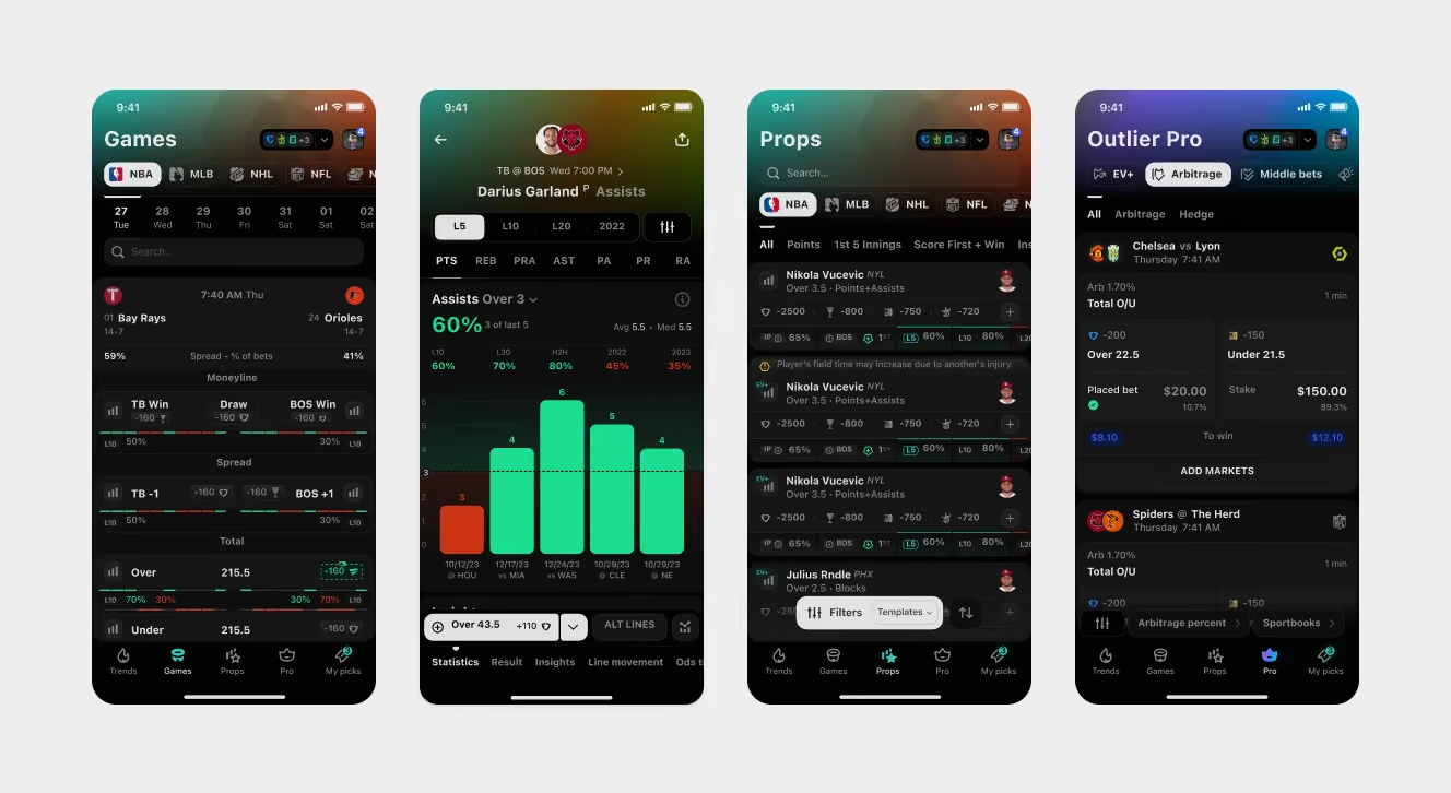
In most dashboards a filter is a sidebar of checkboxes – a temporary condition you apply and forget. In Outlier, filters grew into something closer to strategies. A configured filter encodes a way of reading the market: which books count as sharp, which methods to trust, which thresholds make an opportunity worth attention. The product now ships its own preset templates built on this logic, and configurations can be saved and reused as named views.
It's a productised opinion about how to read the market rather than a shortcut to save clicks. For a newer user, it shows that value isn't found by scrolling harder. For an advanced user, it's a faster way back to their own logic. A normal dashboard's saved filter reduces effort. Outlier's preserves a way of thinking.
Listen to how a serious user describes their process and the shift is obvious: a price range, a recent hit-rate threshold, a rule about the opponent matchup, a head-to-head minimum. At that point the filter has become the user's betting model, and the interface's job is to keep re-running it against a market that won't hold still.
A system built for sportsbooks that didn't exist yet
A product like this was never going to look the same a year later. Each milestone, each partnership and each user comment bought more roadmap, not less – new books, new markets, new analytical formats, new depth for existing features. All of it was predictable in kind, none of it in detail.
So the design system couldn't just describe the screens we already had. It had to make room for new books, new sports, new data and new ways of comparing them. The product now compares odds across more than a dozen books, and the point was that a new sportsbook should drop in as data, not arrive as a new design project.
Extensibility was only one system problem. Colour was another one – expected, but still a loaded one.
In betting analytics colour carries meaning that money depends on – the same green can mean a rising line, a favourable price and a confirmed bet, which are three different things. Colour vision accessibility was built into the palette from day 0 rather than retrofitted. That conflict deserves its own article, and will get one.
The reference you couldn't find
There's a price for working this way, and it's paid up front. An object model eats weeks before anything looks like progress – no screens, no motion, just decisions about what exists and what a decision is. A borrowed skeleton is the opposite deal: cheap on day one, with interest charged every time the category moves somewhere the original never anticipated.
A mental model, here, is just the core assumption a product is organised around. A sportsbook's is that the match is the thing you navigate; Outlier's is that the market is. Borrow the sportsbook's and every screen, row and filter quietly inherits it – then the bill arrives later, when markets, props and value signals need to stand on their own and the foundation was poured for fixtures. Re-pouring it is expensive, and teams tend to file the expense under technical debt, because "we copied the wrong mental model" sounds less professional. The whole bargain comes down to one question: does the reference actually fit, or is it just the nearest thing available?
So that was a start. Outlier needed a product model; Flatstudio needed to keep earning the right to shape it. Flatstudio's role was not to decorate a settled model, but to keep working on the systems, edge cases and logic underneath it. The work also keeps reminding you that the category will always know something you don't, even three and a half years in – an engagement that has since grown into a dedicated product team setup.
Outlier did not become a reference overnight. It had to launch, earn trust, expand across analytical formats and platforms, and prove that the model could hold. The product that began in 2022 with no template to copy now holds a 4.9 rating across more than 16,000 App Store ratings; it reached 20% paid conversion within six weeks of launch, and the company raised a $10.7M Series A in December 2025. The full design scope is documented in the Outlier iOS and Outlier web case studies, with the marketing website as its own track.
Design doesn't get to claim numbers like these on its own – products move for many reasons. But this is the kind of scale that exposes whether the original model can keep carrying the product. Only then did the direction reverse: Outlier began appearing as a reference for the betting analytics products other teams wanted to build.
Products that become references rarely had one.

Frequently Asked Questions
How do you design a product when no UX reference exists?
Start from the object of the user's decision, not from borrowed screens. For Outlier, the market – not the match – became the core object of the interface. Navigation, filters, subscription depth, and the design system all followed from that single structural choice, made before any screen was drawn.
Why doesn't a sportsbook work as a reference for betting analytics?
A sportsbook is transaction-first: it exists to place bets, not to research them. Betting analytics needs price history, cross-book odds comparison, expected value, and line movement – objects a match-centric sportsbook structure was never built to carry. Copying it means paying interest every time the category moves.
What results did the Outlier design produce?
Outlier reached 20% paid conversion within six weeks of launch, holds a 4.9 App Store rating across more than 16,000 ratings, and raised a $10.7M Series A in December 2025. Design doesn't claim those numbers alone – but the product model held at that scale.
