





Two Figma Files, One Brand Library: How We Kept StatKing's iOS and Web Apps Visually Identical





Written for design leads and frontend developers managing visual consistency across iOS and web products.
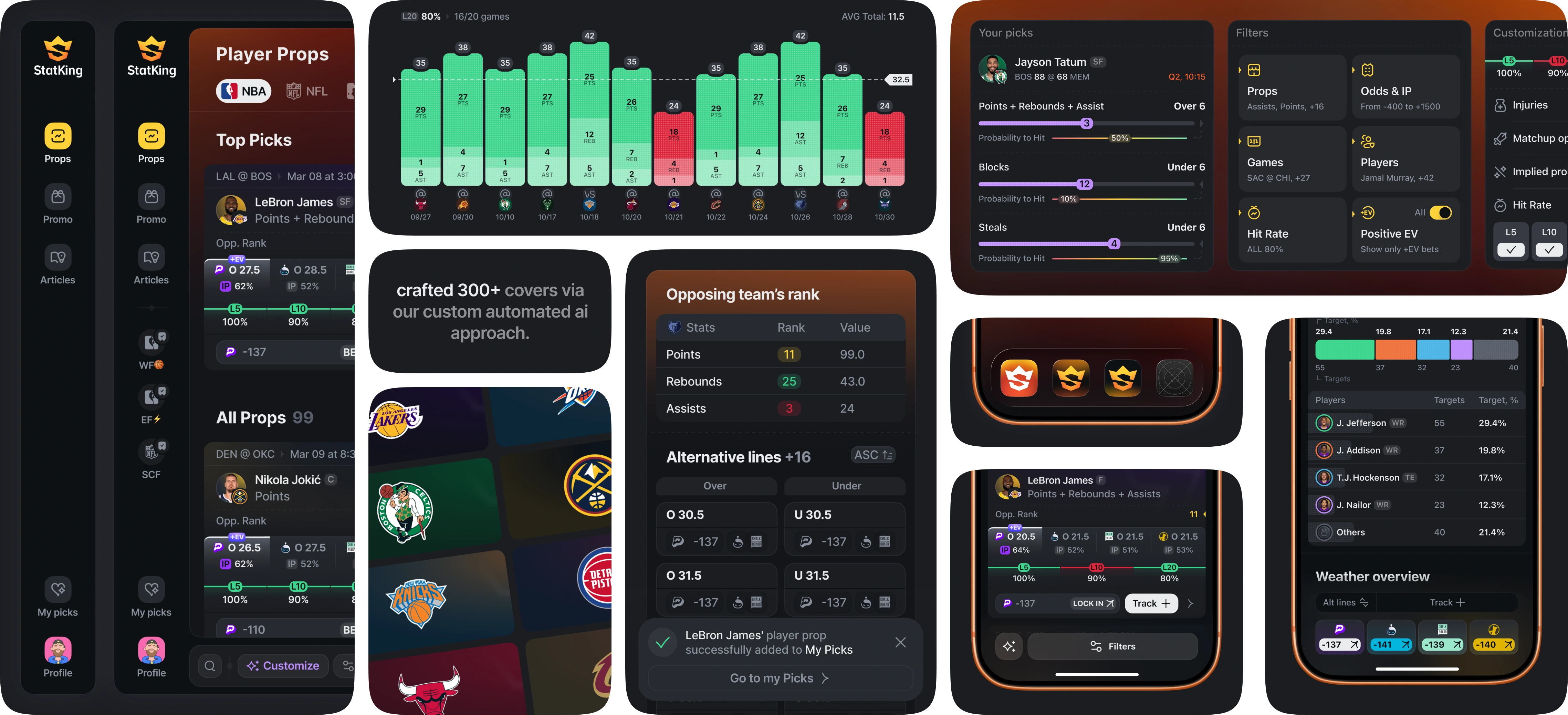
Most teams claiming a "shared design system" mean a single master file feeding two platforms that quietly drift apart within two release cycles. StatKing runs on two separate Figma files — one for iOS, one for web — with no single master file connecting them. The two products still look and behave like the same app, because everything that has to match is rebuilt in parallel by design, not inherited by accident.
TL;DR
- StatKing's iOS and web apps live in two separate Figma files, connected through one shared brand library for color.
- Typography, iconography, components, and interaction rules are rebuilt inside each file rather than pulled from a single master — but mirrored 1:1 so nothing visually diverges.
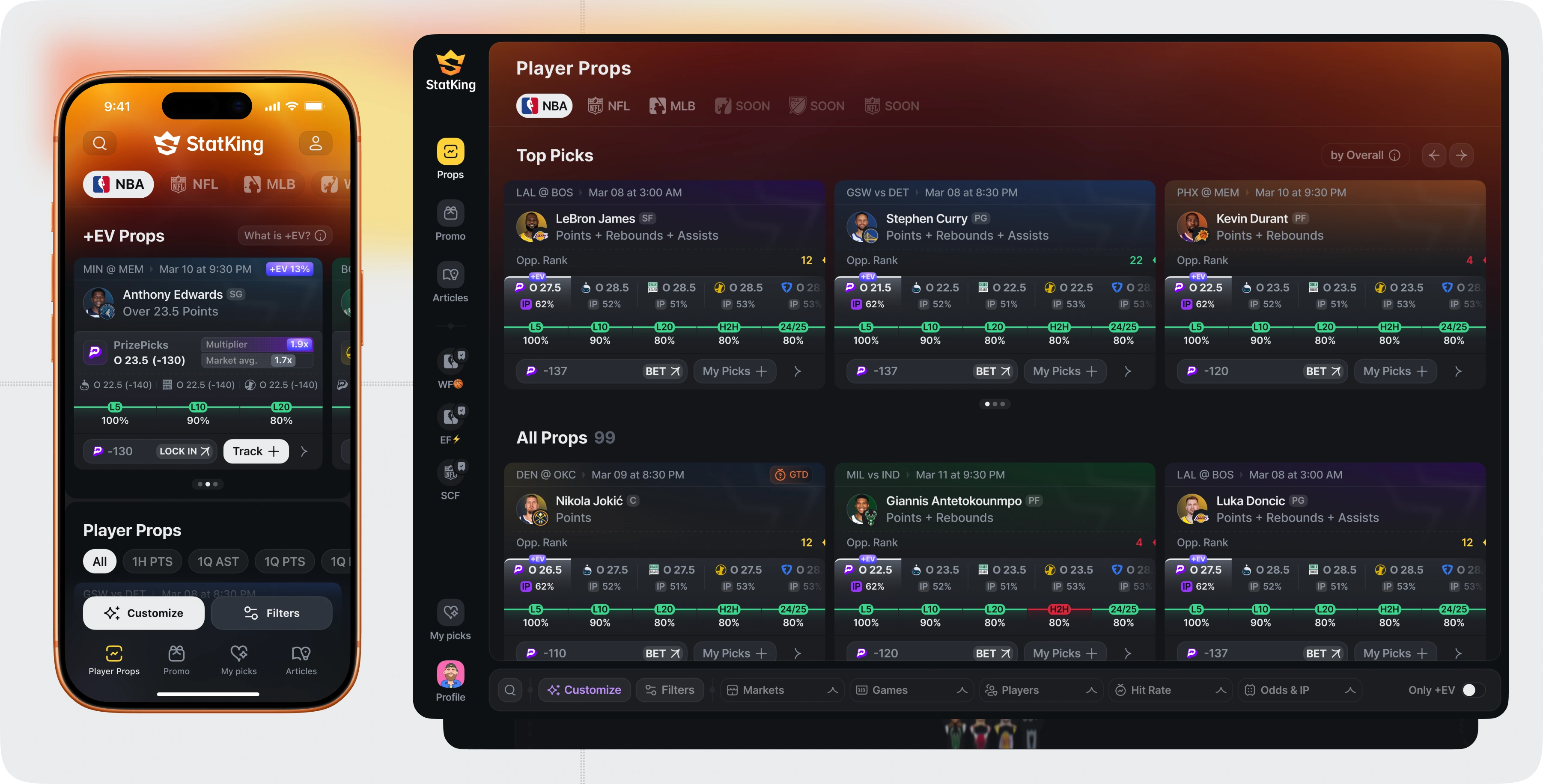
- The desktop app is functionally an expanded iOS layout: three prop cards per row instead of one, a persistent sidebar, and filters that expand into a bottom bar instead of a sheet.
- iOS ended up with roughly 2,800 components; web needed fewer — around 2,360 — because much of the visual language could be reused directly from the same source patterns.
Same Product, Two Files, By Design
The team considered — and rejected — building one master file with platform-specific variants inside it. A single connected library sounds efficient, but it also means every platform-specific override risks breaking the other platform when someone edits the shared source.
Two files with a shared brand library removed that risk. Only the piece both platforms genuinely need to match without exception — brand color — pulls from one connected source. Everything else lives natively inside each file, built to mirror the other by explicit design decision, not by inheritance.
What's Actually Shared: The Brand Library
The brand library covers color, and only color, across both files. That's the one layer where drift is unacceptable — a slightly different shade of StatKing's black-and-yellow palette on web versus iOS would be immediately visible to anyone switching between them.
Fonts, iconography, component structure, and interaction rules are not pulled from that shared library. They're rebuilt separately inside each file — deliberately, so each platform's file stays self-contained and editable without a cross-file dependency chain.
What's Rebuilt Per Platform, Not Just Shared
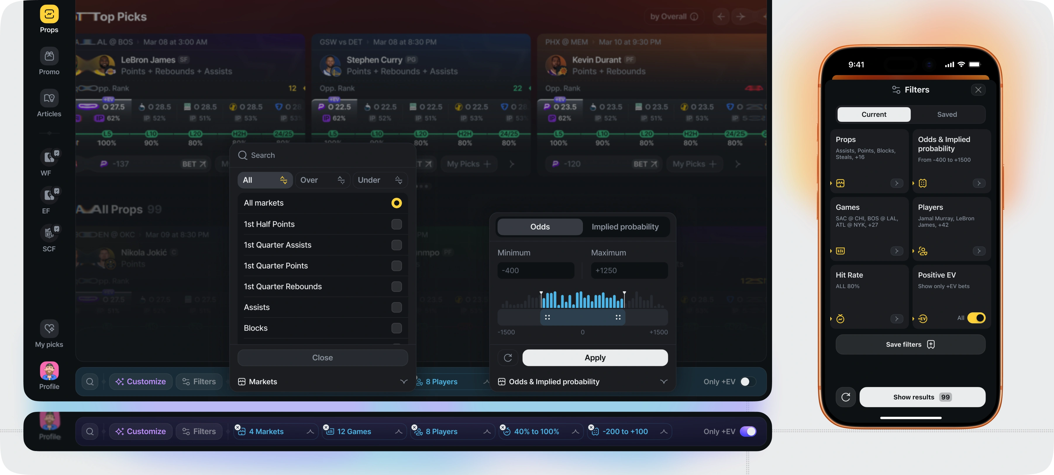
Prop cards, filter panels, the Customization screen, and every core UI pattern are fully mirrored between iOS and web — same structure, same states, same visual logic — but built as separate components in each file rather than instanced from one source.
This is the deliberate trade-off: slightly more design labor to build two versions of the same component, in exchange for zero risk of an iOS-only or web-only edit silently breaking the other platform.
The Desktop App Is an iOS Layout With More Room
Functionally, StatKing's web app is an expanded version of the iOS layout rather than a different design. Where iOS shows one prop card per row, desktop shows three. Desktop adds a persistent left sidebar for primary navigation, something iOS handles with a bottom tab bar instead. And where iOS presents filters as a modal sheet, desktop expands them into a bottom bar that can be pulled open for more room to work.
The underlying UX and interaction logic is identical on both platforms. What changes is how much screen space there is to spend it.
Apple's Own Playbook as the Benchmark
The visual target throughout was the kind of parity Apple maintains between Notes, Journal, and Reminders on Mac versus iPhone — products where someone switching between the two barely registers a difference beyond screen size. That's the standard StatKing's iOS and web apps were built against: someone moving between phone and desktop should recognize the product instantly, not have to re-learn it.
Handoff: Figma Dev Mode, Loom, and the Client's Own Team
Development wasn't run by Flatstudio alone — it was a collaboration with the client's own engineers. Handoff combined Figma Dev Mode, with components and design tokens prepared for direct implementation, alongside Loom walkthroughs recorded on specific decisions and components, so both the design team and the client's developers had a shared reference for how a component should behave — critically, so that changing a card's configuration would update it identically across iOS and web, rather than needing to be implemented twice by hand.
2,800 Components on iOS, 2,360 on Web — and Why the Gap Exists
The iOS file grew to roughly 2,800 components. The web file needed fewer — around 2,360 — not because web got less design attention, but because a meaningful share of the visual language iOS had already established could be reused directly once the desktop layout, sidebar, and expanded card grid were in place.
That gap is itself a signal of how deliberately the two files were built to mirror each other: less original work was required on the second platform precisely because the first platform's patterns were designed to translate cleanly.
Building a sports analytics or betting product? Flatstudio has designed player props tools, sportsbooks, and odds platforms for 8+ years — see the sports analytics portfolio or how a dedicated product team engagement works.
This article is part of the Flatstudio × StatKing case study series. Main article — StatKing: How We Built a Free Betting Analytics Product Against $40/Month Competitors.
Related reading: StatKing iOS · StatKing Web · StatKing Branding — the brand library referenced throughout this article.

Frequently Asked Questions
Should iOS and web apps share one Figma file or two?
Either can work. A single connected file reduces duplicate labor but risks one platform's edits breaking the other. Two files connected only through a shared library for the elements that must never diverge – typically brand color – gives more platform-specific flexibility with less cross-file risk.
What is a shared design token library?
A design token library stores reusable values – like brand colors, spacing units, or typography scales – in one connected source that multiple files or platforms can reference, so a single update propagates everywhere it's used instead of being edited manually in each location.
How do you keep an iOS app and its web counterpart visually consistent?
Mirror the same component structure, states, and interaction logic across both platforms, even if the underlying files are separate. Anchoring only the non-negotiable shared elements – brand color, in StatKing's case – to one connected library limits drift without forcing a single fragile master file.
What's the benefit of a component-based design system for dev handoff?
What's the benefit of a component-based design system for dev handoff? A component-based system paired with Figma Dev Mode and recorded walkthroughs gives developers exact specs and behavior for each UI piece, rather than static screenshots. That reduces back-and-forth clarification and keeps implementation consistent across a product's different platforms.
