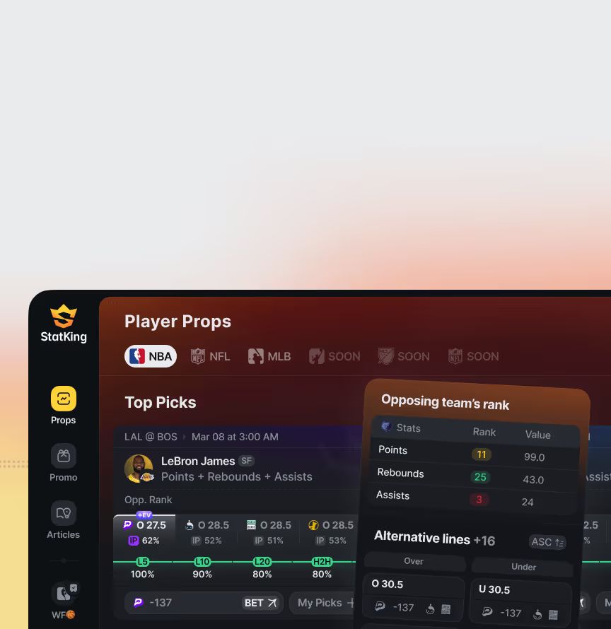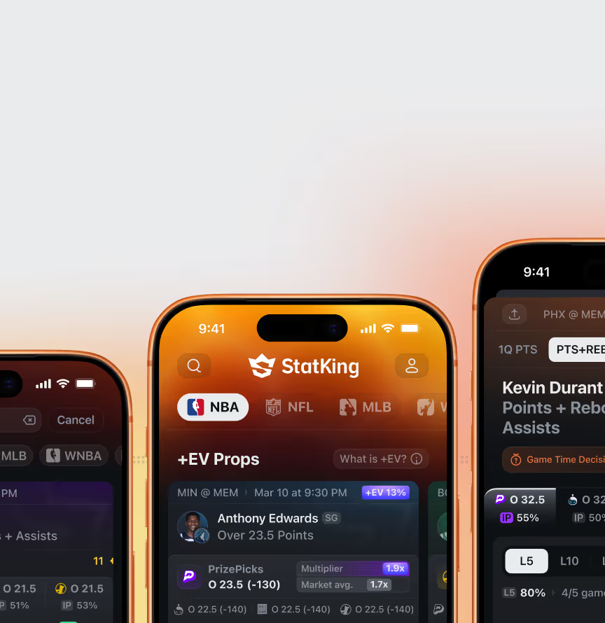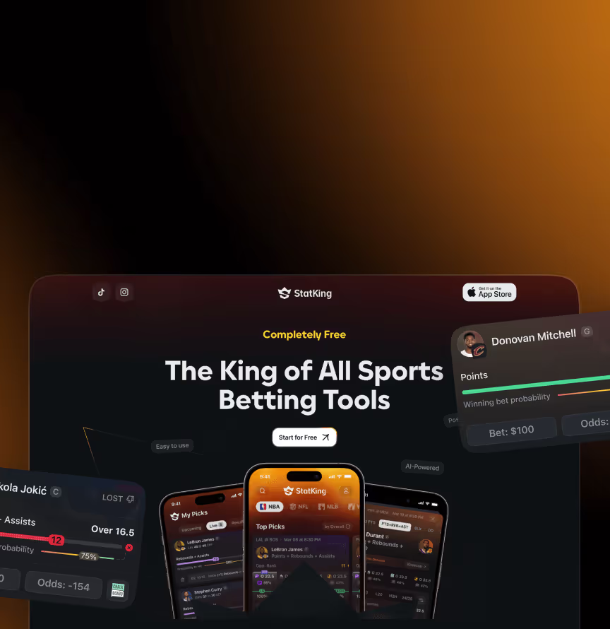













StatKing Brand is a black-and-yellow identity system built around a 3D crown — the "royal standard" for a sports data product competing in a crowded US betting analytics market. The logotype follows a strict structural grid, with alignment rules that standardise every logo combination, plus dedicated app and browser icon versions.
The system covers a colour palette with fluid gradients that add motion to static layouts, typography rules, photography guidelines, and a social media visual system that keeps daily content recognisable without a dedicated in-house designer. Brand style usage rules connect the identity to the product itself, so the same visual logic runs through the iOS app, web platform, and marketing surfaces.
This overview covers the StatKing Brand Identity system built for a US player prop analytics platform – guidelines cover, gradient logo cards, an OOH billboard, and app icons.
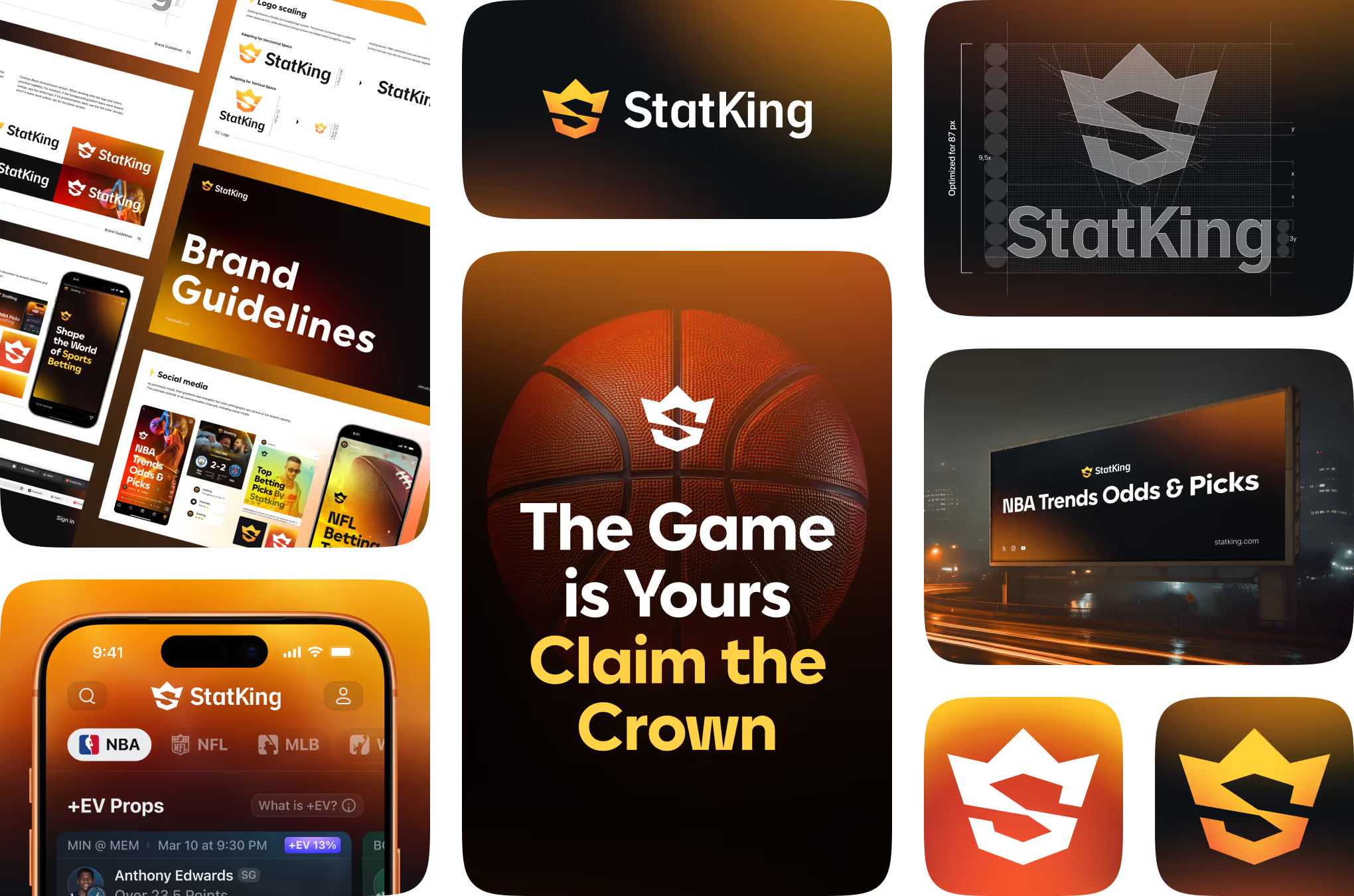
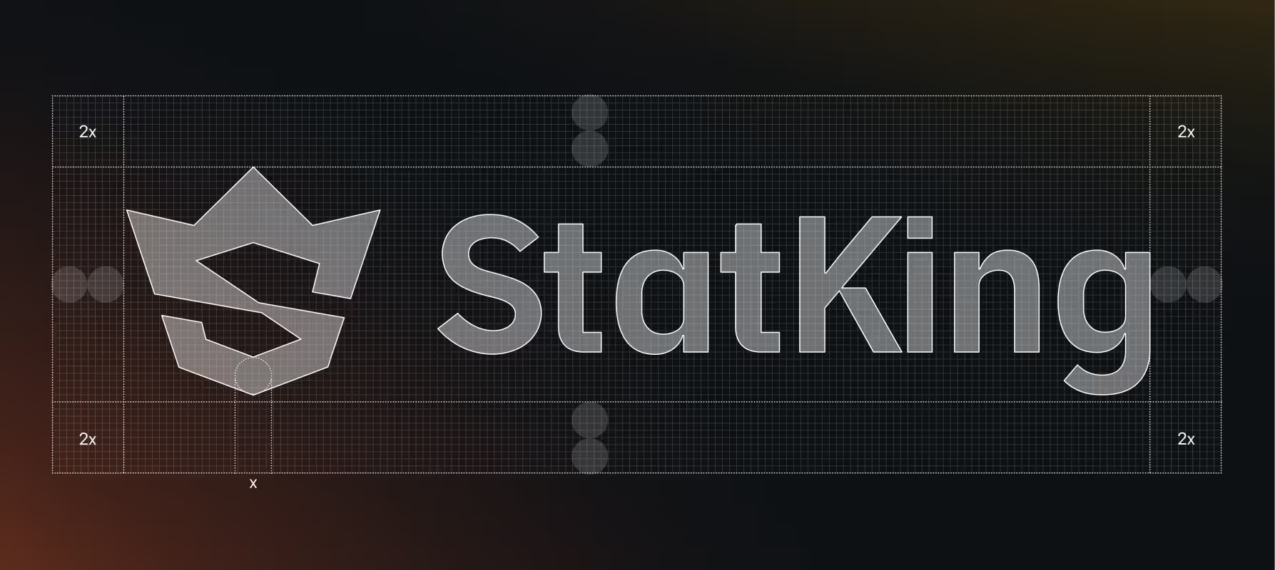
The logotype for this betting analytics brand follows a fixed construction grid built around a 3D crown mark. Clear-space ratios, x-height proportions, and letter spacing are locked for consistency at any size.



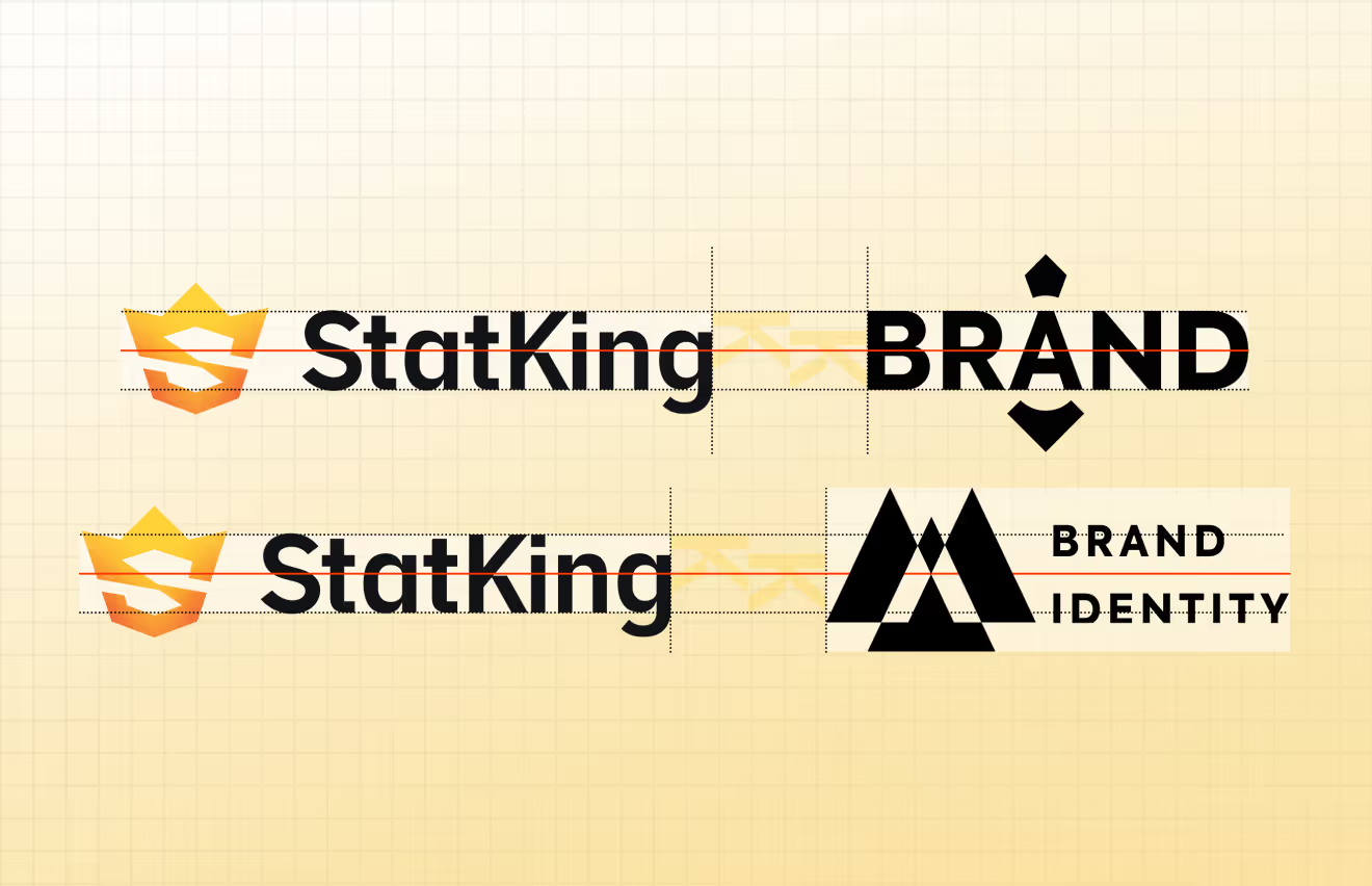
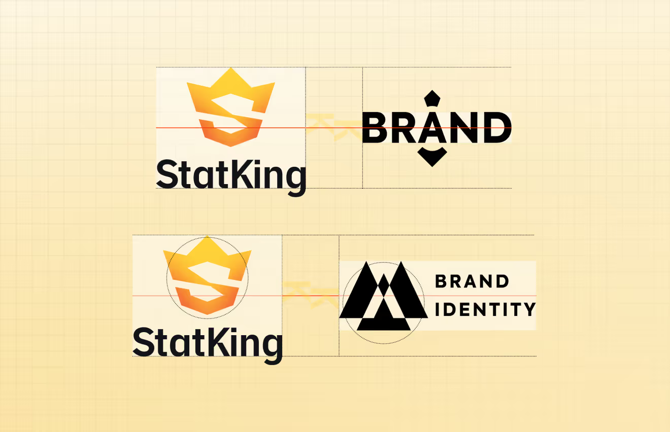
Guidelines define how the crown logo pairs with partner or campaign wordmarks without losing balance. Horizontal and stacked lockups share a fixed alignment axis and spacing ratio across both configurations.
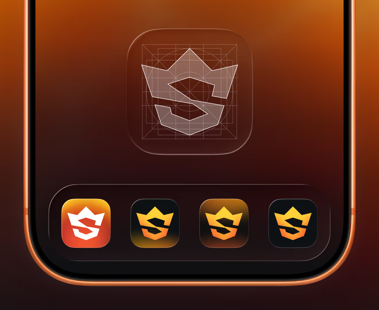
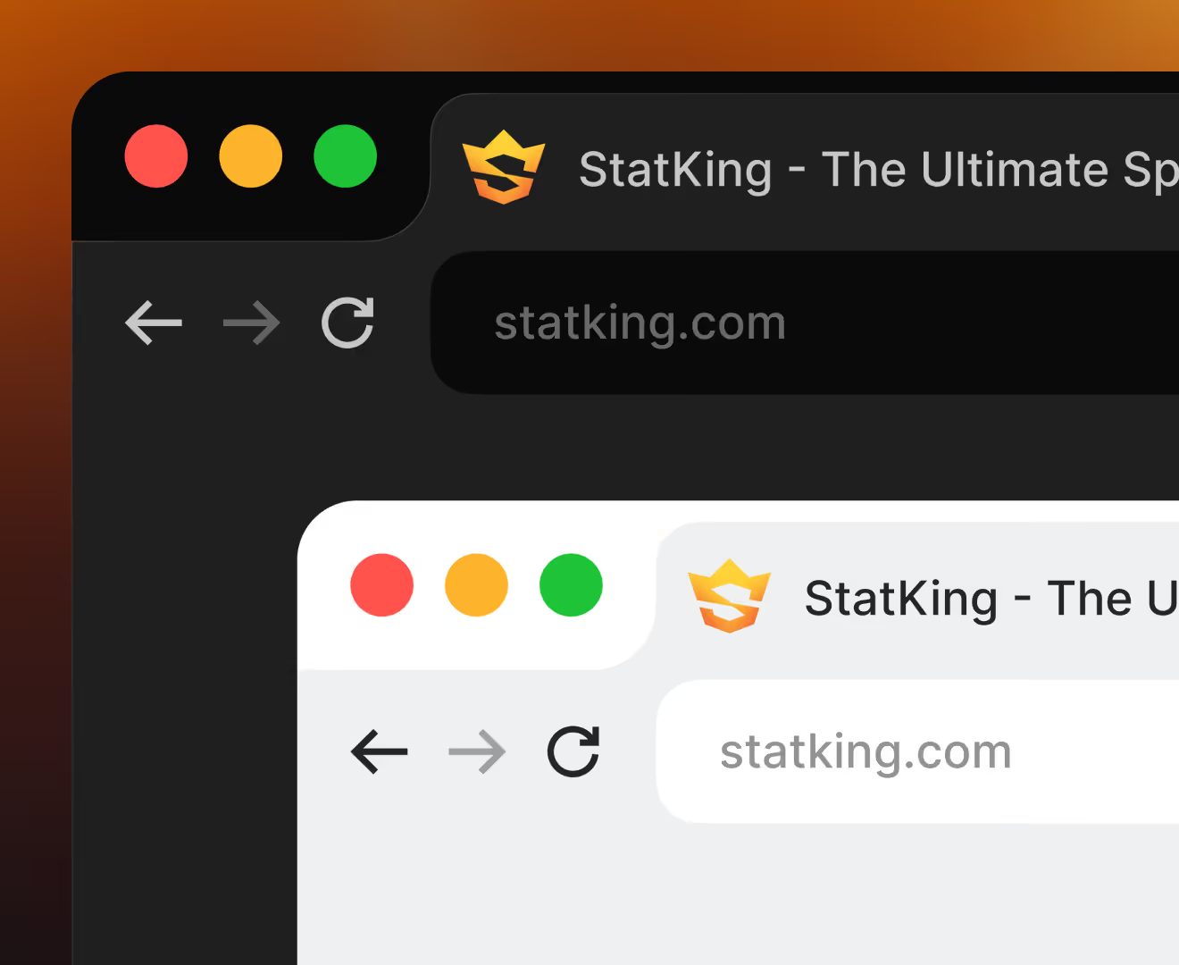
The crown mark condenses into an app tile and browser favicon, shown here across four icon variants and a browser tab. The same icon system carries into the StatKing Web App and mobile product.
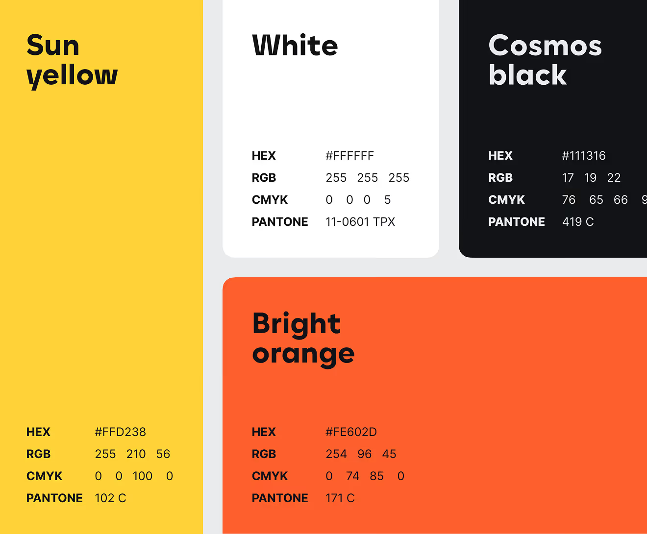
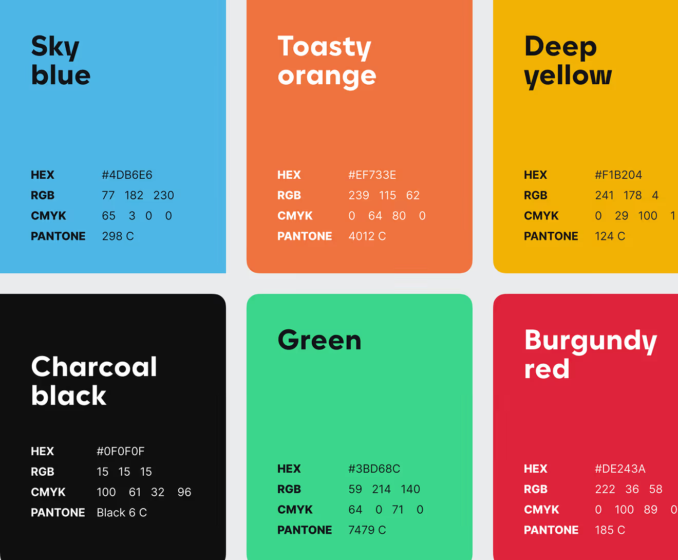
Ten named colors, from Sun Yellow to Burgundy Red, anchor the black-and-yellow identity for this player prop analytics platform. Each ships with hex, RGB, CMYK, and Pantone values, plus fixed background-pairing rules.
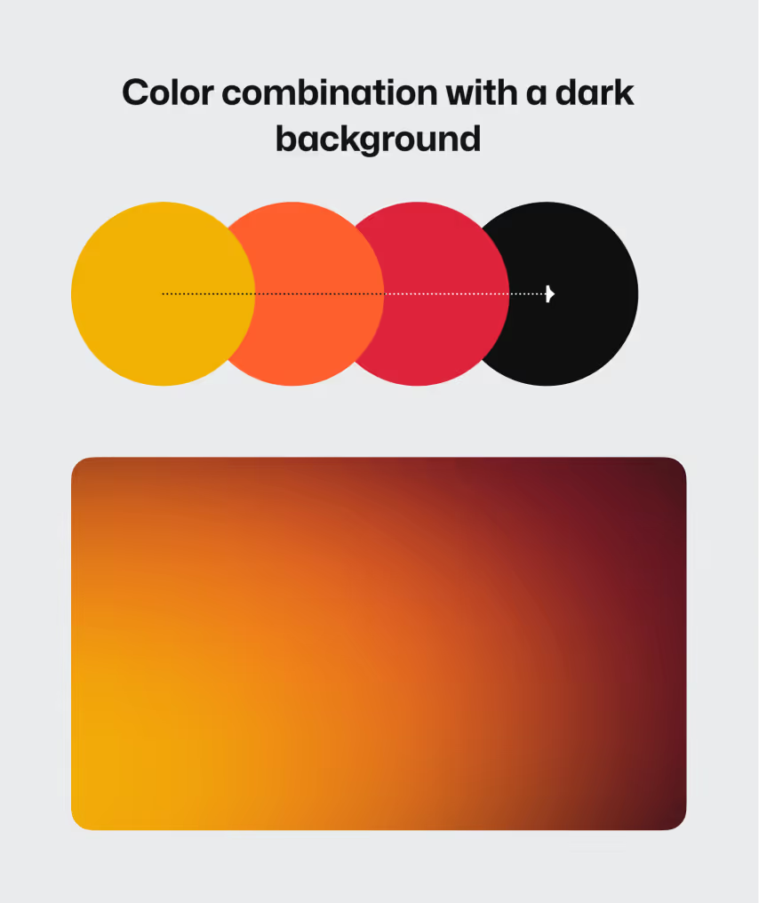
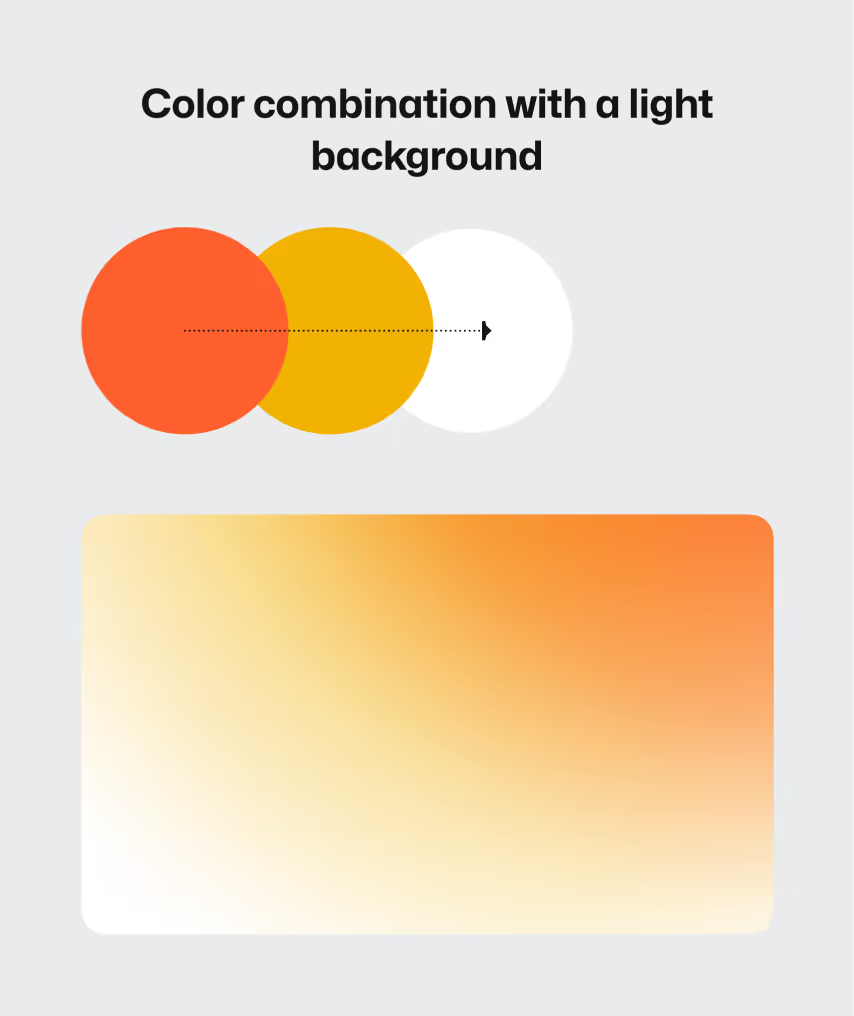
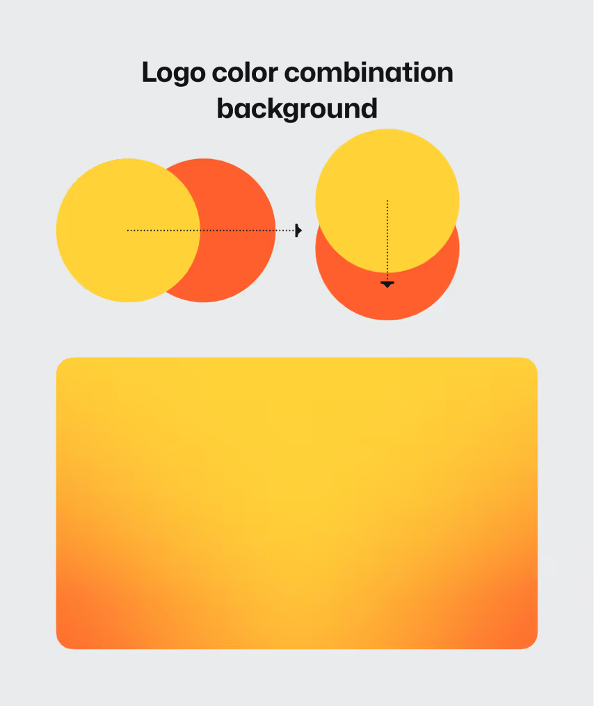
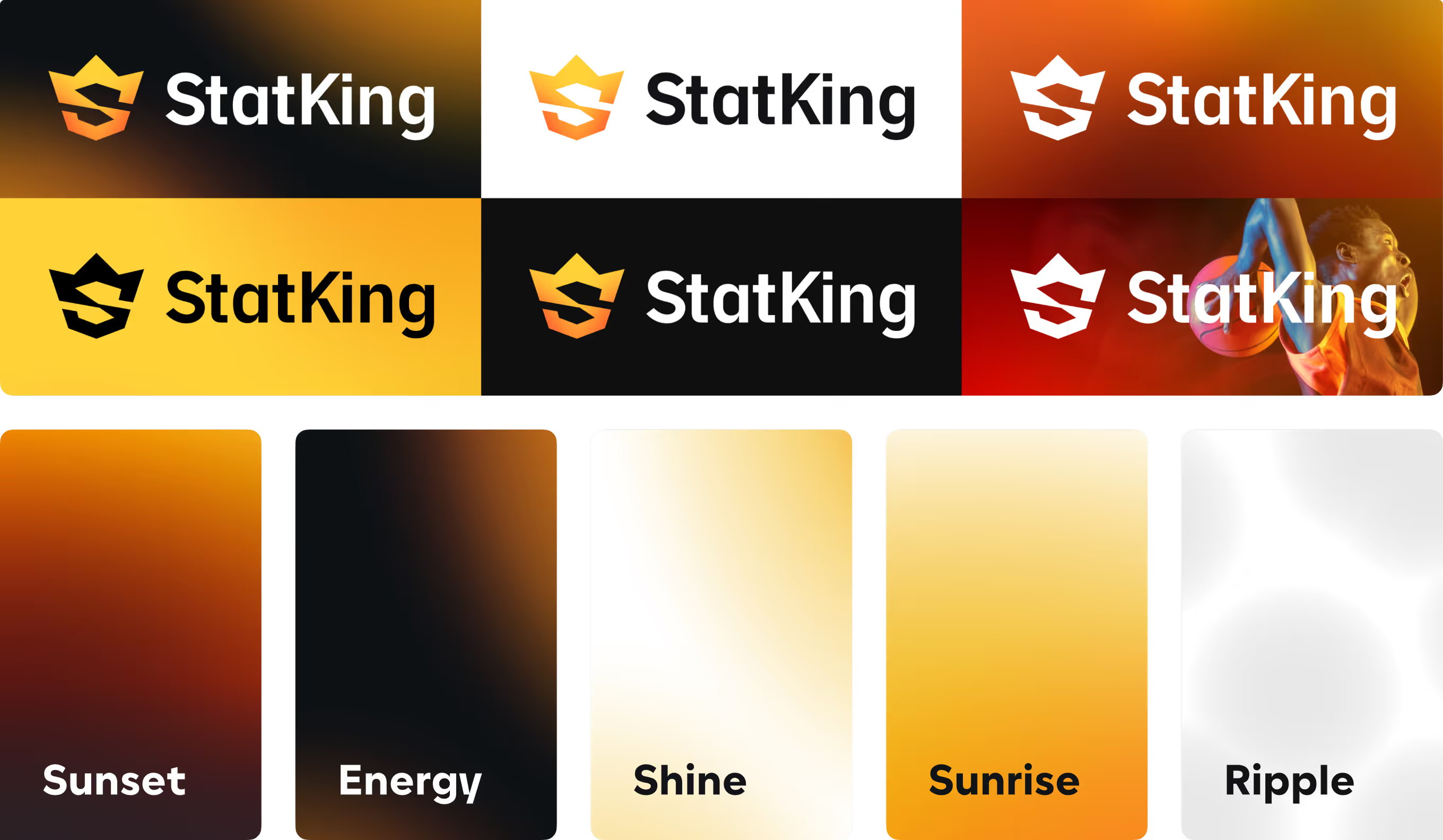
Five named gradients – Sunset, Energy, Shine, Sunrise, Ripple – extend the palette for StatKing's marketing surfaces. The wordmark is tested across six background treatments, including a photographic basketball scene.
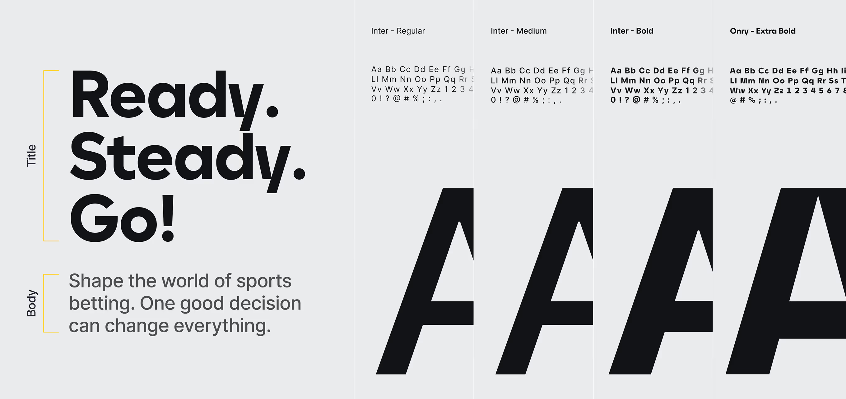
Onry Extra Bold drives bold headline moments across this sports analytics brand, while Inter Regular, Medium, and Bold cover body copy and interface text.
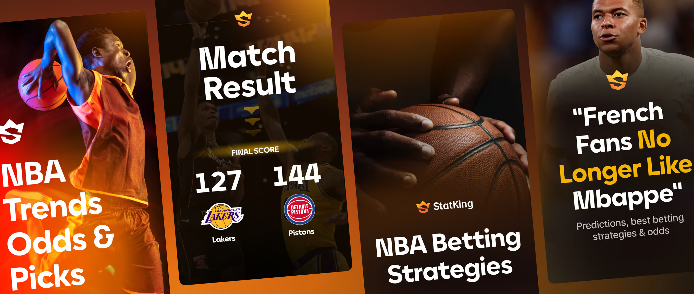
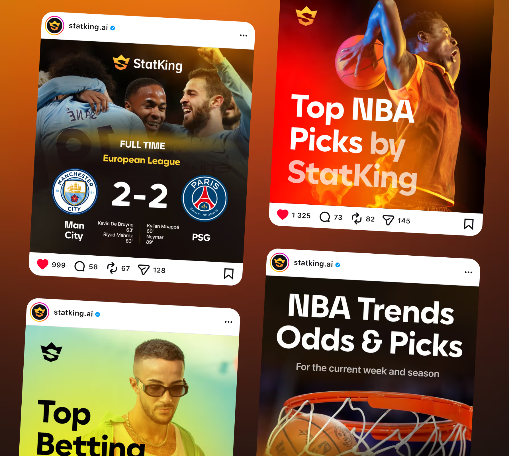
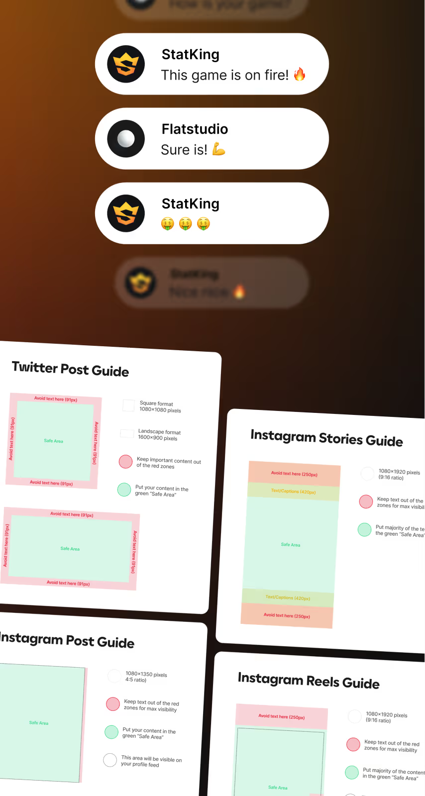
Ready-made templates cover match-result and betting-picks posts for the brand's social channels. Instagram and X guides set exact post, Stories, and Reels dimensions, with safe-zone margins for text and logo placement.
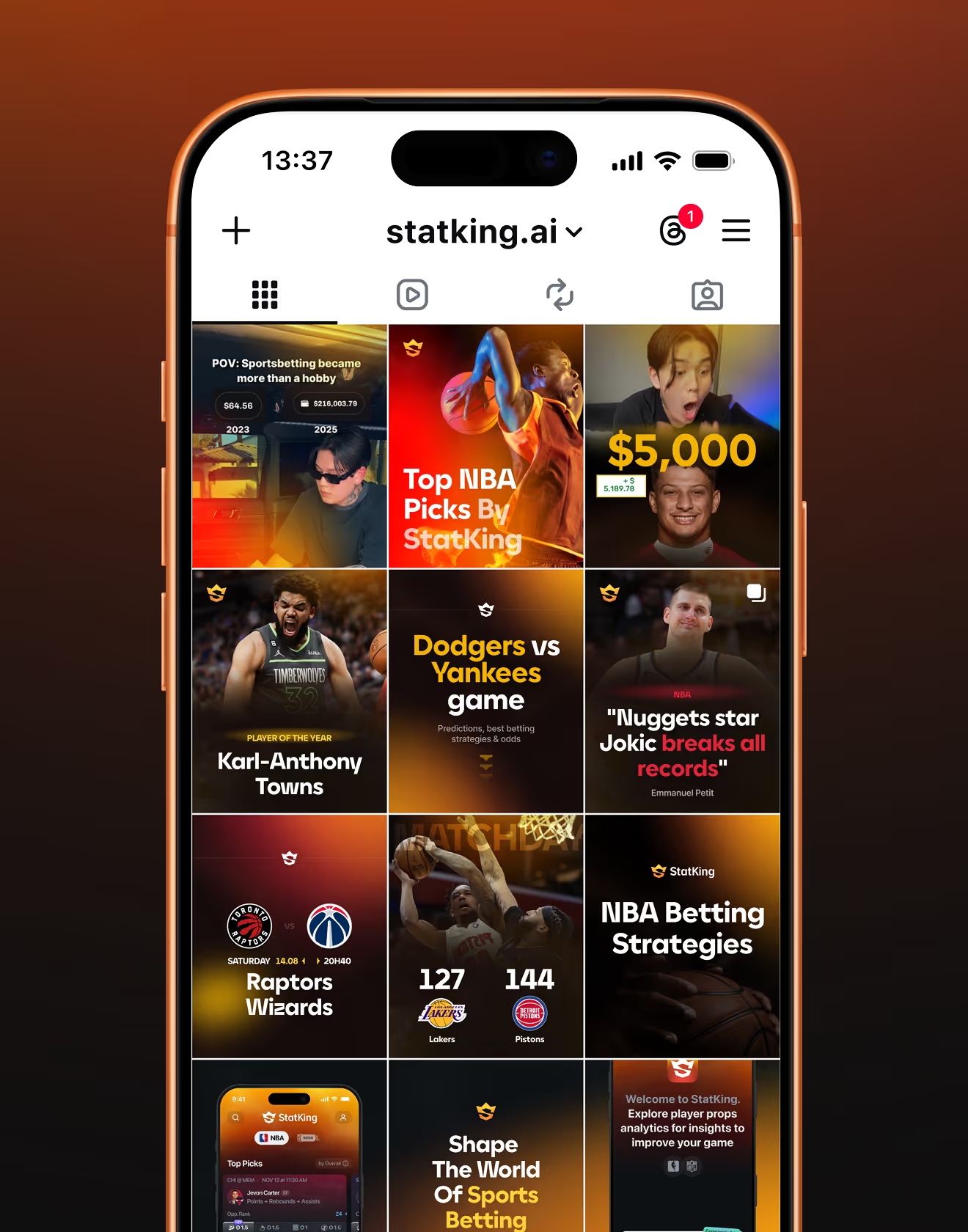
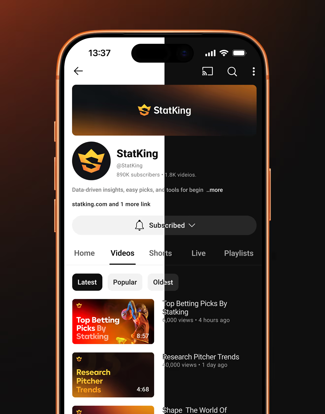
The identity extends into profile and channel pages across social platforms, not just individual posts. Mockups include an Instagram grid layout and a YouTube channel page with banner, avatar, and thumbnails in brand colours.
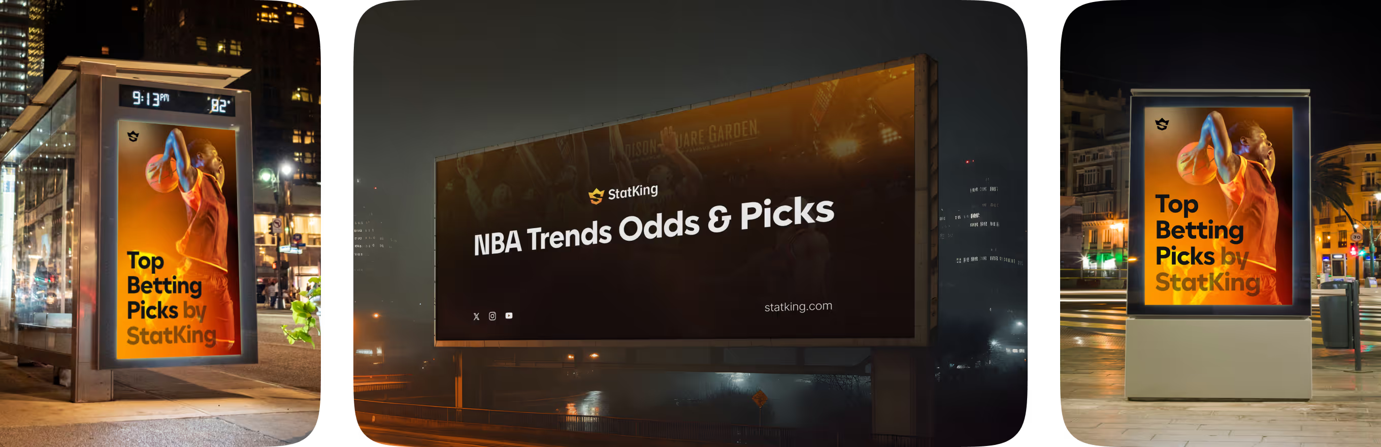
Style guidelines extend the identity beyond screens into physical placements. Bus-shelter and billboard ads, arena jumbotron screens, and branded merchandise carry the same mark seen in the StatKing iOS App.

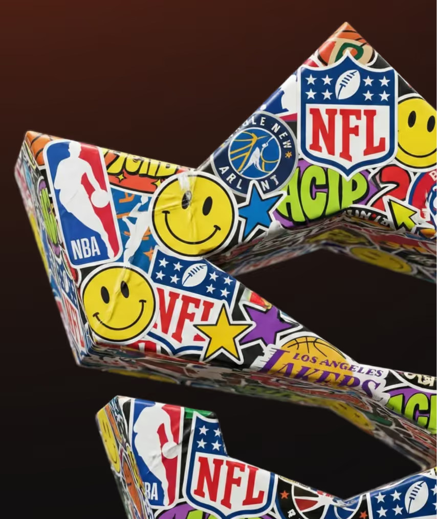




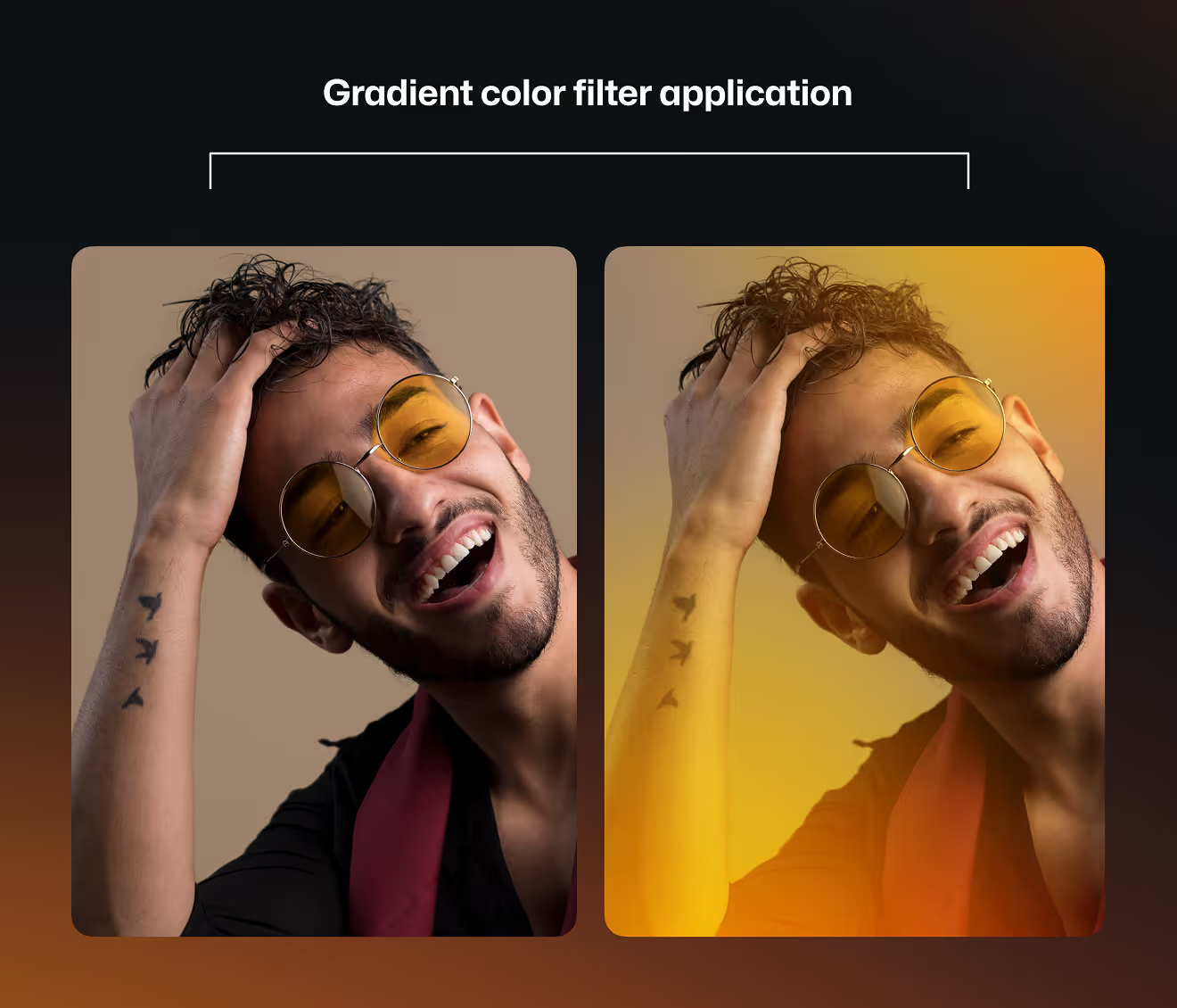
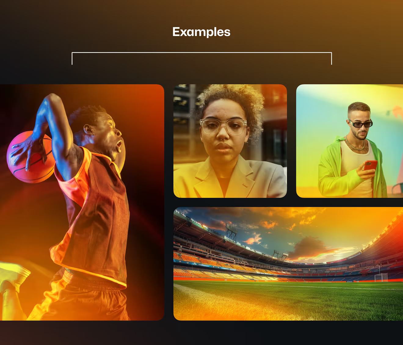
A gradient colour filter standardises photography so campaign images match the palette regardless of source. A before/after portrait comparison and example shots span action, portrait, and stadium photography.
If your product needs to look the same on a phone screen, a billboard, and a jersey, the brand needs one grid – not three. Send us the touchpoints that matter most and we'll build a system that holds them together.