












Stavka Brand is the visual identity system for a sports prediction platform we have partnered with since 2017. We designed a custom typeface in-house, built the logobook and brandbook — graphic style, color rules, system icons, and 3D illustration language — and evolved the identity again in 2025.
The rebrand was executed across 20+ live touchpoints, from the web app and iOS product to Telegram covers, push notifications, App Store banners, and promo assets, during live traffic and without rollback.
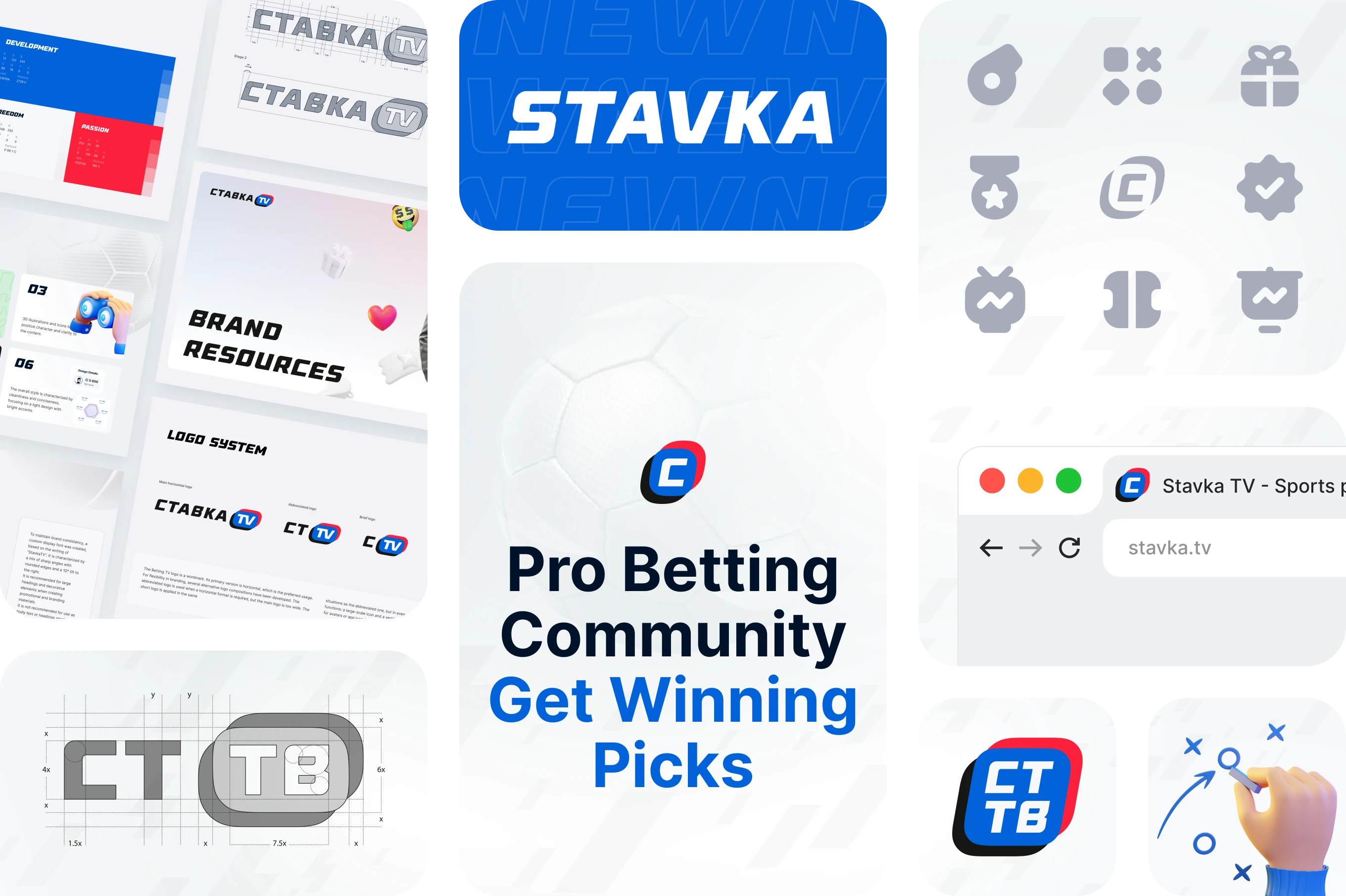
Brand system overview for Stavka, a sports prediction platform. Covers logo construction, color development, achievement badges, and a browser-ready site identity.
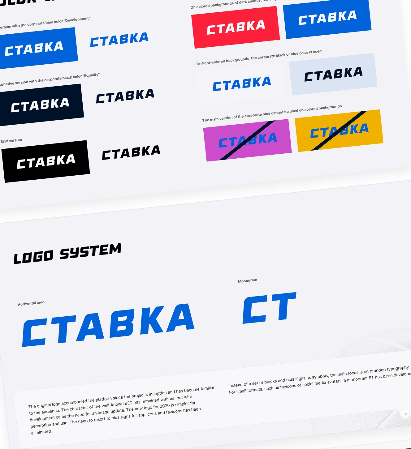
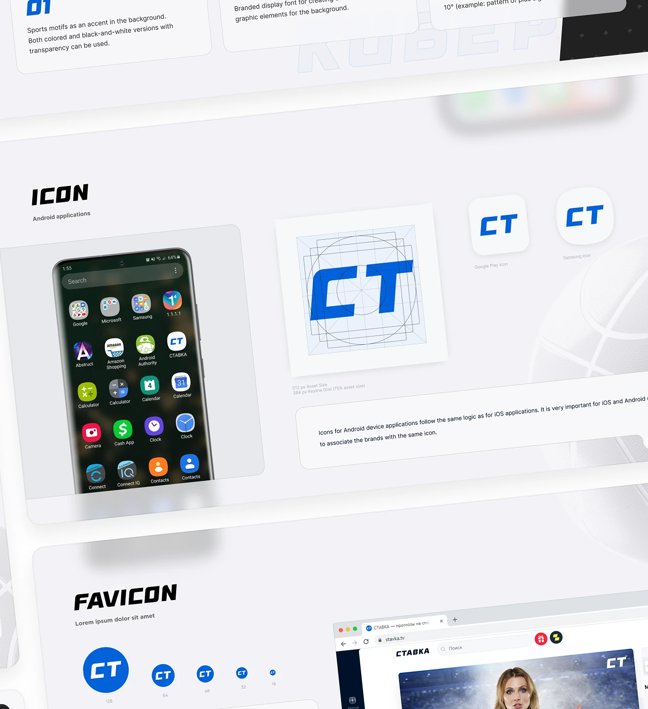
Logobook page for the wordmark and CT monogram, covering approved background colors and forbidden combinations. Includes Android app icon and favicon size specifications.
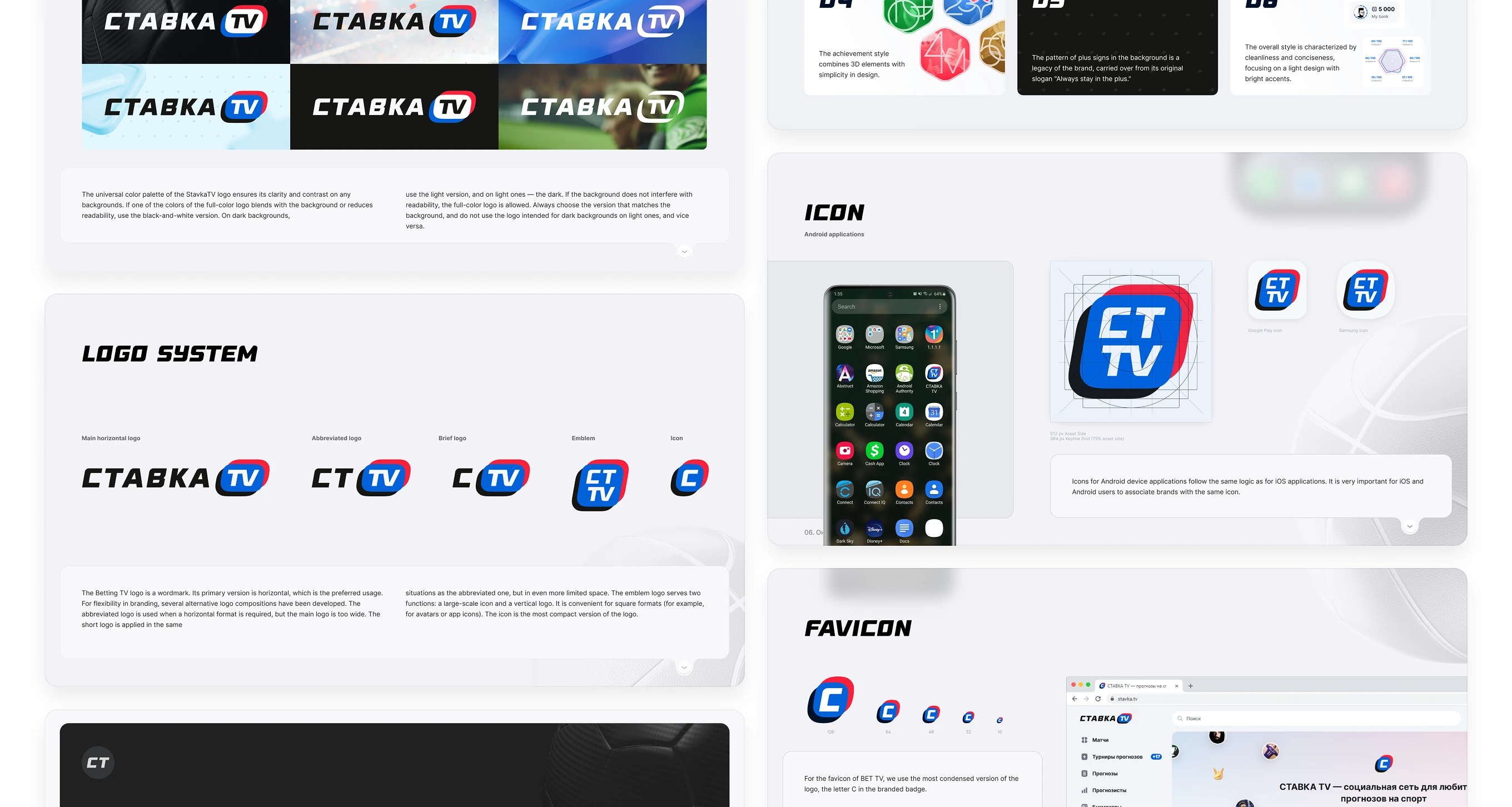
Five logo variants — Main, Abbreviated, Brief, Emblem, Icon — each sized for a different placement, from full-width web headers to app icon squares. The Emblem doubles as both a vertical logo and a large-scale icon.
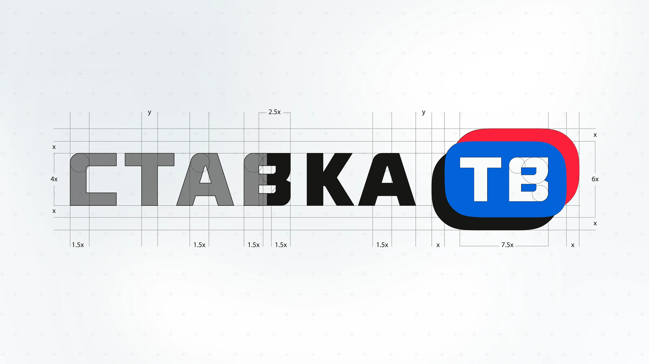
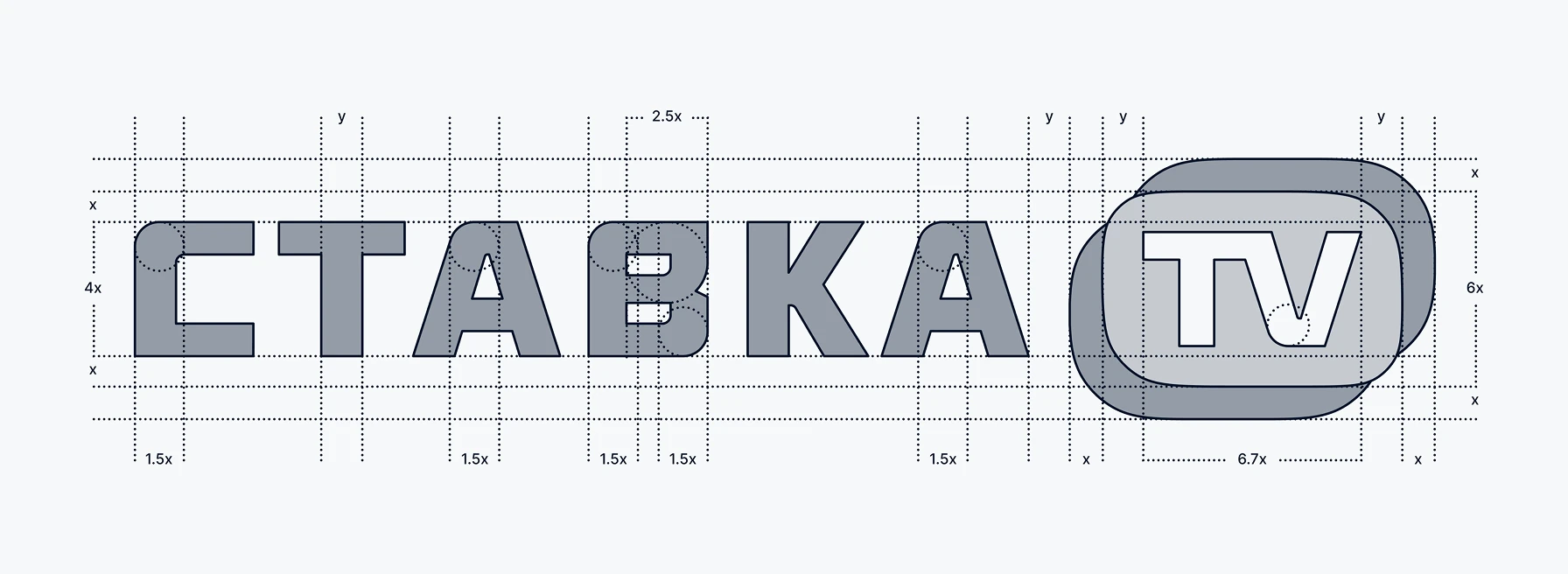
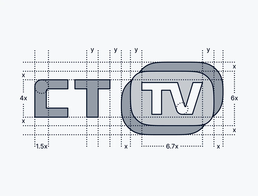
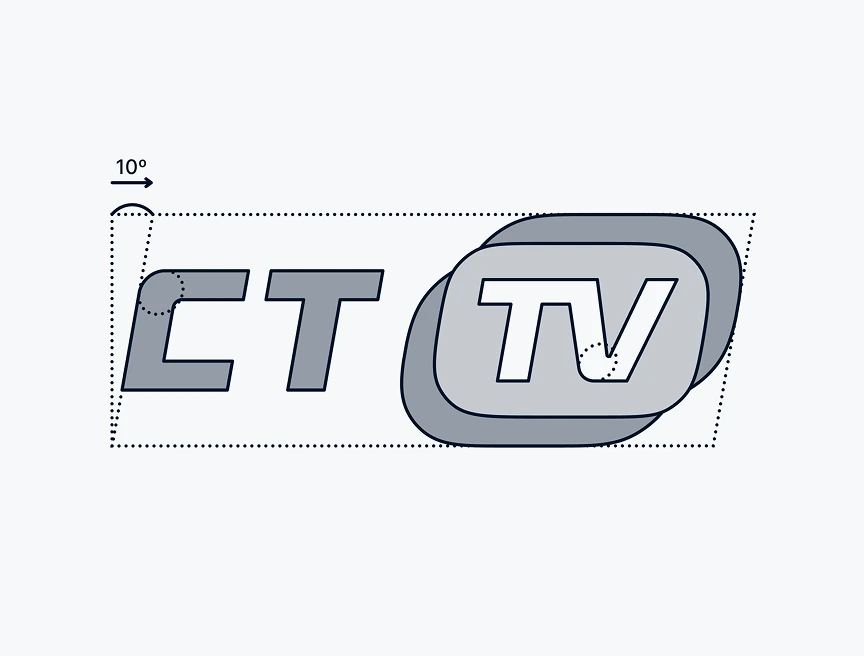
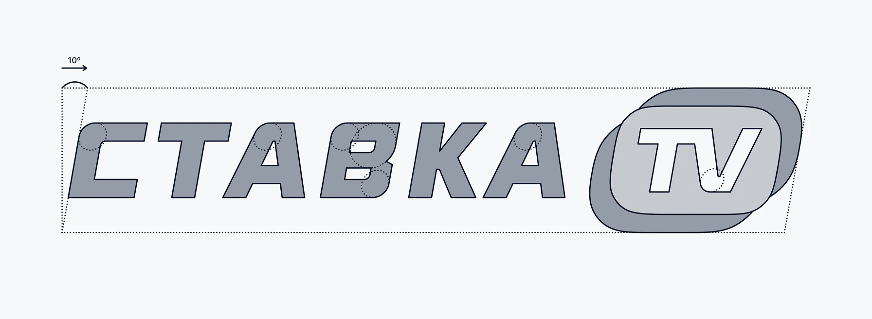
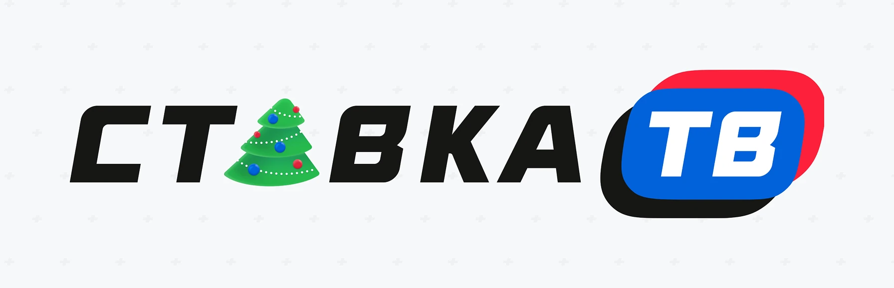
Construction grid for the wordmark and TV badge, defining x-height ratios, clear space, and a 10° badge rotation. Includes a seasonal variant for holiday campaigns.

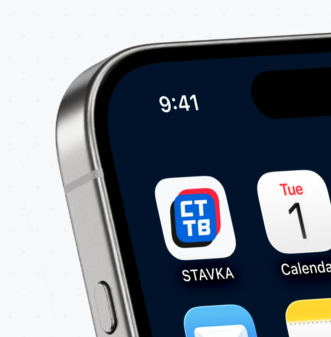
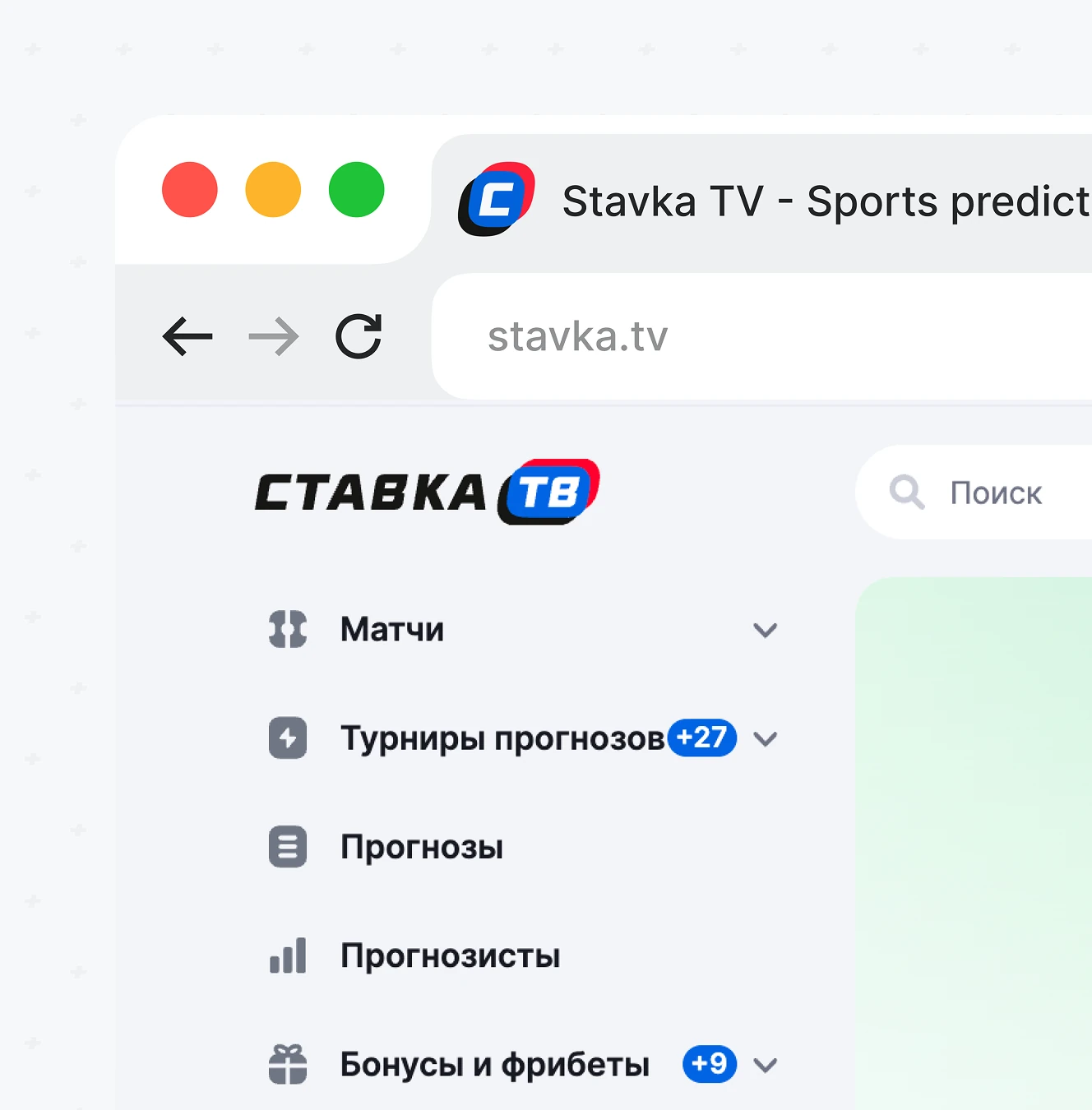
iOS home screen and browser tab placement for the app icon and favicon. The rounded CT TV badge stays legible at iPhone icon size and browser tab scale.
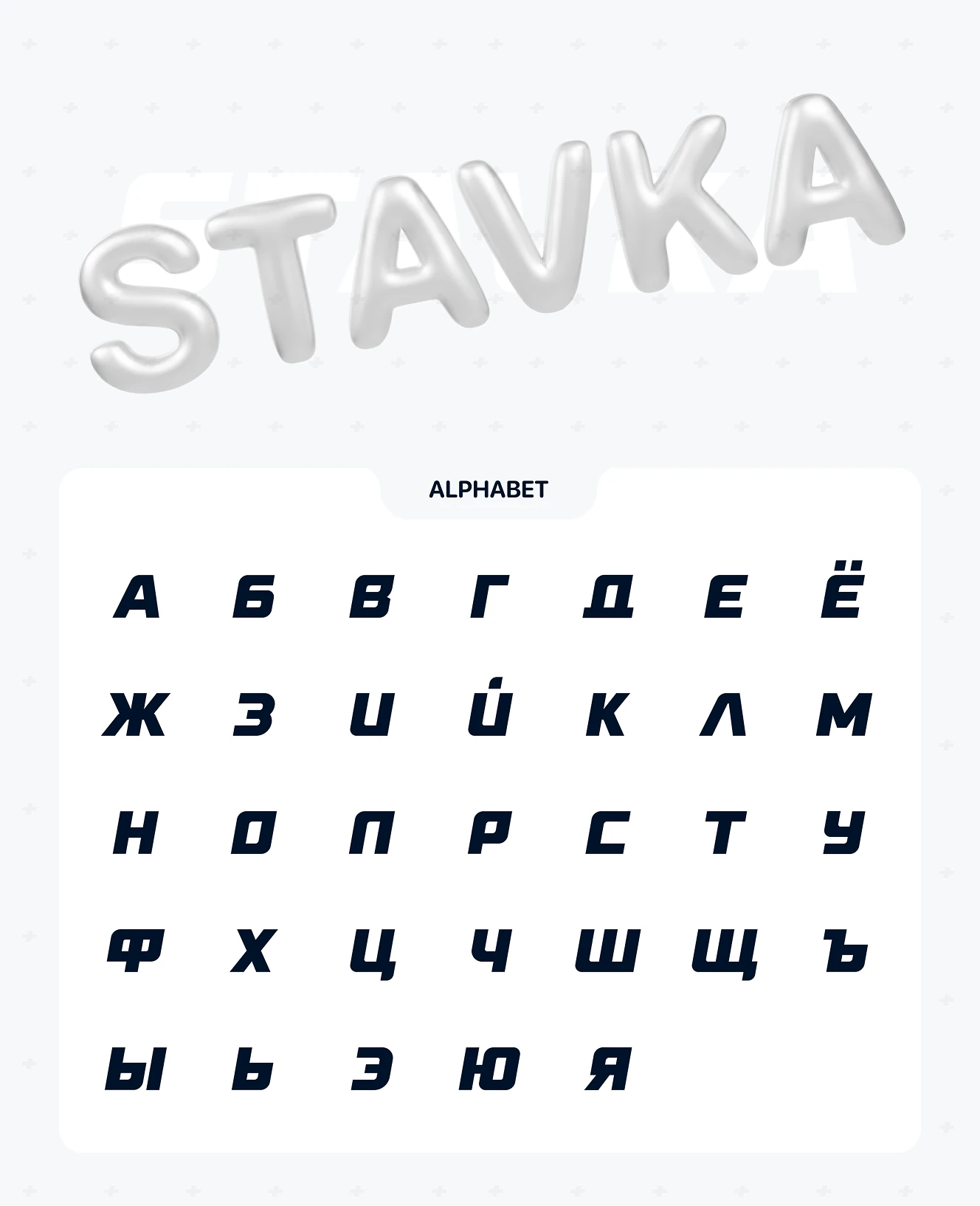
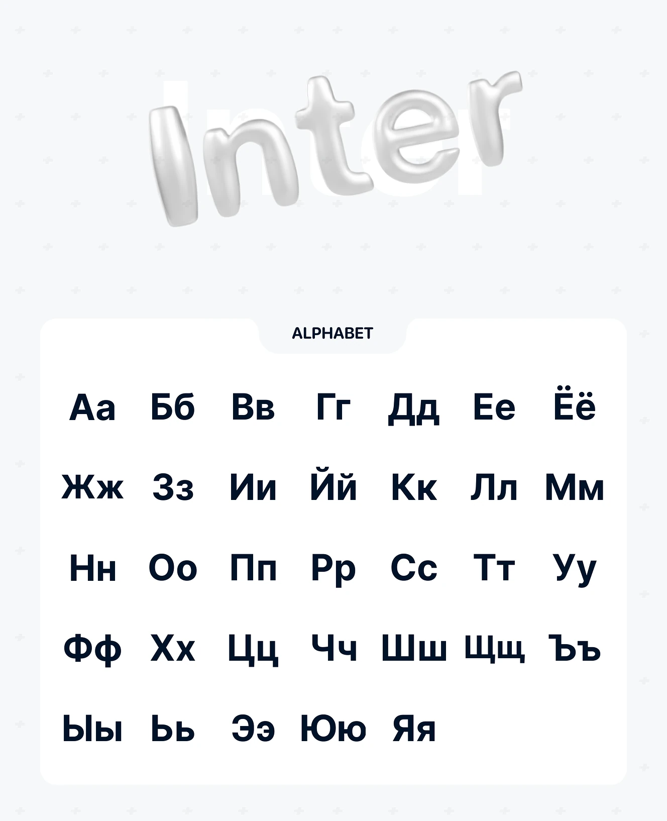
Stavka BoldItalic is a custom display typeface by brand designer Maria Solovyova, covered in our 10-touchpoint rebrand case study. Bold italic by default with a 10° tilt matching the logo; Latin added in 2021.
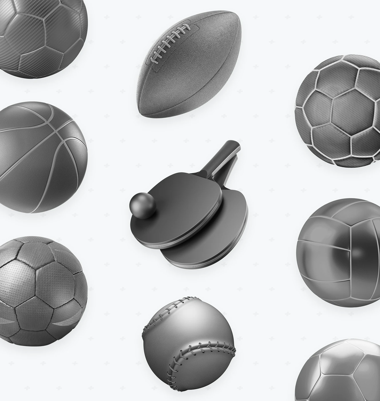
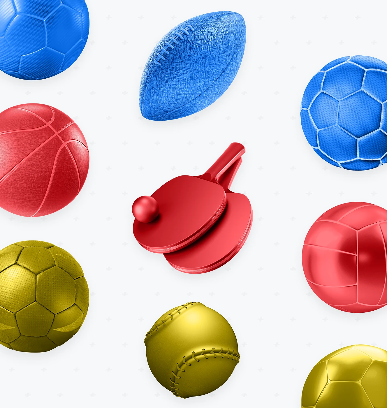
3D icon set of sports equipment – football, soccer, basketball, table tennis, baseball – for a sports prediction audience. Delivered in both grayscale and colored variants for flexible placement.
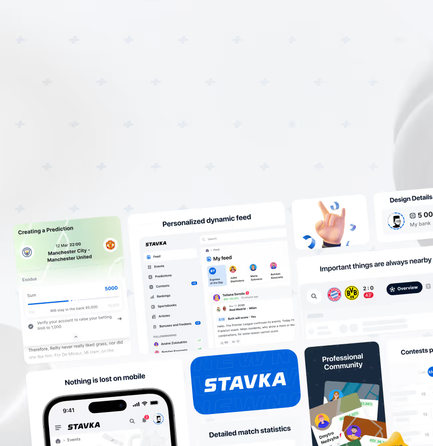
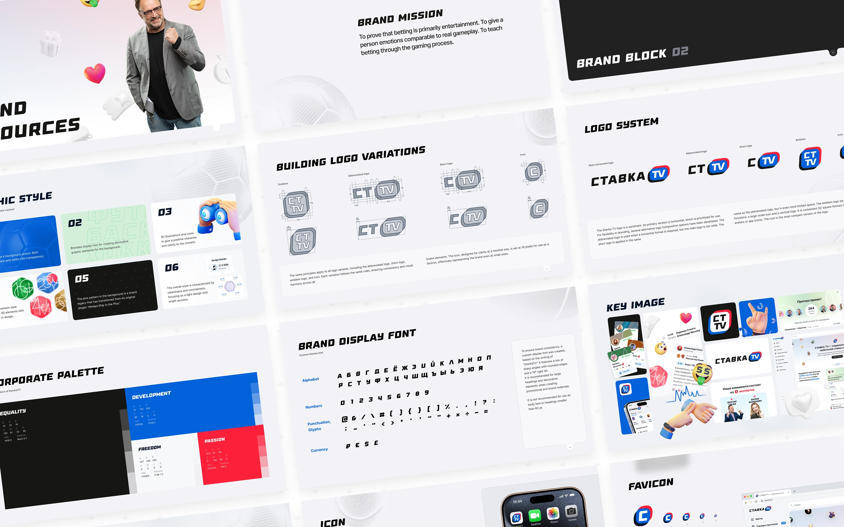
Full brandbook for Stavka covering mission statement, logo variation rules, and a four-color corporate palette. Includes UI mockups showing the brand applied to social feed and match cards.
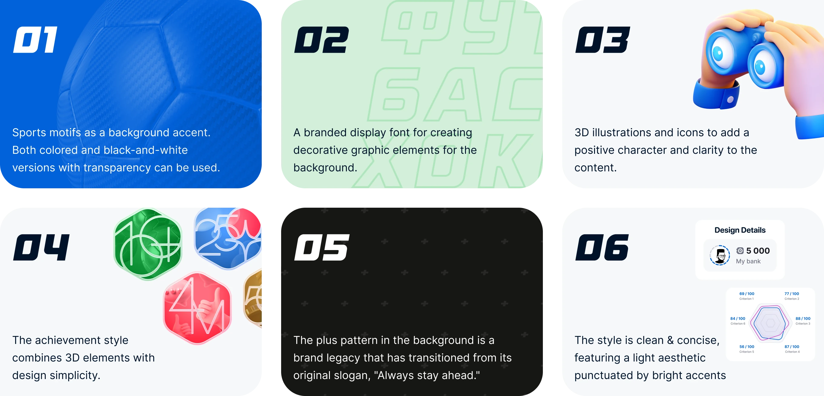
Six visual-system rules for the brand's graphic style, from sports-motif backgrounds to a recurring plus-sign pattern. The plus sign carries over from the brand's original tagline about staying ahead.
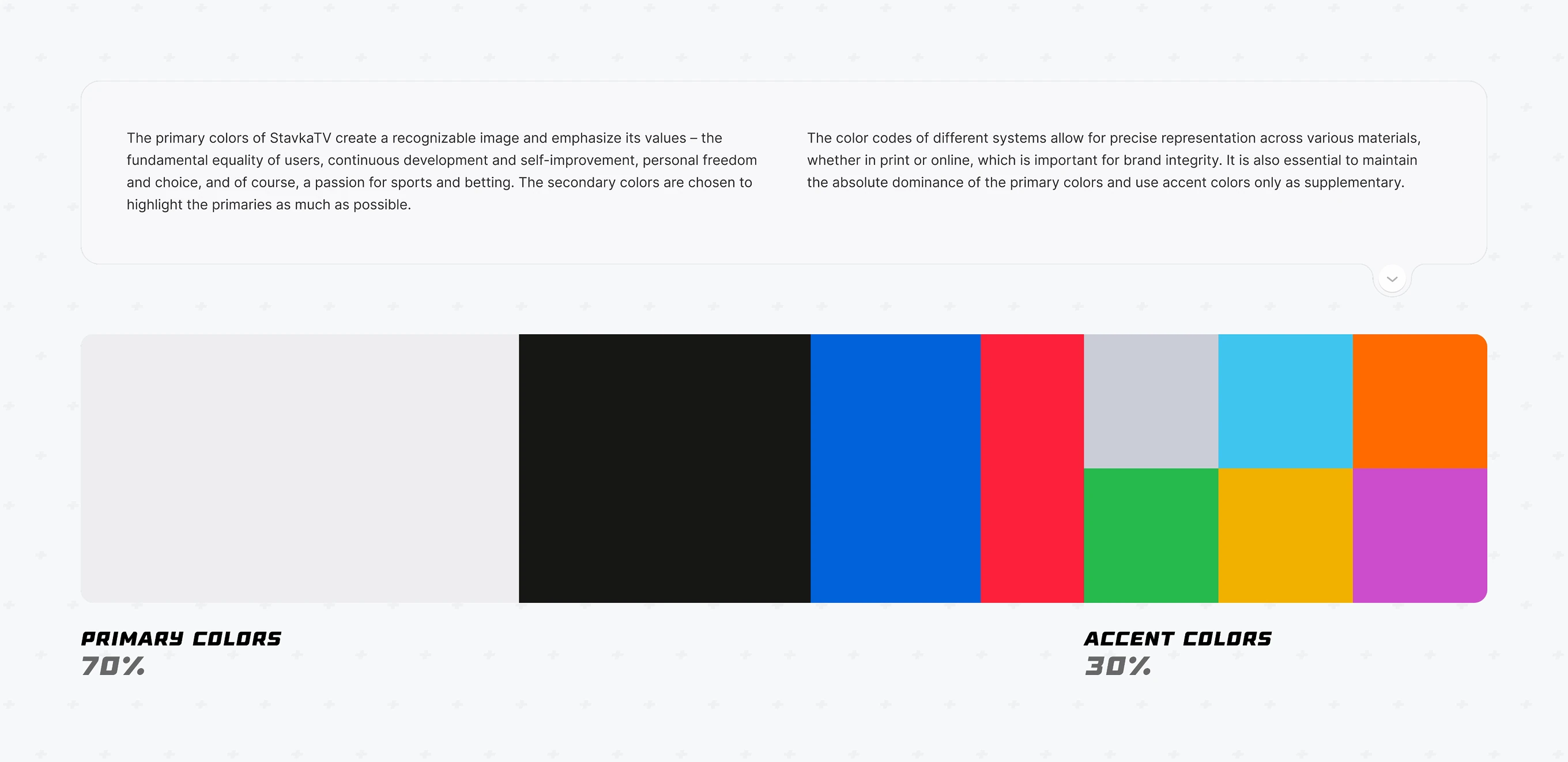
Color rules for the Stavka palette, where each core color maps to a brand value: equality, development, freedom, and passion. Primary colors stay dominant; accent colors are supplementary only.
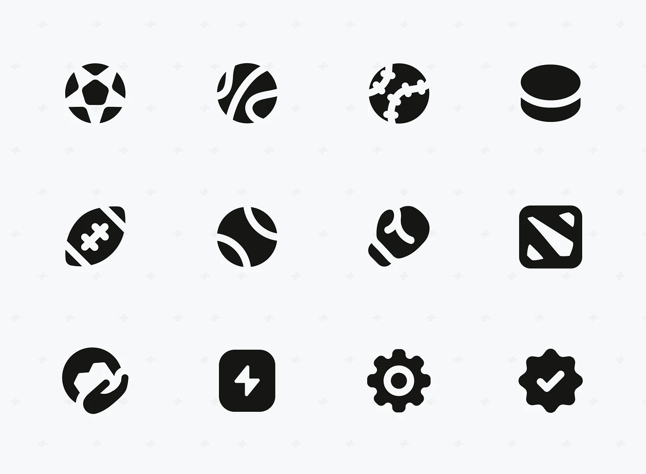
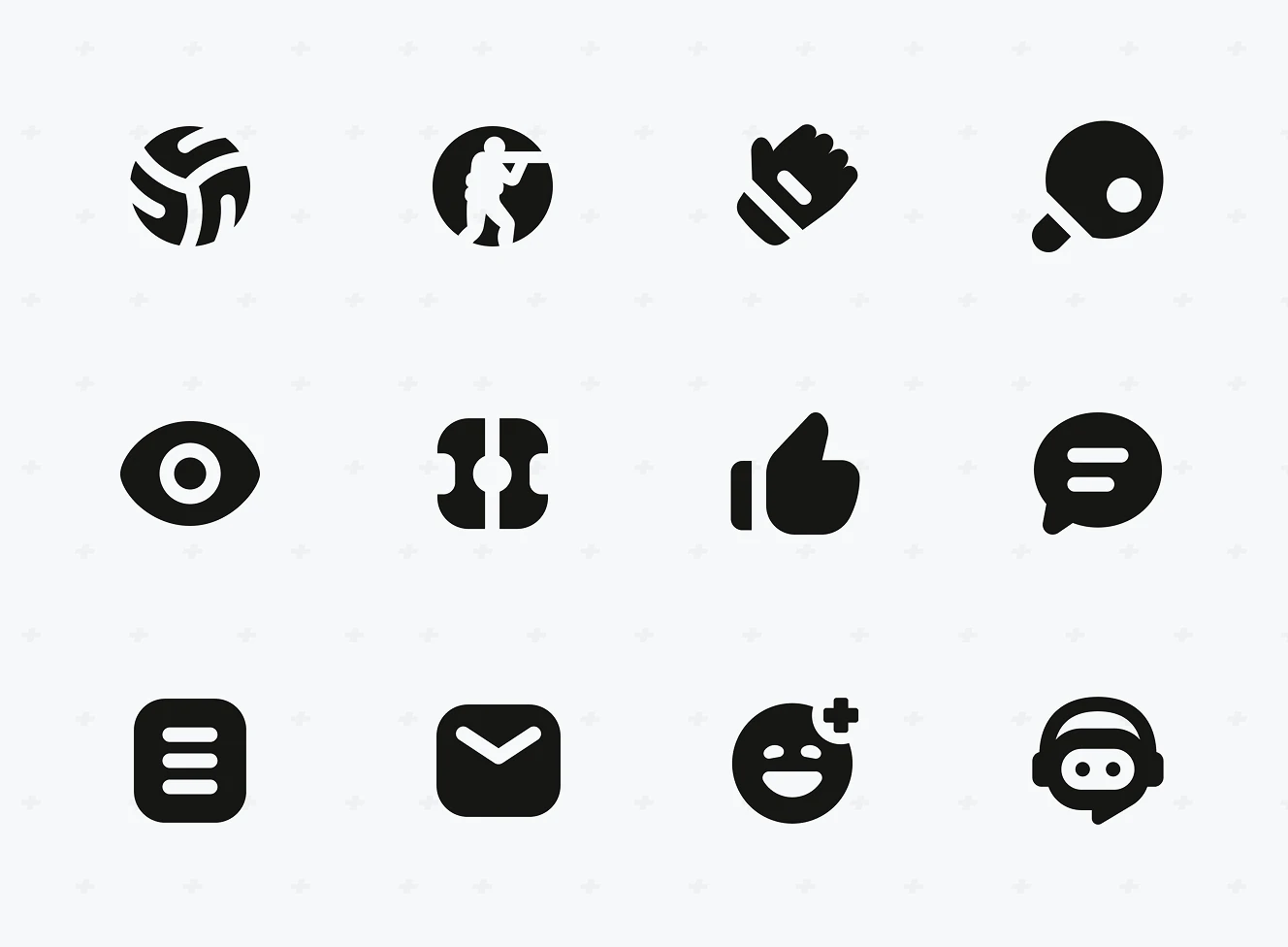
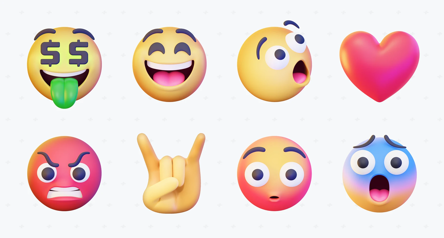
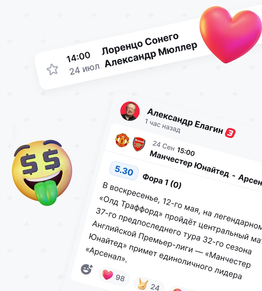
Icon library covering sport categories and interface actions – like, comment, filter, and chat – plus custom emoji reactions. Used across forecast posts and community feed interactions.


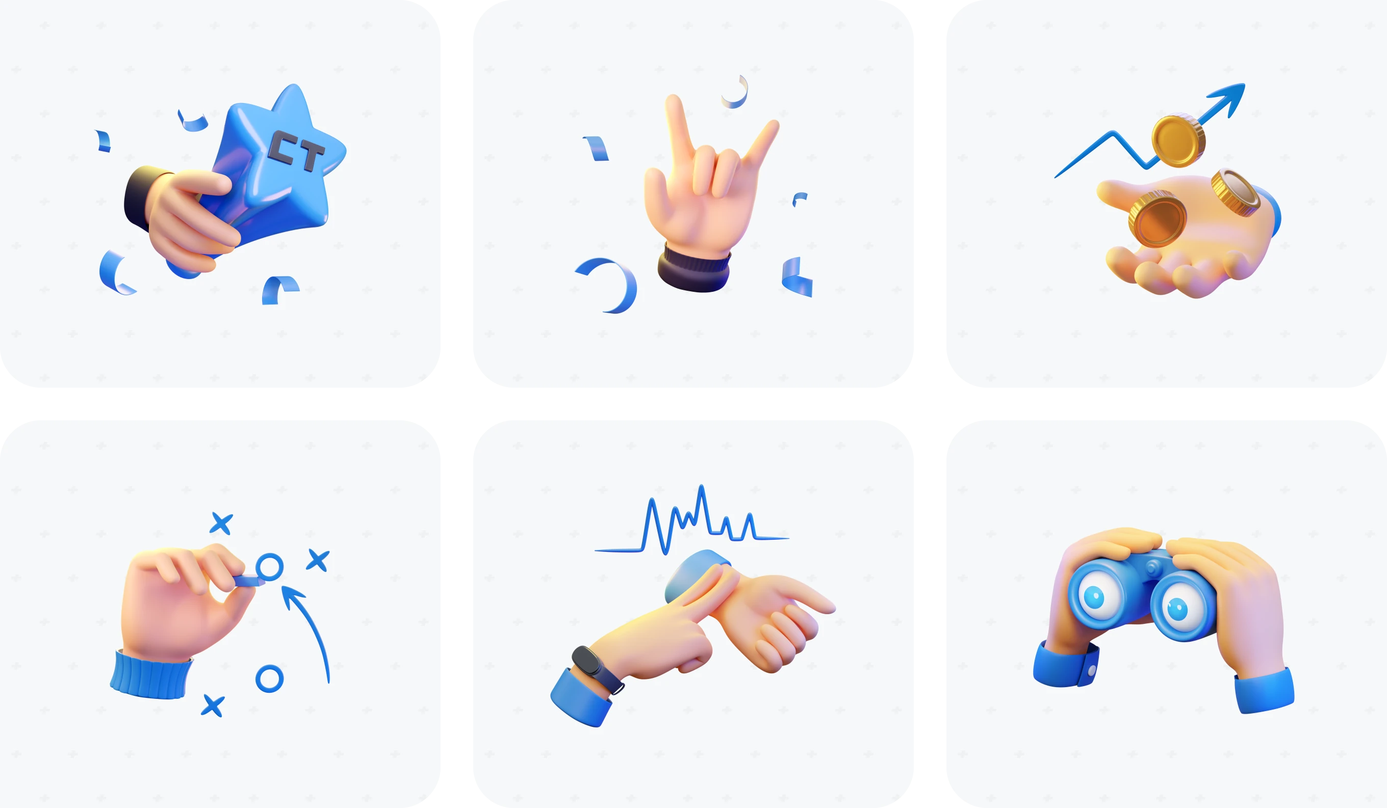
Six 3D hand illustrations for wins, growth, strategy, and community moments across the platform. Icons include a trophy hand, rising-coin gesture, and binoculars for match scouting.
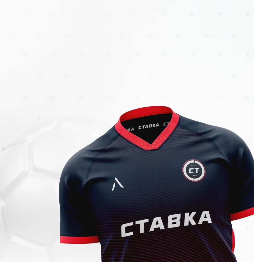
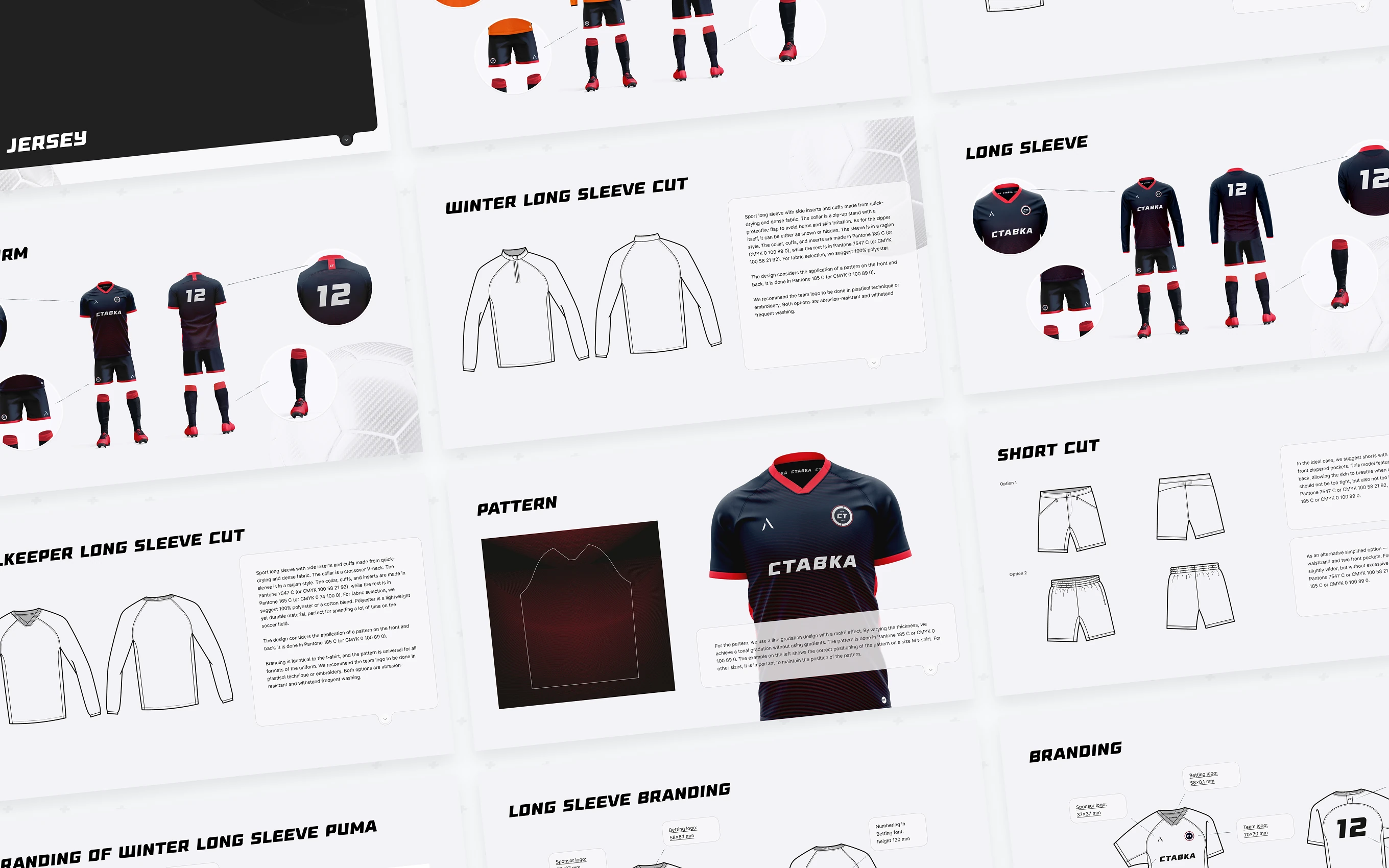
Football Kit Design files for teams sponsored by Stavka, detailed in the Stavka Football Uniform case. Technical flats set exact Pantone colors, fabric, and logo placement in millimetres.
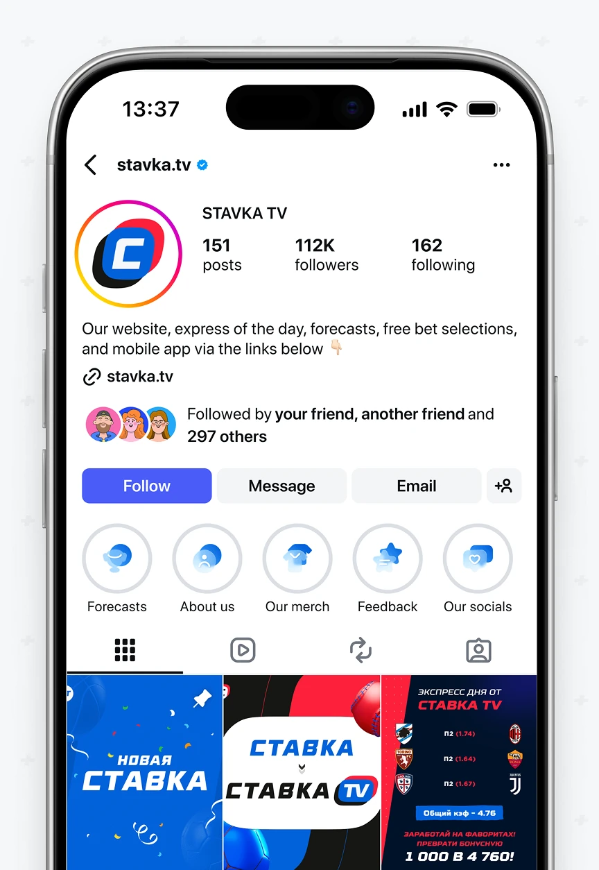
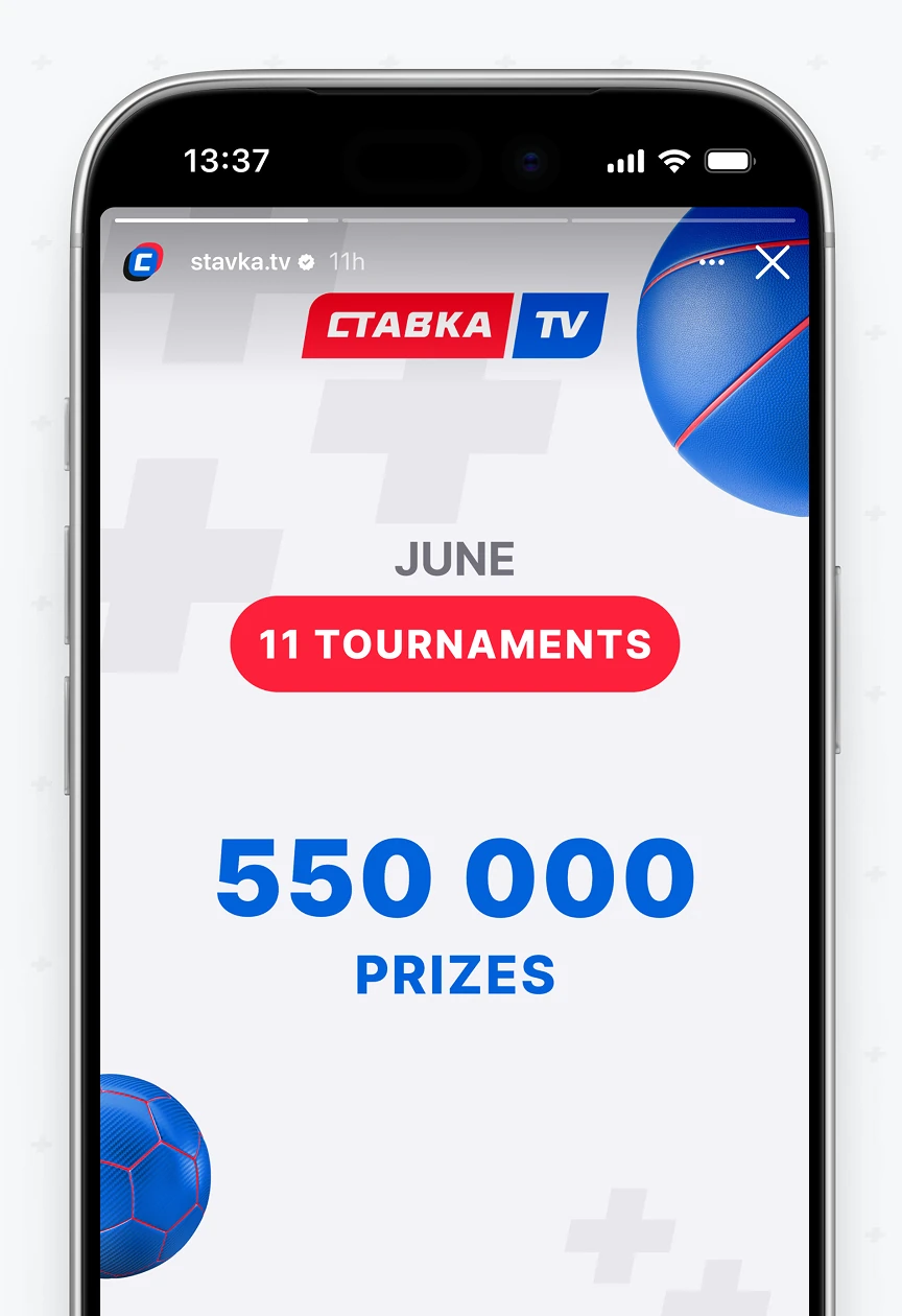
Social Media Design templates for Stavka's Instagram — profile page, feed post, and Story format. Includes bio link structure, highlight icons, and an "Exclusive" content tag.

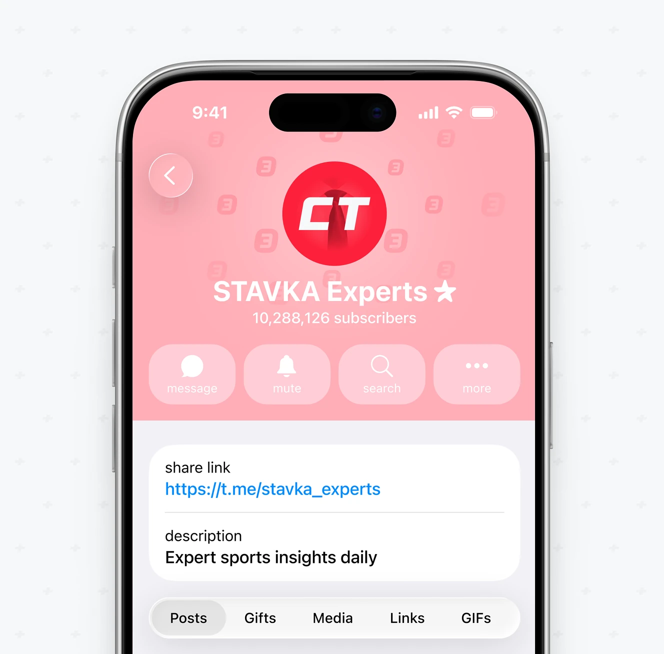
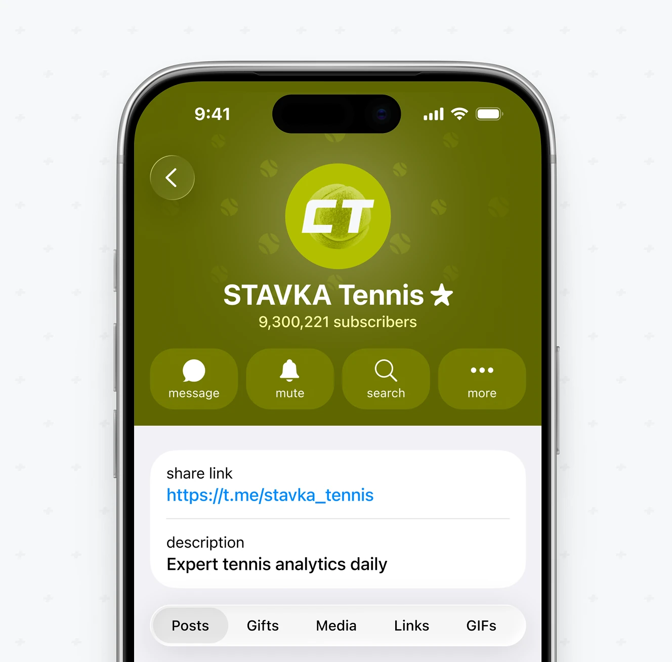
Telegram channel identity system for expert and tennis sub-brand communities, covering avatar, cover, and channel description. Each keeps the CT mark with its own accent color.
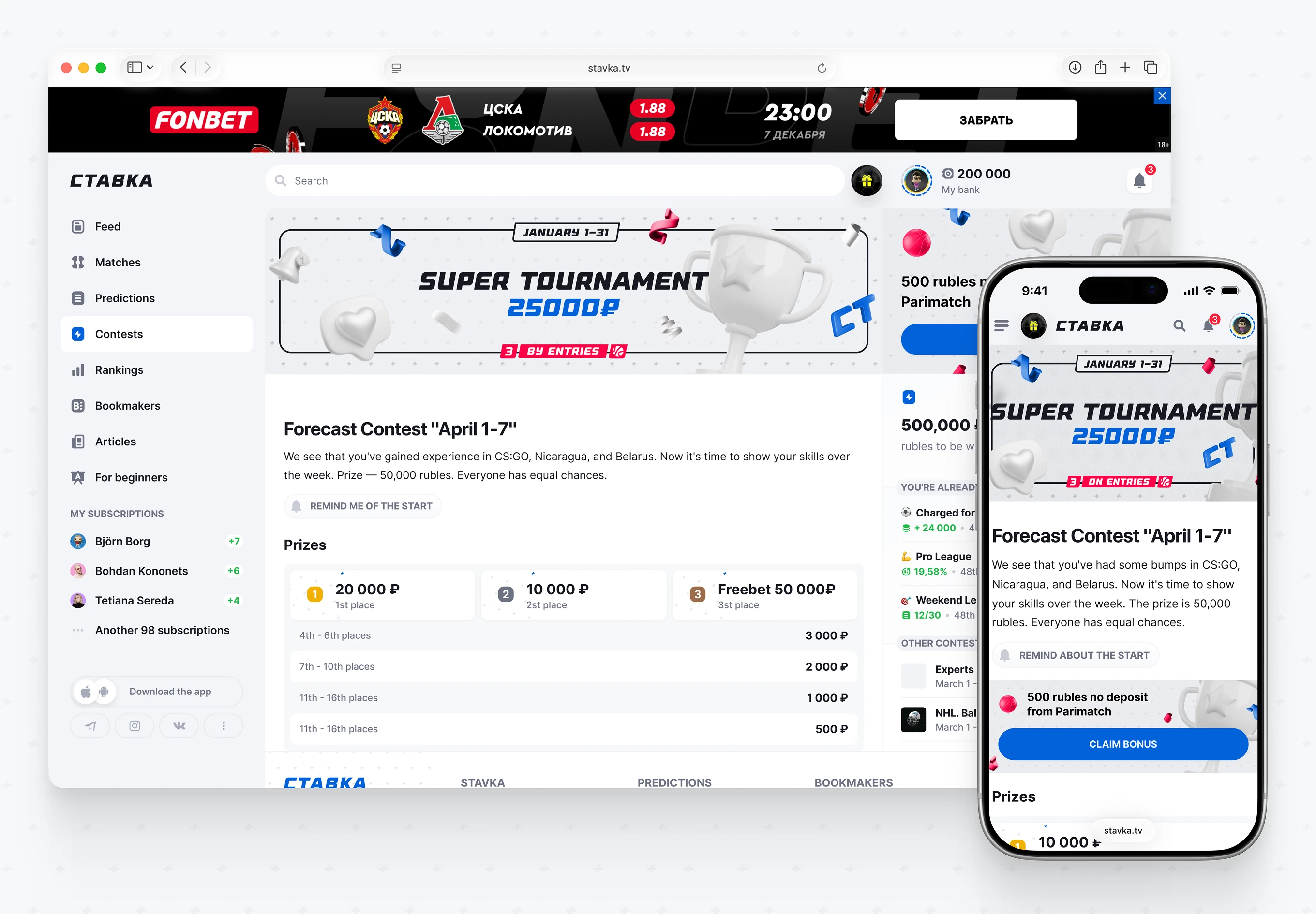
Promo banner set for Stavka's forecast contests, shown on both the web dashboard and mobile view. Each banner pairs a prize amount with an entry-based leaderboard mechanic.
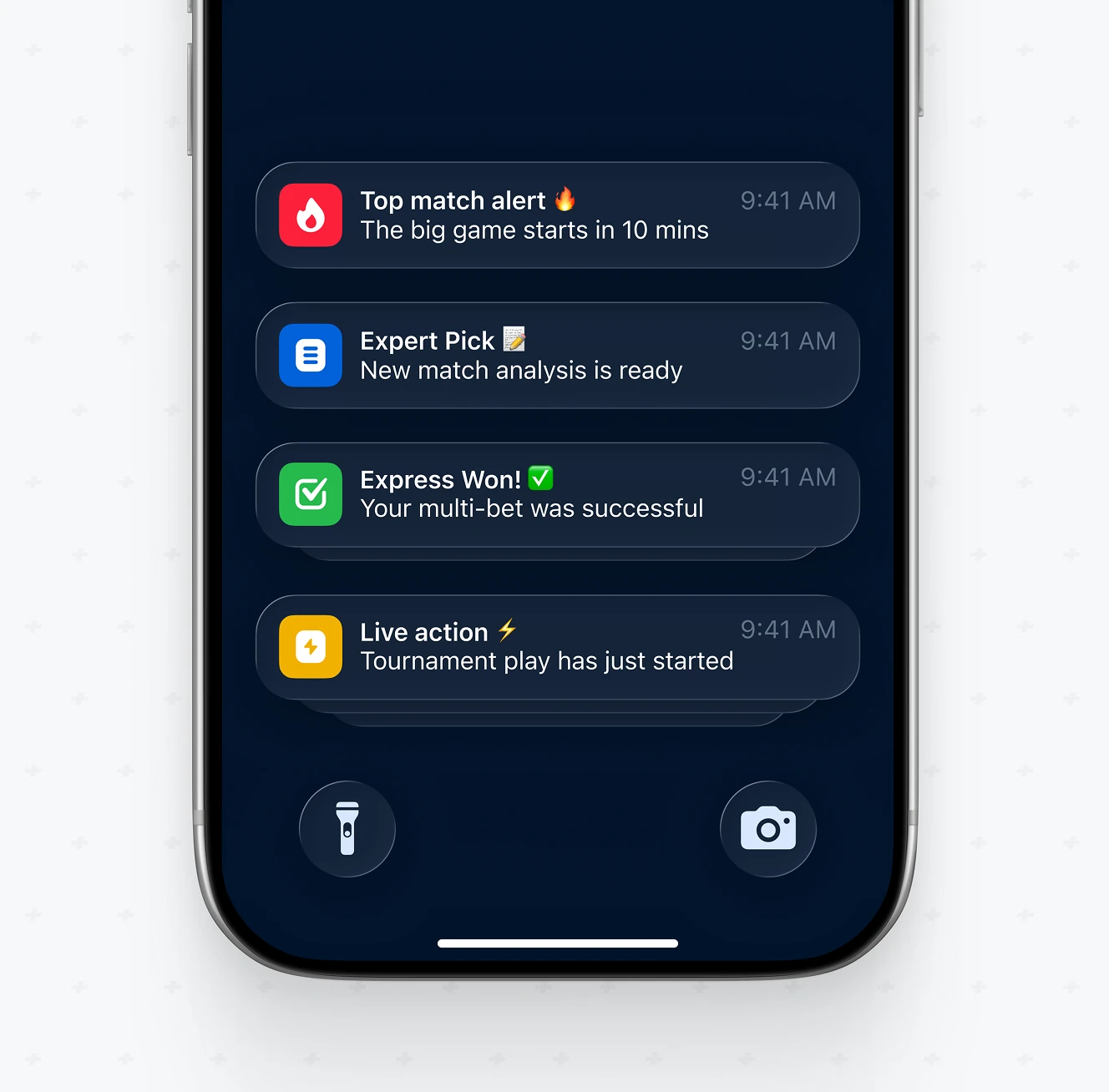
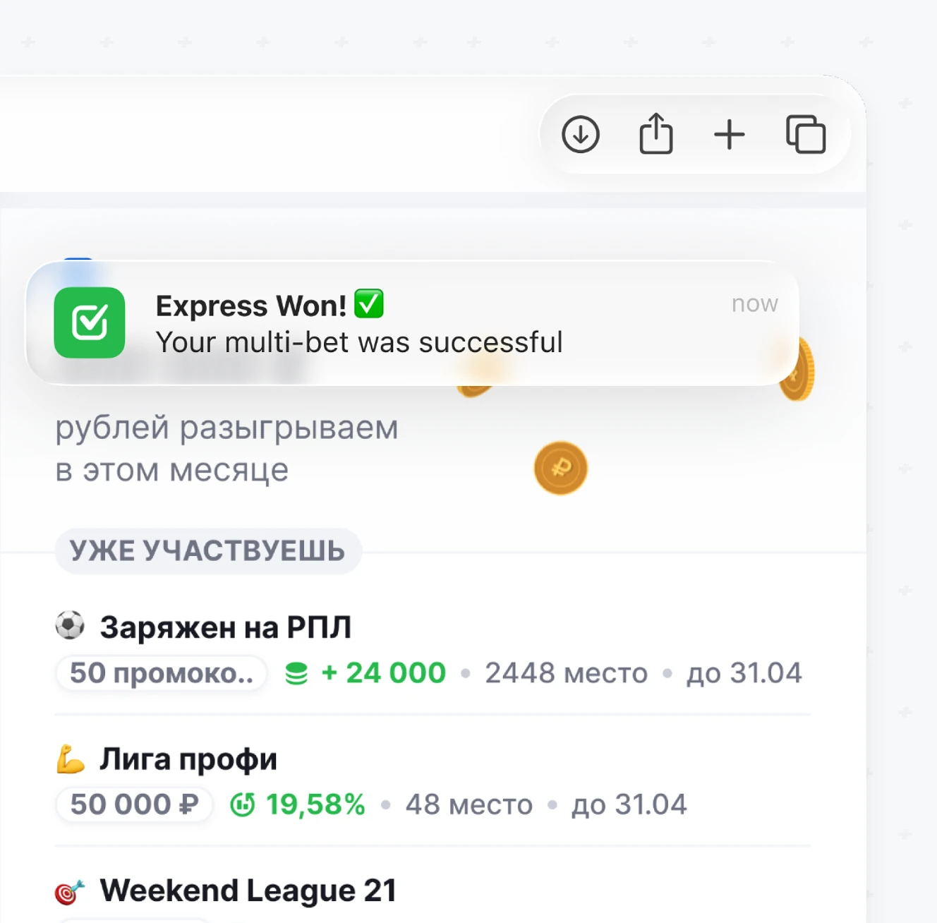
Four notification types for bettors – match alerts, expert picks, win confirmations, live action – shown on iOS lock screen and inside the web app. Same icon logic on both platforms.
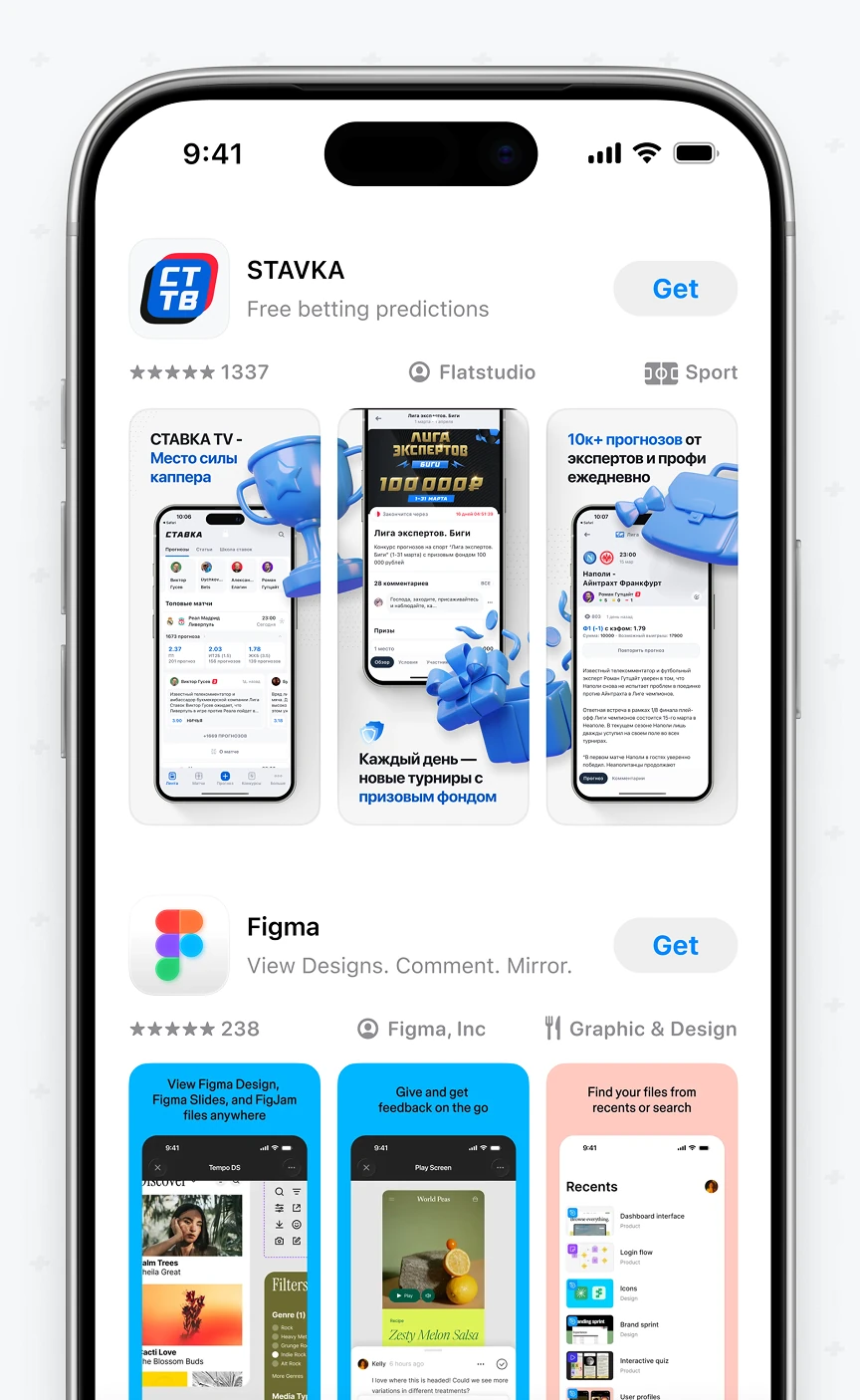
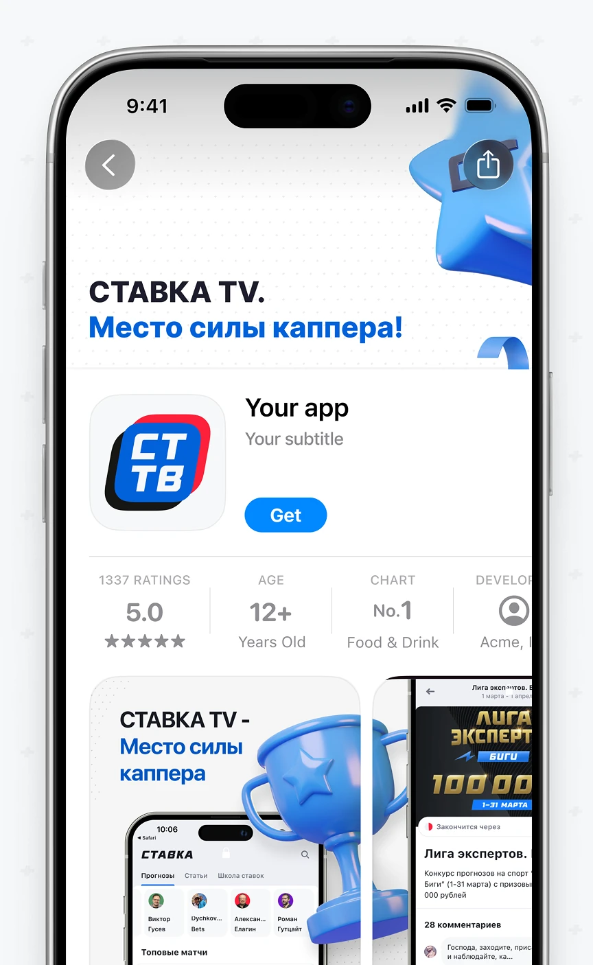
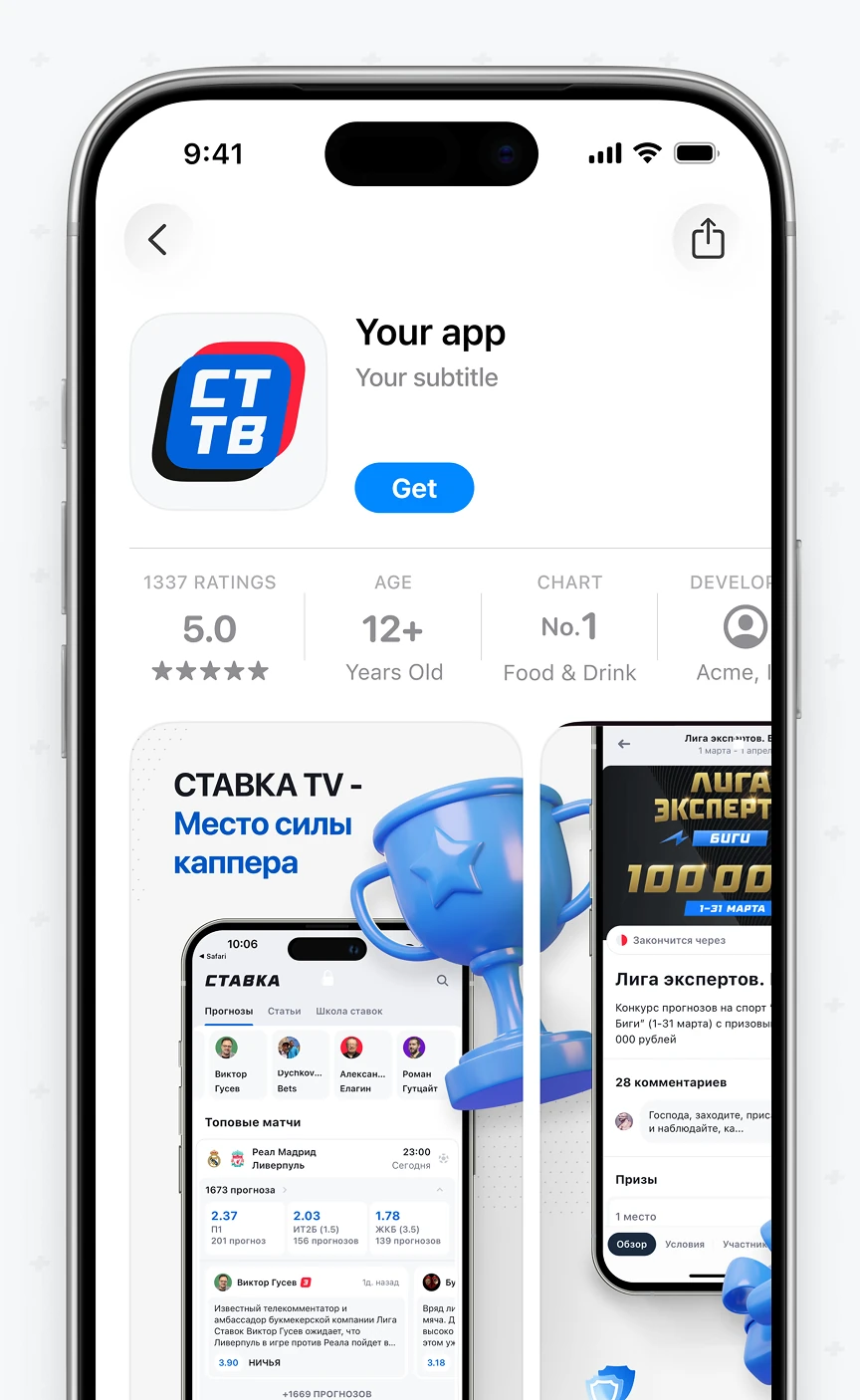
App Store screenshot set for the iOS listing, pairing the CT TV icon with a localized tagline and contest-banner previews. Screenshots translate the web contest banner format for the narrower store frame.
Co-Branding Guidelines applied to a partner promo banner across three live placements inside the Stavka iOS app — the Feed, Match Center, and an open match page. The orange badge and coin icon stay identical whether the bettor is browsing or reviewing one match.
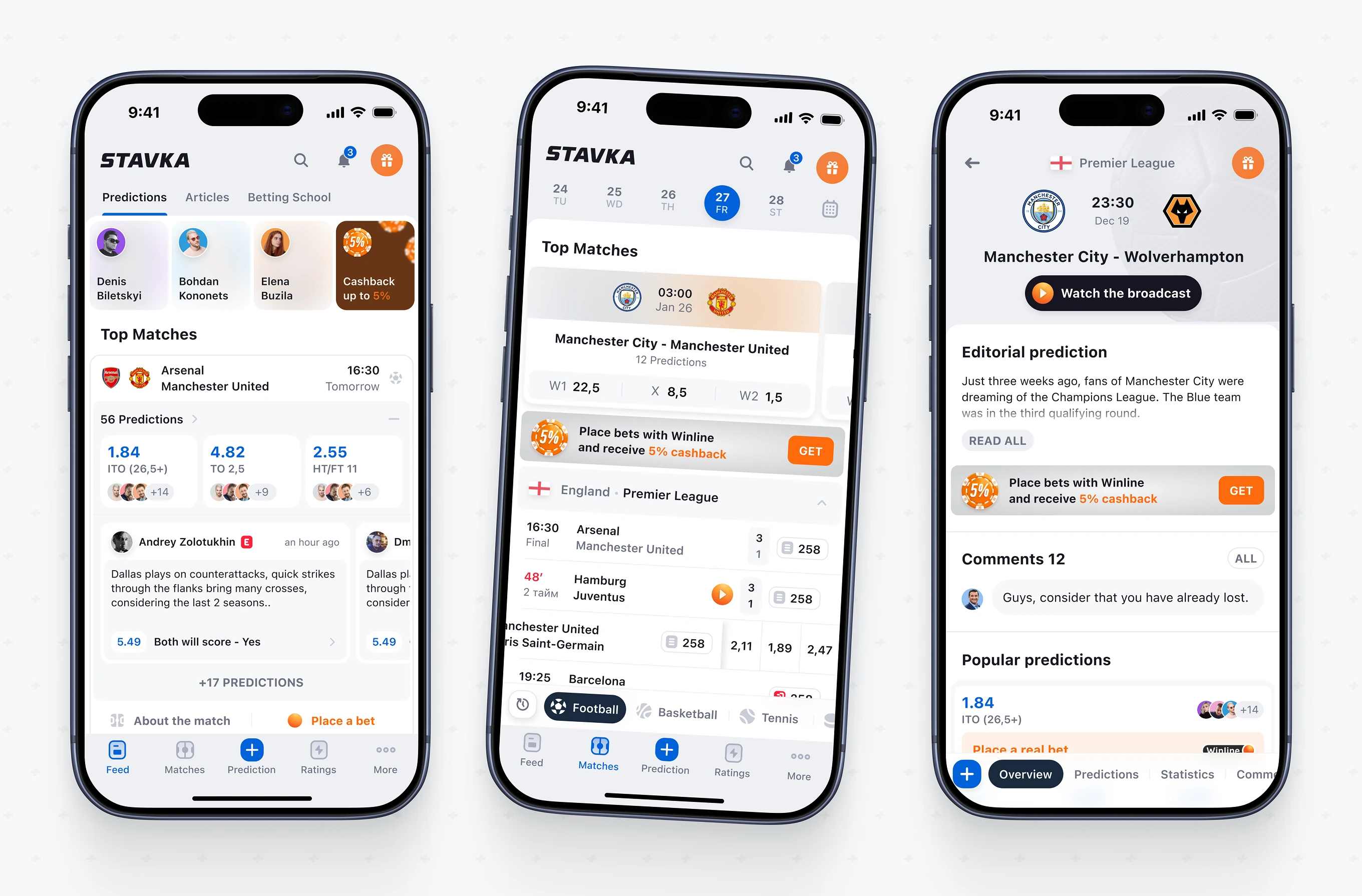
Flatstudio has built Stavka's sports betting brand identity for nine years – the Stavka BoldItalic typeface, a five-variant logo system, Football Kit Design files, and Co-Branding Guidelines extended into partner banners across the iOS app, Telegram channels, and the App Store.
The same 10° tilt shared by the logotype and the Stavka BoldItalic typeface runs through every touchpoint on this page – from jersey graphics to partner banners inside the app.
Nine years of Stavka's brand work maps across Flatstudio's full range of engagement models, from a single fixed-scope sprint to a dedicated long-term team.