





Fintech Onboarding UX: Why Users Drop Off Before KYC Even Starts





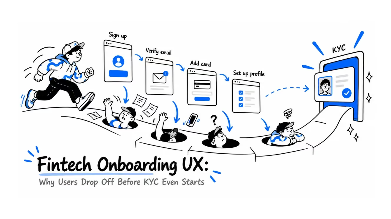
For fintech founders, product managers, and design leads whose onboarding analytics show a cliff where KYC begins.
Most fintech onboarding drop-off happens at registration and at the hand-off to third-party verification — before the KYC checks themselves begin. Fixing those two moments does more for completion than polishing the KYC flow itself. Here's the data and the patterns behind that claim.
"I saw it threw me to some website, so I closed it right away. I thought it was an error. Then I got distracted and never came back."
That's a real answer from a user interview we ran for a European bank. The man had downloaded the app, created an account, and reached identity verification. The product team had picked a verification provider, trusted it without thorough testing, and handed the step over. He left at the exact moment the app sent him to a third-party page that looked nothing like the product he had just started trusting — and worked poorly on top of it.
We've designed onboarding and verification flows for regulated products where KYC is a legal requirement, from licensed betting platforms like Parimatch, BoxBet, and PepperMill to banking apps in the EU. The same pattern shows up everywhere, and it took us years of funnel data and interviews to say it out loud:
By the time a user reaches your KYC flow, most of the damage is already done. The drop-off you blame on document upload usually starts two screens earlier, at registration, and at every point where the product stops looking like itself.
This article is about those earlier moments. What to ask at sign-up and what to save for later. What happened when we redesigned a bank's verification step around its own interface instead of a third-party redirect (short version: drop-off at this step fell from 48% to 30%). And what your product should do during the awkward hours while a verification provider is still deciding.
TL;DR:
- Ask for the minimum at registration: a social login or email + phone, name, and date of birth for the age check. Across the products we've worked on — fintech, iGaming, SaaS, regulated platforms — every unnecessary field at this stage adds 2–6% to drop-off on top of everything else, depending on the product type, the campaign, and where that traffic came from.
- Treat the rest of KYC as a key that unlocks features, requested at the moment a user needs them. People share data to get something specific, never to get through a door.
- Keep verification inside your interface. When we redesigned a bank's verification step around its own design — embedding the flow, rewriting the microcopy, fixing the error and support states — drop-off fell from 48% to 30%.
- While verification is pending, the product must say so on every screen. A silent "why doesn't this work" state loses users you already paid to verify.
Where Fintech Onboarding Actually Loses Users
Open the analytics of almost any fintech product and you'll find the steepest cliff at registration, long before a single document is requested. The industry keeps quoting KYC drop-off numbers, and they're real: Signicat's Battle to Onboard report puts financial application abandonment at 68% of consumers, up from 63% in the previous edition. But in the funnels we've worked with, the quiet killer is the sign-up form that asks for an address, employment status, and a tax number from someone who hasn't seen one screen of the actual product.
Think about how people plan a trip. Nobody applies for a visa first and picks the country afterwards. You browse, you read, you decide you want to go, and only then does the paperwork feel worth it. A fintech app that front-loads its data collection is asking for the visa before showing the country.
Our rule for the registration step is short: a social login, or an email and phone number with code confirmation, plus a name and date of birth. The date of birth isn't bureaucracy. For regulated products it's the age gate, the one check that genuinely decides whether this person can be a customer at all. Everything else can wait.

Wait until when? Until the data unlocks something the user already wants. A deposit limit raise. A withdrawal. Access to investing. At that moment the request has an obvious answer to "why do you need this," and completion rates reflect it. This also matches how regulators actually think: risk-based frameworks expect deeper checks as exposure grows, and a system of thresholds (a transaction limit reached, a feature requested) gives compliance a cleaner structure than one giant interrogation at the door. The cost of ignoring this is measured: in Signicat's research, the amount of personal information required is one of the top three reasons people abandon financial applications, named by 21% of those who quit.
There's one exception worth naming. A user arriving on a strong recommendation, from a friend or someone they trust, will push through almost any form. We've watched this in interviews: motivation borrowed from a trusted person survives friction that would kill a cold sign-up. The trouble is that product teams test on themselves and on motivated early users, then wonder why the same flow collapses with paid traffic.
There's a number that rarely appears in single-product analytics because you can only see it when you've worked across many products in many verticals. Across fintech, iGaming, SaaS, and regulated platforms we've designed for, every unnecessary field added to a registration form contributes an additional 2–6% drop-off on its own — on top of everything else. The exact figure shifts with the product type, the campaign that brought the user, and how warm that traffic is. Cold paid traffic punishes long forms far harder than a referral from a trusted friend. In-house design teams rarely have this visibility because they live inside one product. We work across industries, and the patterns compound into something different: data that doesn't exist inside any single company's analytics.
And the fashionable opposite deserves a separate warning: the quiz-style onboarding with 38 questions and a progress bar promising "67% left until your perfect plan." We've tested this pattern in other products we've worked on, outside finance, and the results were catastrophic. Completion collapsed, and worse, the funnel data became almost unreadable: when most users quit somewhere inside a 38-step quiz, you can no longer tell which question killed them or what the product itself converts at. The pattern keeps spreading because everyone copies it from each other's onboarding, never from each other's analytics.
Embedded vs Redirected Verification: What Our Data Shows
The user from the opening of this article turned out to be the majority.
On a banking project in Europe, the client had chosen a verification provider and handed the step over without thorough testing. Drop-off was high, users were leaving, and the team couldn't pinpoint why. When we came in, we traced the problem: the provider's flow performed poorly and looked nothing like the rest of the product — a different visual language, different interaction patterns, a jarring transition right at the moment users were being asked to hand over their passport. We rebuilt the verification step around the bank's own design system, rewrote the microcopy, fixed the error states, and added support directly on the capture screen. Same provider underneath. Same checks, same requirements, same regulator. What changed was everything the user actually saw and touched.

This wasn't a one-bank fluke. User verification isn't only a fintech problem: we've designed KYC flows for licensed betting platforms too, where age and identity need confirming before someone can place a bet. The pattern holds with striking consistency across industries: verification providers embedded inside the product itself, without a tab switch or an external domain, finish better than the ones that redirect or simply look different from the rest of the product. A provider's slightly off design reads as a minor detail to a team that only ever sees one product. Watch the same pattern repeat across fintech, betting, and SaaS, and it stops being a detail and becomes a rule.
A common objection here is that the visual gap is small. A slightly different font, slightly different buttons — something only a designer would consciously register. Our interviews say otherwise. Users feel the shift even when they can't name it. They won't tell you the type scale changed. They'll tell you "something felt off" — or, like the man from the opening, simply decide it's an error and close the tab. He told us he couldn't be bothered to figure out why he'd been thrown somewhere else, and that reaction is the realistic one. Nobody owes your product the effort of investigating an unexpected redirect, least of all on the screen where they're holding their passport.
On the old flow, 48% of users never completed the check. We expected the rebuild to cut that by about a third. It dropped to 30%, and that 30% is measured across the bank's full audience, including the least digitally confident users — the people most onboarding optimizations quietly exclude. Of everything we changed, moving the flow out of the third-party redirect was the single biggest lever; the microcopy and support fixes accounted for the rest.
There's a wider point hiding in this. Verification is one of the few steps every user must pass, including people who aren't fluent in the digital world and use a banking app because their world left them no other option. They don't have the pattern library in their head that tells a product designer "this is just an SDK handoff, it's fine." Verification design should be built around the users who struggle the most. If the process is clear to them, it will be clear to everyone.
It's worth being precise about what this result does and doesn't mean. It doesn't mean redirects can never work, and it's one project, not a meta-study. What it does show is the size of the lever. Teams negotiate with verification providers about pricing, accuracy, and processing speed, then accept the default screens as a given. In our case those default screens were worth more lost users than every other onboarding problem combined.
How far you can take this adaptation varies a lot from provider to provider, from full embedded SDKs down to a logo swap on someone else's page. That range is exactly why customization depth belongs on the provider comparison sheet next to price and approval rates, and it's where the next section starts.
How Do You Design the Document and Selfie Step in Identity Verification?
This is the screen where most identity verification fails, and a lot of those failures have nothing to do with the user.
Provider choice constrains everything you design afterwards. Teams compare verification vendors on price, approval rates, and region coverage, but two things rarely make the list and should: how deeply you can adapt the flow into your own interface, and which devices the provider actually supports. We've worked with Incode, Sumsub, Onfido, and Ondato, and their behavior across phones is not identical. We've seen the camera capture a document crooked even on an iPhone, not just on older cheap Androids. Check the supported-device list against the phones your audience really uses, not the ones on your design team's desks.
Two capture-screen patterns have saved us repeatedly.
Put support directly on the capture screen, and open the chat only after the user uploads a screenshot of what they're seeing. The screenshot alone usually reveals the problem, which is most often the camera misbehaving inside the provider's SDK rather than user error. With it, the conversation starts at the answer instead of spending five messages establishing what's on screen.
On the selfie step, choose passive liveness. One banking client came to us with users stuck at exactly this point; as part of a product audit, we traced it and recommended switching away from active liveness.
These are real-world numbers from an Innovatrics production deployment: active liveness completed in about 13 seconds on average, passive in about 1.
For the users who struggle most, removing the performance removes a real barrier. If your liveness check is where the funnel bleeds, that's what a focused product audit is built to find.
What Should Happen While Verification Is Pending?
Verification is rarely instant. A document goes off for checking, a human review kicks in, and the user is left in a gap of minutes or hours where the account half-works. Most products handle this badly, and it costs them users they've already paid to acquire and verify.
Two mistakes are common here.
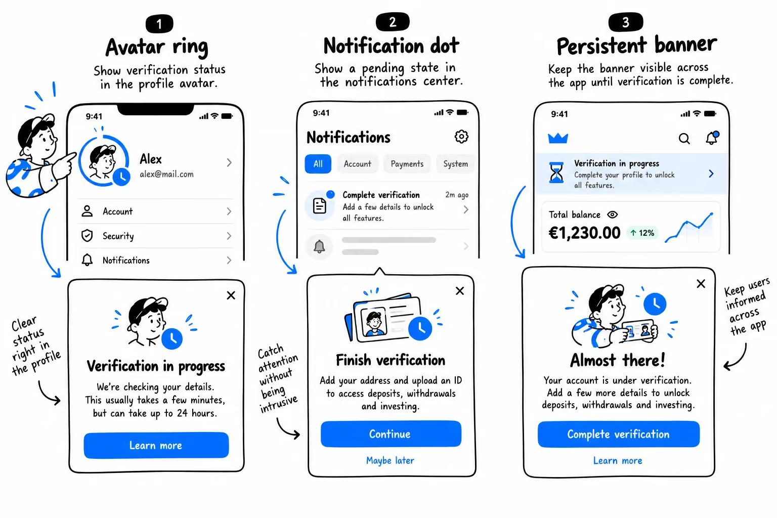
The first is hiding the pending state. The user finishes uploading, lands back in the app, and some features work while others don't, with no explanation. They tap something, nothing happens, and they assume the product is broken. The fix is to mark the pending state on every screen where it's relevant, not just on a status page nobody opens. A ring around the avatar, a dot over the profile or menu icon, a small persistent banner — any of these work. The condition: tapping it opens a tooltip or modal that explains what's happening. Your documents are under review, here's what you can do meanwhile, here's roughly how long it takes. The indicator stops the "why doesn't this work" moment before it starts.
The second mistake is the opposite of hiding: pretending the check already passed. Optimistic interfaces, which show success immediately while the server is still working, are fine for a like or a comment. In compliance they're dangerous. If the app waves the user through and the background check later fails, the interface has to yank everything back. That reversal reads as a serious malfunction in a product holding someone's money. Worse, users often have to re-enter data the rollback discarded. Show the real state, cache everything the user typed, and let them review before committing rather than faking a result you might have to undo.
There's a subtler point about speed. Modern providers can verify a document and a face in a fraction of a second, but on high-stakes actions, opening an investment account, moving a large sum, an instant approval can unsettle people rather than reassure them. They expect something that serious to involve real checking. Showing the steps as they happen, reading the document, checking the security features, matching the photo, does more than fill the wait; it makes the work visible and the result feel earned. Harvard researchers call this the labor illusion: people trust and value a result more when they can see the effort behind it, even at the cost of a longer wait.
Risk-Based KYC: Ask When It Matters
The mechanism behind "ask less at the door" is a system of thresholds, often called progressive KYC: collect the minimum for first access, then trigger deeper checks when the user crosses a defined line — accumulated transactions, a withdrawal request, thirty days of activity. Compliance gets every check it needs; the user meets each one at a moment when refusing would cost them something they already want.
Every sensitive request also needs a reason the user can read, shown before the OS dialog fires. A camera permission that just appears feels like surveillance; the same permission behind one human sentence — "we ask for your location to protect your money from fraudulent transactions outside your country" — reads as the product doing its job.
And one group deserves its own article: face recognition rejects people with disabilities more often, and the standard fallback of "upload your passport instead" fails the same people — hands that shake too much for a selfie shake too much for a document photo. A real fallback works on different principles: screen-reader guidance or manual review. With the European Accessibility Act now in force, this is a legal requirement, and we'll cover it separately.
Onboarding is where fintech products win or lose users they've already paid for, and most of the fixes above are design decisions, not engineering projects. We design fintech products for regulated markets across Europe and the US, and if you want to know exactly where your own funnel leaks, a product audit is the fastest way to find out

Frequently Asked Questions
What is KYC in fintech onboarding?
KYC (Know Your Customer) is the identity verification that regulated financial products must run before giving a user full access – typically an ID document, a selfie or liveness check, and screening against sanctions and risk lists. In onboarding terms, it's the step between creating an account and actually using the product, and it's where most fintech funnels lose the largest share of users.
How long does KYC verification take?
Automated checks usually complete in seconds to a few minutes; cases routed to manual review can take hours or a few days. From a design perspective, the duration matters less than what the product does during it: show the pending state on every relevant screen, explain what the user can do meanwhile, and give a realistic time estimate.
Why do users abandon KYC verification?
In our project data, the two biggest causes sit outside the KYC flow itself: registration forms that demand too much before the user has seen the product, and verification screens that don't look like the product, which users read as an error or a scam. Camera and device issues inside the provider's SDK come third.
What is a good KYC completion rate?
Industry abandonment figures range from roughly 25% to over 60%, so context matters more than a universal benchmark. On our banking project, redesigning the verification step around the product's own interface moved drop-off from 48% to 30%. Track completion per step, not just overall, to see where yours actually leaks.
Should identity verification be embedded or redirected?
Embedded. When verification looks and behaves like the rest of the product, users don't face the "why was I thrown to some website" moment. On a banking app, moving out of the third-party redirect was the biggest single lever in a step redesign that cut drop-off from 48% to 30% – same provider and same checks underneath.
When should a fintech app ask for KYC documents?
At the moment the user needs something the check unlocks: a deposit limit, a withdrawal, access to investing. Registration should collect only a login method, name, and date of birth for the age check. Risk-based thresholds let compliance run every required check without putting them all at the front door.
