





Coded Prototypes: Why Static Design Is No Longer Enough





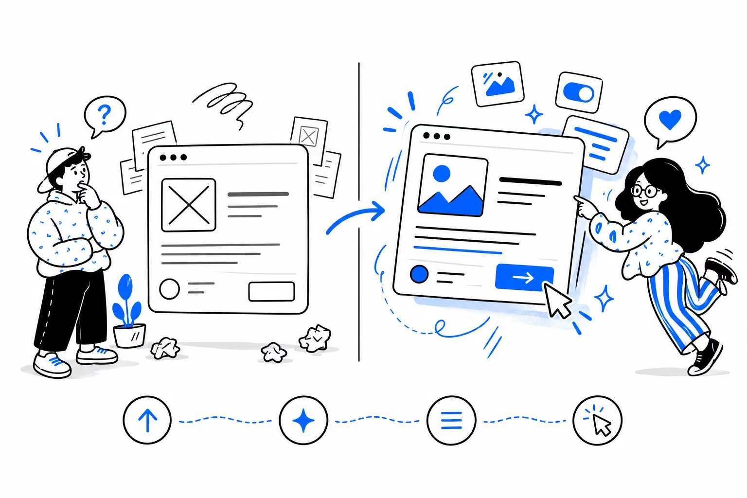
Static design shows what an interface looks like. Coded prototypes let us test how it behaves under real conditions.
Written for product designers, founders, and tech leads deciding what to prototype in code versus what to keep in Figma – and for founders looking for a team that can take a complex product from idea to a working MVP fast, combining hands-on product experience with AI-assisted prototyping.
In a traditional static design process, a designer could only say: "I think this interaction will work." The mockup looked right. The transition was described in an annotation. The hover state existed as a second frame. Everyone imagined the rest.
Now we can say something different: "Here it is. Try it."
That shift sounds like a productivity story – design faster, ship faster. The real change runs deeper than build speed: coded prototypes change what can be designed and tested at all.
TL;DR
- Design tools can represent intended behavior – and Figma simulates plenty of it. Code lets us push the simulation further: real content, real browser constraints, responsive conditions, and interaction logic that's hard to represent convincingly in a design tool. Those decisions used to be made blind – now we test them before committing.
- We benchmarked it on five real interaction tasks: logged hours hand-building them versus rebuilding the same set with agent-assisted coding tools. Across that set, the coded workflow was roughly 10× faster – 18 hours by hand against under two hours agent-assisted. The full table is in the article.
- The real gain is exploration rather than speed: the cost difference is large enough that testing several interaction alternatives becomes practical within the time it previously took to build one – and we run the same brief through generation several times to compare different UX solutions for the same page before committing.
- Don't take our word for it. The prototypes are embedded in this article – try them.
What Is a Coded Prototype?
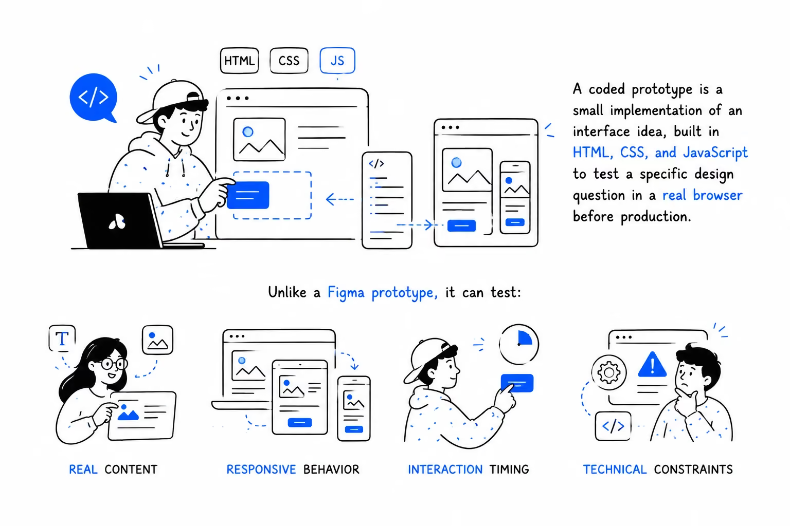
A coded prototype is a small implementation of an interface idea, built in HTML, CSS, and JavaScript to test a specific design question in a real browser before production. Unlike a Figma prototype, it can test real content, responsive behavior, interaction timing, and technical constraints.
The rest of this article explains when and why we use them – and lets you try the results.
What Static Design Shows – and What It Hides
A Figma file is very good at answering some questions. Layout, typography, color, visual hierarchy, component anatomy – static design represents all of this faithfully. And Figma can simulate many interactions: transitions, overlays, hovers, scroll behavior. Nothing in this article argues otherwise.
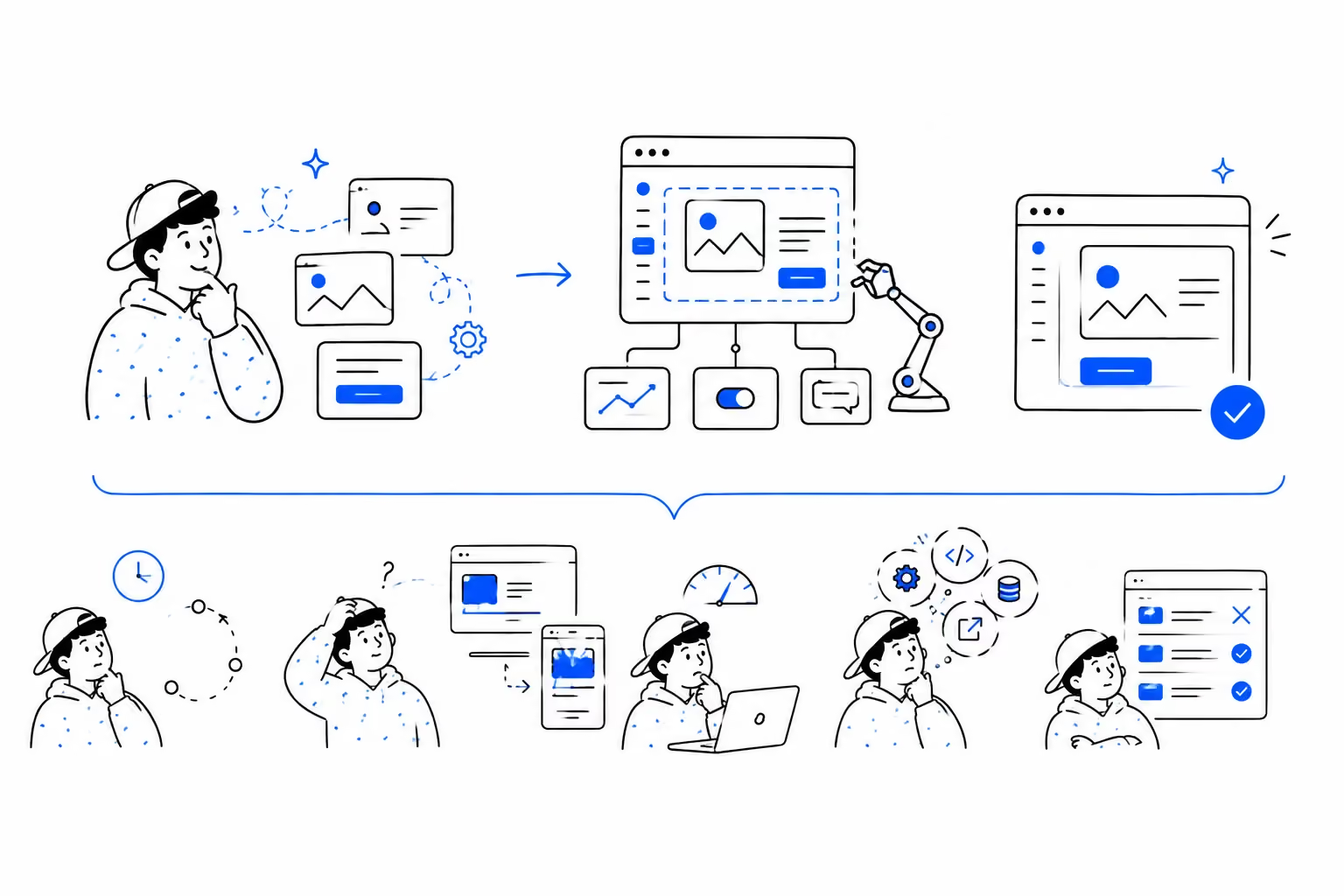
But an interface is more than a picture – it's a system of behaviors. Figma can represent many of those behaviors – the difference is how far that simulation can go before it stops behaving like the real interface. Questions the representation struggles to answer convincingly:
- What happens in the 200 milliseconds after the click?
- Does the modal's transition communicate hierarchy, or just decorate it?
- How does the layout behave with real content – long names, empty states, a slow connection?
- Does the interaction still work when the viewport changes?
- What does "feels fast" actually mean in a real browser?
In a traditional workflow, these questions often get answered during implementation – which means they get answered late, after many of the earlier design decisions have already been made, at the moment when changing the answer is most expensive.
From Representation to Simulation
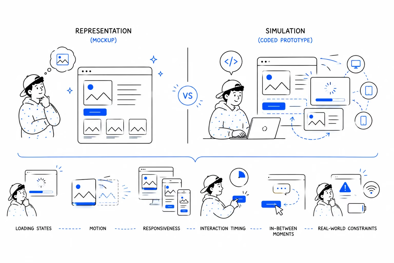
The definition above hides the distinction that matters: a mockup is a representation of the product. A coded prototype is a simulation of it. A representation shows what the product might look like. A simulation lets you experience a version of how it will behave – loading states, motion, responsiveness, interaction timing, and all the unglamorous in-between moments where interfaces actually succeed or fail.
One boundary from the previous article in this series holds here in reverse. There, code helped us verify we understood a conversation correctly. Here, code does something more ambitious: it explores what the interface itself can become.
Prototype the Question, Not the Screen
We prototype because we have a question, never because a screen is unfinished.
Can this navigation collapse without losing hierarchy? Can this interaction communicate state without another label? Can this visual system handle 3,000 different team logos? Can the same UX survive at 360px and 1440px?
A good prototype answers one of these questions. If we don't know what we're trying to learn, we're probably just building a demo.
One Brief, Several Interfaces
The exploration starts earlier than interaction prototyping – at the brief itself.
A structured brief can go straight into visualization: working wireframes, with hovers and animations already behaving. No translation step between "what we agreed" and "what we can look at."
But the more interesting move is this: we run the same brief through generation several times. Each run produces a different UX interpretation of the same requirements – a different structure for the page, a different logic for the feature. We then edit the variants directly, put them side by side, and compare actual UX solutions instead of debating hypothetical ones.
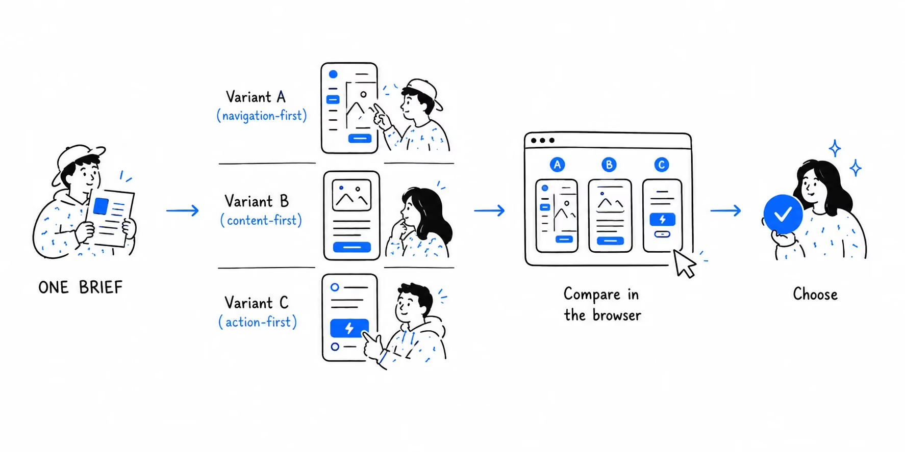
The same principle applies to interaction decisions. Instead of committing to one transition, loading behavior, or navigation pattern, we can generate several working interpretations and compare them in the browser – which is exactly how the interaction language of our own website was chosen (more on that below).
The biggest change: we can afford to produce several prototypes, not just produce one faster. The cost of a wrong direction falls because the cost of exploring alternatives falls first. Design stops being one interpretation defended in critique, and becomes an exploration of a solution space – where the best solution wins a comparison, not an argument.
The same environment covers responsive behavior: blocks, features, and whole pages get tested across viewports while they're still hypotheses – not after the design is committed.
What We Actually Prototype
At this stage we prototype the parts where behavior is the design, never whole products:
- Interaction – does this hover communicate the right hierarchy? Live demo: Boxbet logo hover
- Motion – does this transition feel immediate, deliberate, or distracting? Live demo: Bookmaker.XYZ balance animation
- Interaction behavior – how should elements respond to scroll speed and touch? Live demo: Boxbet dynamic banner
- Waiting – what does the system say while it works? Live demo: StatKing icon loading
- System behavior – can this idea scale from one asset to thousands? Live demo on CodePen
- Responsive – does the same UX survive at 360px with real content? Tested on every project in this article, from the eFootball concept to our own site
- Complex behavior – does search, filtering, or navigation still make sense when the state changes? Too big for a pen – the Teamtopia case below is exactly this question at system scale
Each demo reads as evidence rather than decoration, on one pattern: the question → the prototype → the decision. The Boxbet banner answered how a banner should change with scroll speed – and how its glow should bleed into the site background. The balance animation answered what loading a user's balance should feel like. The StatKing mark answered how a logo becomes a loading state for a page or feature. The Oddible transformation answered whether 3,000+ logos could adapt to the interface automatically.
Four of these demos also share one production decision worth naming: in each case the client asked to see how an animation could look – and instead of producing a reference video in After Effects, we built the answer directly in code. The saving is double: the exploration is faster, and the approved version is already implementable behavior rather than a video someone still has to translate into code.
Sometimes one coded feature answers more questions than thirty Figma screens – because the thirty screens show variants of a picture, and the one feature shows the actual behavior under actual conditions.
10× Faster – But Faster at What?
We didn't want to argue this from a feeling, so we tested five real interaction tasks rather than comparing whole projects: we logged the hours spent hand-building each one for our CodePen collection, then rebuilt the same set with agent-assisted coding tools, and compared the totals.
Benchmark note: 10× refers only to the five tested interaction tasks and compares our hand-built workflow with agent-assisted coding. It is a task-level measurement, never a benchmark for overall design or development speed.
Across this set, the agent-assisted workflow was roughly 10× faster. Depending on the question, we use tools such as Figma Make, Claude Code, Codex, and Lovable – but the tool is secondary to the workflow. This is close to what the industry now calls vibe coding – though our use of agent-assisted coding is more constrained: we generate to explore specific design questions, never to replace product or engineering judgment.
Here's why the number matters less than what it buys. Faster at producing one hover is a nice saving. But the difference is large enough that testing several alternatives becomes economically practical instead of exceptional – several variants fit within the time it previously took to build one.
Before, a designer proposed a modal transition, everyone imagined it, and it went to production – where reality delivered its verdict late. Now we can build multiple variants of the transition, put them in a real browser, feel the difference, and commit to the one that survives comparison. The decision quality changes, not just the delivery date.
This is the same principle that runs through this whole series: the time AI saves shouldn't be pocketed as margin – it should be reinvested as scope. In research, that means investigating more sources. Here, the thesis in one line: AI makes more interaction alternatives economically testable – not just faster to build.
We Prototyped the Process on Our Own Product
Before using this workflow on client products, we tested it on our own.
We took our internal eFootball concept – a large product model covering club management, tactics, matchmaking, live match events, player contracts, and an in-game shop – and used it as a test case for AI-assisted prototyping. Building the concept was only half the goal. We were testing the method itself: how source screens should be prepared before they enter an AI prototyping environment, what happens when assets carry multiple layers, blend modes, or effects, how responsive behavior should be defined, where generation saves time – and where it creates cleanup work instead.
What we tested: the full path from designed screens to a large animated prototype – how source screens should be prepared, how assets behave, how responsive rules translate, where generation saves time and where it creates cleanup work.
What broke: screens that looked perfectly acceptable in a design file produced broken results as a working prototype – overlapping image effects, incorrect sizing, misplaced assets, layouts that misbehaved when the viewport changed.
What we changed: some screens were rebuilt specifically for export – Andrei Zolotukhin maintained a separate file for exactly this: effects flattened, images re-exported at the correct proportions and sizes, responsive relationships defined explicitly in the mockups. You wouldn't hand engineers a banner built from five layers with blend modes – code won't render those effects – so you flatten it into one asset. The same discipline applies here.
What we learned: the quality of the prototype depends heavily on the quality of the inputs. We started preparing design files almost like we were preparing them for developers – because the prototype was no longer just an image but an implementation. And the second half of the lesson: know what you want before you generate. File preparation and a clear question are what separate a fast workflow from a costly one. That experiment became the basis for the workflow we now apply to client projects.
Real Projects
Teamtopia – prototype the system, not just the screens. Much of Teamtopia's complexity lived in the head of one person. There wasn't time to document every relationship between entities, every state, every flow for adding, editing, and removing things – and because the product was still in discovery, any change could cascade through static designs.
Instead of documenting the entire system before building it, we built a detailed interactive prototype in Figma Make. The goal was to model enough of the system that the team could actually use it – rather than make every screen production-ready: move between flows, change states, create and edit entities, and see how one decision affected another. A prototype only has to model enough of the system to expose the important questions.
Using the prototype changed the design itself. Interaction decisions that were invisible in static screens surfaced – including an additional transition screen with a short pause when switching between product modes. Micro-interactions could be tested rather than described, and AI-assisted prototyping made dozens of them cheap to explore. Just as importantly, the prototype became the team's shared reference: instead of re-explaining how entities and flows connect, everyone could click through the system and feel it behave. What the same prototype revealed about the project's real scope is a story we told in the previous article of this series
Oddible – 3,000+ logos, one system. The problem: the app works with the client's base of more than 3,000 team logos – NHL, NBA, and beyond – and out of the box they clashed with the interface palette, looking like assets from a different product entirely. Recoloring thousands of logos by hand would have taken weeks; leaving them untouched would have kept them visually foreign. So we wrote the color transformation in code ourselves – by hand, before AI-assisted workflows – and showed the client a working example: the system adjusts the tonal value of each logo programmatically. The solution is public: try it on CodePen. This is the kind of design question that becomes much easier to answer in code – because the solution itself is a system. The prototype proved the idea could scale from one logo to thousands – and saved the client the cost of redrawing an entire logo library.
The new Flatstudio website – when animation becomes the design. Our own site set itself a constraint: the design principle is restraint. The canvas is white – black at night – and the color comes from the work itself: case imagery, client logos, the faces of the team. Early on it became clear that restraint alone wasn't enough – the site read as quiet, not as designed. The design had to come from somewhere other than graphics.
It came from behavior. Content appears as you scroll and as pages load. Navigation hides on scroll down and returns when you reverse. The burger menu slides in. Every button and card carries cursor magnetism – the interface subtly pulls toward your intent. Together these decisions form an animated design language that people remember from using it, not from looking at it.
All of it – the hovers, the magnetism, the reveals – was tested through generation before implementation, including several variants of button, text, and card hovers built and compared side by side. We didn't log the hours on this one; the honest measure is that, against eight years of doing this by hand, the felt difference was days. The site became the proving ground for the workflow this article describes.
We are currently applying the same workflow to several projects in development. So stay tuned! 😉
What Coded Prototypes Don't Replace
Two honest boundaries, because this method has limits and pretending otherwise would undermine the rest.
This doesn't make Figma obsolete. Figma remains the better environment for visual exploration, design systems, component libraries, and team alignment – and our design systems still live there. The browser joins the process; it doesn't replace the canvas.
Prototype code is not production code. These builds are quick, sometimes rough, and intentionally disposable. Their job is to answer a design question, not to ship. What carries into production is the decision and the behavior it describes – the timing values, the interaction logic, the behavior spec – not necessarily the prototype code itself. Treating prototype code as production-ready by default is how you turn a fast method into technical debt.
The Browser Becomes Part of the Design Process
Something larger sits underneath all of this. Figma used to be the only environment where design "happened," and the browser was where design was implemented – by other people, later, with losses in translation.
That line is dissolving. When interaction decisions are made by feeling them in a real browser, on real devices – we test on iPhones and Android phones – with real content, the browser stops being downstream of design. It becomes one of the environments where design happens. What that means for the whole process – from research through AI synthesis to testable interfaces – is where this series ends up.
Until then, the working thesis of this one: coded prototypes change what can be designed and tested. When the cost of testing an idea drops, the number of ideas worth testing goes up. That's the real shift: a larger design space before commitment, rather than faster screens.
Have an interaction you can't validate in Figma? Bring us the question. We'll prototype the behavior in the browser – and help you decide what should actually be built. Talk to Flatstudio!

Frequently Asked Questions
What is a coded prototype?
A coded prototype is a small, intentionally limited implementation of an interface idea – built in HTML, CSS, and JavaScript to answer a specific design question in a real browser before production. Unlike a static mockup, it shows timing, transitions, states, and how the interaction feels with real content on real devices.
When should you prototype in code instead of Figma?
When the design question is about behavior: timing, motion, loading, responsive logic, or how an interaction feels. Figma remains stronger for visual exploration, design systems, and team alignment. A practical rule – if the answer depends on how something moves or responds rather than how it looks, code answers it faster and in an environment closer to the final product.
Do designers need to know how to code to build coded prototypes?
Less than before. Agent-assisted tools can turn a described interaction into working code in minutes, which removed the main barrier. Designers still need to judge the result – timing, easing, interaction feel – but the bottleneck shifted from writing code to knowing what to ask for and what good behavior looks like.
Is prototype code used in production?
No. Prototype code is intentionally quick and disposable – its job is to answer a design question, not to ship. What carries into production is the decision it produced: timing values, interaction logic, behavior specifications. Reusing prototype code in production trades a fast design method for long-term technical debt.
What is the difference between a coded prototype and a Figma prototype?
A Figma prototype links designed screens and can simulate many interactions; a coded prototype is a working implementation in HTML, CSS, and JavaScript. The practical difference is what each can test: Figma tests flows and visual decisions, while code tests real content, responsive behavior, interaction timing, and technical feasibility.
Is vibe coding useful for product design?
Yes – when it's used for exploration rather than production. Agent-assisted coding makes it practical for designers to test interaction ideas, responsive behavior, and technical feasibility quickly, without turning prototype code into production code. The judgment about what to build stays with the product team.
Can a coded prototype replace a Figma prototype?
No – they answer different questions. Figma is better for visual exploration, design systems, and team alignment; coded prototypes are better when behavior, responsiveness, interaction timing, or technical feasibility is the question. In practice we use both: the design system lives in Figma, and behavior decisions get tested in the browser.
