





From Logo to System: How We Redesigned Our Branding Process






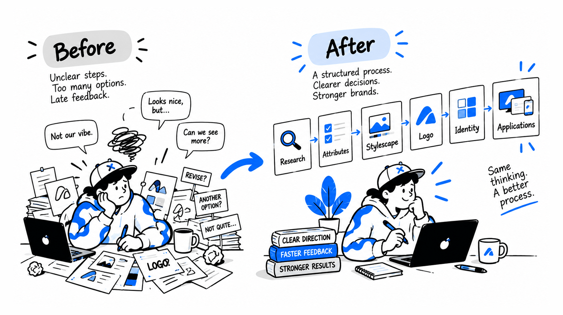
For founders, product managers, brand designers and design leads who either buy branding for a digital product or run the process themselves.
The studio grew up around digital products and interfaces, so branding usually arrived as one part of a larger product project: a client needed an interface, and a mark to put on it. The interface team developed the product's visual concept, a brand designer worked on a logo alongside it, and logo concepts reached the client already quite polished. The client chose one, asked for changes, or rejected them and sent the designer back to work.
That worked well enough on simpler projects. As the work got more complex, the same problems kept surfacing. We spent a lot of time polishing directions nobody had validated, feedback arrived as "like / don't like" with no structure for what was actually being rejected, and because the interface usually established the visual style before the identity did, the brand was effectively fitted around an existing product concept.
Eventually we realised the problem wasn't how we designed identities. It was the order we made those decisions in — and the order we showed them to the client.
The rebuild was collaborative. Maria Soloveva and Julia Slazhnieva, our Brand Designers, brought years of practical branding experience and knew where projects tended to get stuck. Andrei Zolotukhin, our Design Lead, approached it from the process side: studying external branding methodologies, breaking them into stages, and making the team's existing practice explicit. We tested the changes on real projects and kept adjusting them.
TL;DR
- Our old process presented logo concepts before anyone had agreed on a visual direction, so rejection was expensive and feedback was unusable.
- Presenting rough sketches instead of polished logos didn't fix it. We'd changed the fidelity when the problem was the order.
- We rebuilt it around one question: what needs to be decided before we invest in the next level of detail?
- Stylescapes became the decision point, and the shared language. A client chooses a visual direction before we design inside it — and each direction is built to express the agreed brand attributes in a different proportion.
- A narrower funnel doesn't mean less creative exploration. It means the exploration gets deeper as the direction gets clearer.
- We didn't eliminate wrong turns. We made wrong turns cheaper.
- AI helps produce a direction faster. It doesn't decide which direction is worth producing.
What Was Wrong With Our Old Branding Process?
The brand's visual language was rarely chosen. It was inherited.
Colour, typography and atmosphere were usually settled inside the product's interface concept, while screens were being designed. A brand designer then worked from the brief, found several metaphors, and refined each into a clean vector concept. That took real time, and it took it from the wrong place — hours that should have gone into searching went into polishing a handful of early ideas instead. The client reviewed several refined logos and decided: this one, none of these, try again. Once a mark was approved, the identity was assembled around it and the interface that already existed. That identity could be rejected in turn, because until that moment nobody had shown the client a visual world as something to agree to.
The process leaned on one person's reading of the brief. When the designer's vision happened to match the client's, everything moved fast and cost little. When it didn't, the cost climbed with every round. What was missing wasn't talent or effort — it was a reliable way to align on vision before committing to execution. Words don't do that job: the same adjective calls up different styles, and different emotions, in different heads.
We tried the obvious fix, and it didn't work. Instead of refining every concept, we started presenting rough logo sketches — cheaper to produce, more ideas per hour, easier to throw away. But a sketch reads differently depending on who is looking at it: a designer sees a direction in it, someone outside the profession sees an unfinished drawing. And more fundamentally, we had changed the wrong variable. We lowered the fidelity when the problem was the order. A rough logo shown first is still a logo shown first, and no single mark — sketched or polished — tells a client what their brand is going to look like.
The interface concept was doing a job nobody had assigned to it. It answers how a product looks and behaves in use — a real question, and not the same one as what this brand means to its audience. So the logo and the wider identity had to fit around decisions nobody had framed as brand decisions. That's tolerable when branding means "make us a logo." It breaks the moment identity becomes a system that has to work across product, website, social, decks and advertising.
So the target wasn't better design, or faster design. It was finding a way to show a client a visual direction, and agree on it, before anyone drew a mark.
Treating Branding as a Process Design Problem
The idea came from looking at the problem through UX and product design.
Not because branding was missing those stages. Understanding the task, clarifying requirements, exploring solutions, checking assumptions, raising fidelity gradually — all of that was already happening inside the studio. The problem was that none of it was visible. From the client's side, a branding project looked like a jump from a brief straight to a finished result.
That's the part product design is genuinely good at: not having stages, but making them legible, and putting a decision at the end of each one. So we broke the existing workflow into smaller decisions and tried different ways of ordering them. The question that organised everything:
What needs to be decided before we invest in the next level of detail?
Which leads to a single principle: the more expensive a decision is to change, the earlier we should validate the thinking behind it.
A few habits from product design carried over almost unchanged:
- Decide at the cheapest fidelity that can answer the question. If a rough board settles a direction, don't build a finished identity to settle it.
- Keep several options alive instead of refining one early. Committing to a single idea works only if you happened to pick the right one first.
- Widen, then narrow — twice. Once to find the right direction, then again inside it to find the right execution.
- Write the rules last. Guidelines describe a system that has already worked, not one you hope will.
- Settle visual questions visually. Verbal agreement is the least reliable kind. Two people can agree on the word bold and picture nothing alike.
The goal was never to make branding objective. Subjectivity is part of the work. But a large share of it is avoidable — it comes from people imagining different things behind the same words, and that part disappears the moment you show instead of describe.
The New Process, Stage by Stage
The process now starts with the information behind the brand rather than its final visual form:
- Brief and research — client conversations, context, audience understanding. What does this identity actually need to communicate?
- Attributes and personas — the inputs get distilled into a small set of brand attributes and audience definitions. Everything downstream is judged against them.
- Visual exploration — moodboards and reference collections, kept deliberately broad. These are internal tools for searching and comparing, not client deliverables.
- Stylescapes — the research resolves into coherent visual directions, each balancing the attributes and audiences in different proportions. Three or so reach the client.
- Visual direction — the client answers one question: which direction should we develop?
- Logo and identity — work on concrete logo ideas begins only now, inside the approved stylistic direction.
- Applications — the system meets real media, and the rules of the system become clear.
- Guidelines — written last, once those rules have been tested across contexts and settled.
The exact sequence shifts from project to project, but the principle holds: nothing gets built at final fidelity until the decision above it is closed.
What Is a Stylescape, and Why Is It Central?
A stylescape is a single composed board that resolves one coherent visual direction for a brand — typography, colour, imagery, graphic technique and composition together. It is not a mood collection and not a finished design. It exists to answer one question: which direction should we develop?
The distinction from a moodboard is the whole reason it works:
Where the directions come from
A stylescape isn't a mood we liked. Each one is built on the personas and brand attributes already agreed with the client at the previous stage.
The useful insight is that those attributes don't carry equal weight for every audience. A brand can be professional, technological and approachable at once, but one persona responds mainly to the first two while another needs the third to dominate. So each direction is deliberately built to express the same attributes in a different proportion — one leaning technological and precise, another warmer and more human, a third pushing energy and confidence.
That gives the client a real choice between meanings, not just between palettes. Each stylescape also gets a name that states its concept, so the conversation has language in it: people can argue about a named idea in a way they can't argue about "option two".
The name earns its keep later. When logo exploration begins, it works from both the visual language and the concept behind it — so a sketch can be judged against something specific rather than general taste. That alone cuts a lot of wandering out of the search.
We usually explore more directions internally than we present. Several variations get tested and discarded before three or so distinct ones reach the client. The point isn't to show every possibility. It's to give the client a clear enough set of alternatives to answer a useful question.
The technique isn't ours. Stylescapes come out of Blind, and most of what we learned about the process around them came from Chris Do and Building A Brand, The Futur's series documenting one complete identity project — a family brewery rebrand — from the first client call through to business results.
We didn't just watch it. We went through the episodes frame by frame, transcribed the dialogue, and reconstructed the entire flow into a sixteen-stage board: first introduction, discovery session, briefing, reference research, first stylescapes, the internal review before presenting, the presentation and client feedback, chosen direction, logo exploration, first mock-ups, logo presentation, rework, website, packaging, style guidelines, results. Having the whole sequence laid out where we could see it is what let us compare it against our own workflow honestly — and spot which decisions we were making in the wrong order.
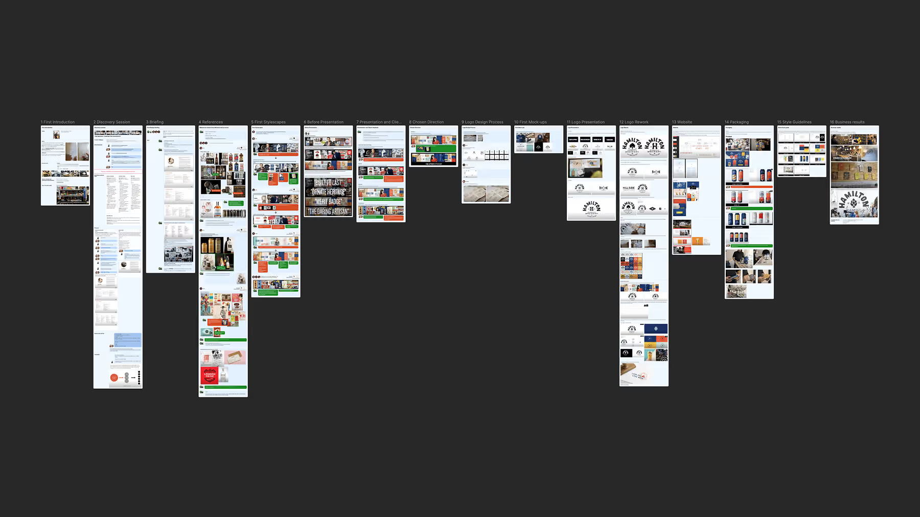
What no series can hand you is the judgement: where each artefact belongs in your own decision hierarchy, and at what fidelity to build it.
That last part caused real friction. Designers were understandably reluctant to show work built on other people's imagery, or compositions that weren't fully polished. There was a genuine fear that "unfinished" would simply read as "bad". Learning the right level of fidelity took time: a stylescape needs to communicate an idea clearly and professionally, but it doesn't need to look like the finished identity. Its value is in making the decision cheap, before we invest in implementing it.
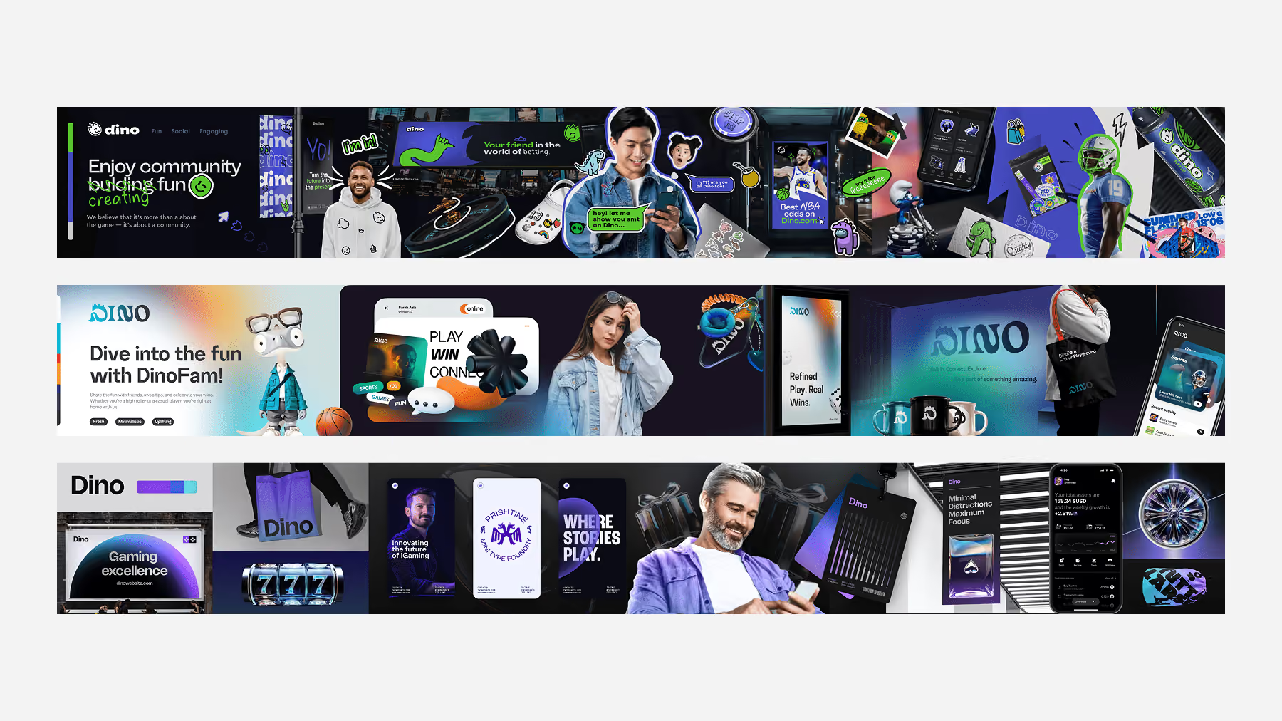
On BoxBet, a crypto iGaming platform, the whole brief was one sentence — the client wanted it to feel like a McLaren W1. No references, no direction, just the name of a car. Moodboards first, then five stylescapes set to different emotional registers, from technological coldness to aggressive energy. The client chose one. Only then did anyone draw a logo.
From Direction to Identity
Once a visual direction is selected, the funnel narrows.
Work on concrete logo ideas begins only now, inside the approved stylistic direction. The search for metaphors and forms stays broad — but every idea is developed in a visual language the client has already agreed to, instead of guessing at the mark and the language at the same time.
That changes what exploration means. Take a bird as a metaphor: in a cybernetic direction it comes out angular and constructed, in a warmer, more humanist one it comes out soft and drawn. Same metaphor, different execution. With the direction undecided, a designer has to guess at both at once and hedge on each. With it set, execution stops being a question — so you can generate more metaphors and take each one further.
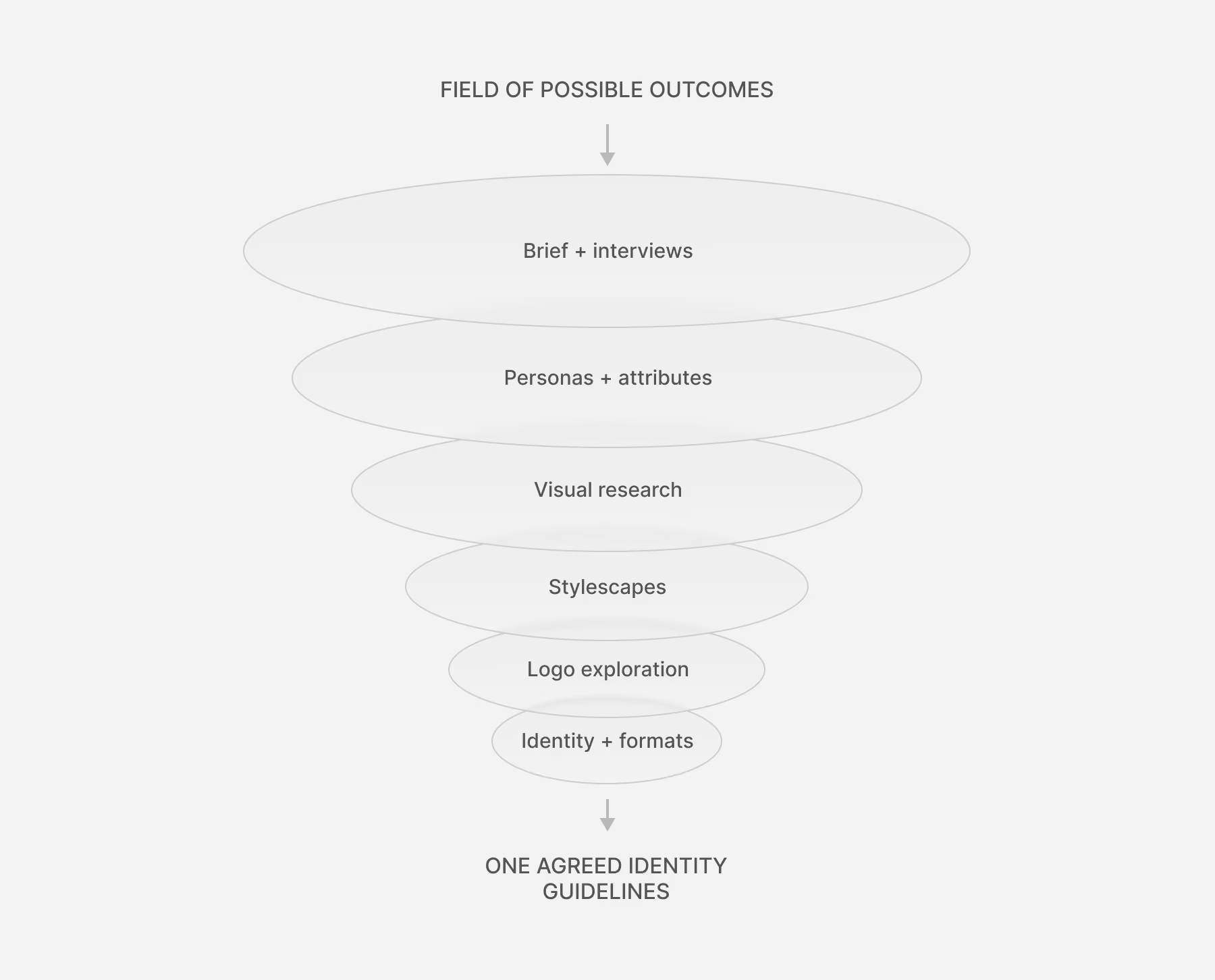
The identity works the same way. Elements and applications are explored and refined inside the chosen direction, and as applications accumulate, the rules of the system become clearer. Guidelines come last, once those rules have been tested across different contexts and have effectively settled.
The Funnel Gets Narrower. The Exploration Gets Deeper.
This is probably the most important difference from the old process, and the easiest to misread.
A narrower funnel doesn't mean less creative exploration. It means exploration gets deeper as the direction gets clearer.
Previously a designer might spend two weeks on several polished logo concepts belonging to unrelated visual territories. Now much of that same time goes into exploring more possibilities inside a direction that has already been selected.
The same applies to stylescapes. We may work through many internal variations, but those variations aren't just more random directions — they're attempts to understand one particular combination of attributes, audience and technique more deeply.
Less breadth at each successive stage. More depth. We aren't trying to explore everything. We're trying to find the right place to dig, and then dig deeper.
A Lower Cost of Being Wrong
This changes the economics of mistakes.
- Discover a visual direction doesn't work while building a stylescape → relatively cheap.
- Discover a logo idea isn't working while it's still one of many inside an agreed direction → cheaper again.
- Discover the same problem after the identity has been built out across a website, social media and other applications → much more expensive.
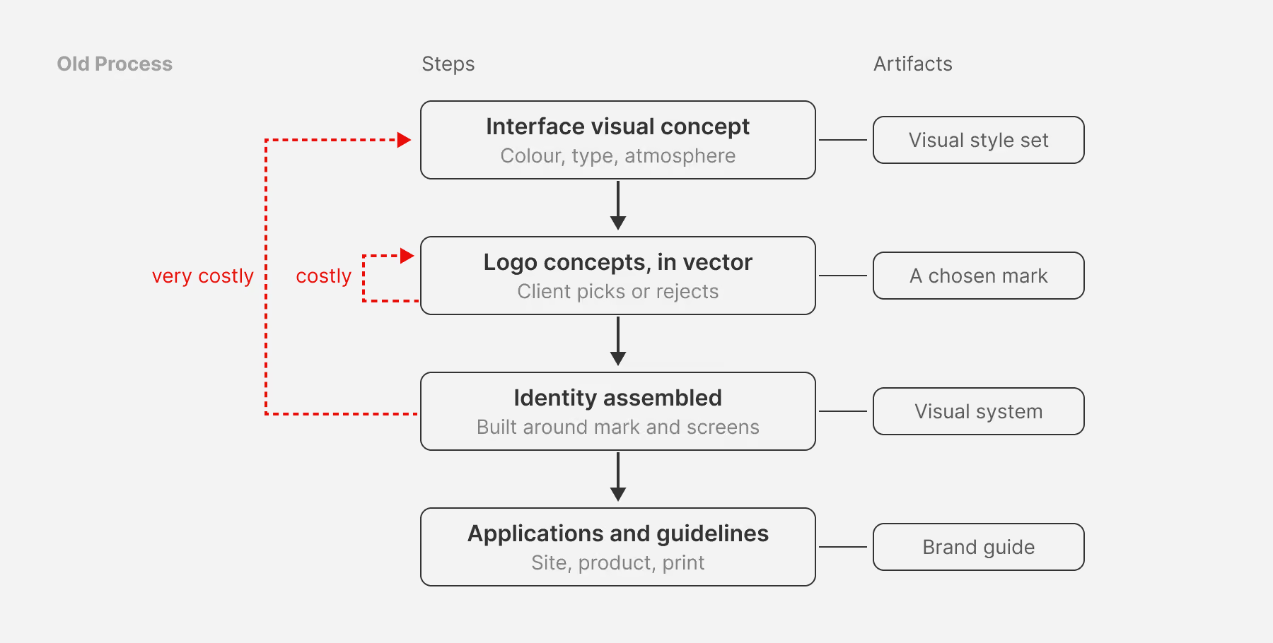
The process creates smaller, more manageable points of failure. It also gives the client better moments to give feedback. They don't need to approve every design detail; they react where their input is most valuable — to the direction, then the logo, then the developing identity and its applications.
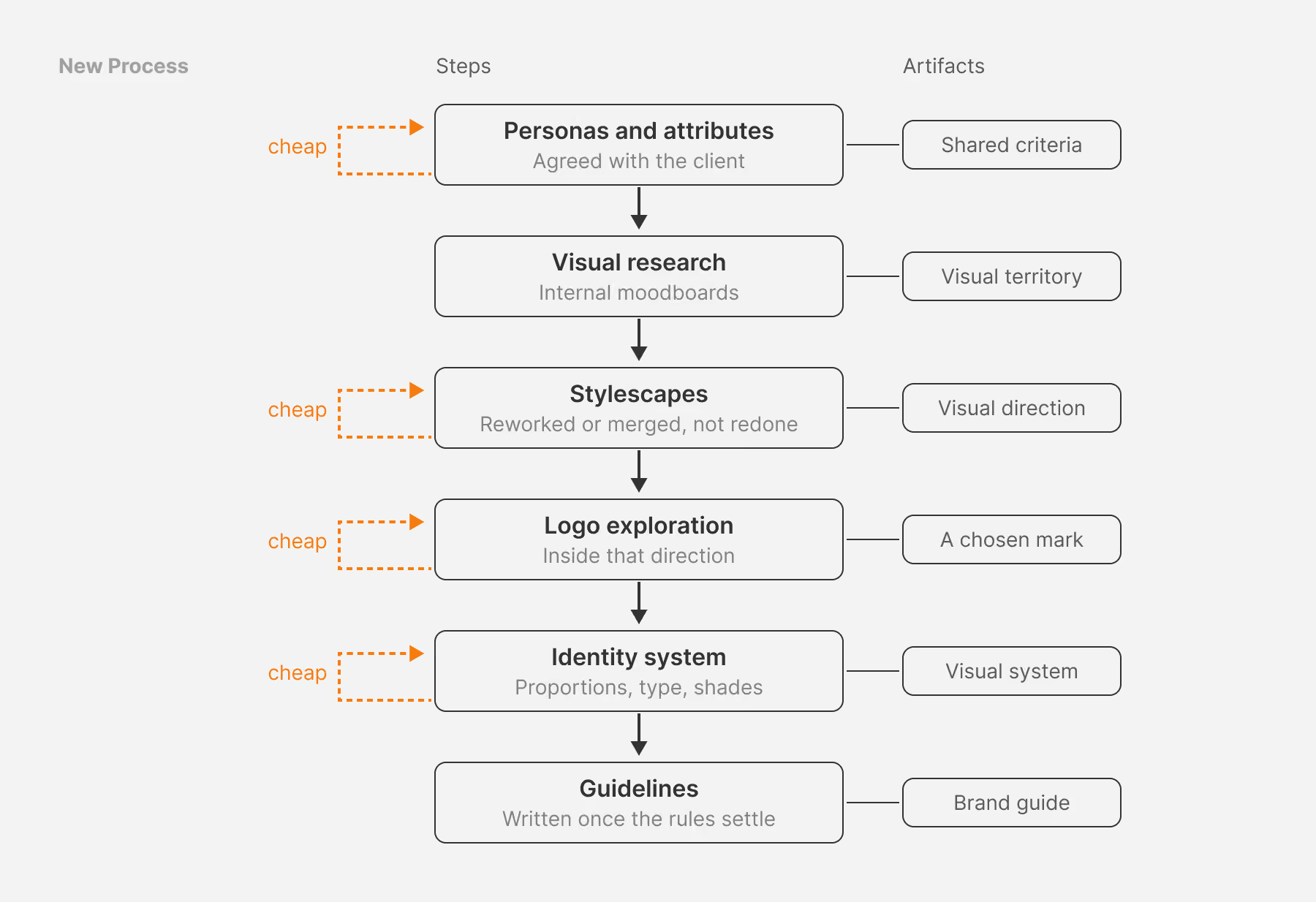
A problem can now surface while it's still relatively inexpensive to solve. That became one of the biggest benefits for us: we didn't eliminate wrong turns. We made wrong turns cheaper.
Branding and Product Design in Parallel
The process also changed the relationship between branding and product design.
The old problem wasn't that branding took too long. It was that branding often didn't start at all until the product's interface concepts had been approved. By the time a brand designer got involved, some visual language already existed — it just hadn't been called a brand.
The two streams can develop in parallel instead. While the product team works on requirements, architecture and wireframes, the branding process works on research, attributes and visual directions. Once the visual direction is established, it informs the product's visual concept.
This reverses the old relationship. Instead of:
interface concept → branding
we move towards:
product structure + visual identity → product visual concept
The interface becomes one expression of the identity, rather than the place where the visual language gets invented first.
What AI Changes
AI has changed the production part of this process more than the decision-making part.
We tried generating complete stylescapes from text descriptions. The results weren't good enough. A useful stylescape isn't simply a collection of attractive images — it has to make sense for a particular product, audience and set of attributes, and the relationships between its elements require judgement.
AI is much more useful once that direction has been established. Stylescapes traditionally involved a lot of searching for imagery and mockups, then cropping, editing, recolouring and combining them. Generative tools can now help us create more specific imagery and applications for the actual project.
So the role of AI is closer to:
human-led exploration → selected direction → AI-assisted production
rather than:
brief → AI-generated brand
AI can help us materialise a direction faster. It doesn't replace the process that determines which direction is worth materialising.
What We Learned
The biggest change wasn't stylescapes or personas as individual techniques. It was learning to treat the branding process itself as a design problem — and realising that most of what looked like creative disagreement was a communication failure.
Stylescapes improved alignment inside the studio and with clients, which took a large share of the guesswork out of subjective work. Everything else follows from that: mistakes became cheaper and easier to correct early, and once a direction is agreed, there's room to go deeper into it rather than wider.
We applied a principle familiar from UX and product design: make important decisions at the right level of fidelity, get feedback before the cost of change becomes high, and increase commitment gradually as uncertainty decreases.
The process didn't reduce the amount of creative work. It changed where that work happens. Instead of spending most of the time polishing several uncertain directions, we spend more of it researching, exploring and going deeper into directions that have already shown potential.
For the client, that means clearer decisions, earlier feedback and a lower cost of changing course. For designers, more room to explore before committing to details. For the studio, a process that gets more valuable with every project.
The goal was never to make branding less subjective. It was to make the journey from uncertainty to a finished identity more deliberate, more collaborative, and more affordable to change.
Working on an identity for a complex digital product? This is how we run Brand Identity & Strategy at Flatstudio. See the process applied end to end in the BoxBet identity case study, or talk to us about where your brand and product streams should converge.
Frequently Asked Questions
What is a stylescape in branding?
A stylescape is one composed board resolving a single coherent visual direction for a brand — typography, colour, imagery, graphic technique and composition together. It isn’t a mood collection or a finished design. Its only job is to let a client answer one question: which direction should we develop?
What is the difference between a moodboard and a stylescape?
A moodboard helps you understand a visual territory and can hold many unresolved references, which makes client responses hard to interpret. A stylescape resolves one specific combination of decisions into a coherent direction, so the feedback you get is a choice rather than a vague reaction."
