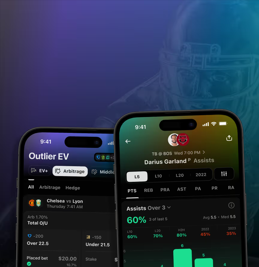
















We shaped it alongside the product from day 0, covering strategy, visual identity, and logo in step with the first wireframes. Outlier had to register as a data-first analytics platform, not another betting brand – and the identity launched together with the product itself.
This is the visual identity for Outlier, a US sports betting analytics platform, built as part of a Pitch & Product Concept engagement. Logo, icons, and colors took shape alongside the product.
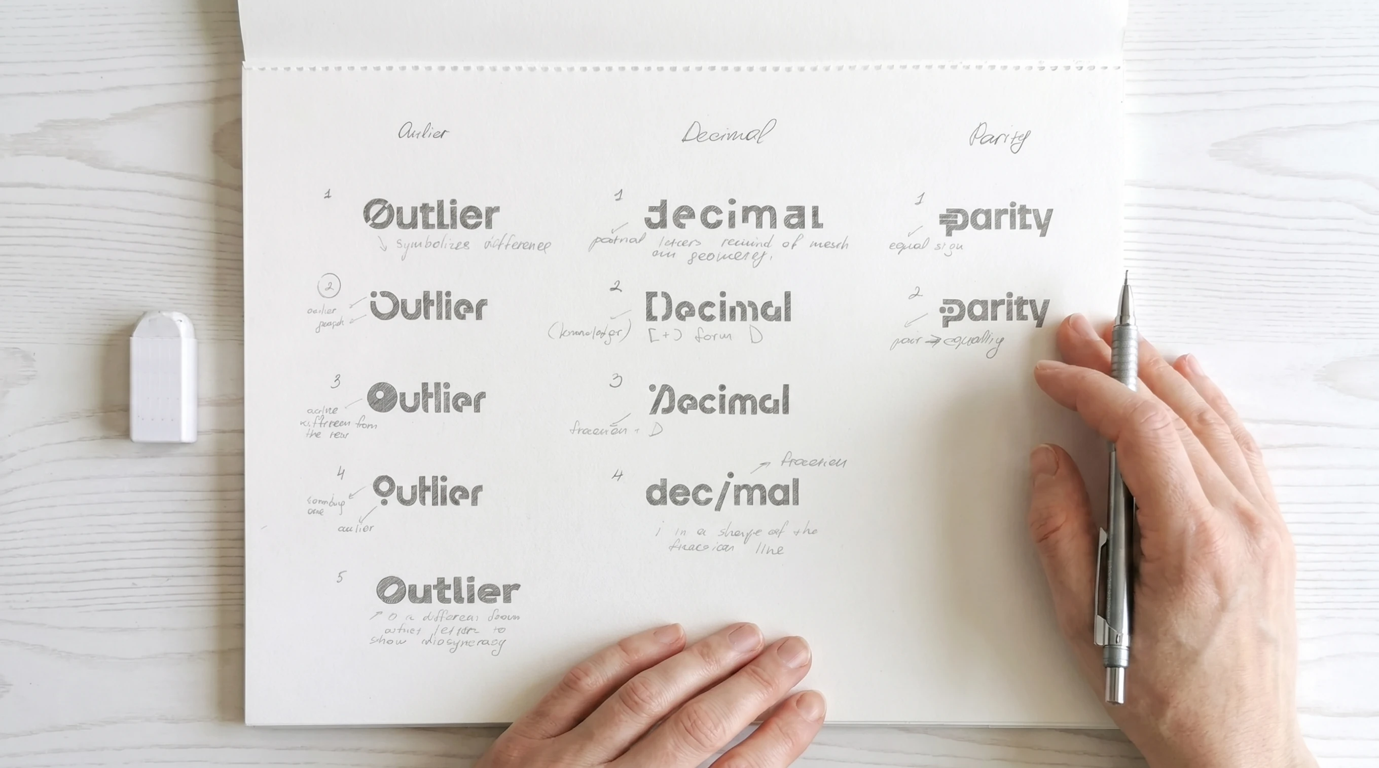
Early logotype sketches comparing naming directions for a sports analytics product. Alongside Outlier, the team tested alternate concepts before settling on the final mark.
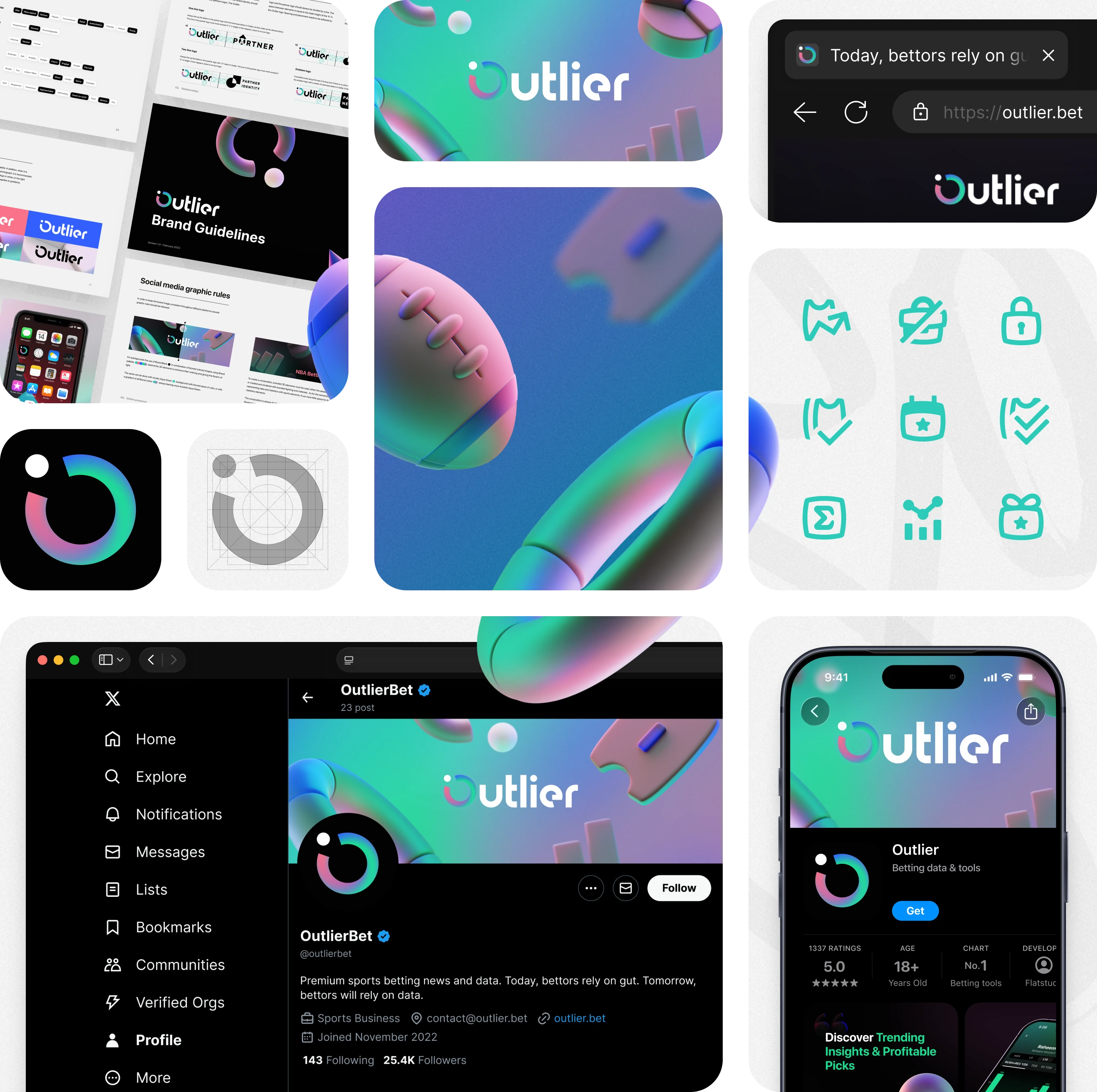
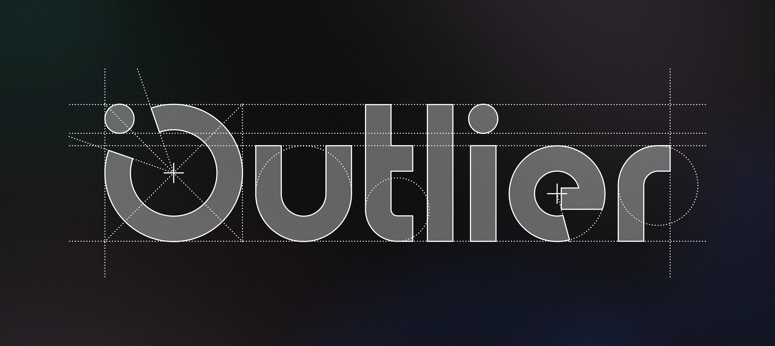
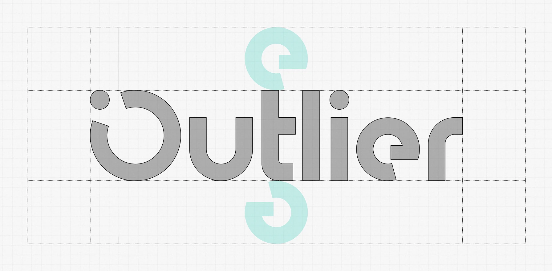
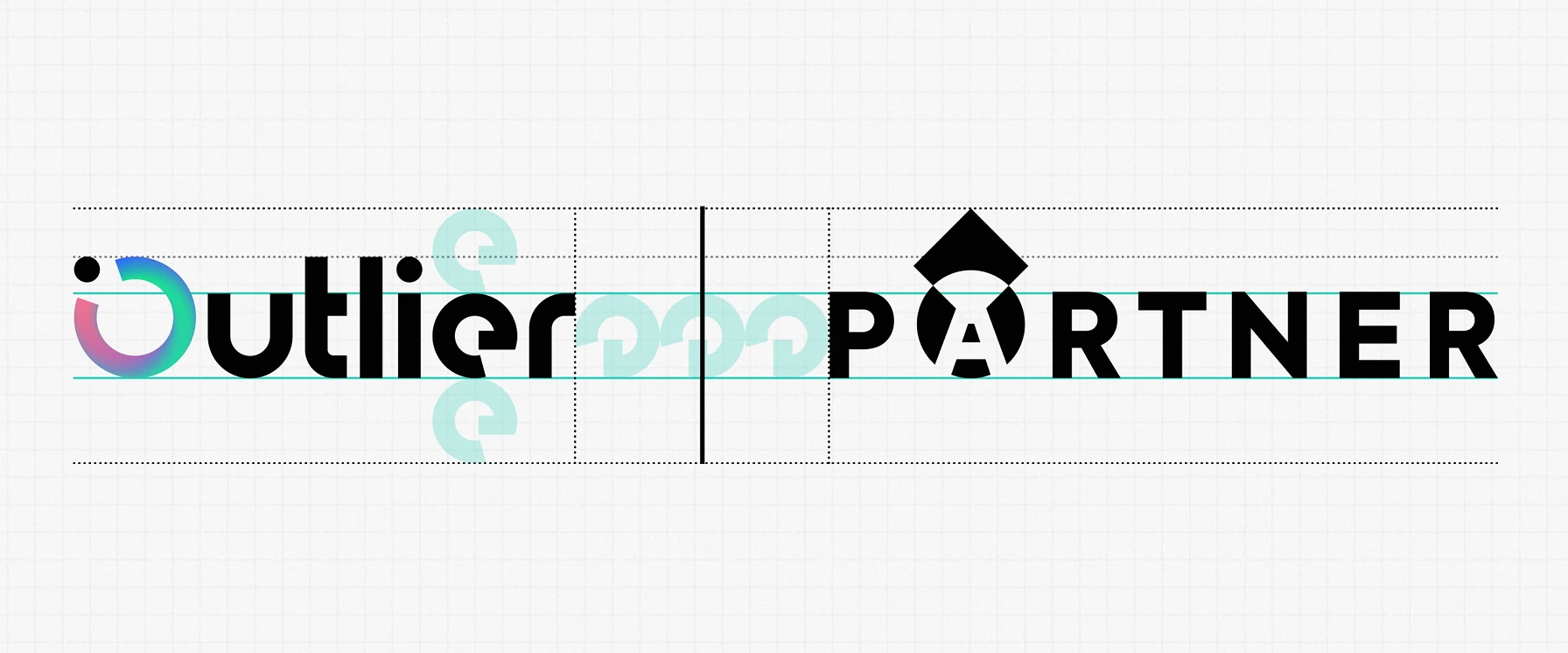
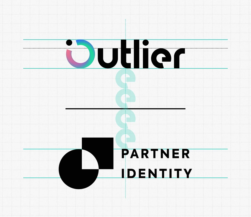
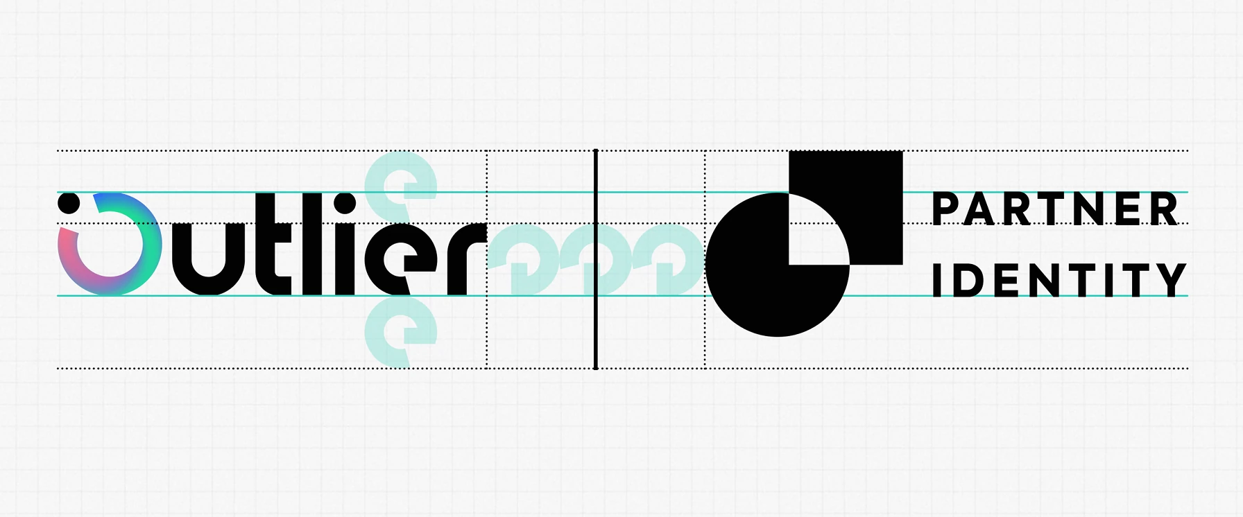
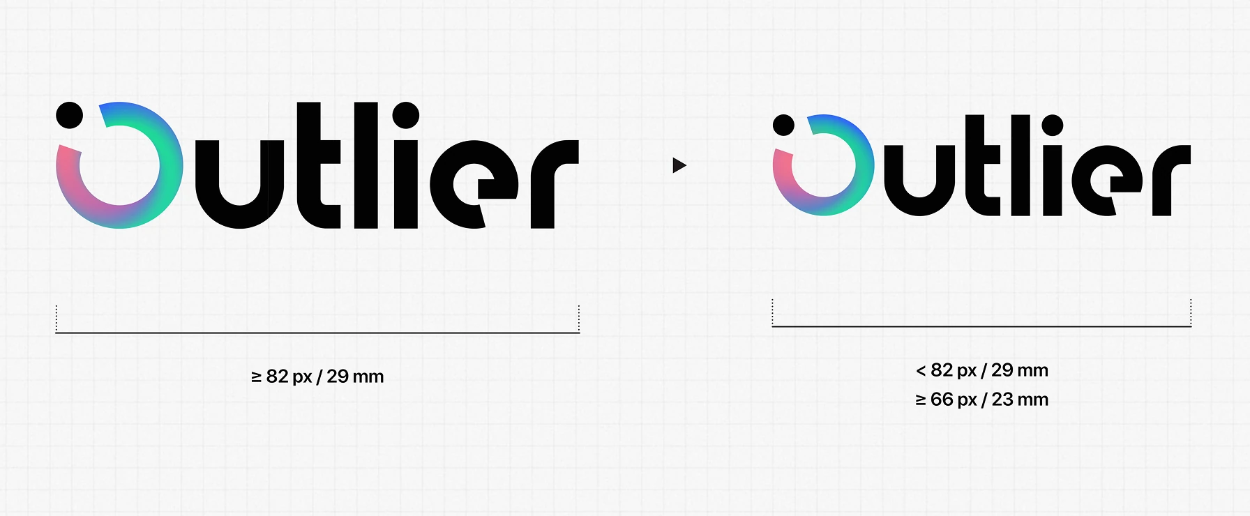
Technical specifications for the wordmark: grid proportions, minimum clearspace, and partner co-branding lockups that keep the logo consistent across every touchpoint for this sports analytics brand.


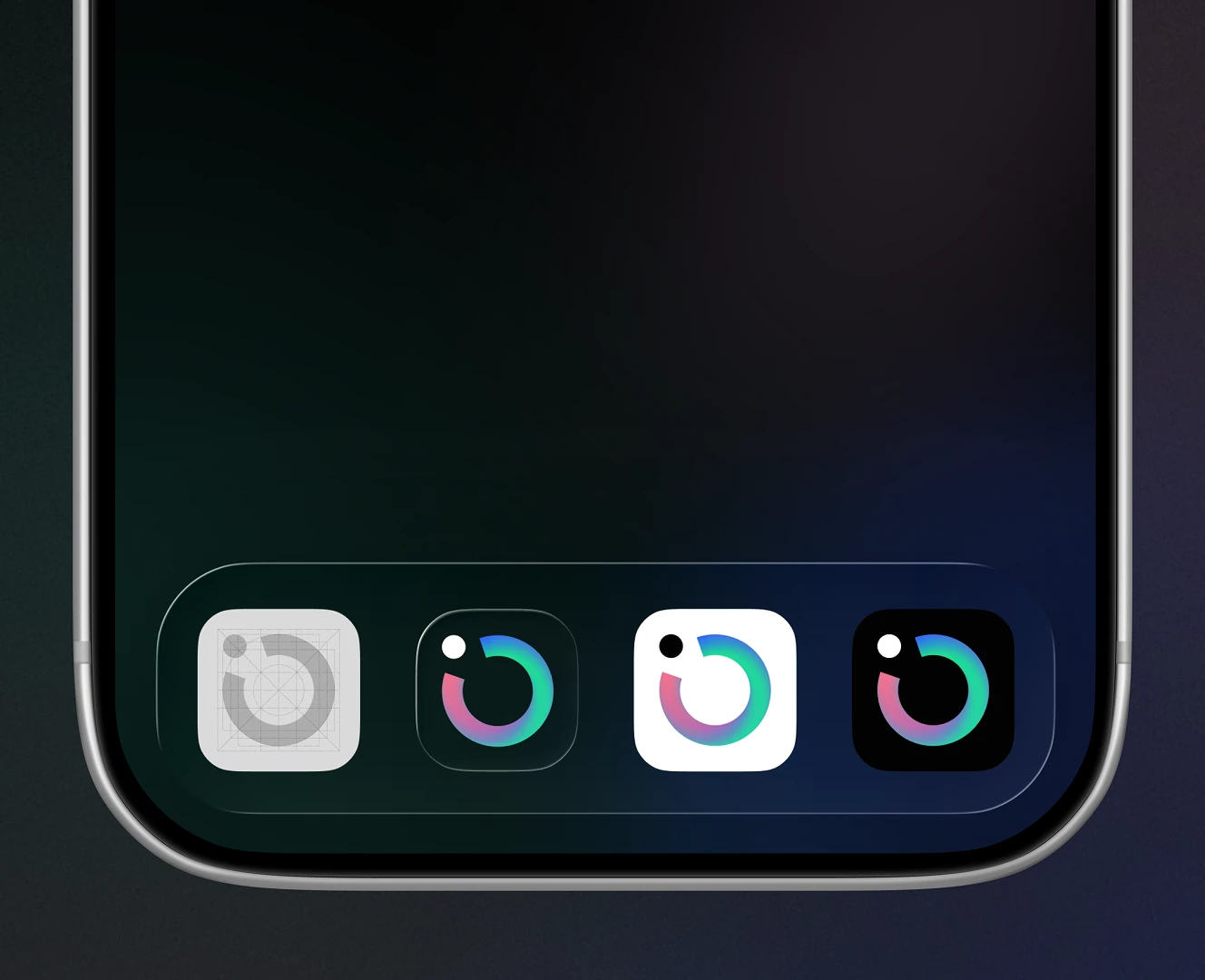
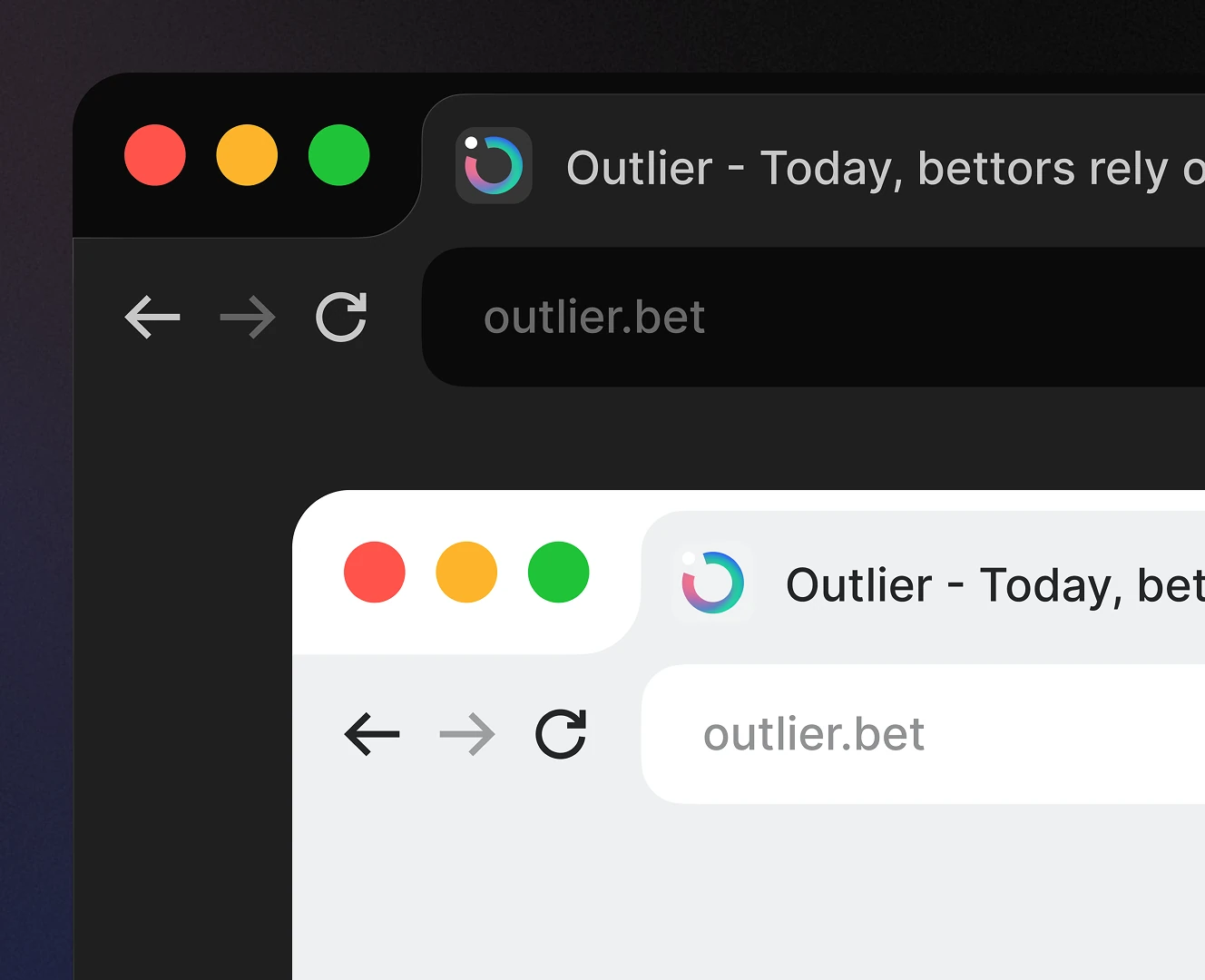
How the logo mark scales down to a favicon and home-screen app icon for a betting analytics app. Browser tab and phone screen mockups show it staying legible at the smallest sizes.
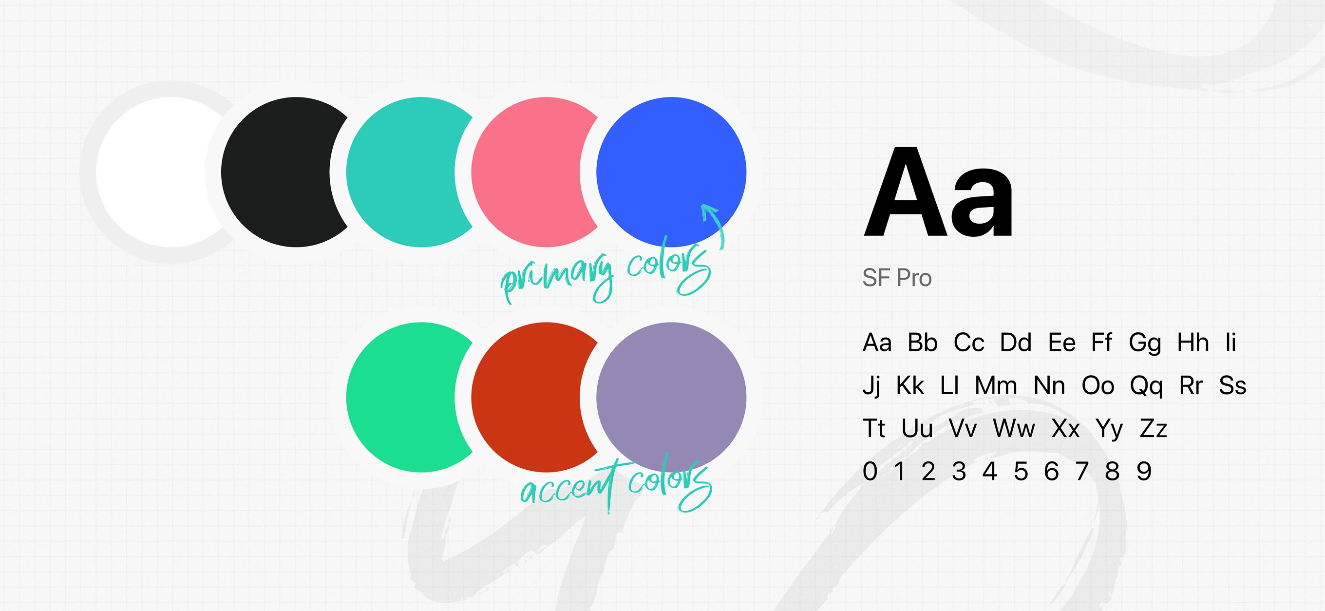
The core palette and typeface behind the identity: five primary colors plus three accent tones, paired with SF Pro as the system typeface. Built to stay legible across data-heavy screens.
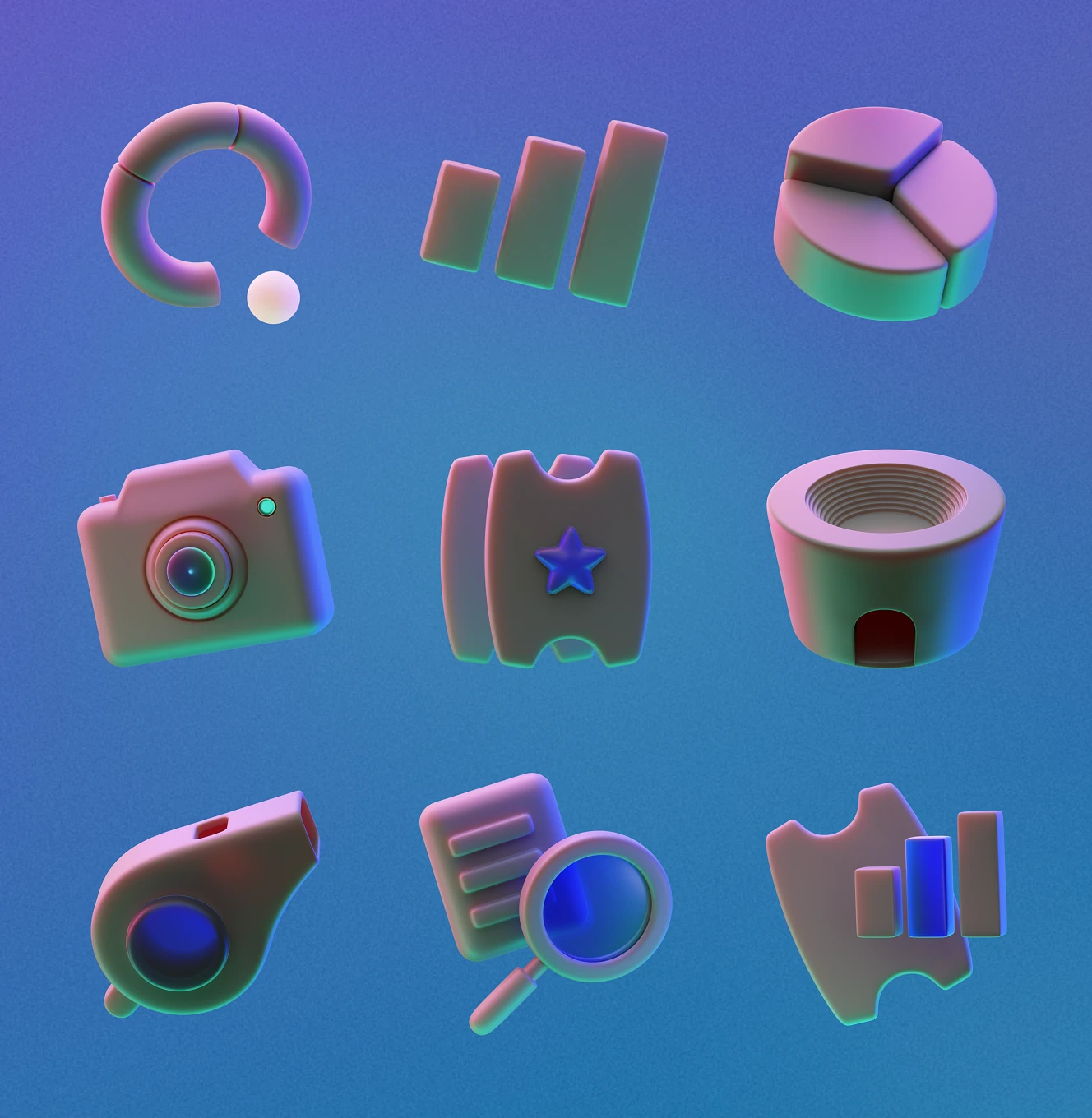
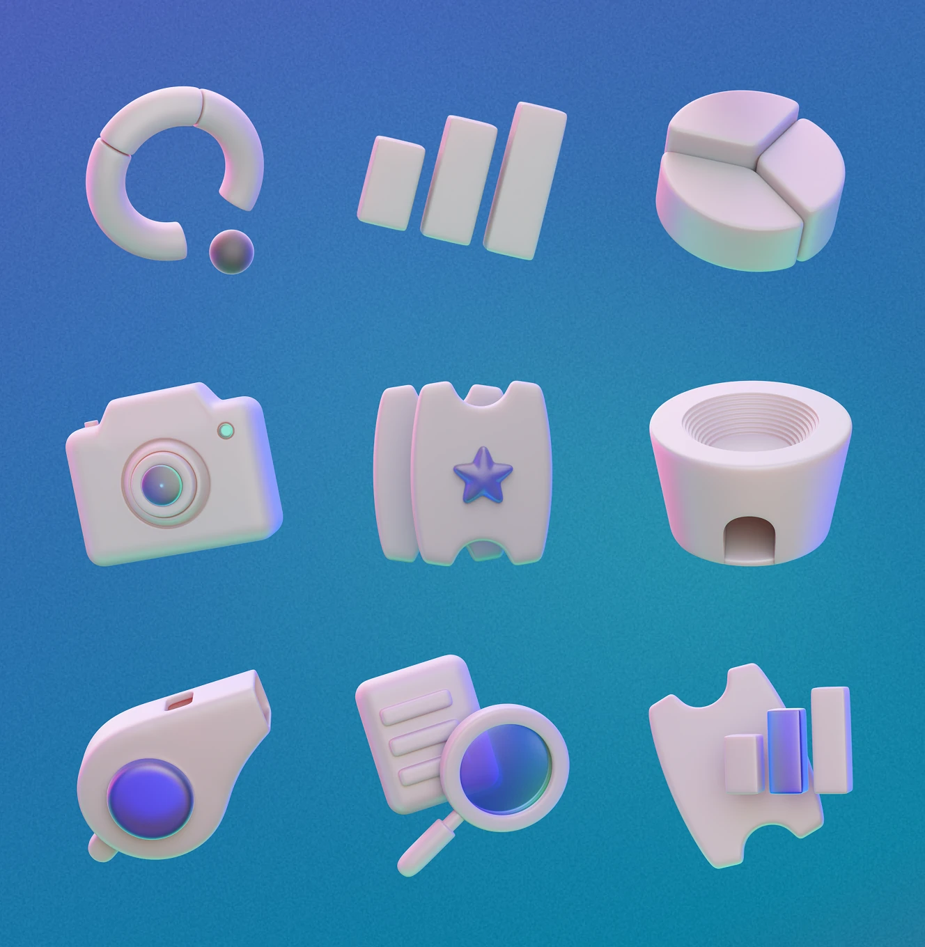
Custom 3D icons – bar charts, trophies, whistles, and search – built for a sports betting analytics brand. Each icon exists in a full-color and a monochrome pearl finish.
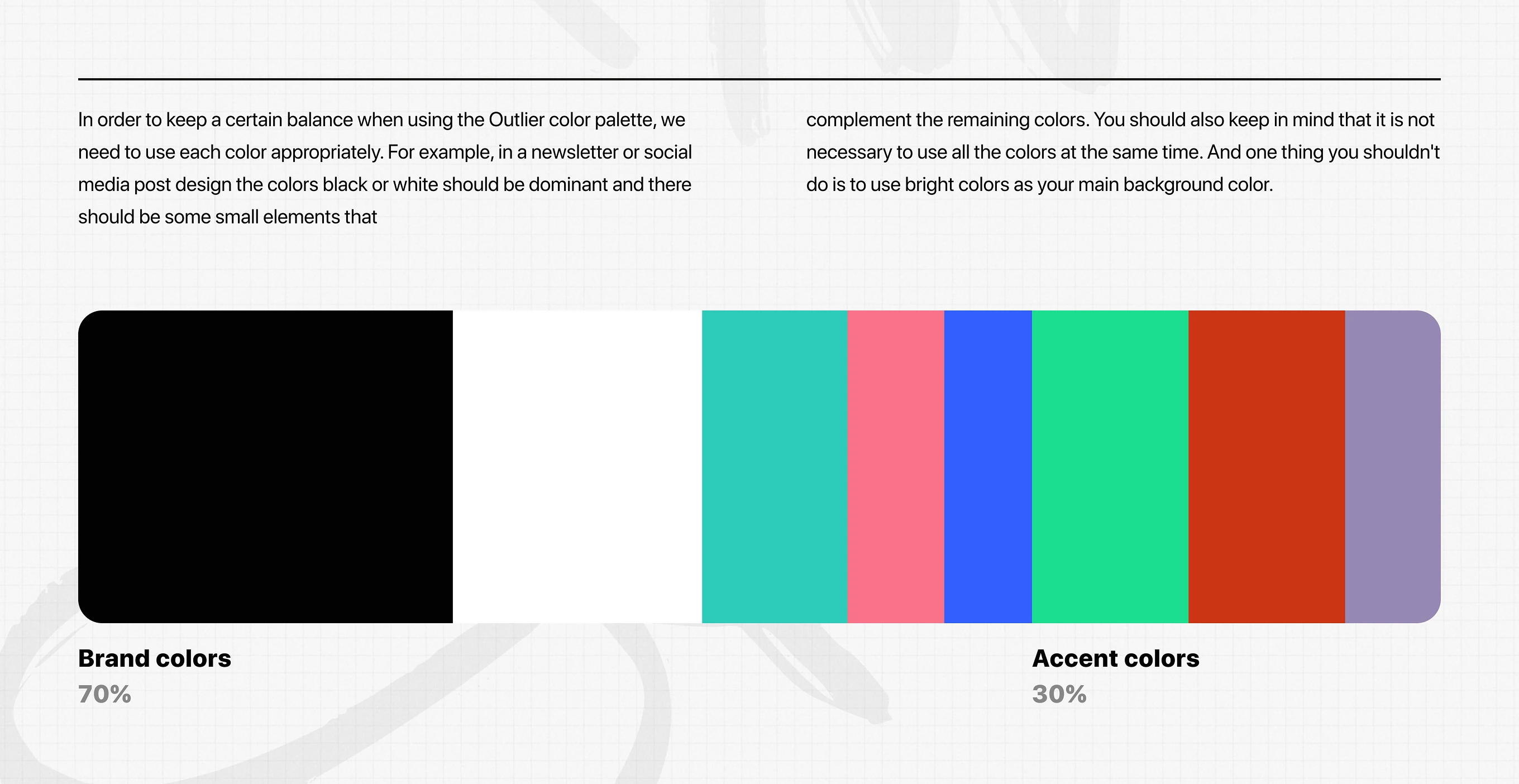
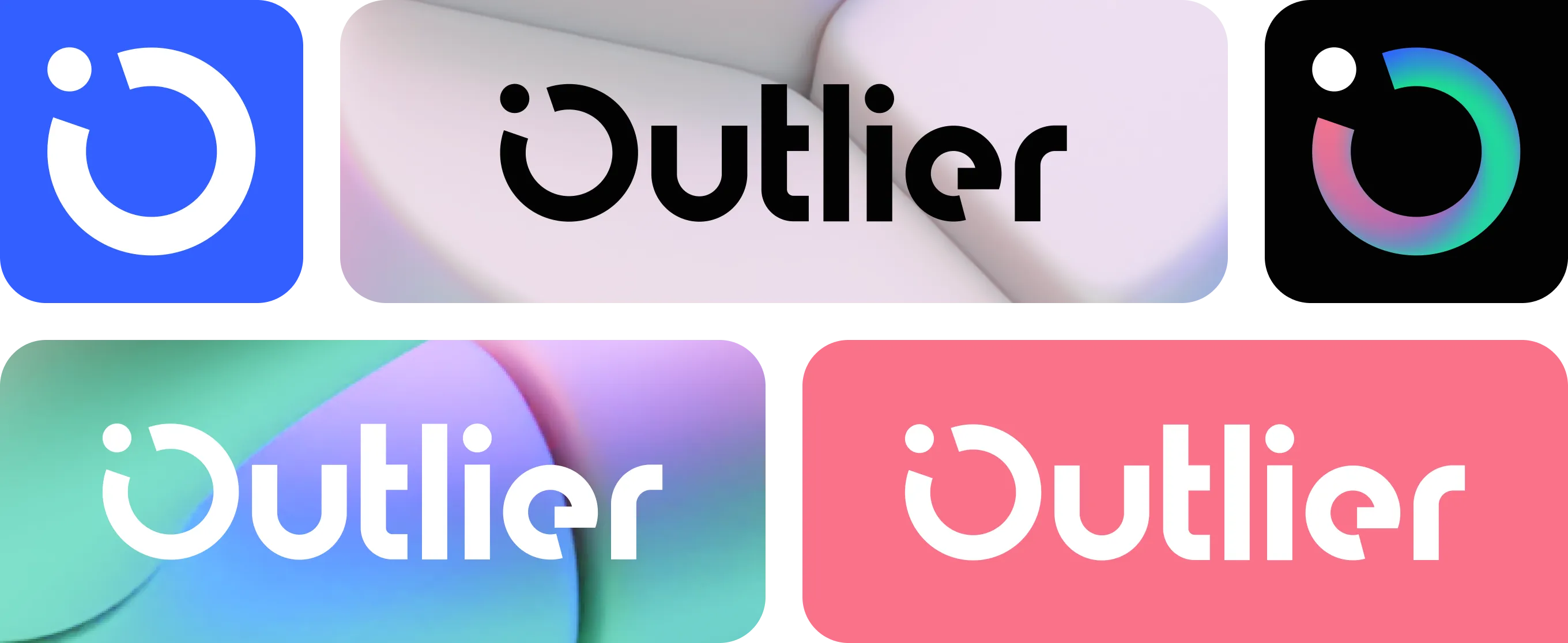
Usage rules for the eight-color palette and wordmark across backgrounds. Brand colors dominate at roughly 70%, accent colors stay to about 30%, and the logo adapts light or dark by surface.
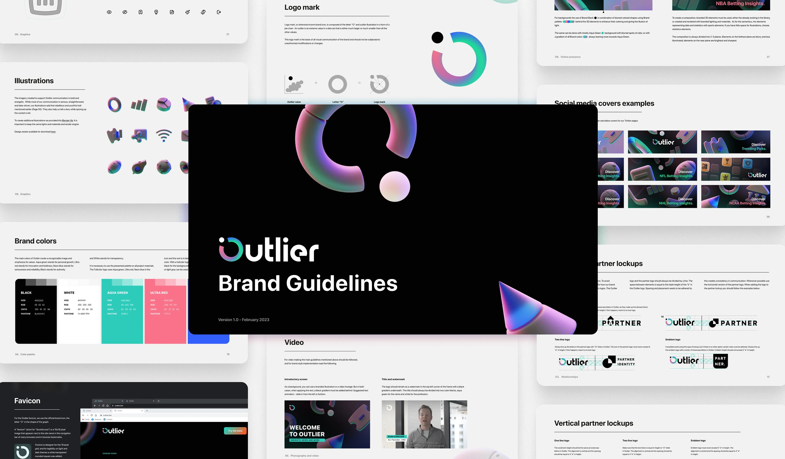
The complete Brand Guidelines PDF: logo mark, color system, illustration style, social covers, and partner lockups in one reference – the single source of truth for every team using the identity.
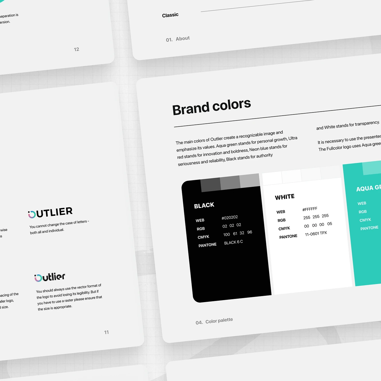
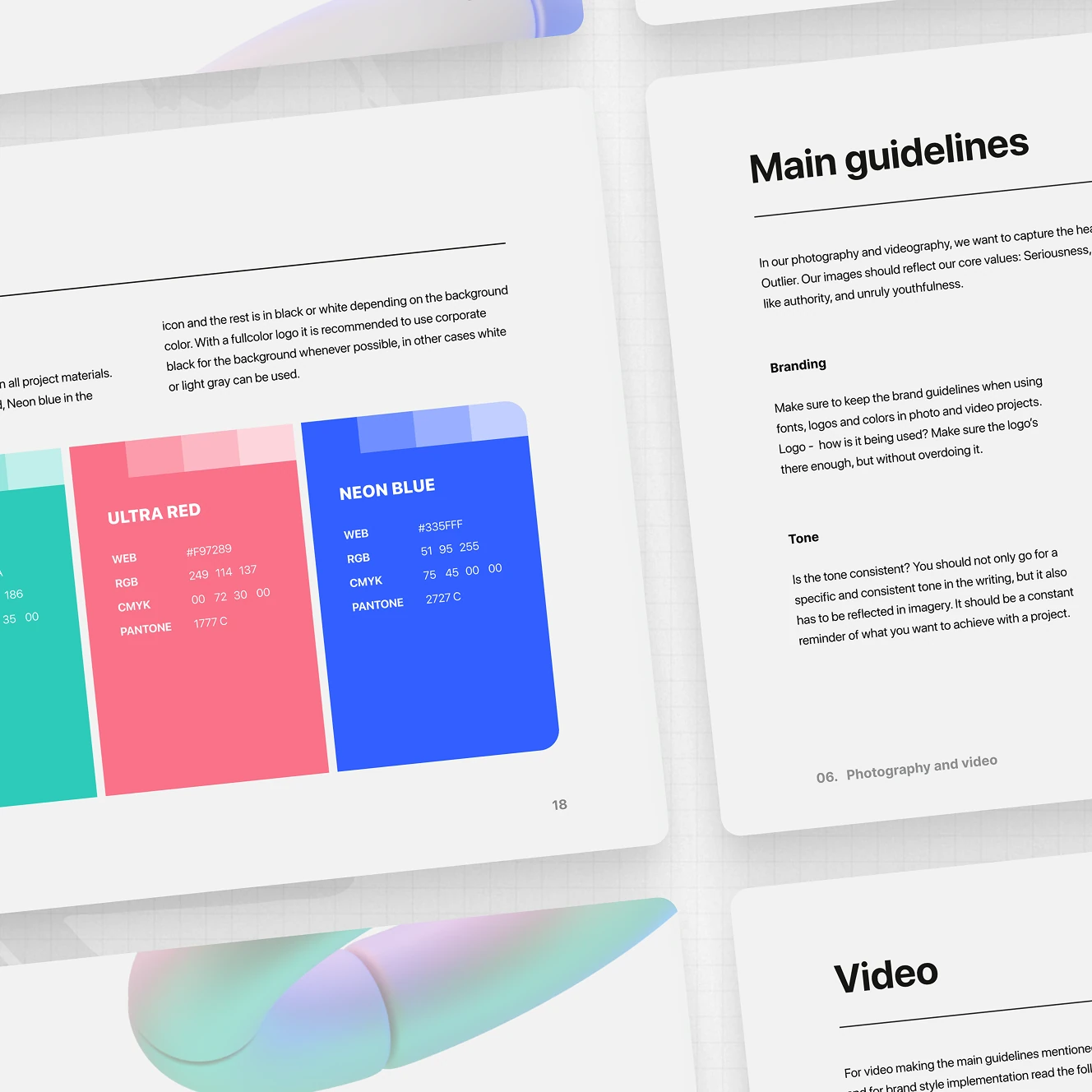
Exact hex, RGB, CMYK, and Pantone values for each brand color, paired with Tone of Voice notes on seriousness, authority, and youthfulness. Photography and video guidelines keep every asset consistent.
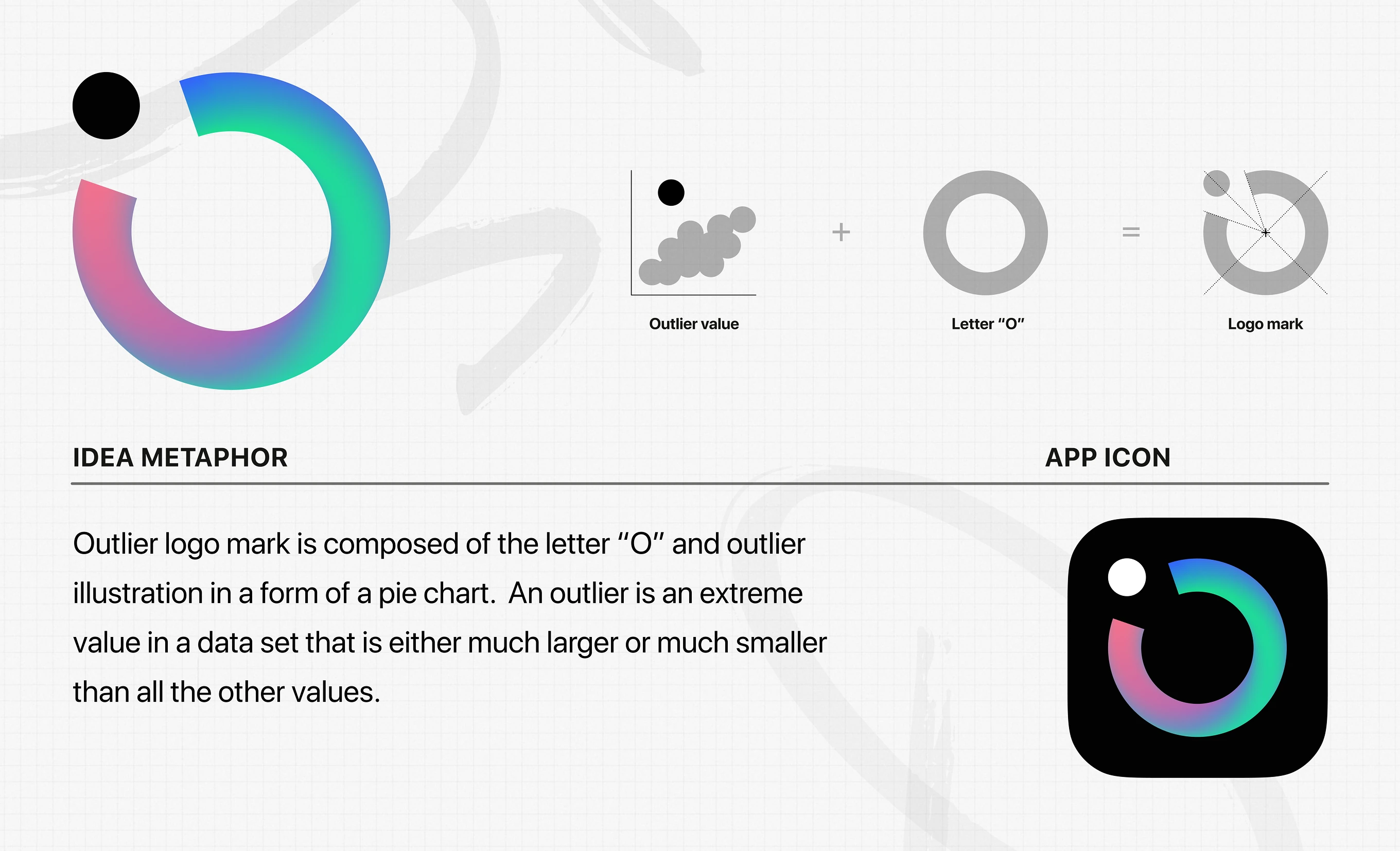
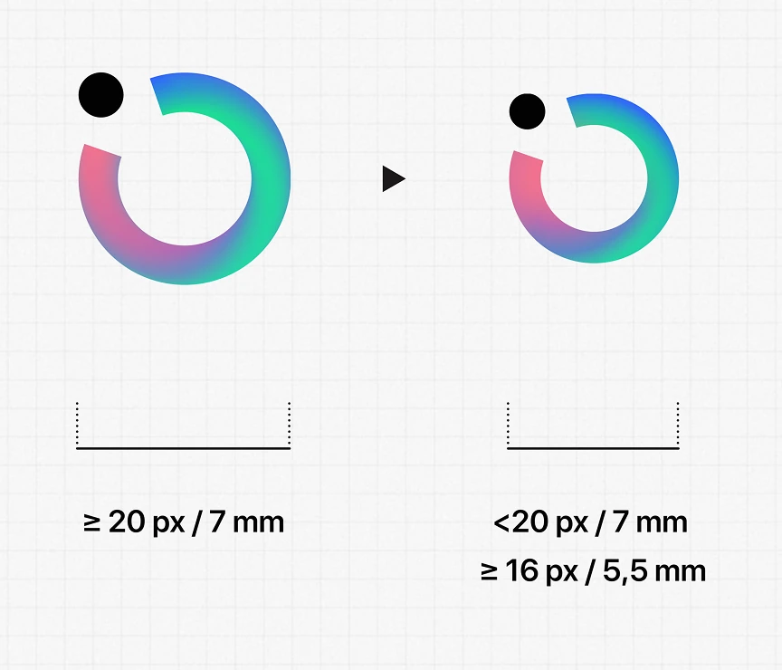
The logo mark combines the letter "O" with a pie-chart shape, referencing an outlier: a data point far from the rest of the set. Minimum size rules keep it legible at every scale.
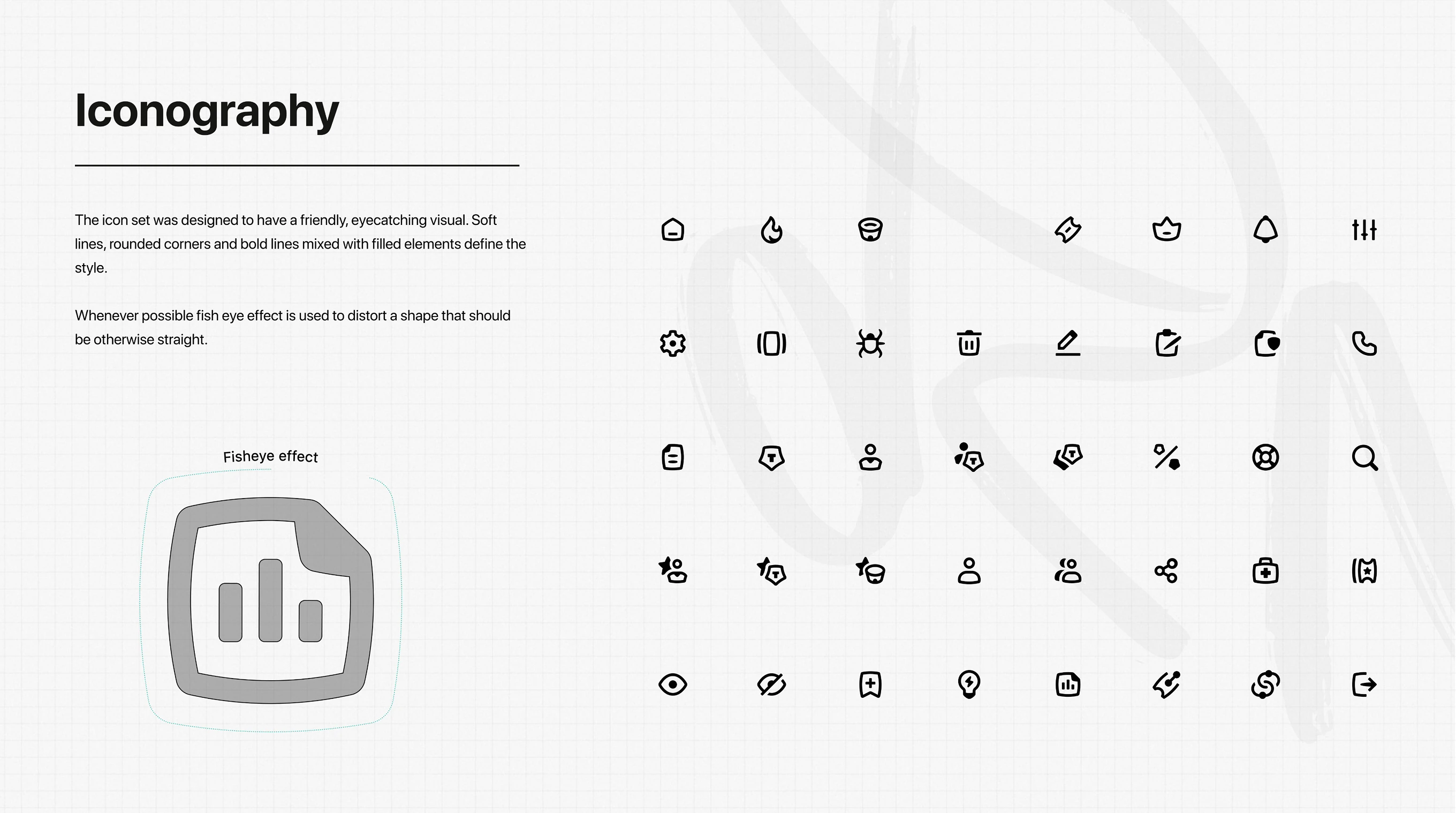
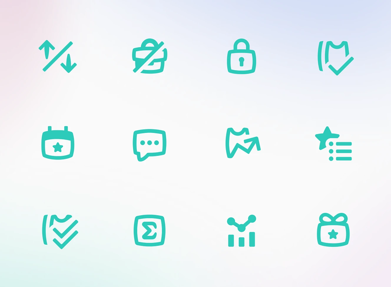
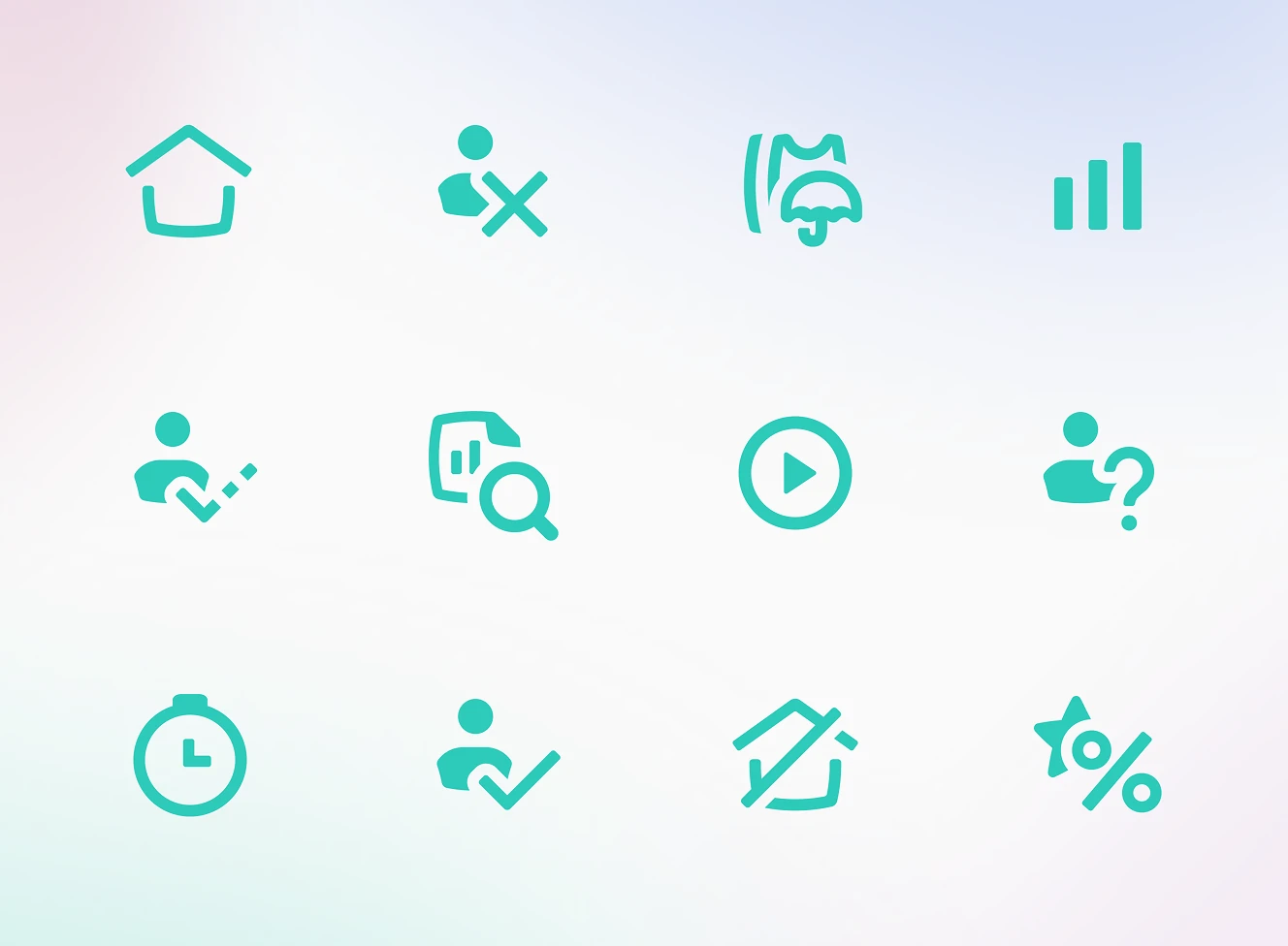
Rules for the icon set powering the product: soft lines, rounded corners, and bold filled shapes for a friendly, eye-catching look. A fisheye distortion technique bends straight edges into the brand's signature curve.
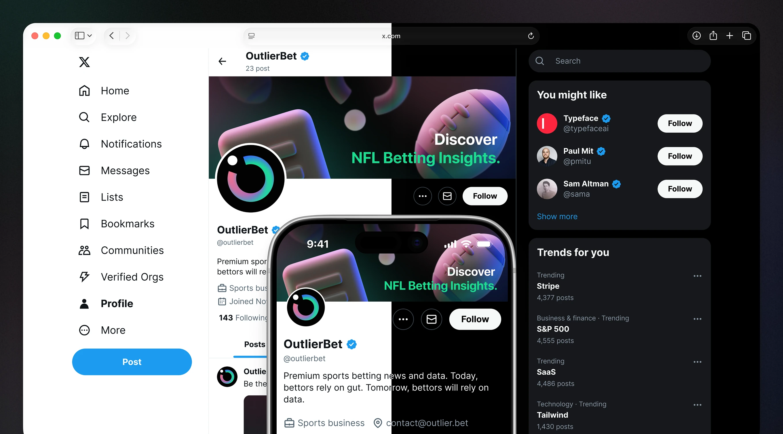
The identity extends to the OutlierBet profile on X (Twitter), reaching the same Sports Analytics audience as the product. Verified badge, banner copy, and bio copy carry one consistent tone.
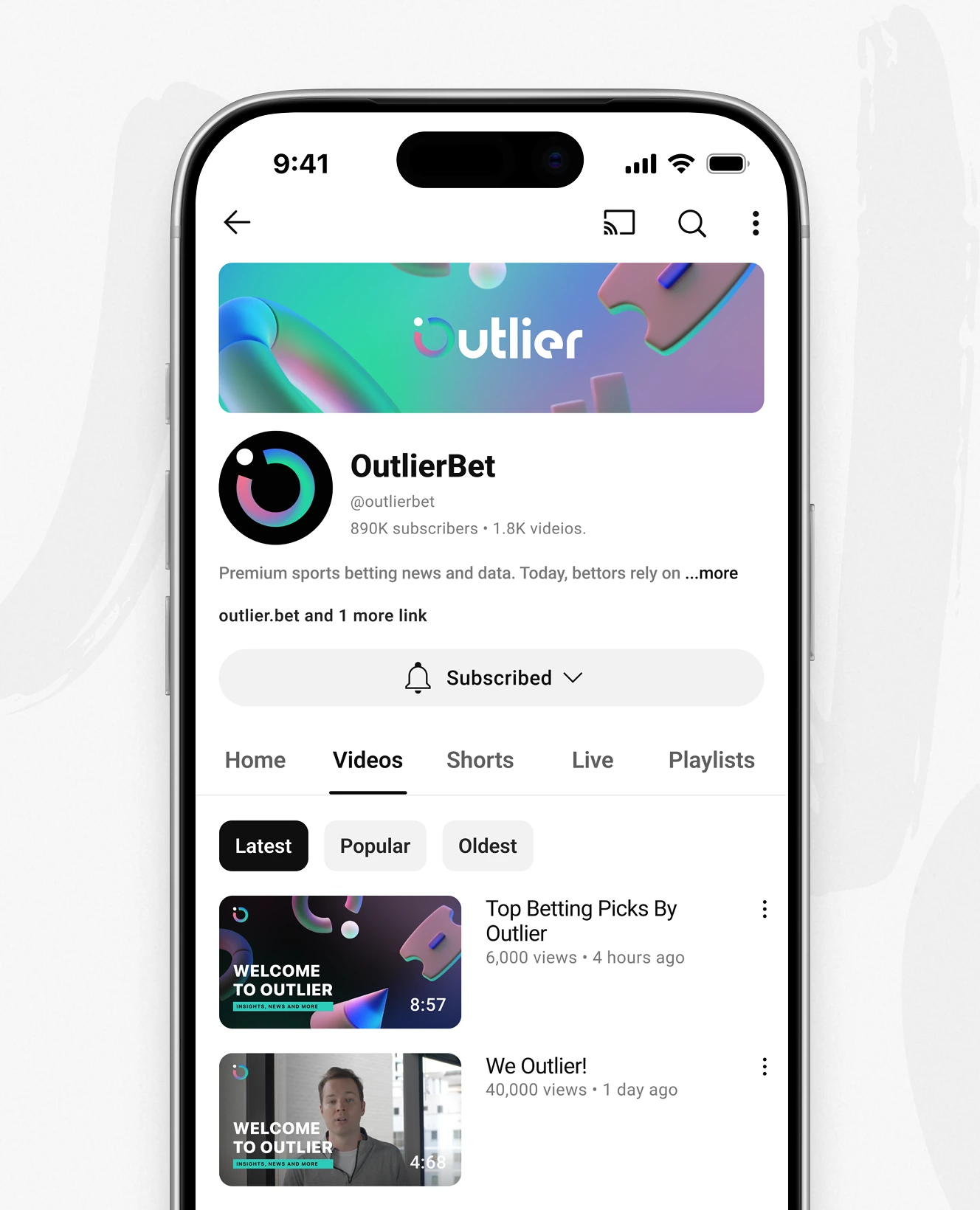
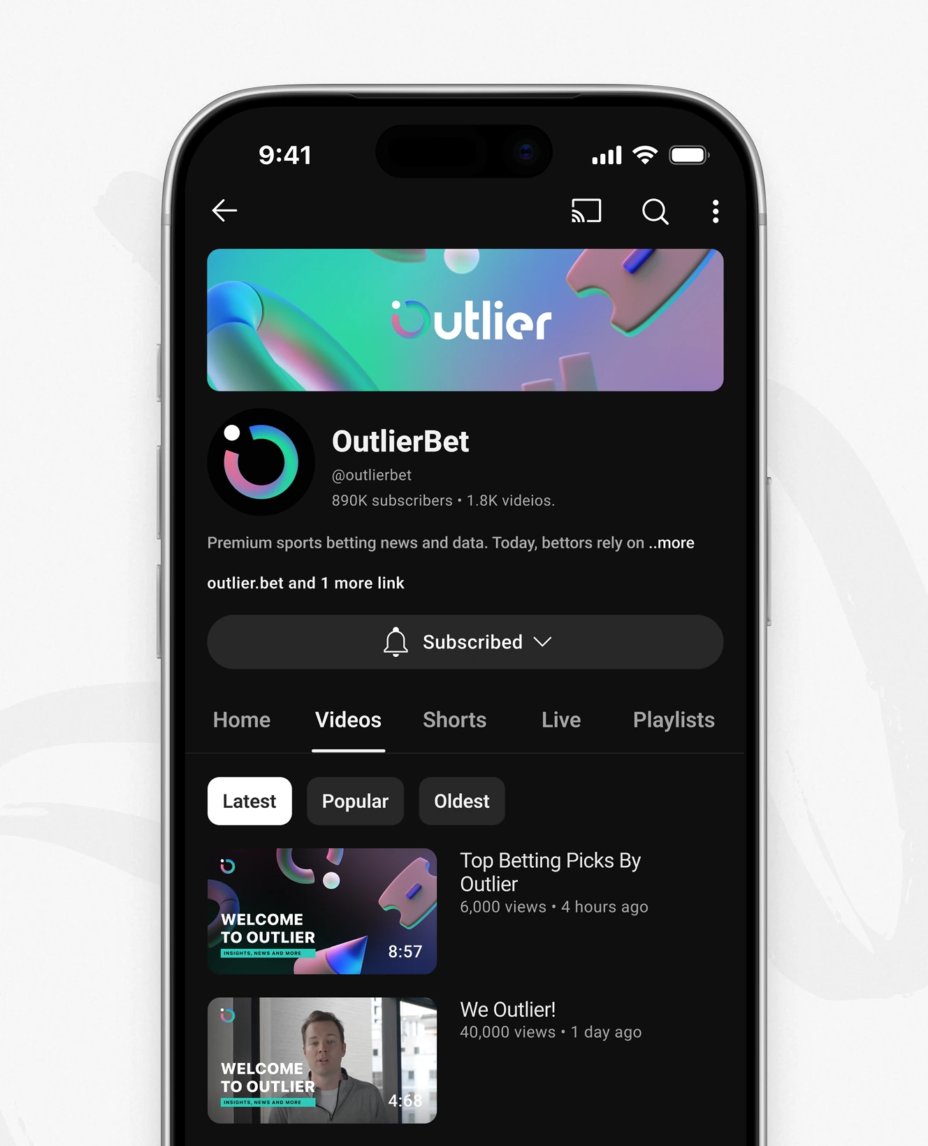
The same palette and wordmark carried onto the OutlierBet YouTube channel: banner, avatar, and video thumbnails share one gradient system.
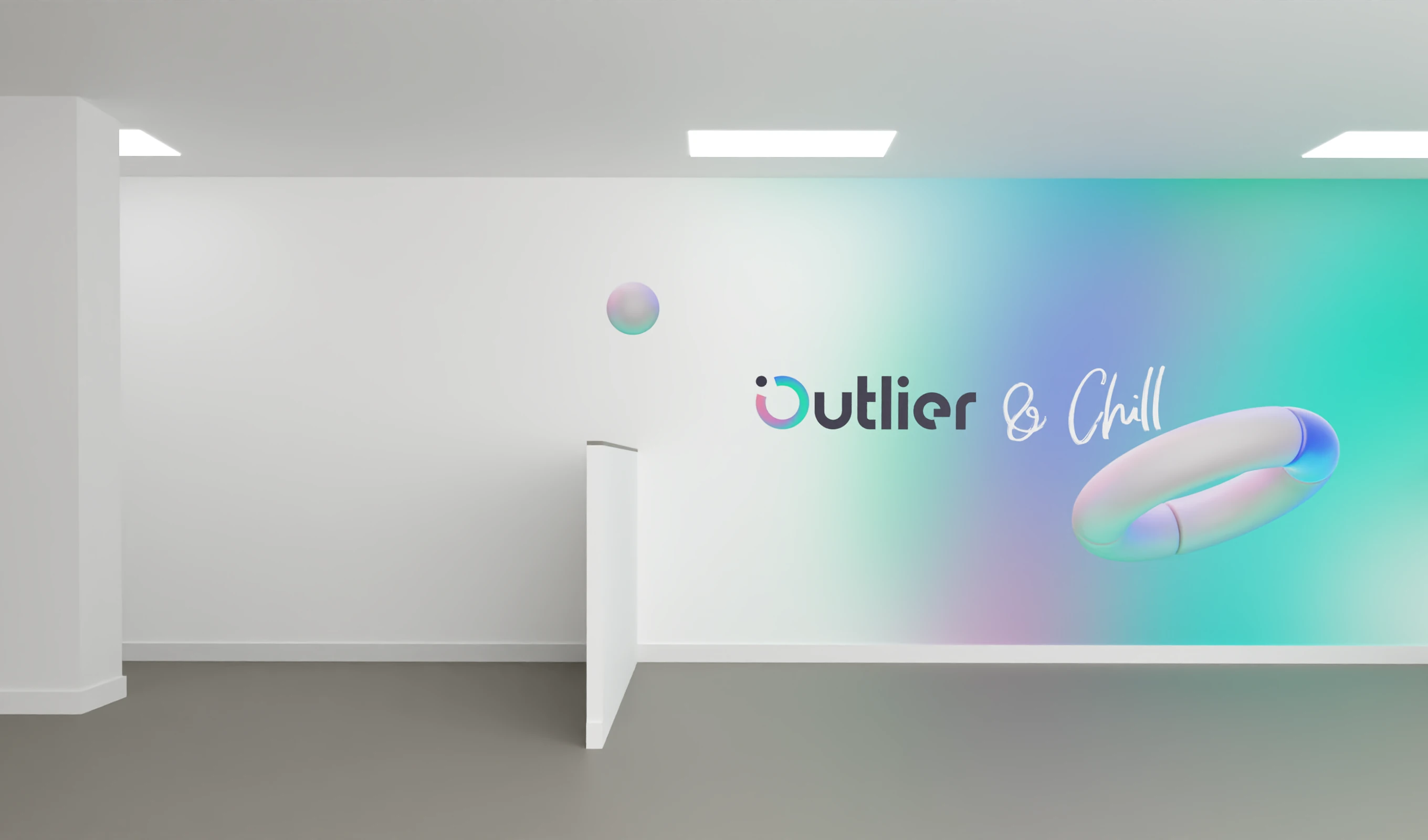
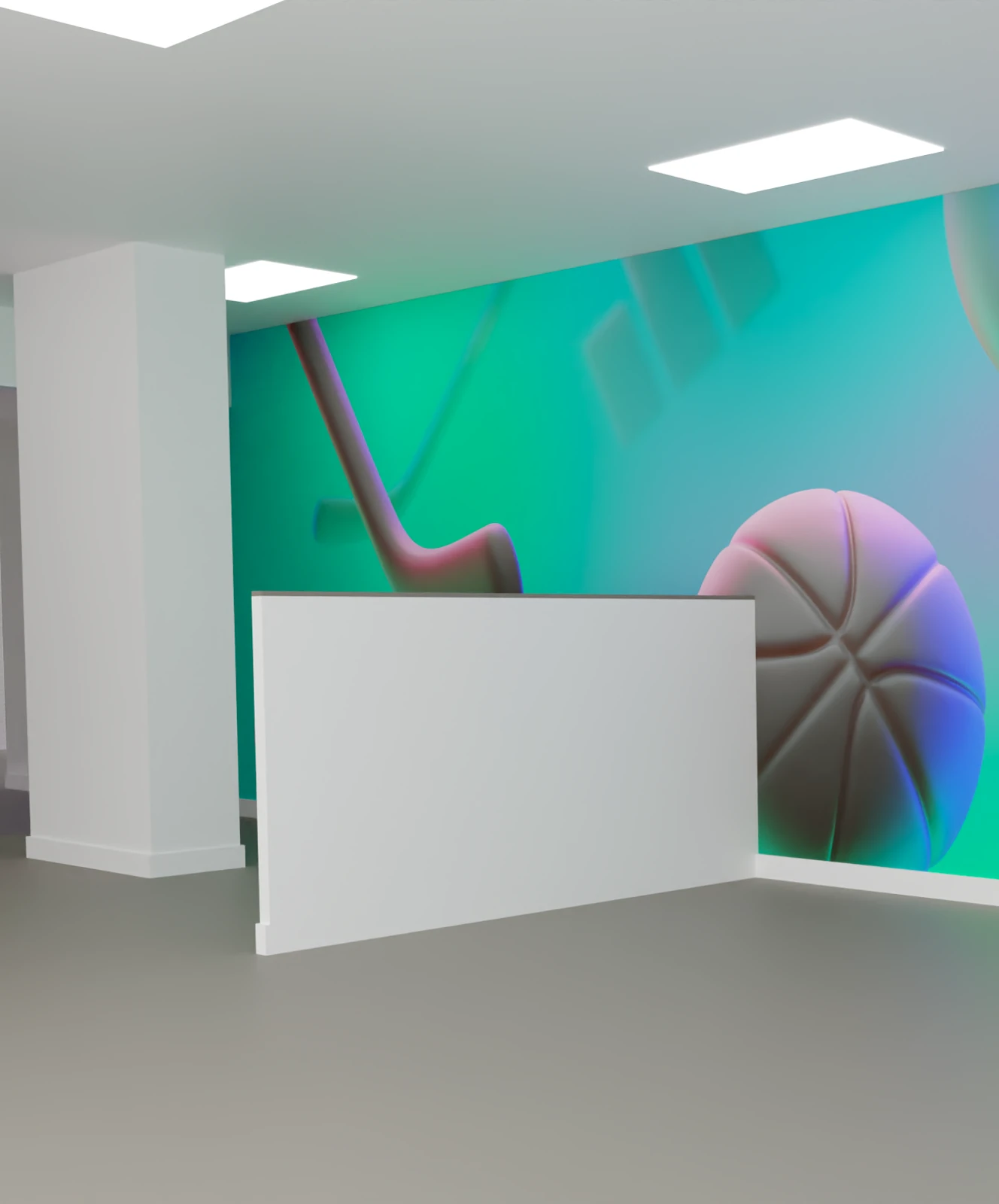
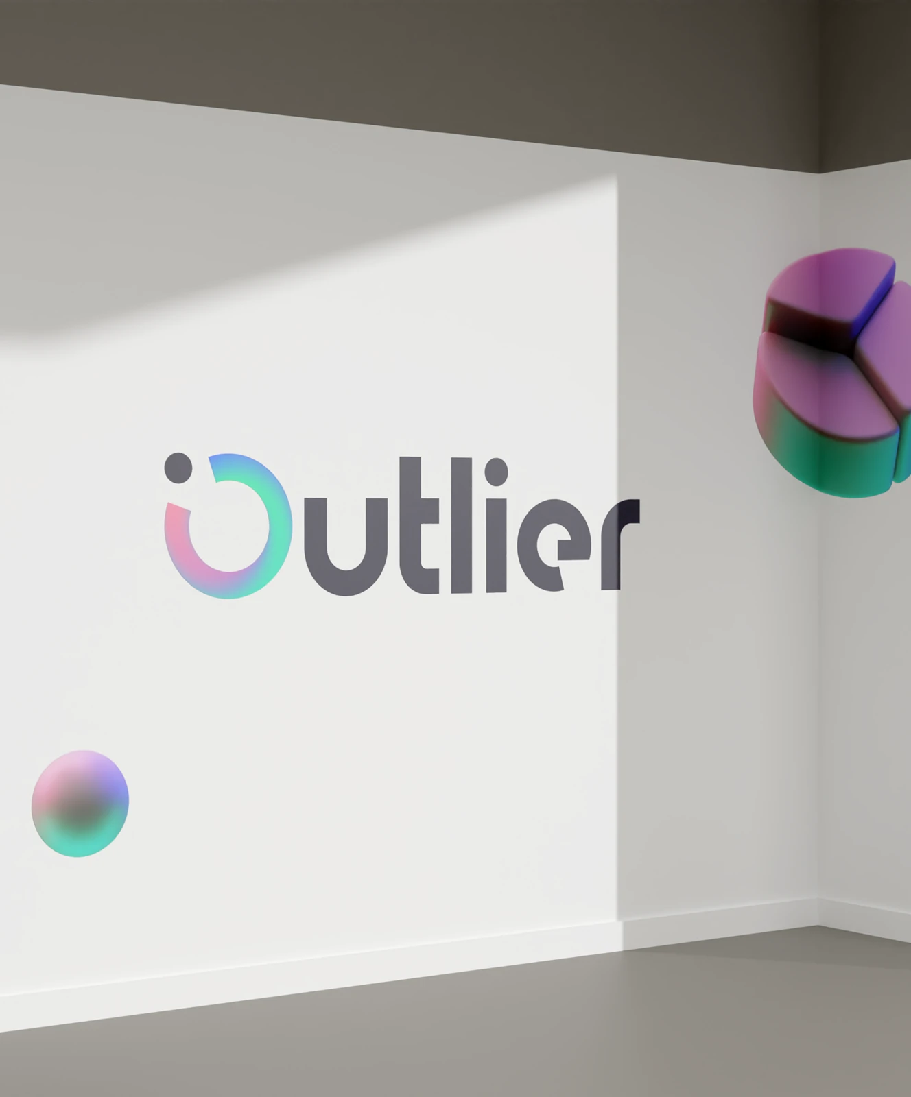
The visual language extended into physical space: gradient murals, 3D sports props like a basketball and hockey stick, and the wordmark on plain walls – a counterpoint to the data-dense product screens.
The color system and icon carried into App Store marketing screenshots and the listing itself. Captions use the same palette as the product.
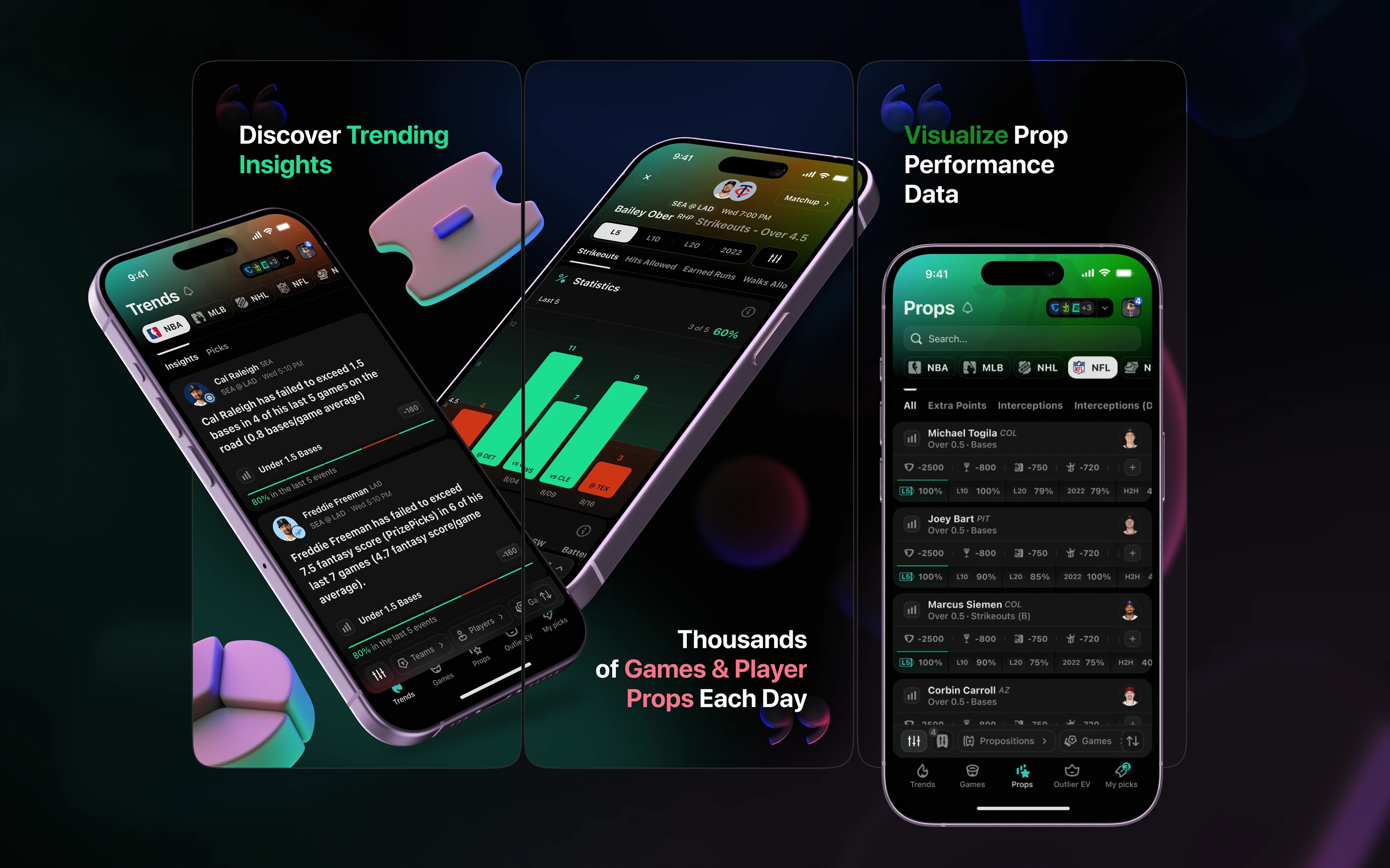
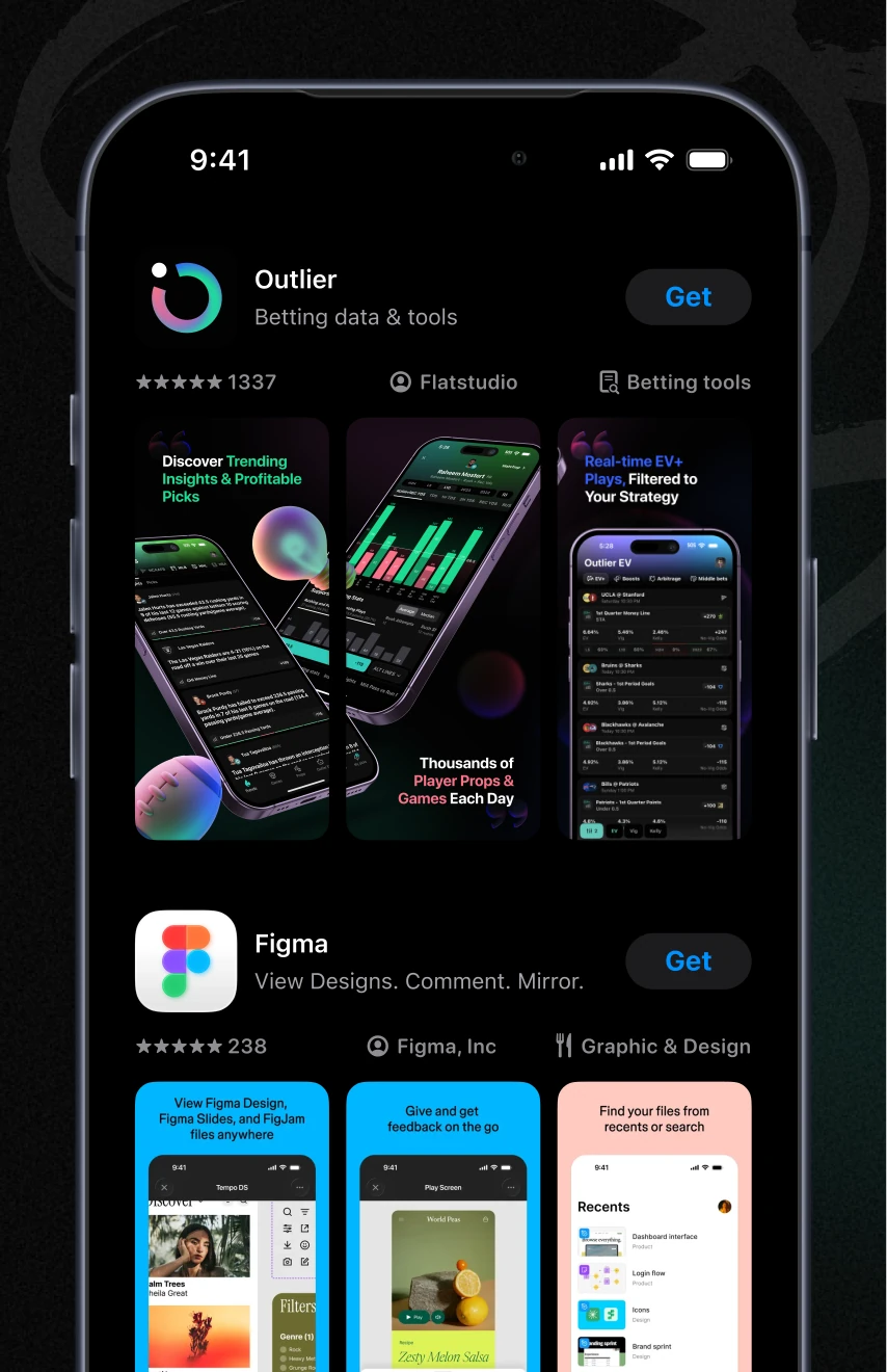
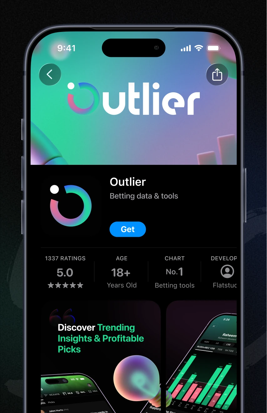
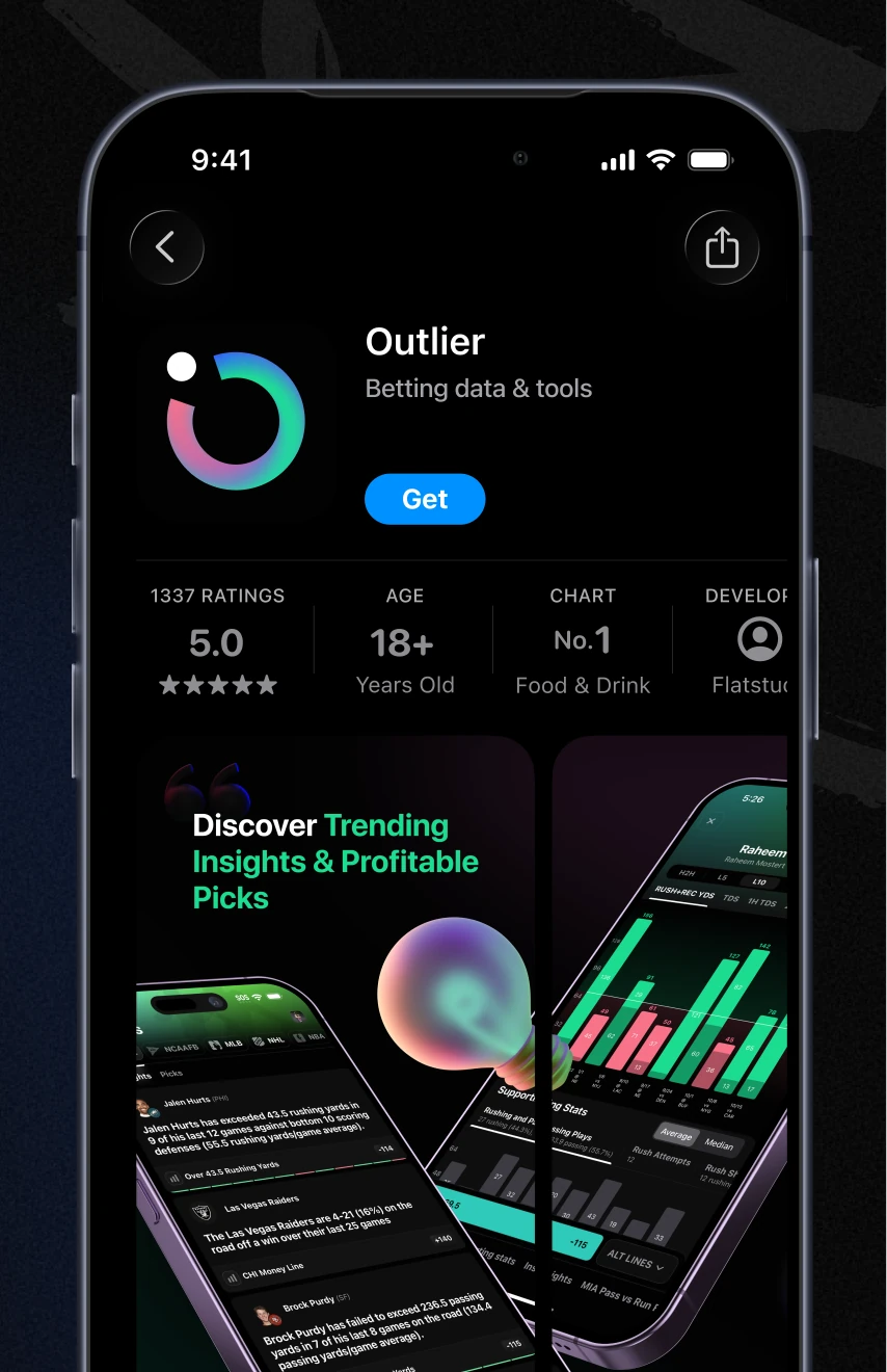
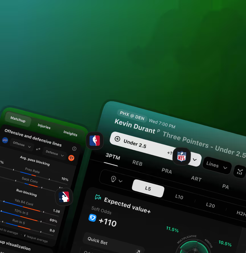
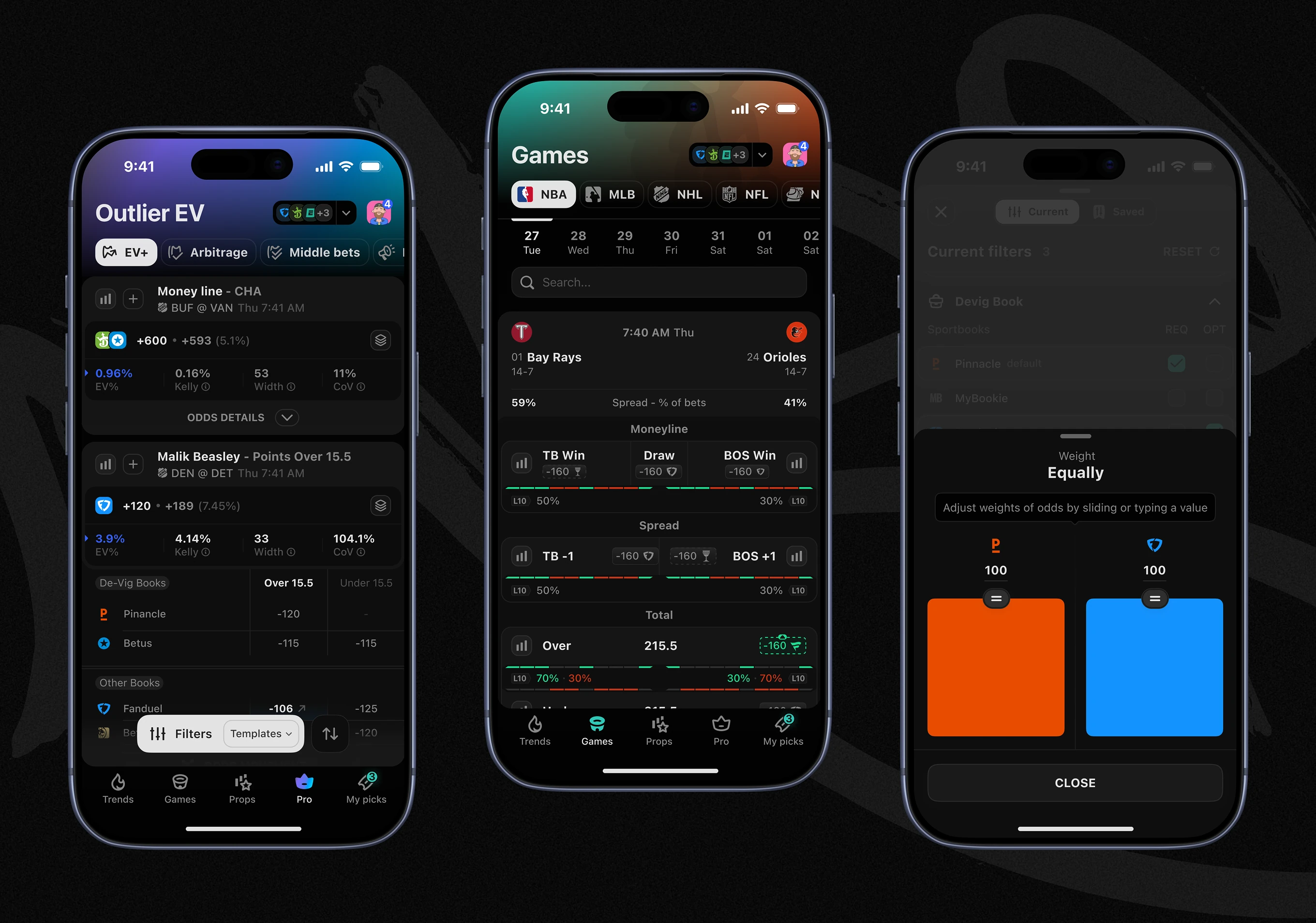
The same color system and iconography carry into the Outlier iOS App: green and red highlight value, brand blue and orange mark team sides. One visual language spans brand and product.
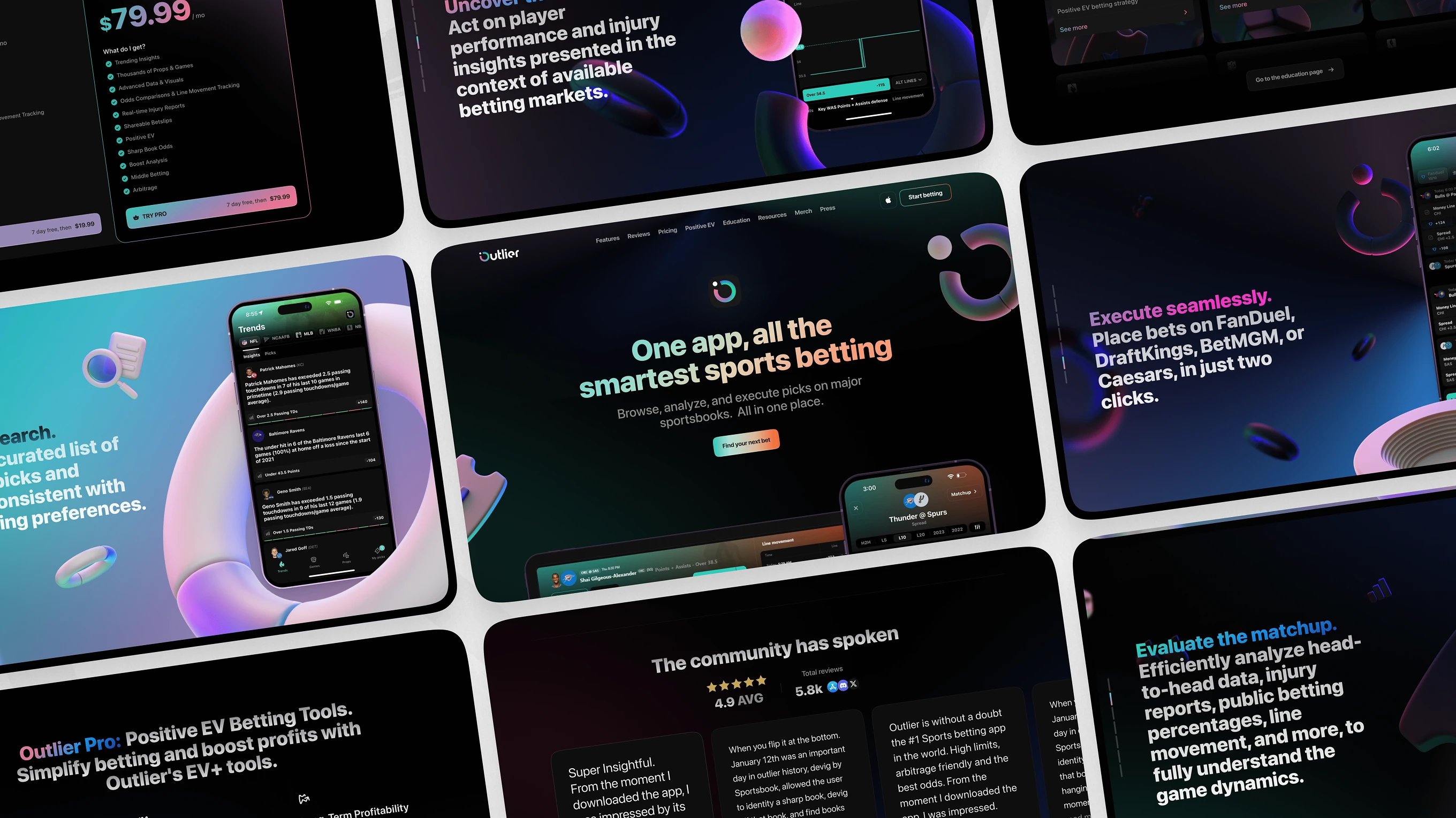
The palette, logo, and iconography extend to the promotional website.
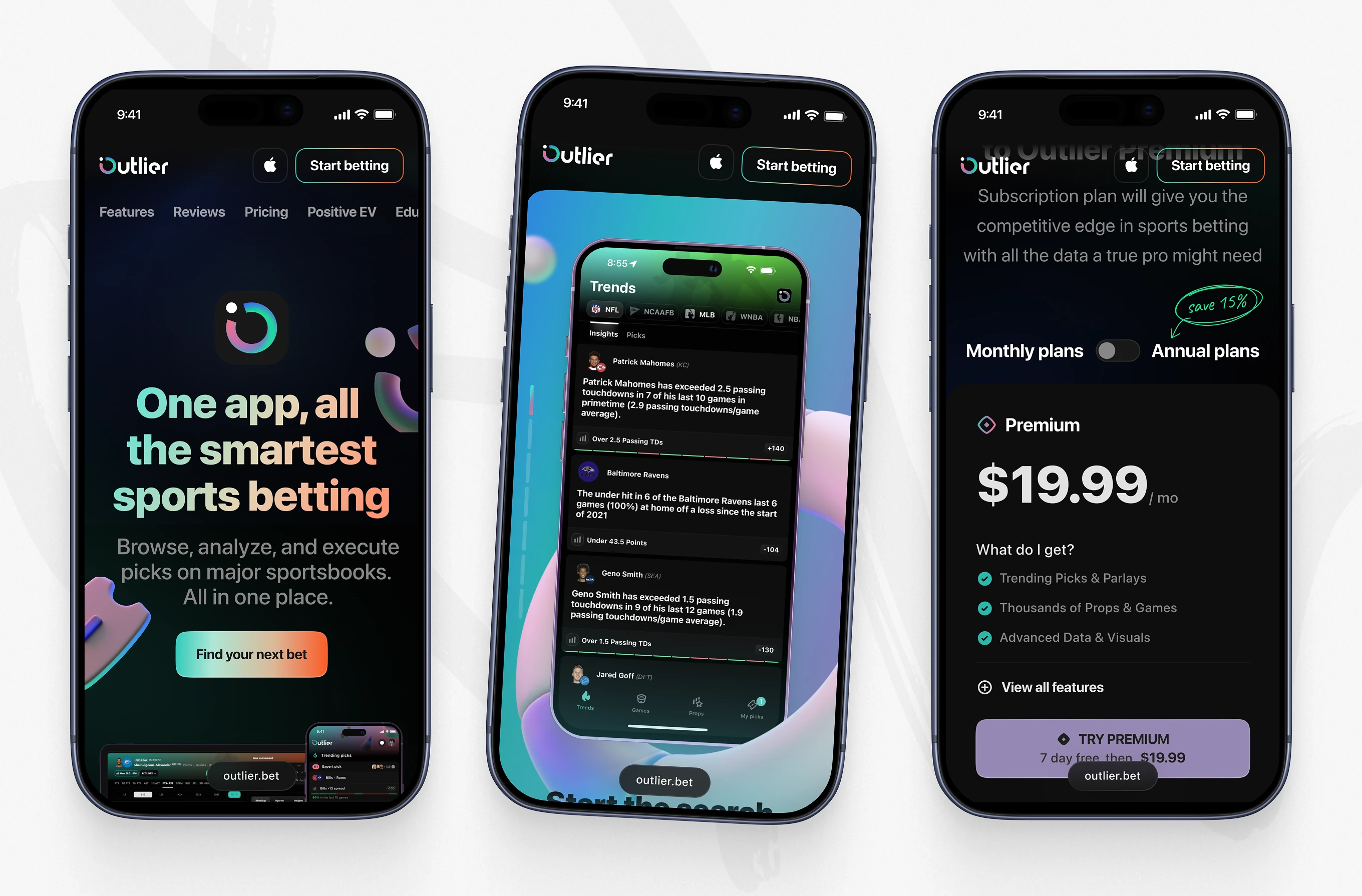
The same visual system adapts to mobile: hero, trends feed, and a Premium plan screen all in the brand's dark theme and gradient accents.
Brand built after the product always fights the product. Built alongside it from day 0, they reinforce each other – which is when to bring us in.
Starting something? Talk to us.