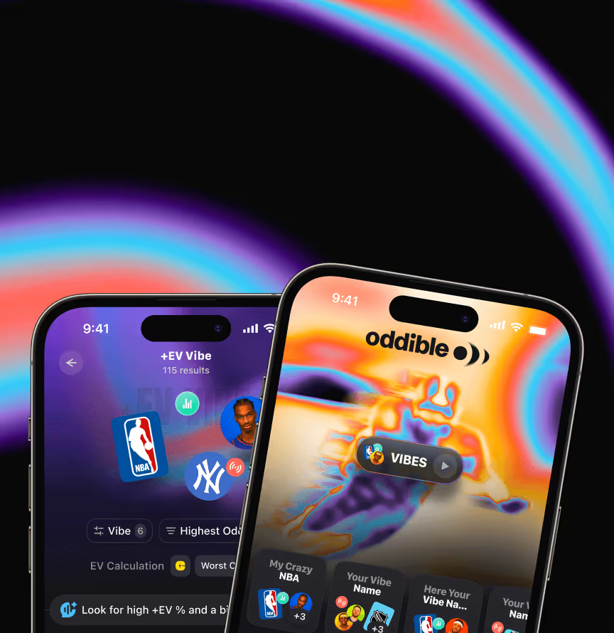















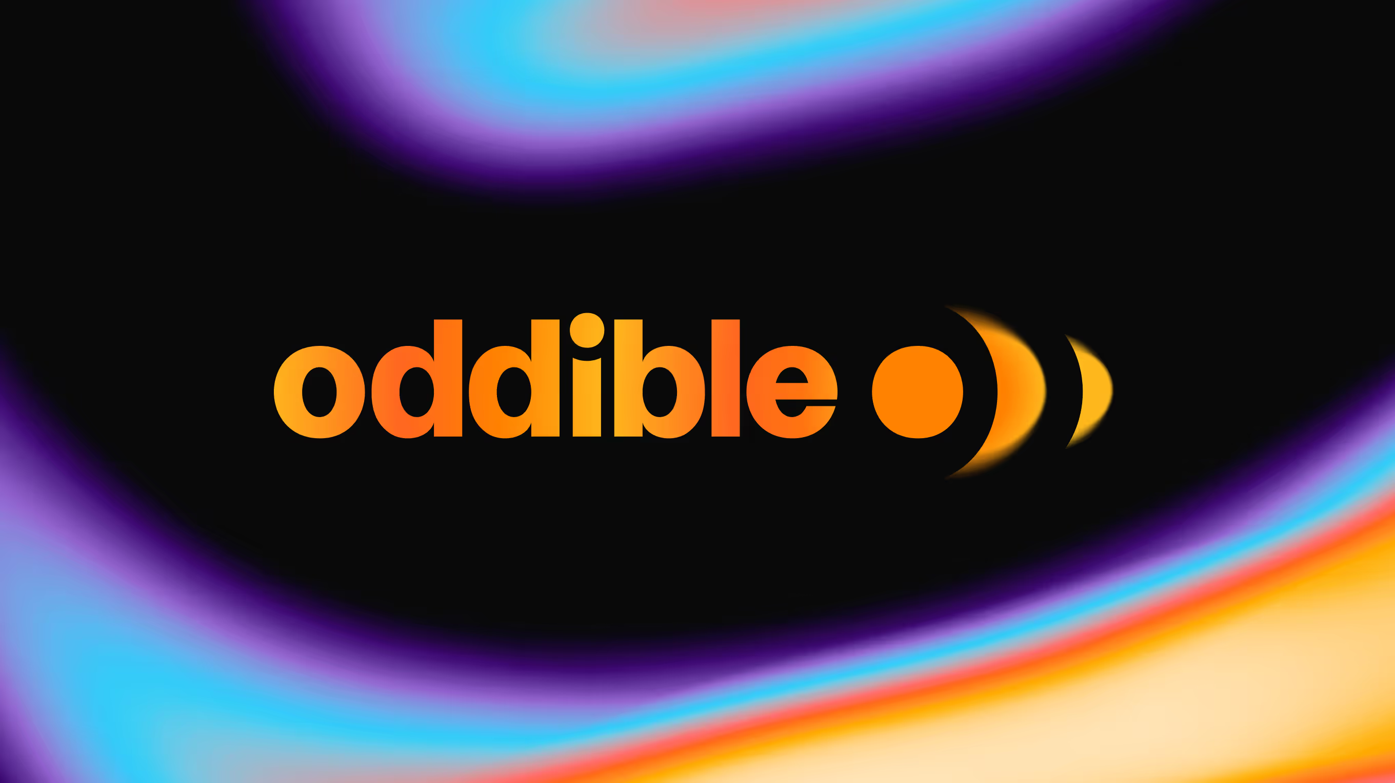
We shaped it from the same one-sentence brief as the product, covering strategy, logo, guidelines, and tone of voice. Oddible's promise – complex markets turned into clear, shareable picks – needed an identity that reads instantly in a social feed, and the brand system now carries that positioning across the product.
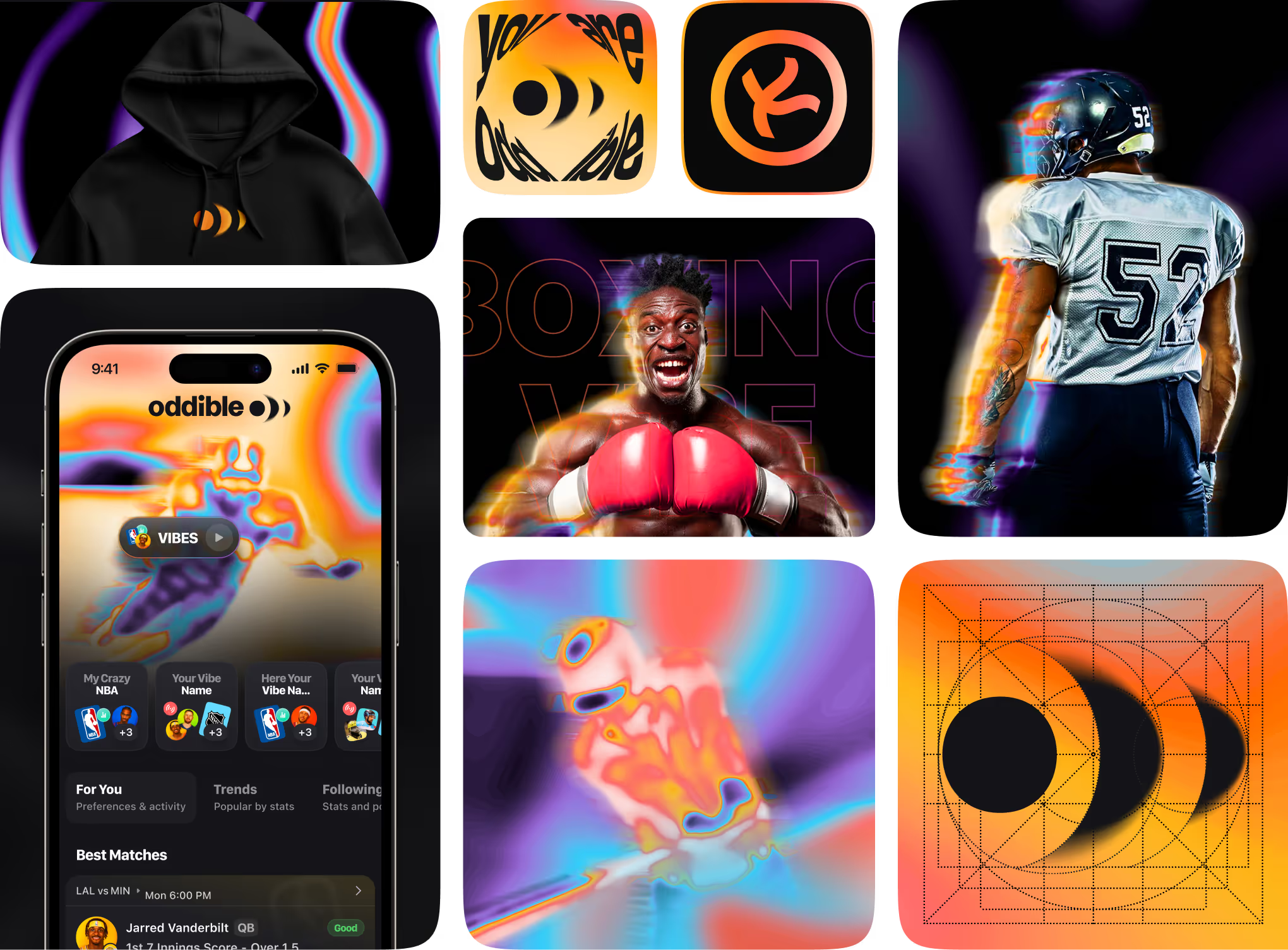
Visual identity system for Oddible, a social betting app, applied across product screens, merchandise, and campaign art. Includes the iOS app UI, a branded hoodie, and vibe-themed sports visuals for various markets.
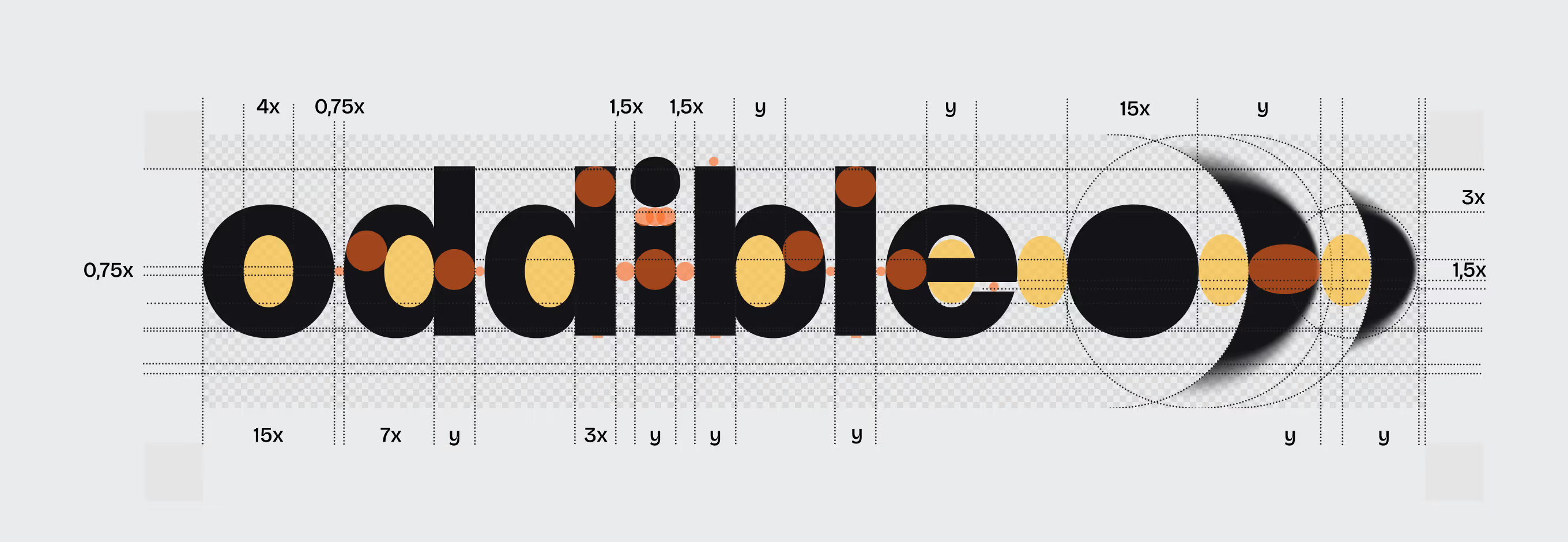
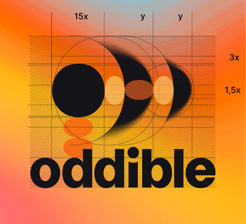
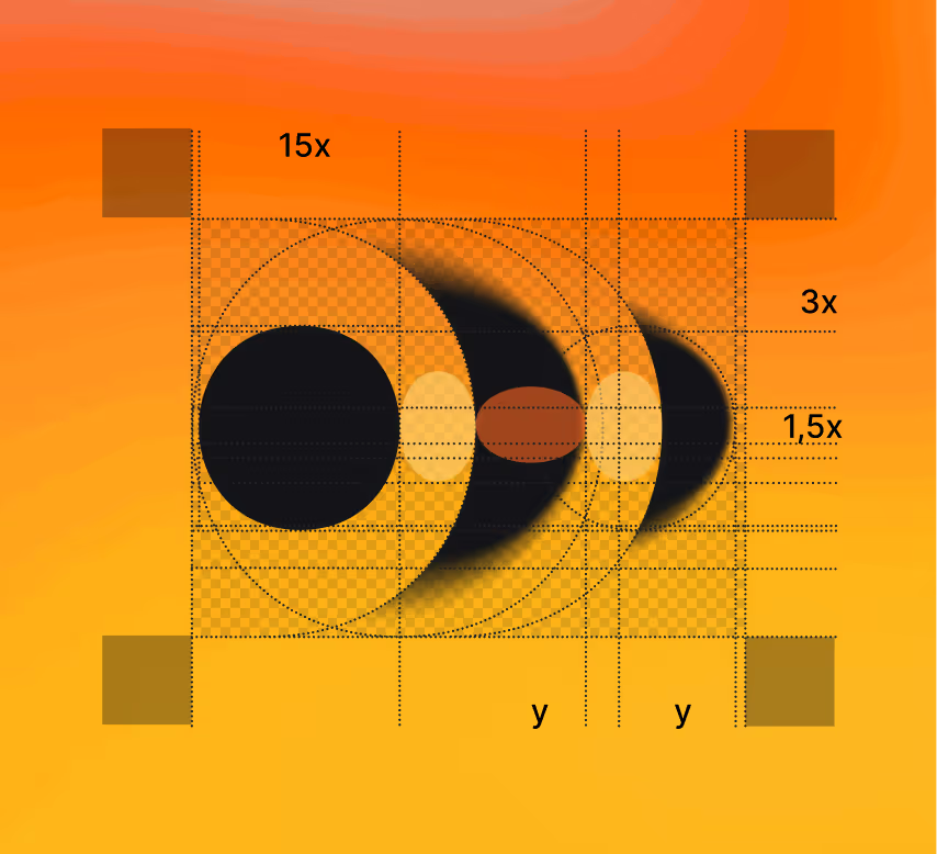
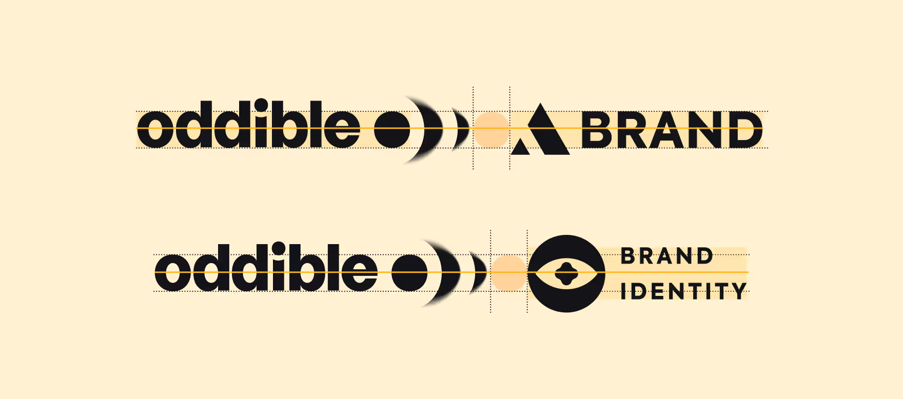
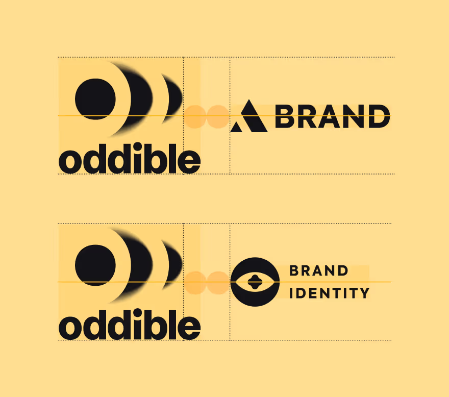
Logo construction grid defining spacing, proportion, and clear-space rules for the wordmark and icon lockups. Grid multiples set minimum sizing and safe zones so the mark stays legible on small social thumbnails.

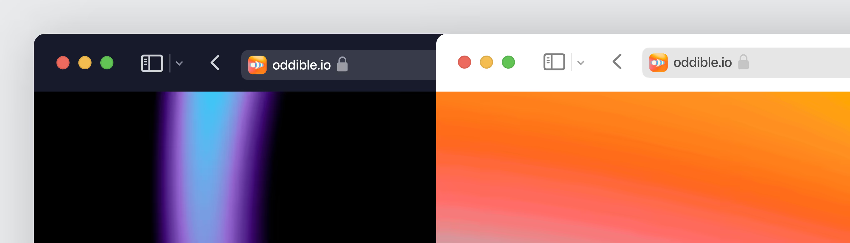
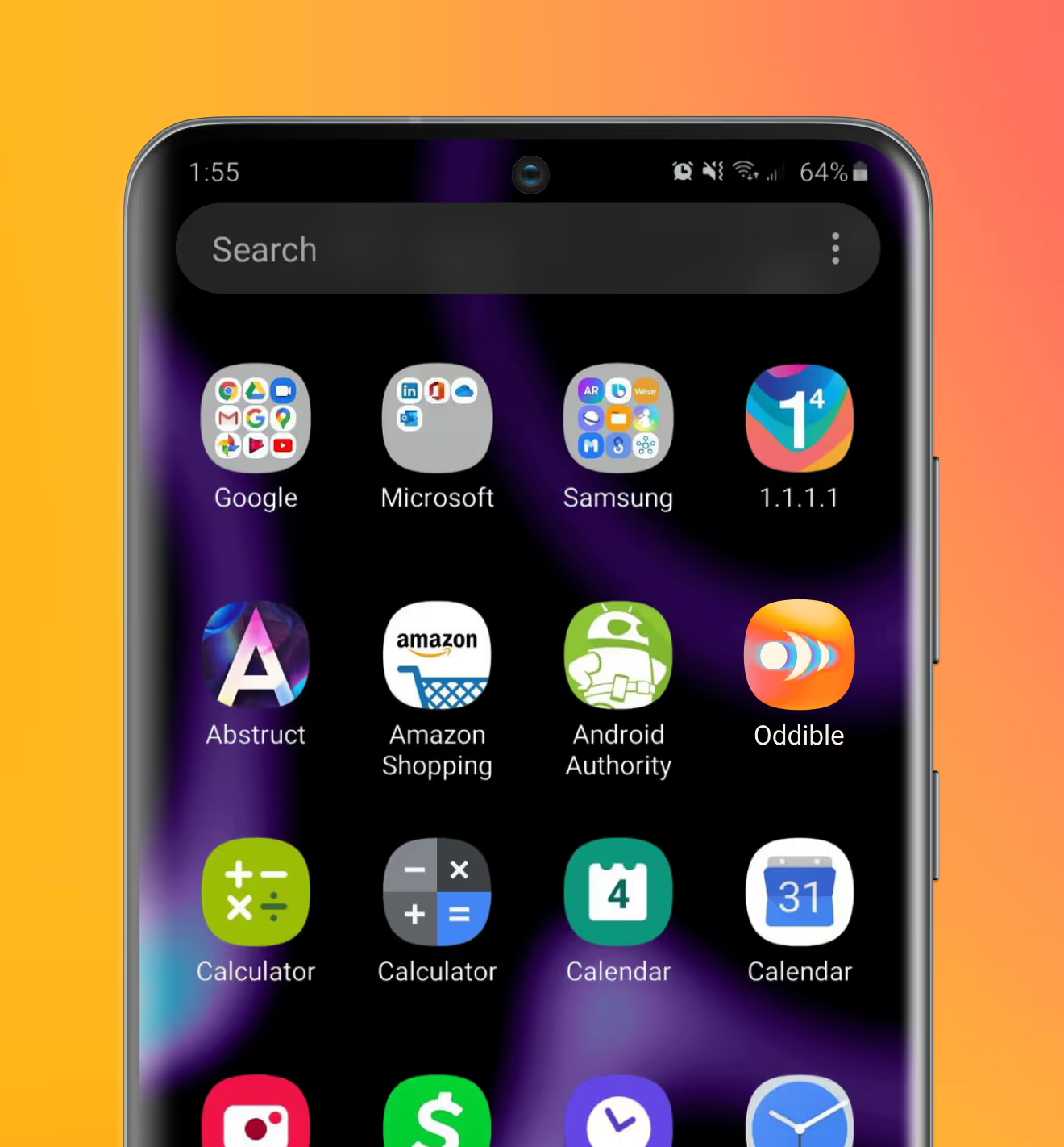
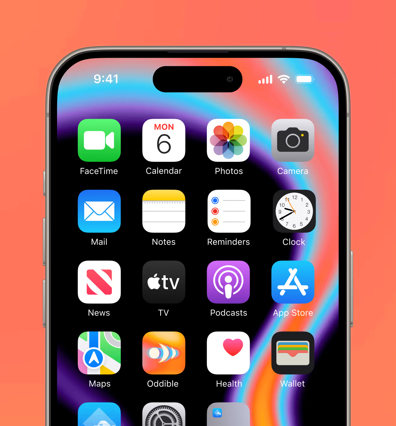
App icon and browser favicon for the app, tested against home-screen and browser-tab environments. Designed to remain recognizable and high-contrast at small sizes.
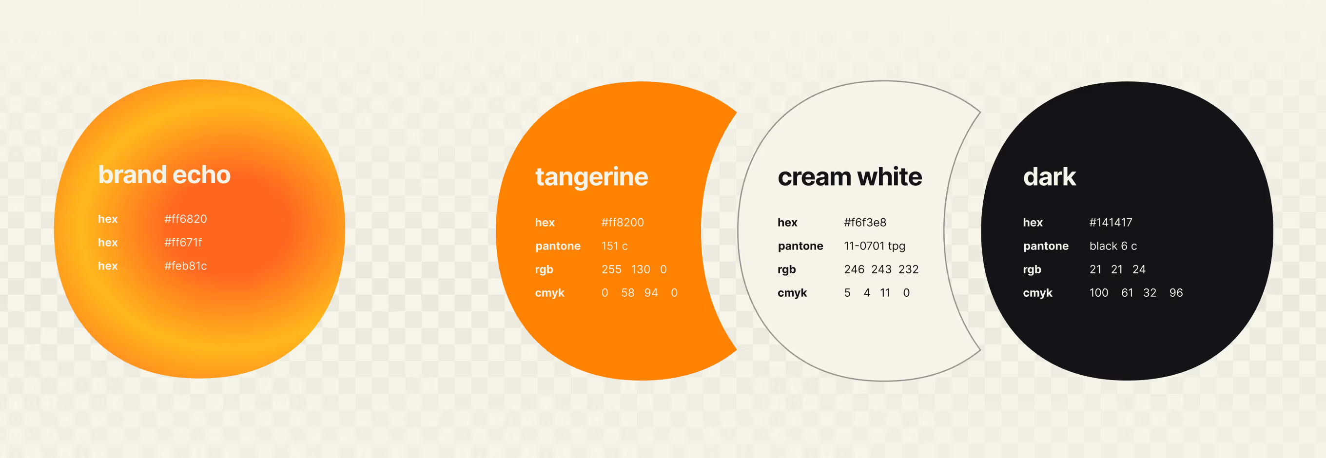
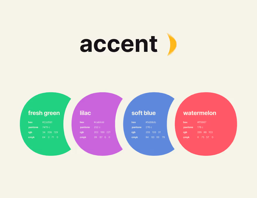
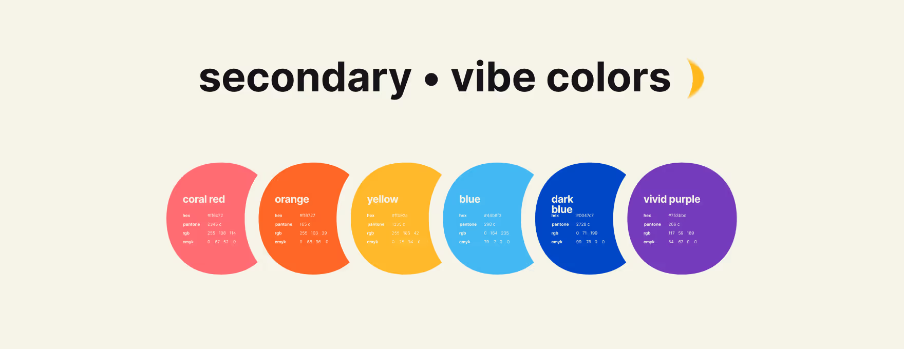
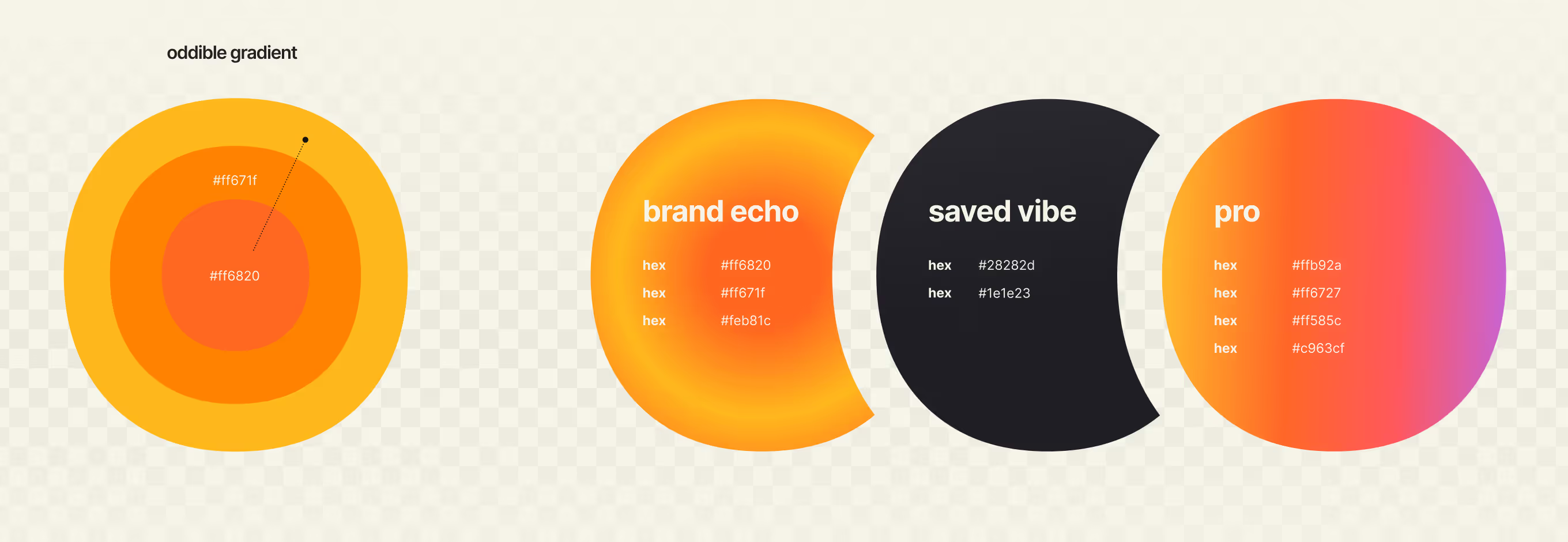
Color system covering primary brand tones, accent colors, and a secondary set of 'vibe' colors. Includes a gradient with named variants for different product states.
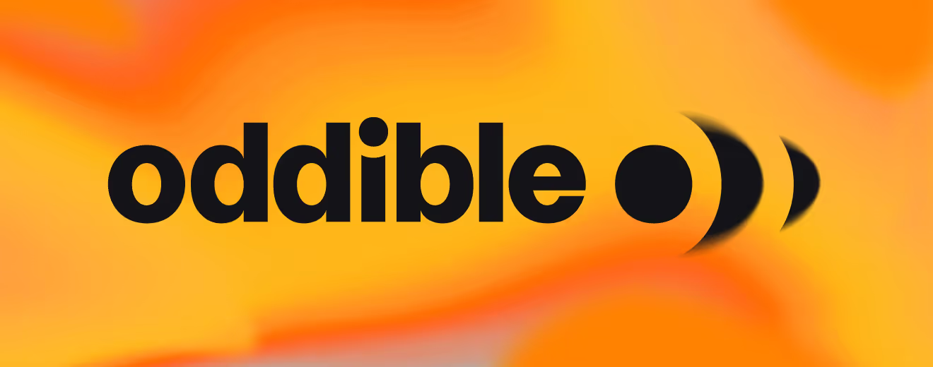
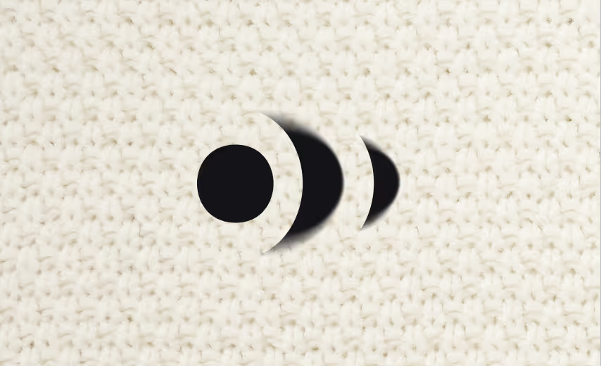
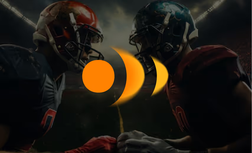
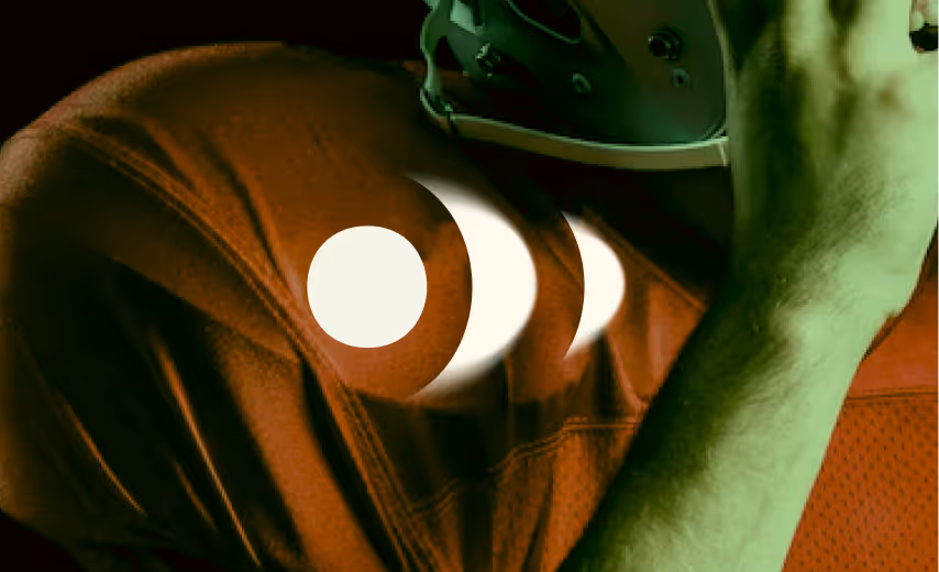
Logo lockups for the brand tested on dark backgrounds, gradients, and real photography rather than flat color only. Reversed marks sit over a fabric swatch and football action shots to confirm legibility over busy imagery.
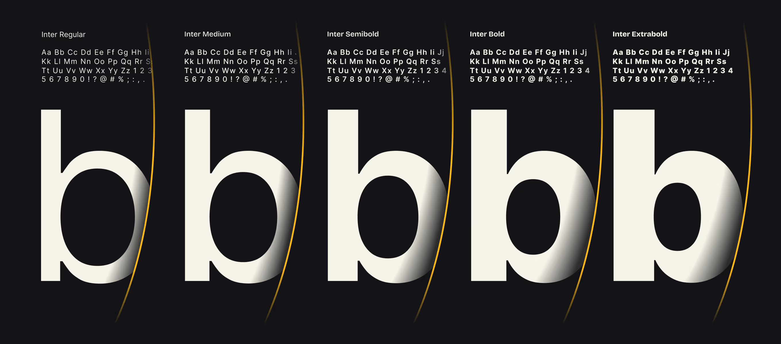
Typeface system, Inter in five weights, used across the app and its social marketing content. The typeface is also applied across marketing tiles.
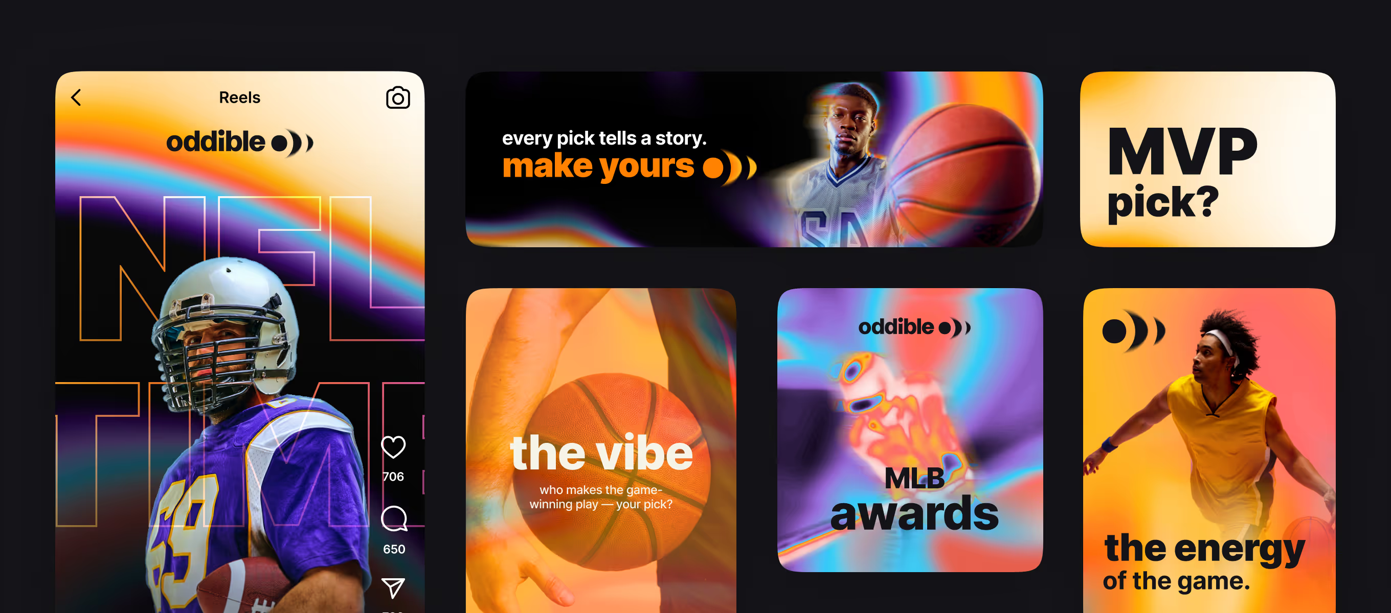
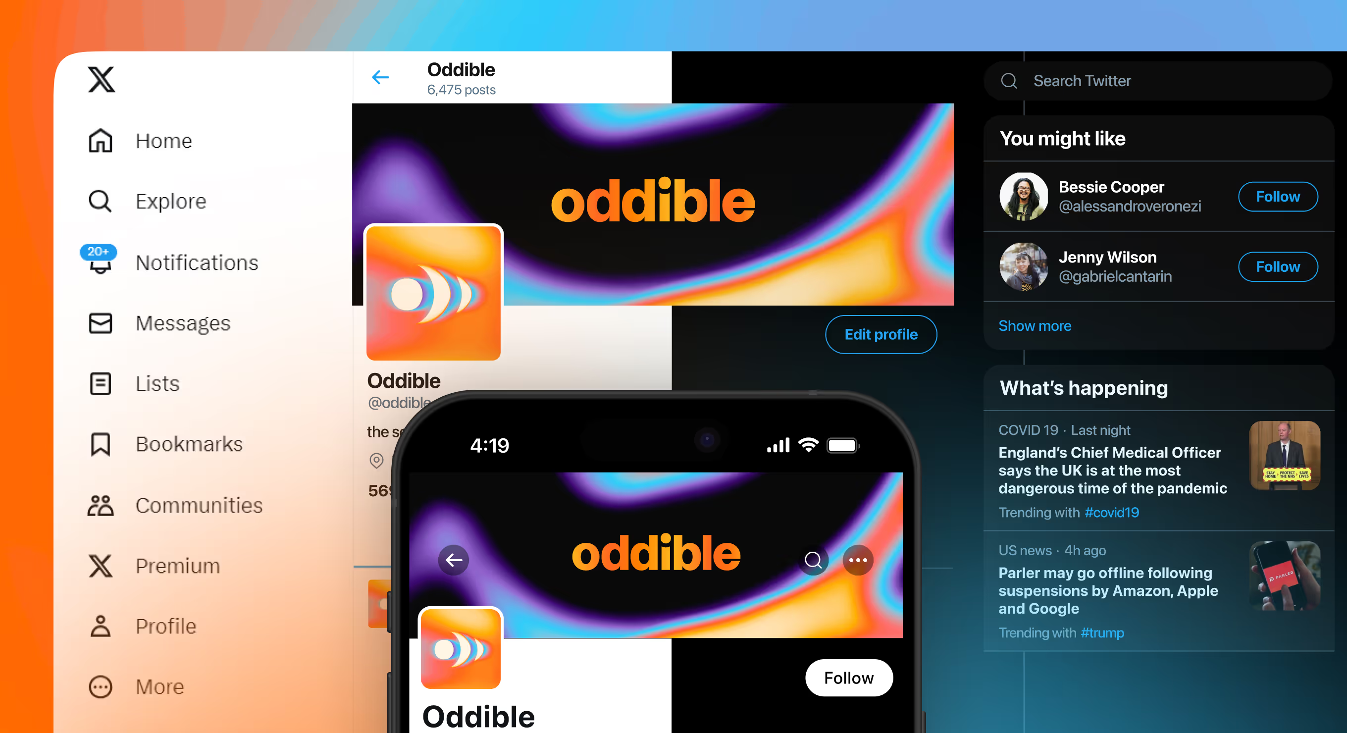
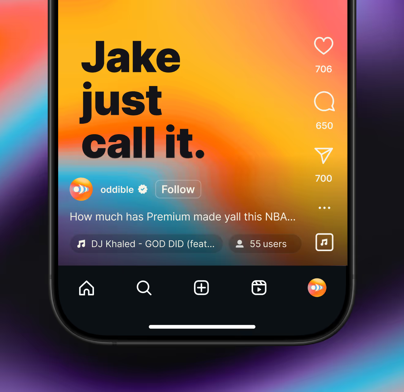
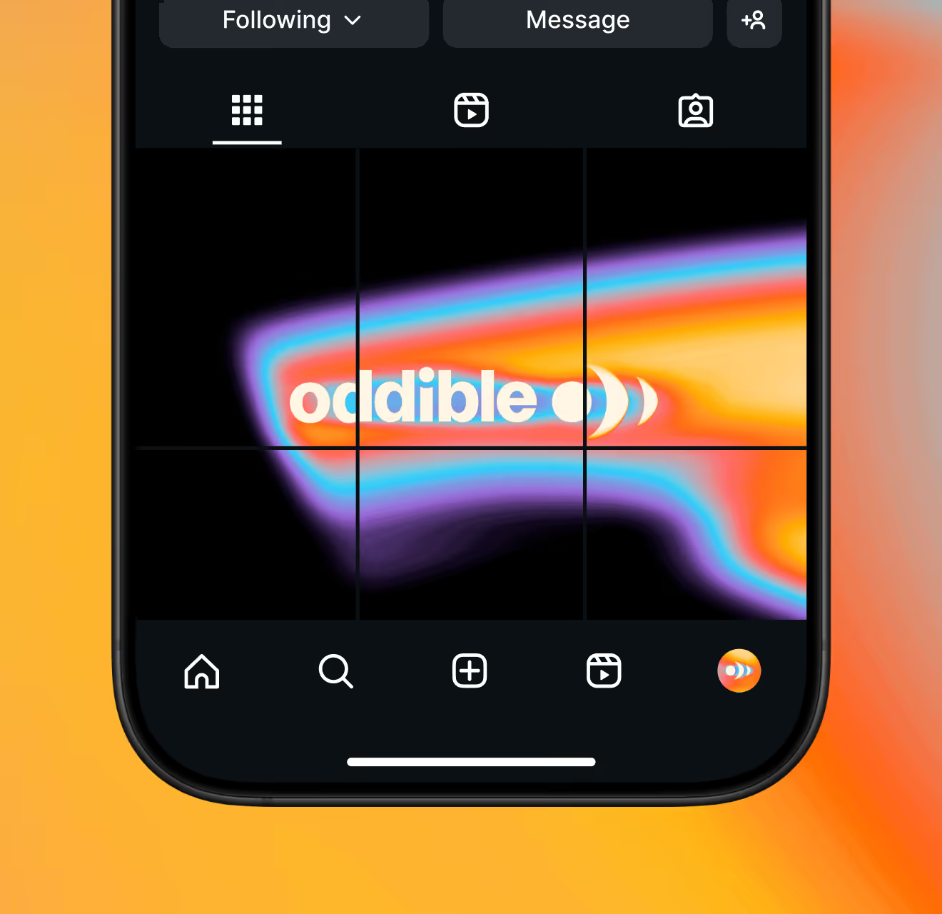
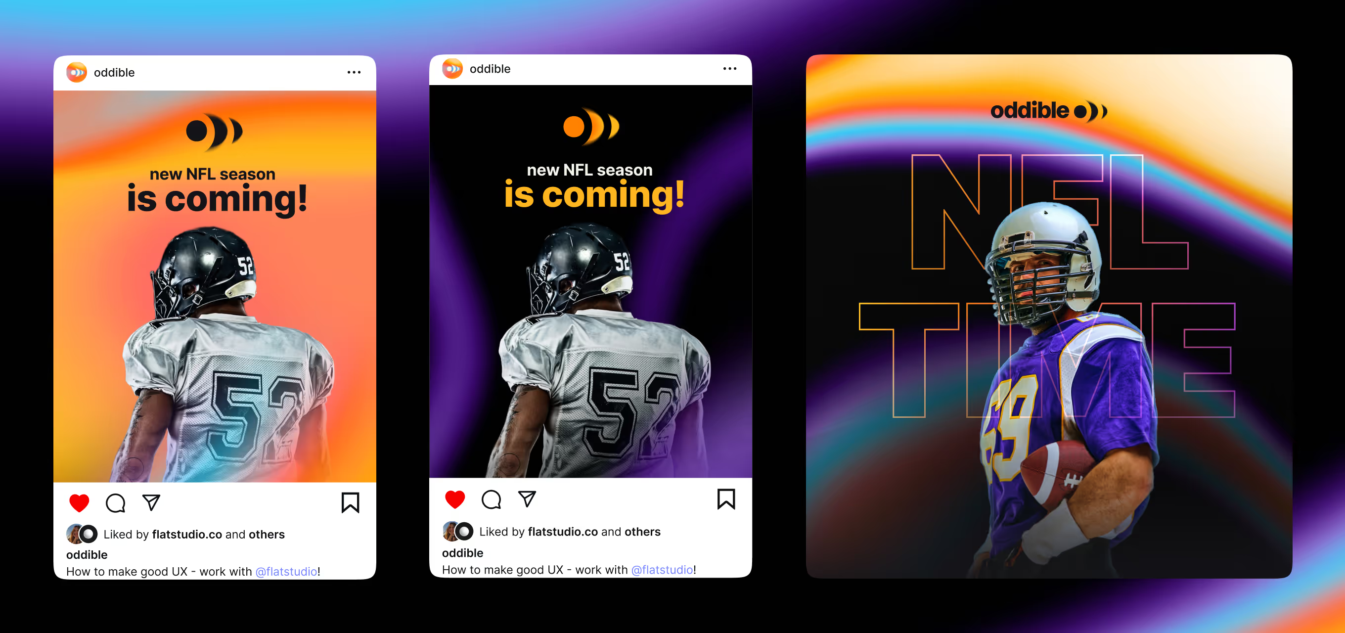
Social post templates for Oddible, built for feeds where picks get shared. Covers a profile mockup, a story format, and a seasonal promo carousel.
If your product's core promise fits in one sentence, the brand should read just as fast – especially in a social feed. Send us that sentence and we'll take it from there.