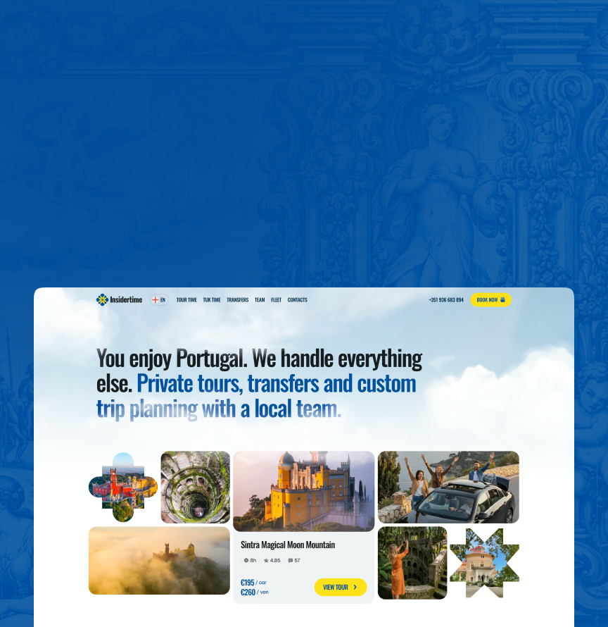












We built it around a dual Portugal–Ukraine concept, covering brand strategy, visual identity, logo, guidelines, and tone of voice. The brand had to keep both homelands visible while staying credible and modern for a public-facing travel company – so the visual language combines Portuguese azulejo patterns with Ukrainian vyshyvanka ornamentation, and that system now carries across every touchpoint.
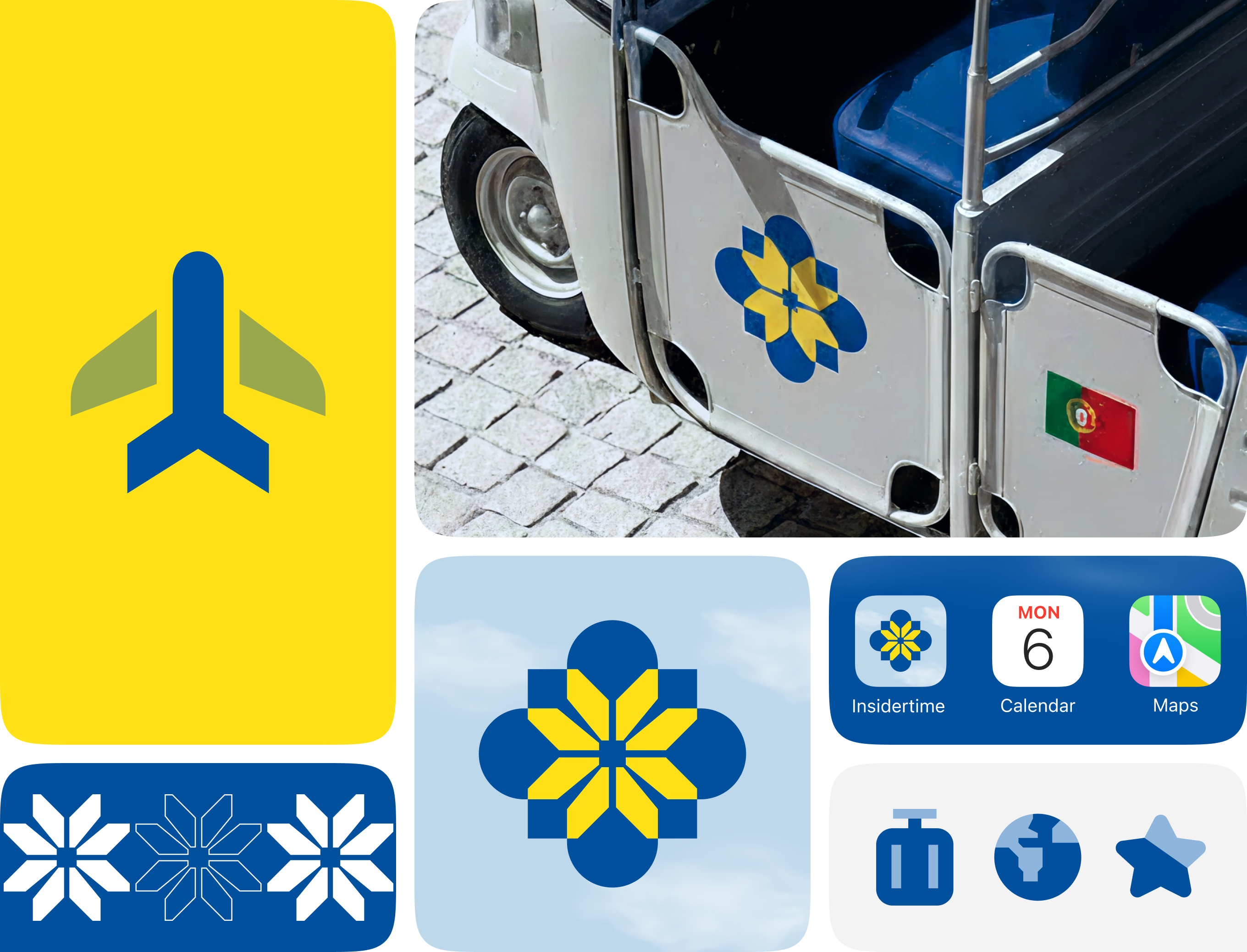
This overview covers the Insidertime Brand Identity system built for a tour operator in Portugal – flower logo mark, airplane symbol, star ornaments, travel icons, a tuk-tuk panel and an iOS app icon.
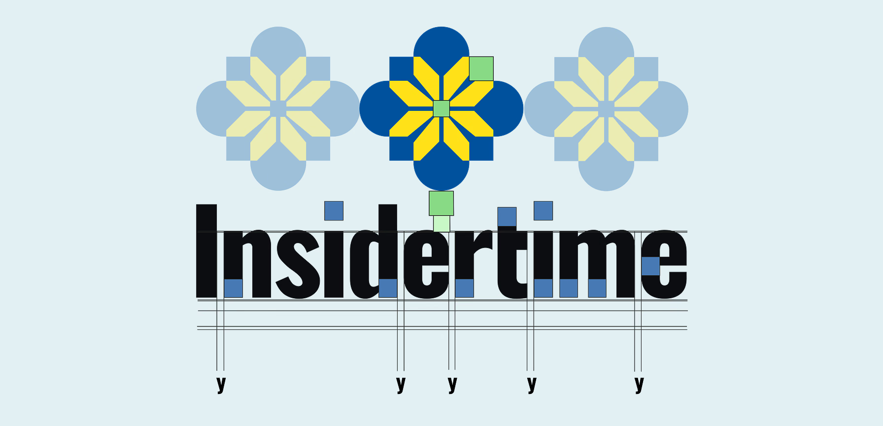
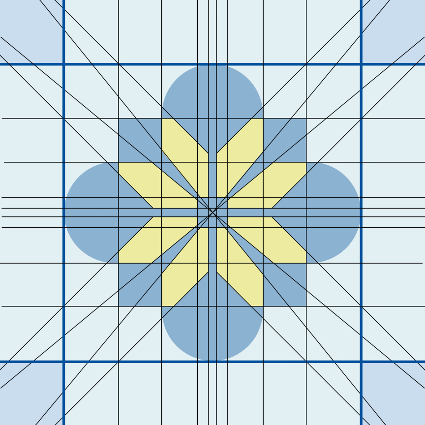
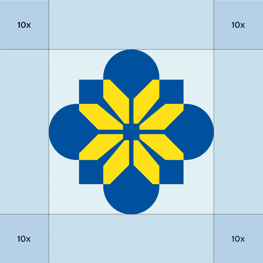
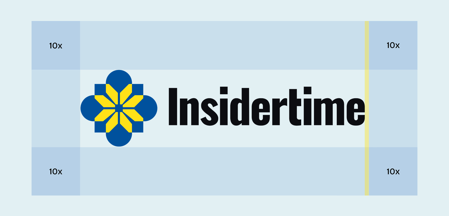
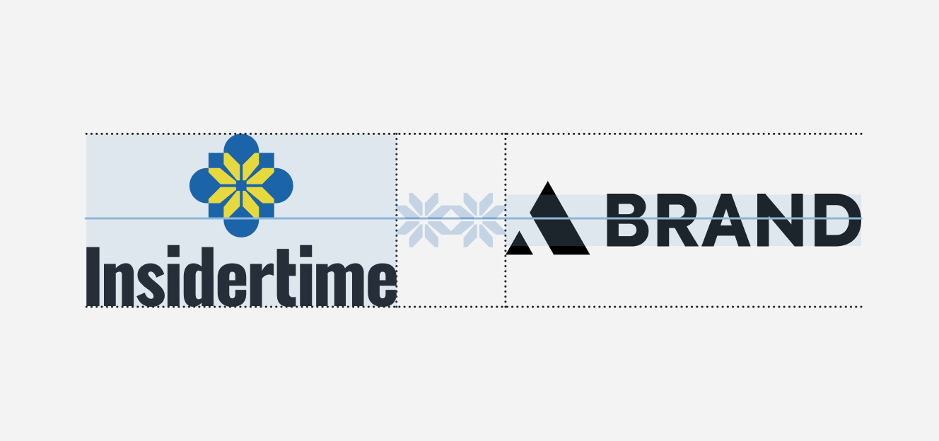
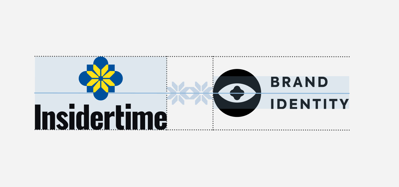
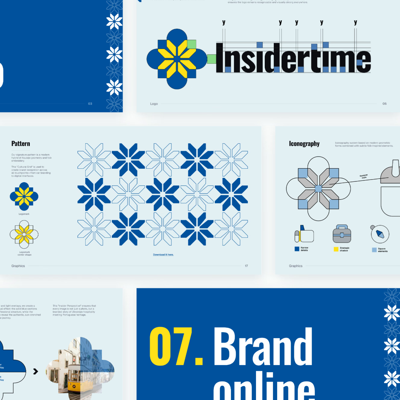
Logo specification for a travel brand’s mark: a construction grid, wordmark alignment guides and clear-space zones. Outline, full-color and horizontal lockup versions are shown on blue and light backgrounds; an app icon closes the set.



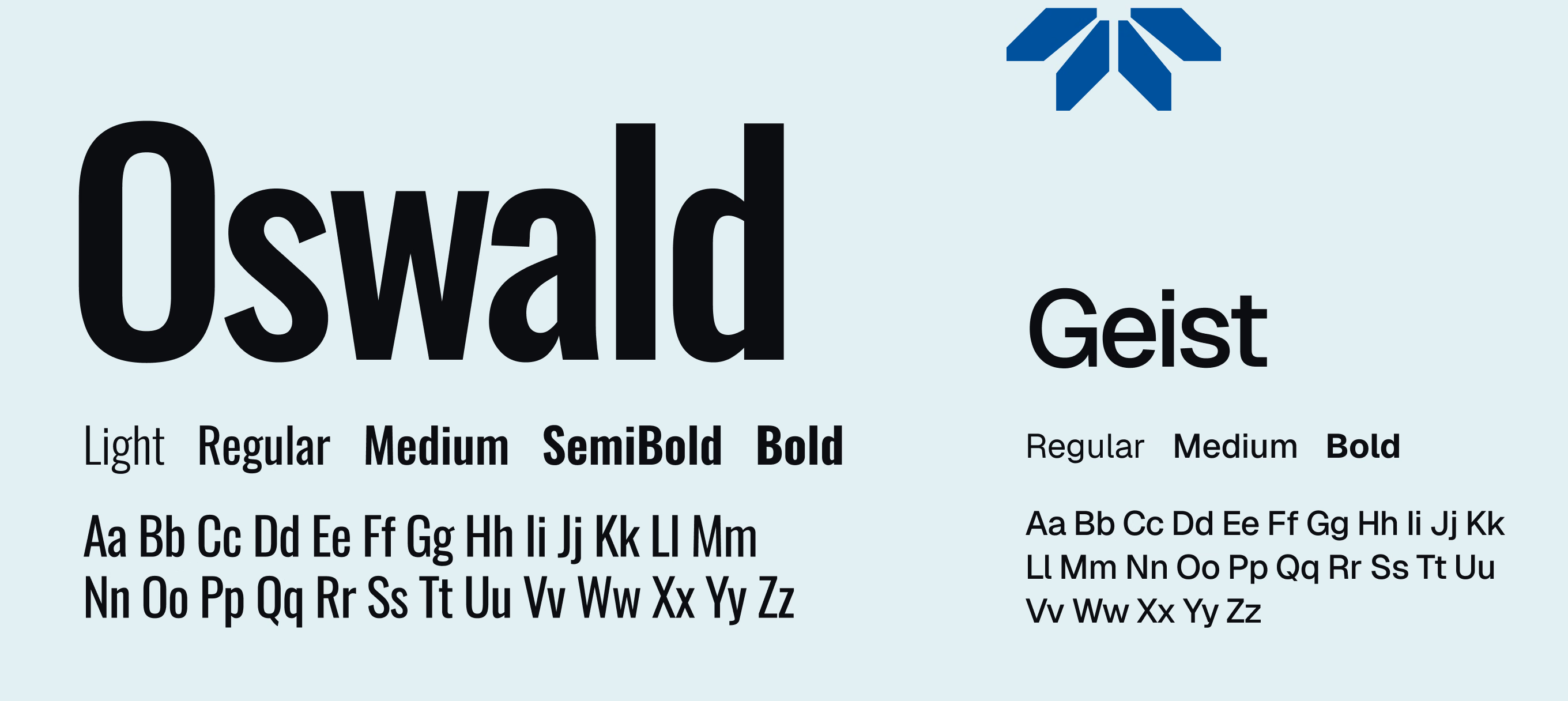
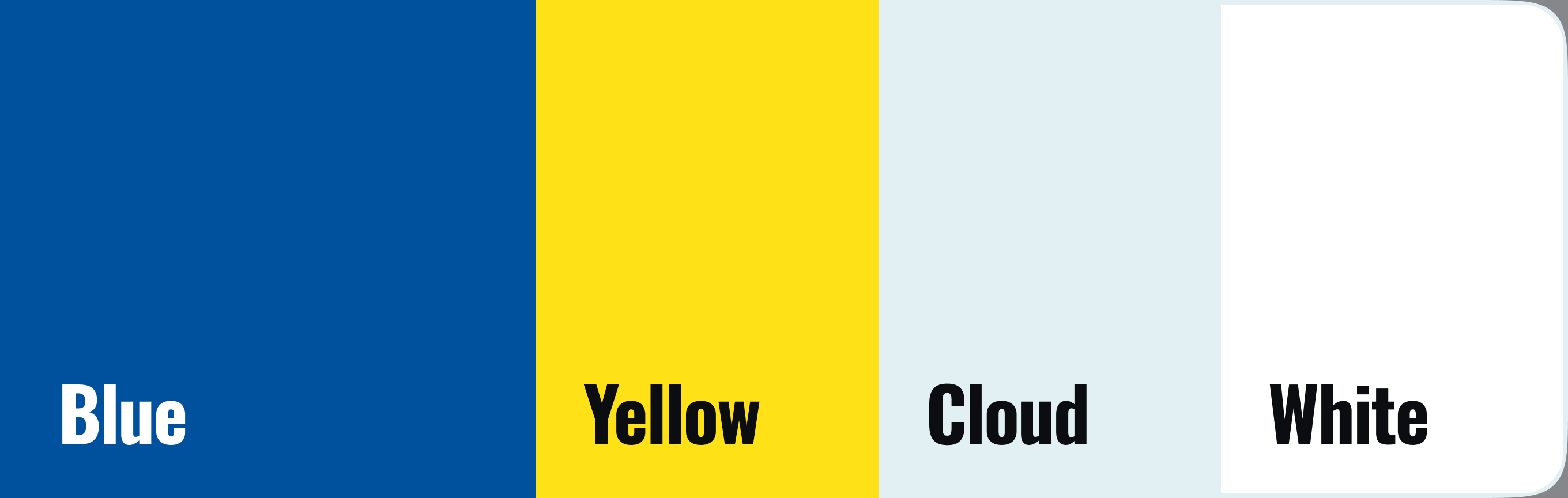
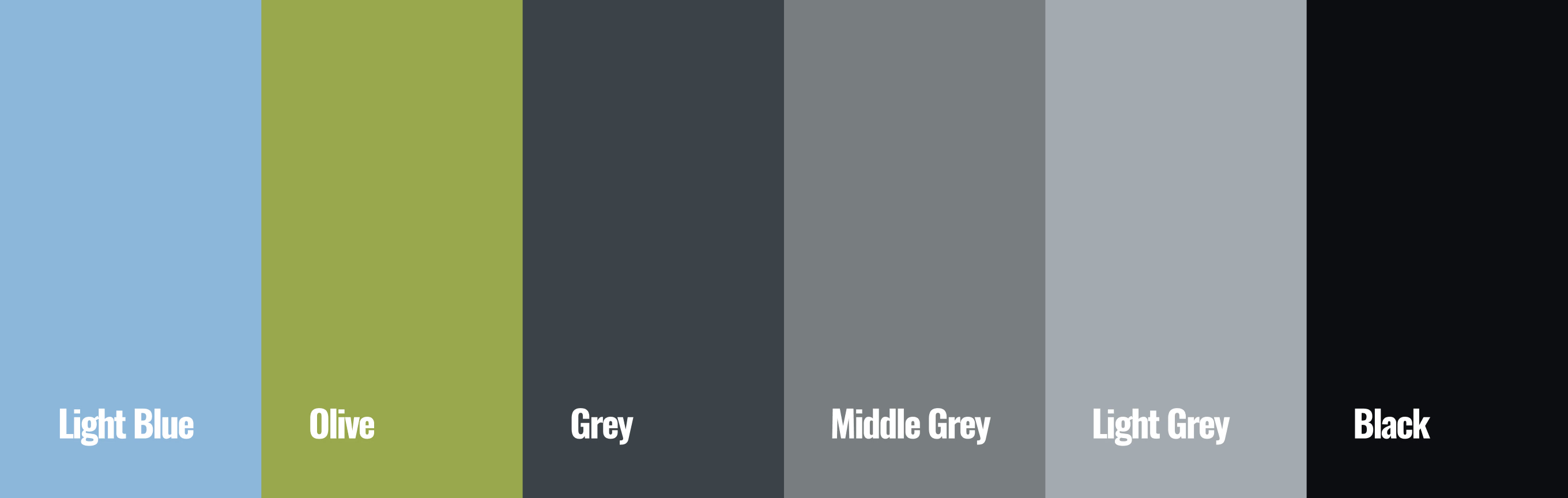
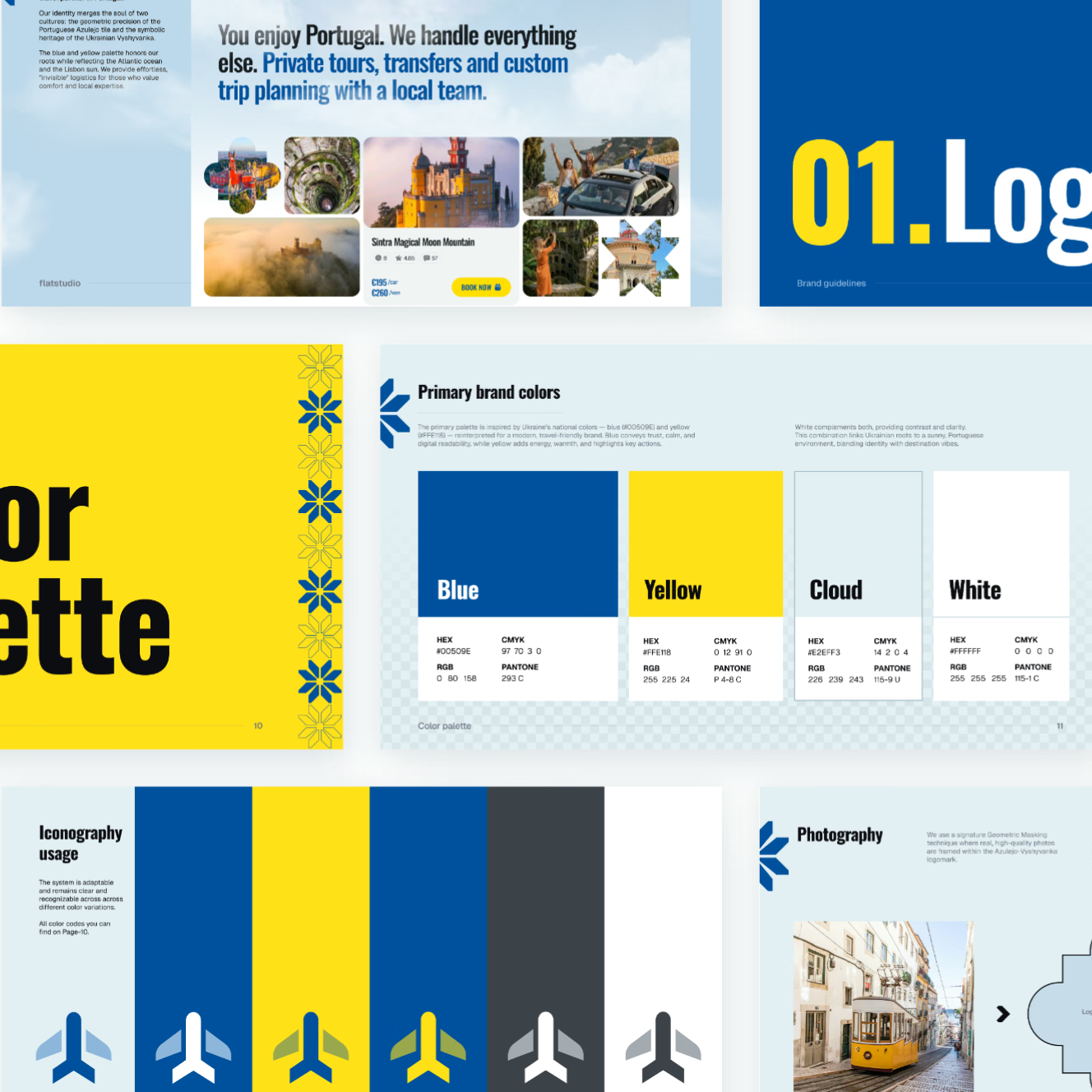
Typography and color specification for a tour operator’s brand identity: Oswald and Geist weights, four primary and six secondary colors. The flower mark and logo appear in colorways on blue, cloud, black and photo backgrounds.





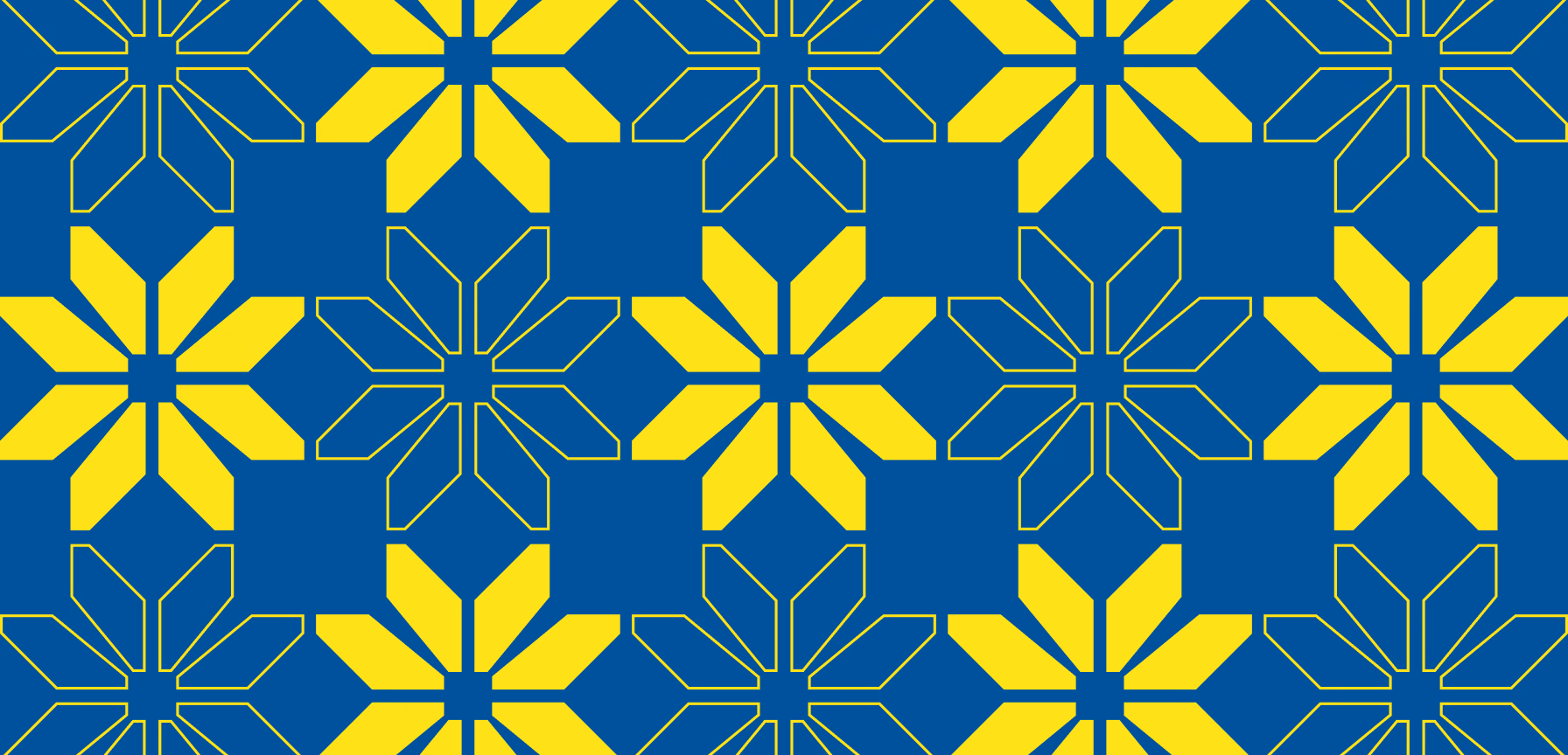
Pattern and icon system: flower motifs alternate filled and outlined in blue-on-cloud and yellow-on-blue. Ten icons follow three rules – narrow details, strategic shadow, square elements – plus an airplane symbol in six colors.



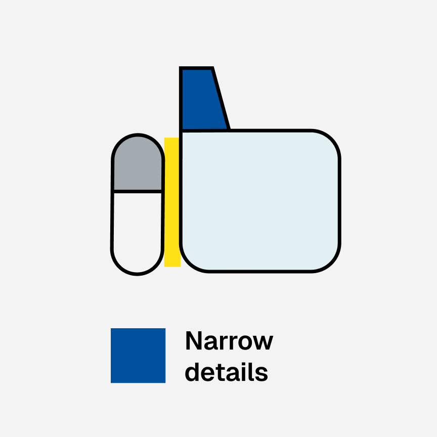
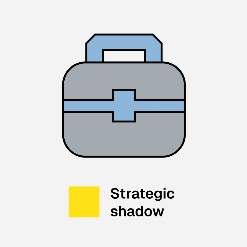
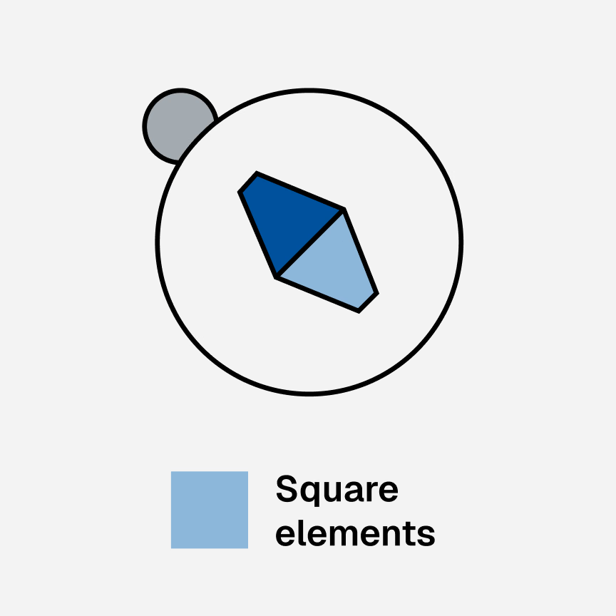
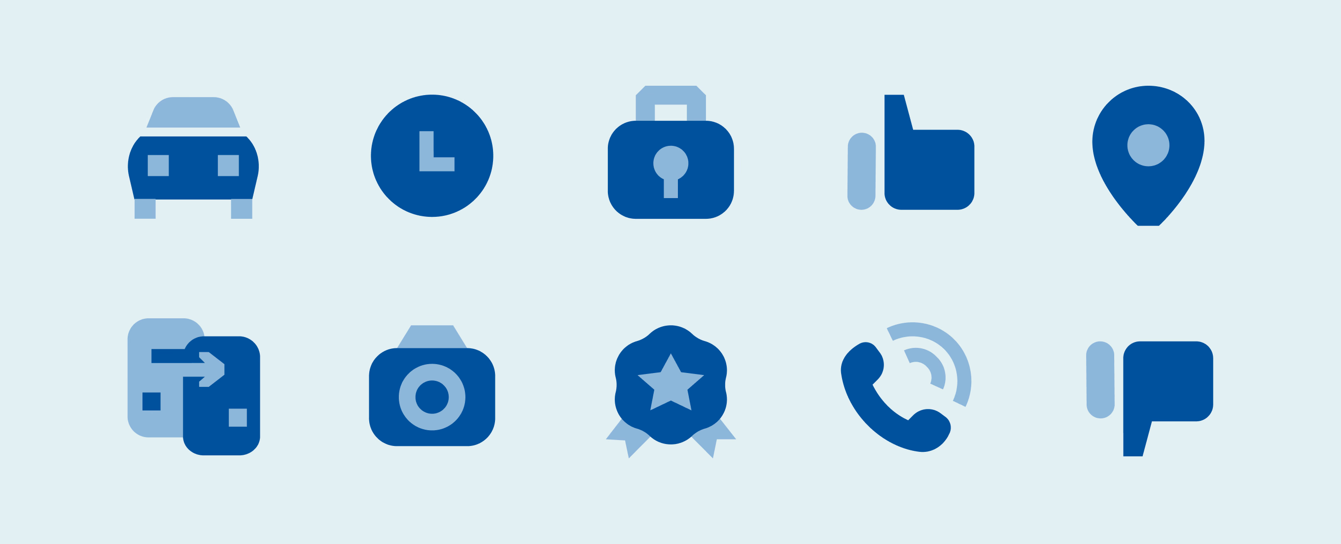

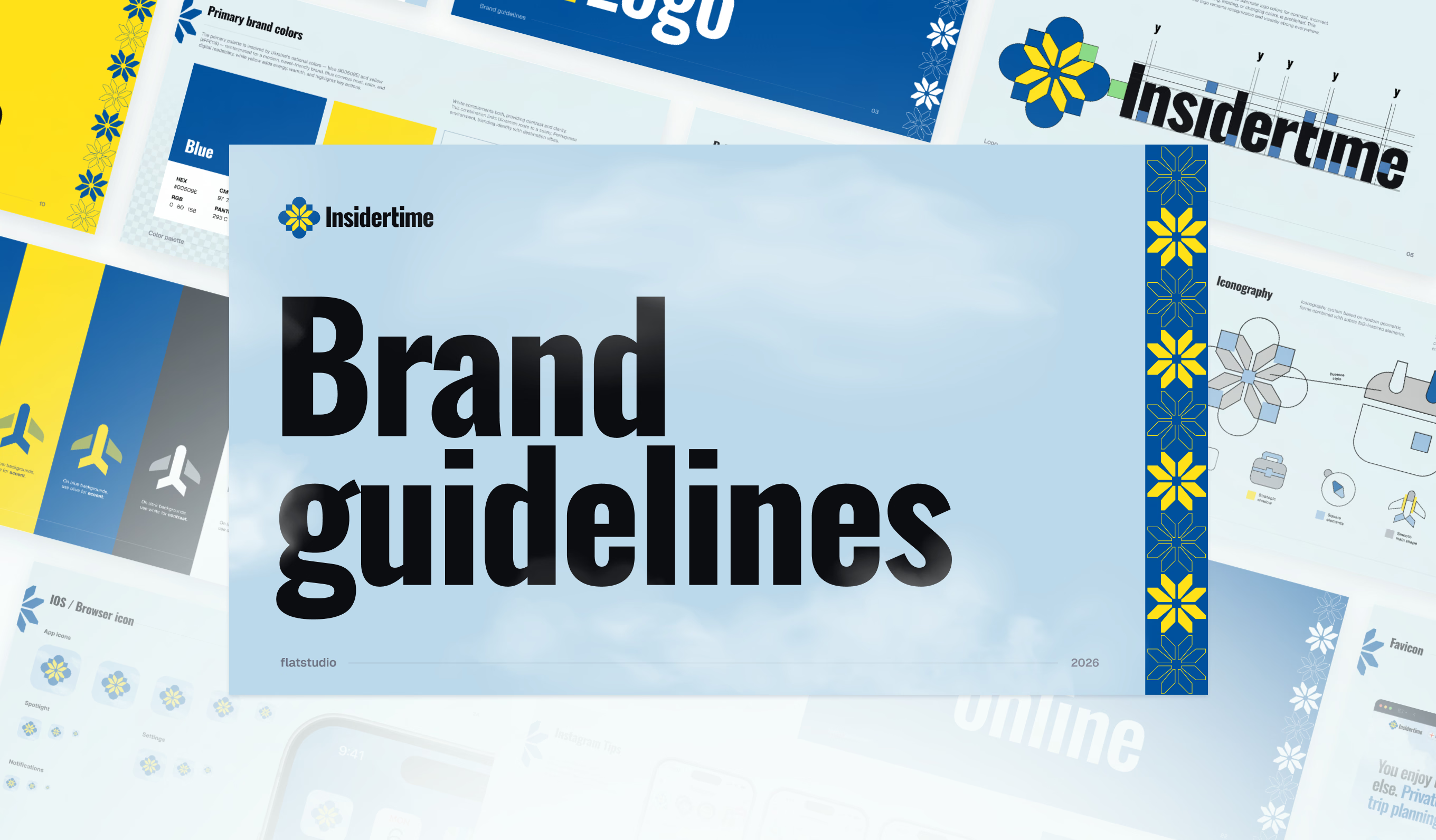
Brand guidelines built as one reference for logo, colors, patterns, iconography and photography. Spreads show primary colors, iconography usage and a Brand online section on a sky-blue cover and light pages.
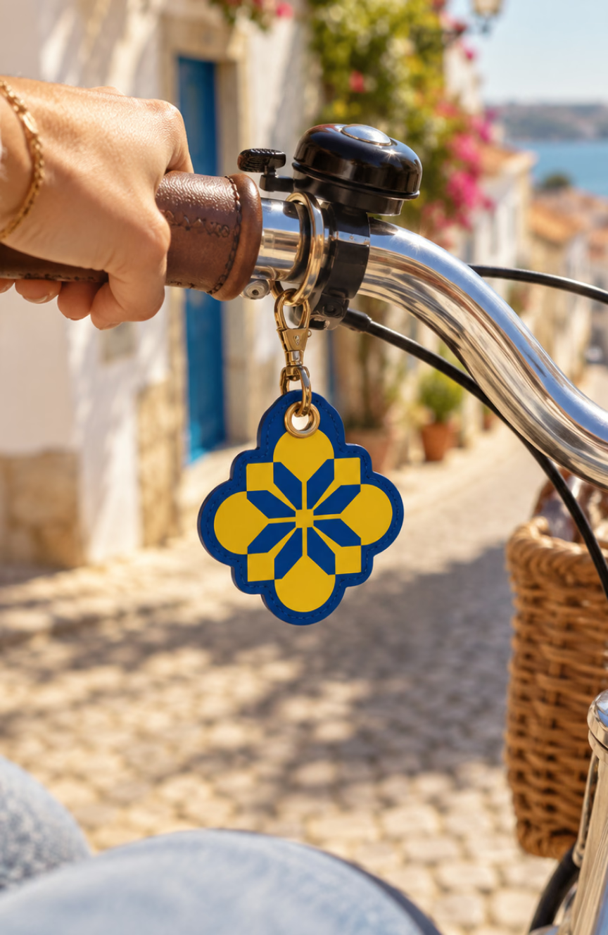
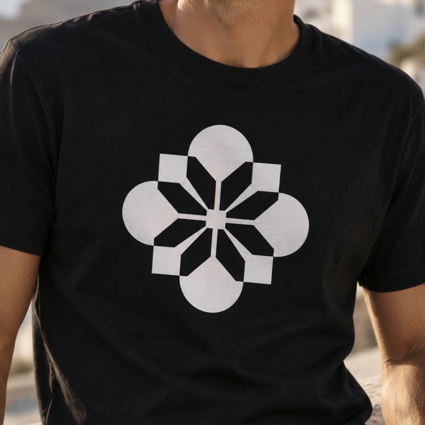
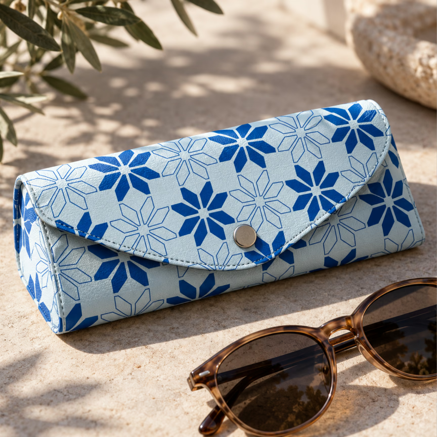
Brand applications across travel accessories, apparel and street scenes: key tag, luggage tag, tote bag, T-shirt, glasses case and a tram. The flower mark runs in full color, in yellow and in white on black.
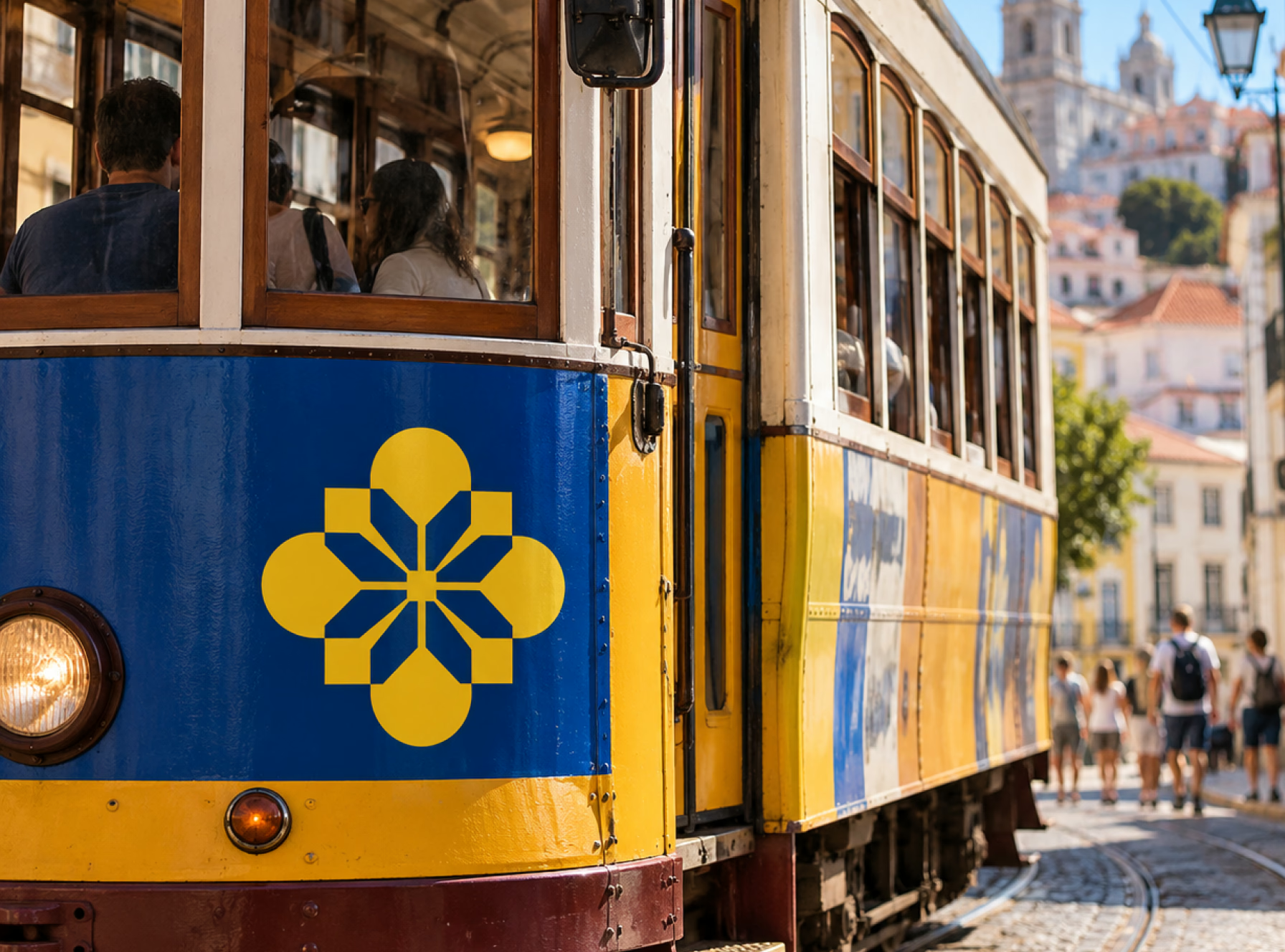
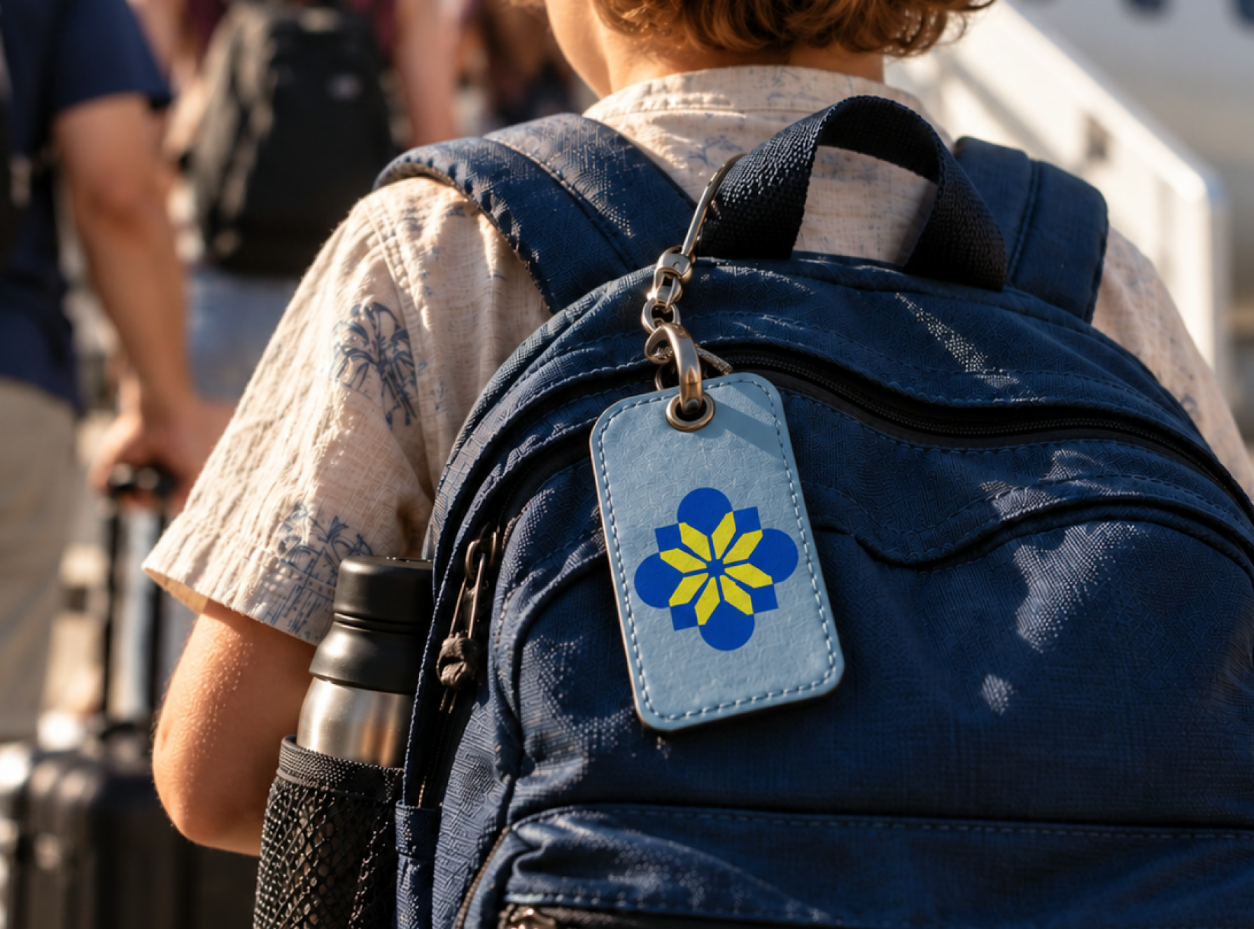
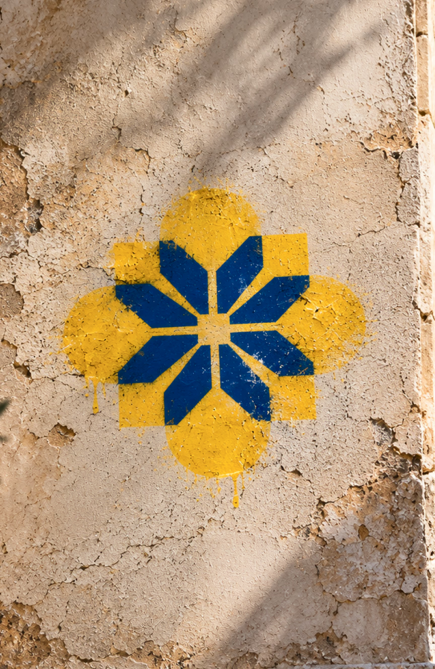
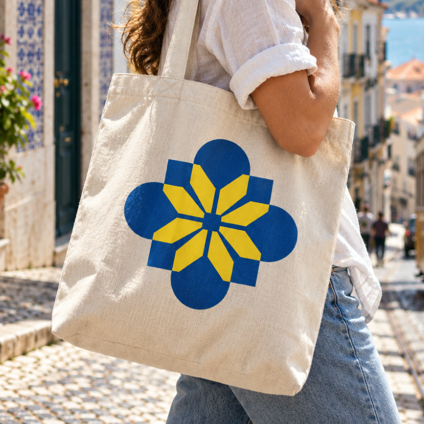
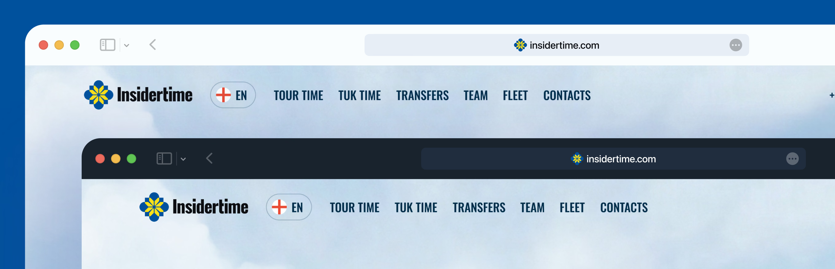
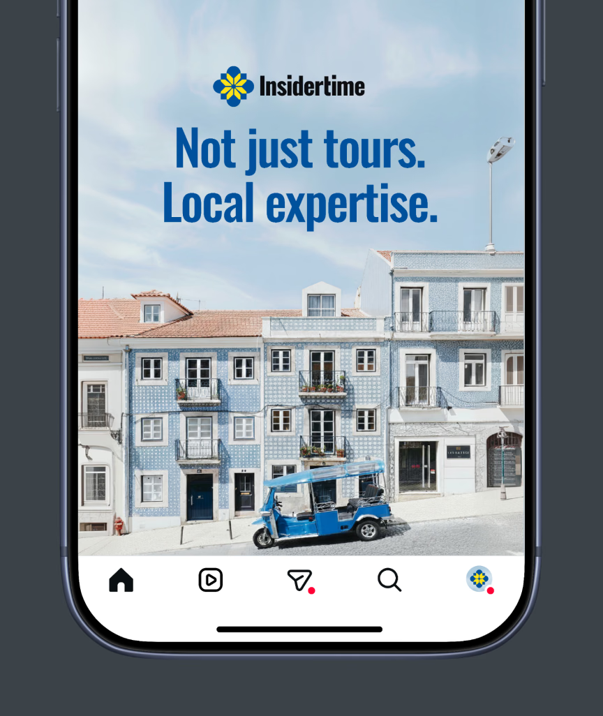
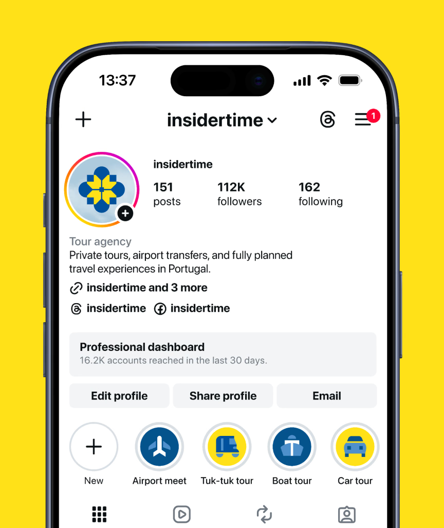
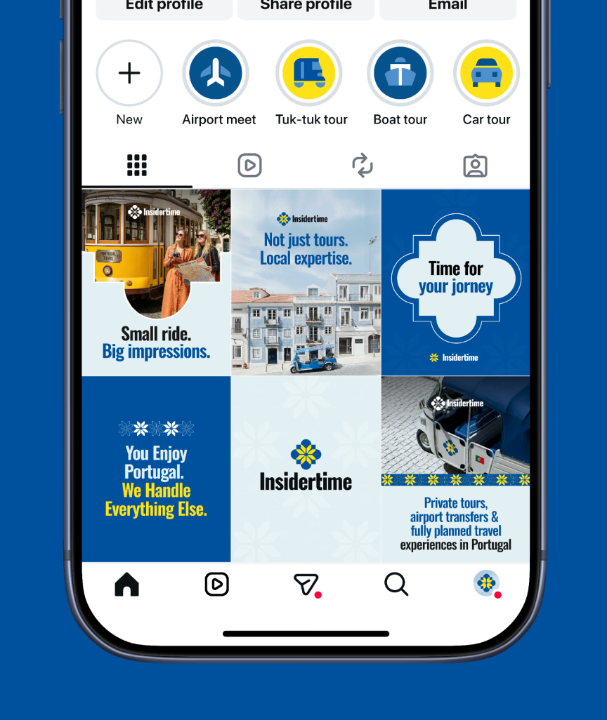
Brand identity extended to digital touchpoints: a website header in light and dark versions, an Instagram profile with story highlights and a feed grid, and a vertical ad. The full site is covered in Insidertime Marketing Website.
If your company sits between two cultures, your brand shouldn’t have to pick one. A travel brand needs to feel local and trustworthy at once, and that’s a strategy question before it’s a visual one.
Tell us yours.