





One Flower, Two Homelands: Tour Operator Branding for InsiderTime





Written for founders and marketing leads of travel and local businesses whose audience lives between two cultures.
A company that belongs to two countries usually ends up branding itself with one. The colors of home go on the logo and the host country becomes a backdrop, or the local look takes over and the founders' origin disappears.
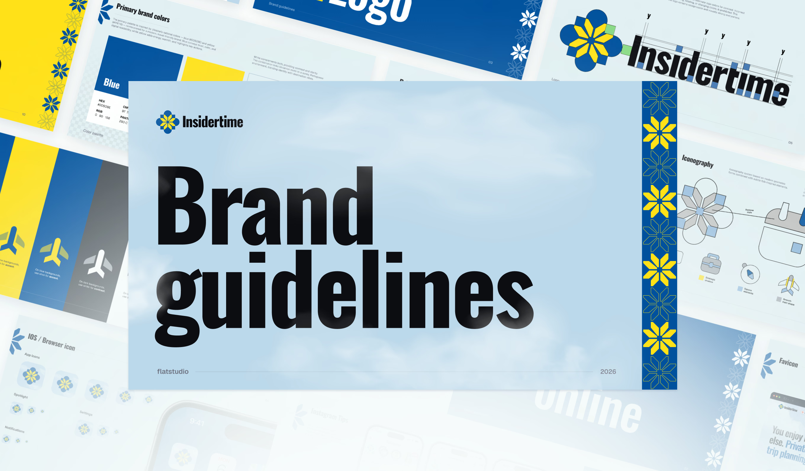
InsiderTime needed both to stay visible in a single mark. Flatstudio answered with one icon: a vyshyvanka flower sitting on an azulejo tile.
Who is InsiderTime and why did the brand need two cultures?
InsiderTime is a tour operator in Portugal founded by Ukrainians who have lived in the country for more than 15 years. The company runs walking, car, van, bus, boat and tuk tuk tours across Lisbon, Porto and most of Portugal's historic sites.
The guides tell Portugal's stories in Ukrainian. Clients arrive from different countries, and the language is what they share. The founders describe the service in one line: Portugal shown and told for Ukrainians.
That line became the brief for Flatstudio. The identity had to carry Ukrainian culture and Portuguese culture with equal weight, and stay credible for a public travel company.
How do you combine two cultures in one logo?
Flatstudio picked one concrete symbol per culture.
Vyshyvanka is the traditional Ukrainian embroidered shirt. Its ornament is stitched, so every shape is built from straight lines and sharp angles.
Azulejo is the glazed ceramic tile that covers Portuguese facades. One of its typical outlines is a rounded, four-lobed tile.
The InsiderTime mark stacks the two. A yellow flower with eight sharp petals comes from the vyshyvanka. The blue rounded shape underneath comes from the azulejo.
The decision that holds the mark together is geometry. Ukraine owns the sharp angles and Portugal owns the curves. Because each culture has its own shape language, the two layers stay readable even in one color, such as the white mark on a black T-shirt.

What does the InsiderTime color palette mean?
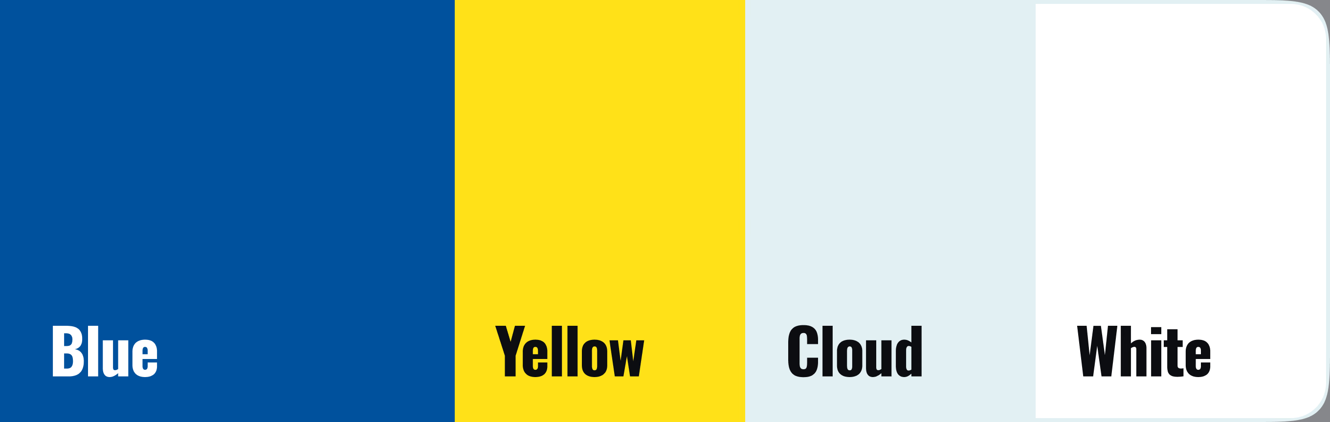
The primary palette has four colors: Blue, Yellow, Cloud and White.
Blue comes from azulejo, the color of Portugal's tiled facades. Yellow comes from the Ukrainian flag and from vyshyvanka embroidery. Side by side, the pair also reads as Ukraine's blue and yellow, so one palette speaks for both countries.
Cloud is a pale sky tone, and it stands for Portuguese weather. The sky over Portugal is blue most days, with small clouds that form from the humidity. Cloud is the default background of the website, the guidelines, the ads and the social media templates.
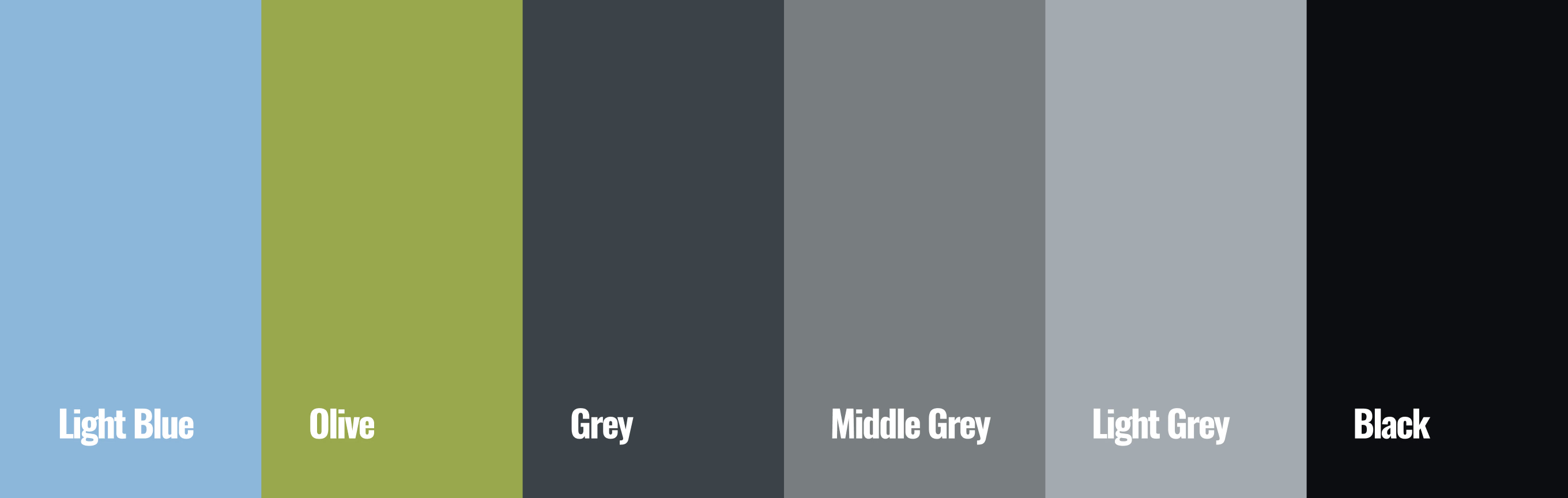
Six secondary colors support the set: Light Blue, Olive, Grey, Middle Grey, Light Grey and Black. Typography pairs two typefaces, Oswald and Geist.
How does one mark become a full brand system?
Flatstudio extended the flower and the tile into every other asset:
- Patterns. The flower repeats in filled and outlined versions, blue on Cloud and yellow on Blue, like a tiled wall or an embroidered band.
- Icons. Ten travel icons follow three rules: narrow details, strategic shadow and square elements.
- Airplane symbol. A secondary symbol in six color variants for transfers and airport services.
- Brand guidelines. One reference for logo, colors, patterns, iconography and photography, delivered with a separate tone of voice guide.
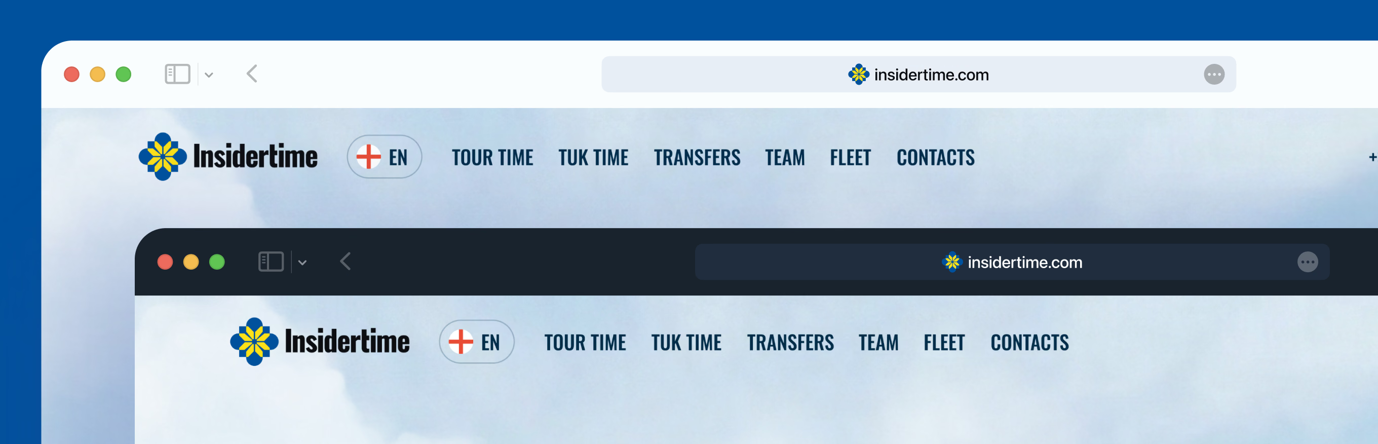
- Applications. Tote bag, T-shirt, luggage tag, key tag, glasses case, website header and Instagram templates.
Maria Soloveva, Julia Slazhnieva and Bohdan Kononets completed the identity in one month. The full set of visuals is in the Insidertime branding case.
What happened after the brand launched?
Flatstudio explored many versions of the icon. InsiderTime founder Igor Kucheriavyi asked the team to recommend the one that fit best, and the team pointed to the flower on the tile.
His reaction was immediate:
"Wow. I didn't think two countries and two folk traditions that seem so different could be joined with this much quality and creativity."
He approved the mark on the spot and said he needed no time to think it over.
Clients who have seen the new brand and website have responded warmly as well.
The work continues. Flatstudio is now producing video creatives for Insidertime's social media and designing a branded guide's bag. The bag holds everything a guide needs on a tour: a power bank, an umbrella, water, sunscreen, stickers, Insidertime badges, maps and a book of Ukrainian jokes.
The identity also set the foundation for the company website. Tour pages, guide profiles and the booking flow are covered in the InsiderTime website case and in the companion article.
Does your company sit between two cultures? Tell Flatstudio about your brand.

Frequently Asked Questions
What is Insidertime?
Insidertime is a tour operator in Portugal founded by Ukrainians. The company runs walking, car, boat and tuk tuk tours and private transfers across Lisbon, Porto and other regions, with guides who speak Ukrainian. Flatstudio designed its brand identity and its website in 2026 around a dual Ukrainian and Portuguese concept.
Who designed the Insidertime brand identity?
Flatstudio is a product design and engineering studio from Portugal and Ukraine that builds brands, websites and digital products. For Insidertime, Flatstudio delivered the brand strategy, logo suite, visual identity system, tone of voice guide and brand guidelines in one month, then designed and built the company website on top of that identity.
What do azulejo and vyshyvanka mean in the Insidertime logo?
Azulejo is the glazed ceramic tile found on Portuguese buildings, and vyshyvanka is the traditional Ukrainian embroidered shirt. In the Insidertime logo, the blue rounded tile shape stands for Portugal and the yellow flower with sharp, stitched angles stands for Ukraine. Together they form one mark for a company with two homelands.
How long does tour operator branding take?
The Insidertime brand identity took Flatstudio one month. That covered market research, brand strategy, the logo suite, colors, typography, patterns, ten icons, a tone of voice guide and brand guidelines. The website followed as a separate three-month engagement built on the finished identity.
