





How We Designed a Complex Real Estate SaaS Platform: The Tonomo Case





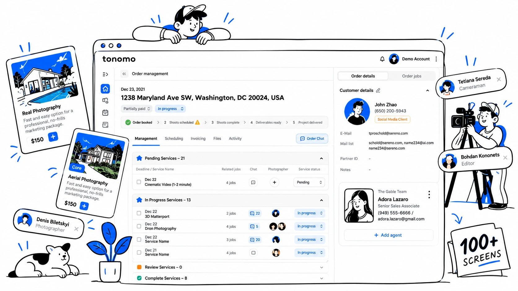
Tonomo already had a live product when Flatstudio joined the team. A landing page was live, parts of the dashboard worked, a development team shipped regularly, and real estate media companies were already running orders through it. The functionality was there. As the product grew feature by feature, the experience needed a stronger system to keep everything connected. That is the core problem of complex dashboard UX.
That is a very different starting point from a blank Figma file, and a common reality for growing SaaS products.
How do you join a live product, understand its logic, and turn a growing set of features into one system?
In Tonomo's case, that system had to hold booking, scheduling, orders, jobs, production, payments, delivery, and property websites together.
Flatstudio worked on that question with the Tonomo team over the course of a year. The engagement started as an MVP scope for a handful of new modules and became a dedicated product design team as the size of the system became clear. This is a product design case study rather than a retrospective of the current Tonomo product. Where we write "we designed" or "in the design," we describe our work. Where we write "Tonomo now," we describe the live product. Screens are from the Tonomo case.
TL;DR
- Tonomo is a real estate media operations platform. One order runs through booking, package selection, photographer scheduling, production jobs, invoicing, media delivery, and an auto-generated property website.
- Flatstudio joined an existing product with users, code, and partial UX. We kept what worked, researched the product and its competitors, and extended it module by module: MVP design first, then a dedicated product team.
- Wherever possible, users move between related objects in one step, so an order behaves like a small workspace rather than a record.
- Packages simplify choice for clients; job templates simplify repetition for staff. The team calendar turns physical constraints (daylight, territory, skills, capacity) into visual signals.
- We designed every major workflow for mobile except the team calendar, which remained desktop-only by client decision.
A real estate media operations platform is software that manages the full workflow of a photography or video business serving listing agents: from ordering and scheduling to production, payment, and delivery. Tonomo uses the term for itself, and it fits: each stage feeds the next on the same data.
What did we find when we joined an existing product?
The research had two parts: the product and the market around it.
Inside the product, the existing flows had grown from the development side. The existing flows were functional, but patterns varied from one part of the product to another. The product served two broad sides of the workflow. On one side, clients: real estate agents ordering media. On the other, the internal production team: project managers, photographers, videographers, editors, and 3D specialists. Internal users needed speed and efficiency, while agents needed the product to explain itself. Time and resources were tight on both sides.
Outside the product, the market was fragmented. We looked at products including HDPhotoHub, Aryeo, Rela, Full Frame Systems, Show & Tour, and RealTourVision, which approached different parts of the real estate media workflow, from booking and scheduling to delivery and property websites. Aryeo covered a similar scope until Zillow acquired it in 2023. General project tools like Monday.com covered the internal production side. The gap we saw was between the client-facing and production sides: most tools focused on one part of the workflow rather than connecting the two.
The positioning also shows up in customer feedback on tonomo.io: Bear Karry of Bear Karry Productions described Tonomo as combining the strengths of Monday.com and HDPhotoHub, while Zack Reuter of Epic Drone Tours said it had replaced Monday.com as their backend.
That research shaped the brief. Rather than a redesign, the work was to keep the existing information architecture where it held up and replace it where it did not. The missing modules were added so the whole ran as one real estate media operations platform while the product stayed live.
Why did the order have to become a workspace instead of a record?
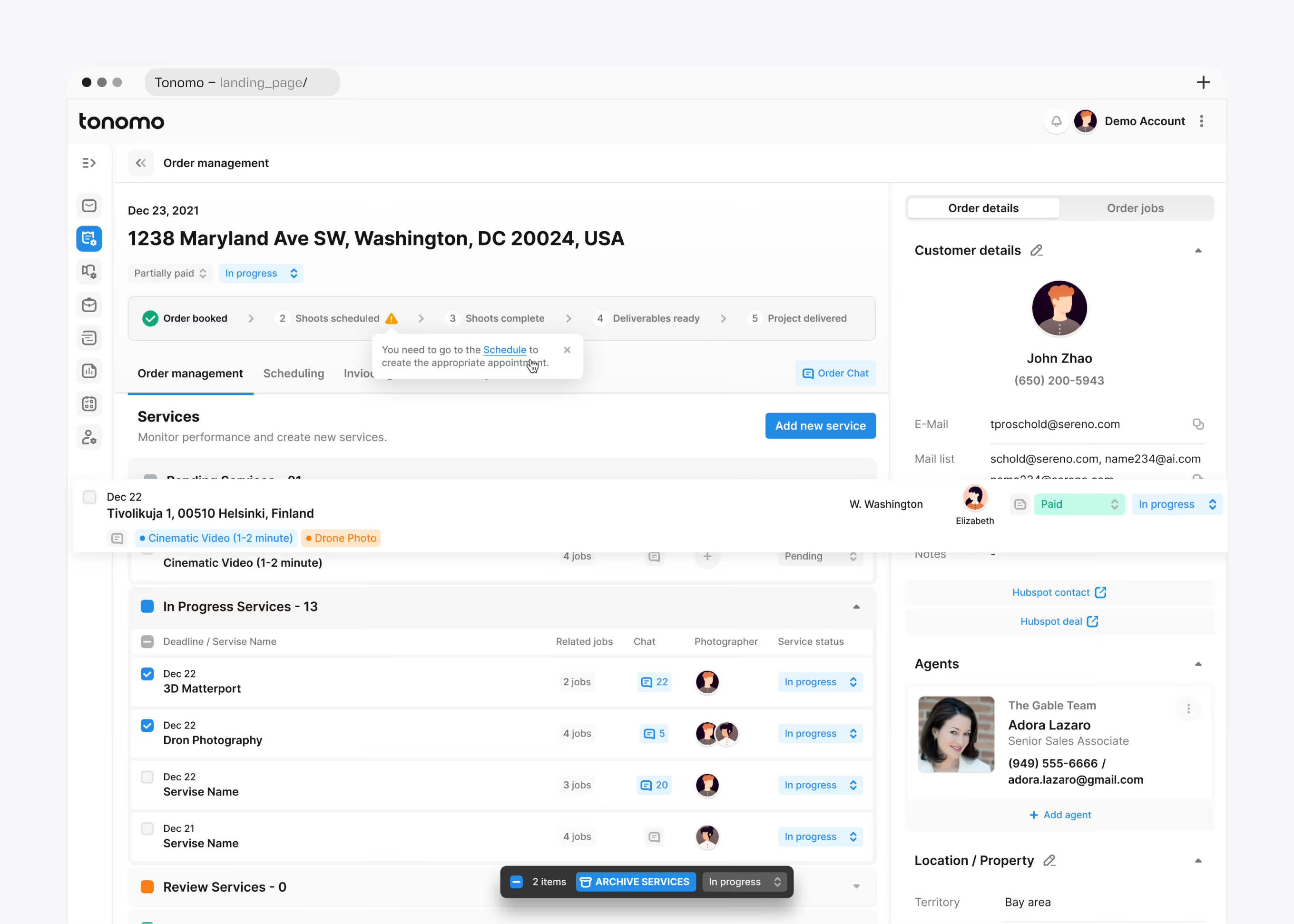
Problem. In typical order management UX, an order is a row with fields. In Tonomo, one order touches far more: a customer, a property, listing agents, and appointments; production services and jobs for different specialists; a chat per job, an invoice with partial payments, a delivery package, and a property website. Spread across separate pages, that means constant context switching for a manager.
Decision. We designed the order as a mini workspace. A five-stage stepper runs across the top (Order booked, Shoots scheduled, Shoots complete, Deliverables ready, Project delivered), with tabs for Order management, Scheduling, Invoicing, and Order delivery. A sidebar keeps customer, agents, and property visible in every tab. When a stage is blocked, the stepper says why and links to the fix: in the design, an unscheduled shoot shows a warning on stage two with a direct link to Schedule. Order status and payment status change from the header, and payment has its own vocabulary because money and production move independently.
System. Order, then Scheduling, then Jobs, then Chat, then Invoice, then Delivery, all inside one object. The same order opens from the calendar, the internal queue, a job, and the client's dashboard, with identical layout and actions.
How does the internal queue stay readable at scale?
Problem. Each order carries a lot of state, and managers act on many at once. Tonomo now describes handling hundreds of orders at a time; the design shows a queue of 136.
Decision. Collapsible status groups: Pending, In Progress, Completed, Postponed, Cancelled. One dense row per order with tags for package and services, and inline dropdowns for status and payment. A fixed bottom bar appears on selection for bulk actions: archive, add performers, set mixed payment, change status. Performers are assigned from a panel that lists people by role.
System. The status vocabulary in the queue is the one used in the order header, the client dashboard, and the mobile list.
Why do clients get packages instead of a catalog?
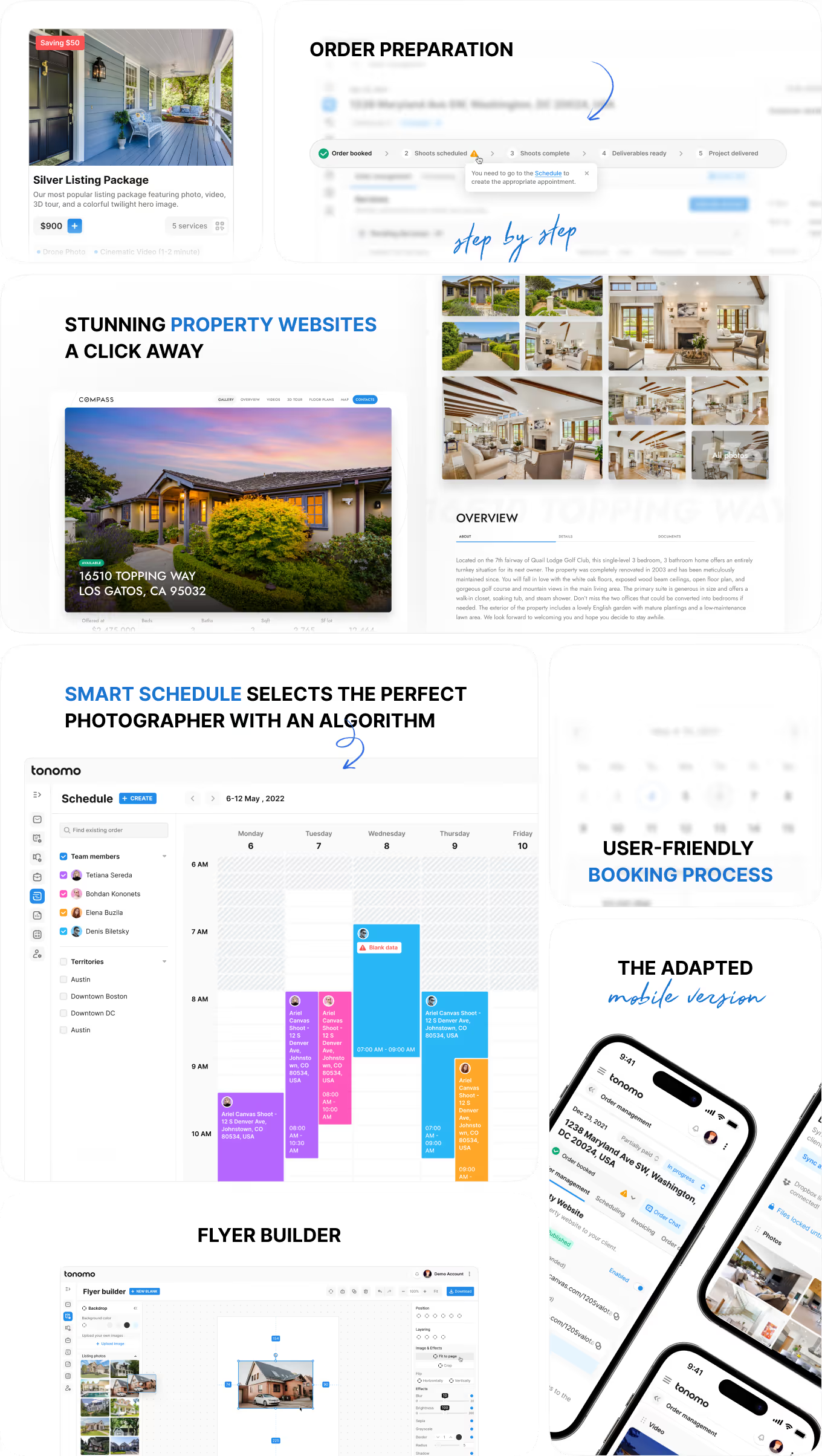
Problem. A real estate media company sells dozens of services with dependencies and options. Listing, HDR, twilight, and aerial photography. Cinematic and aerial video, HDR listing video with a music choice. 3D tours, floor plans, a listing website, social edits. Each is priced by property size. Presenting the full catalog at once would add unnecessary cognitive load to every order.
Decision. We designed packages as the entry point. A Silver Listing Package at $900 bundles five services and shows the saving against buying them separately; a Photo Package and a Photo & Video Package define common sets. Inside a package, each service opens only the options that matter for it: how many virtual twilight images, which music track. Business rules appear where they apply, such as the fee for changing a track after the edit. Add-ons follow the same card pattern. The Order Details panel totals live and applies coupons and referral credits.
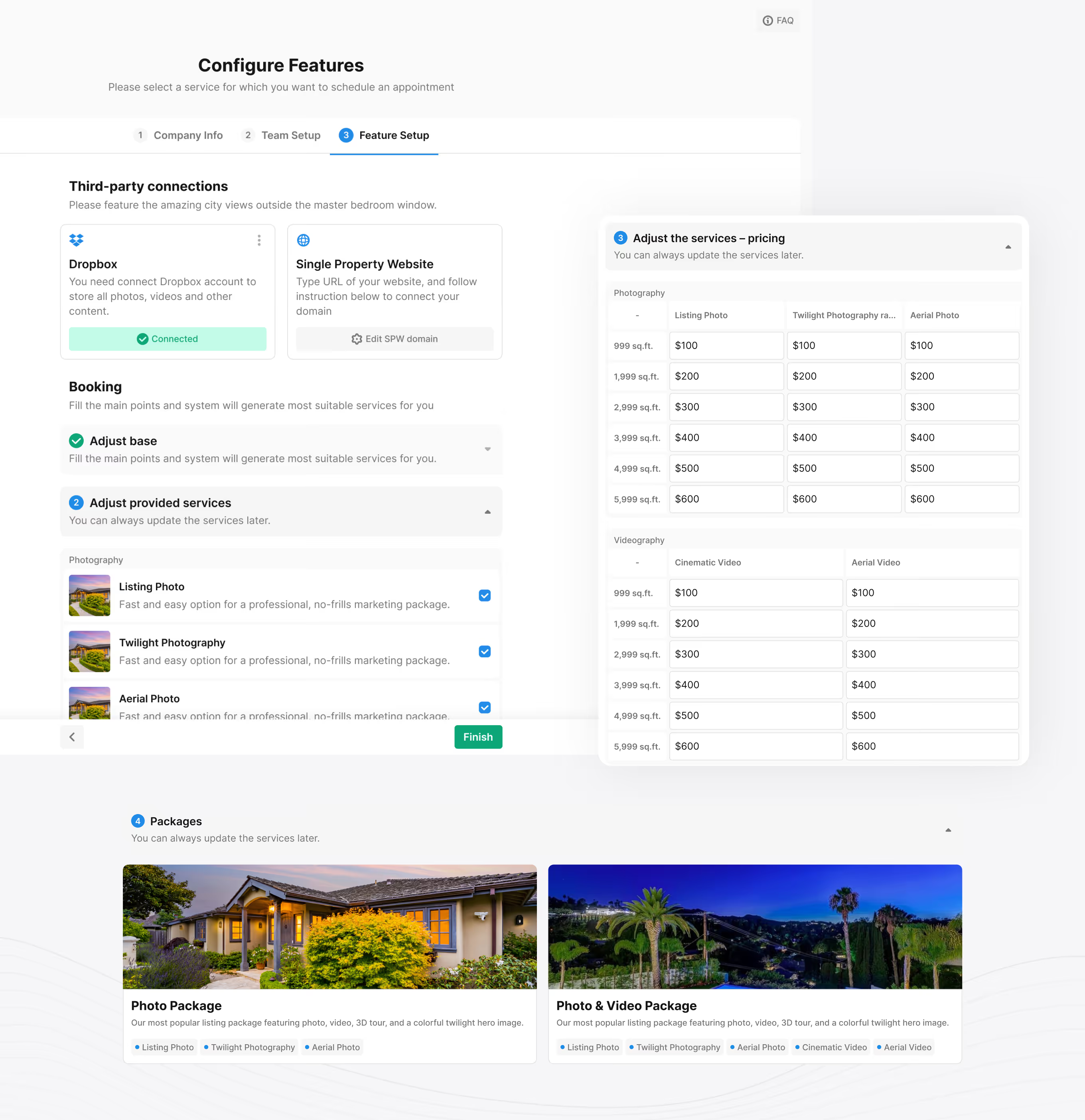
Packages are configured by the media company during onboarding. We split onboarding into three steps: Company Info, Team Setup, Feature Setup. The volume of setup data, including six square-footage price tiers per service, would create too much cognitive load on a single screen.
System. The package card in the order flow is the same component a manager sees in the Add services panel inside an order. Packages are also the unit the invoice discounts against.
How should scheduling software reflect a physical workflow?
Problem. Photography happens outdoors and on a clock. A twilight shoot lands in a narrow window after sunset. A drone shoot depends on weather. A coastal property looks different at high tide. A generic slot picker ignores all of this and pushes the conflict into a phone call.
Decision. In the design, the constraints live in the scheduling UI. Schedule Shot shows the estimated duration of the selected product, lets the agent choose a photographer or anyone available, and prices the slots: a late-evening slot carries a shot-timing fee, the next slot does not. The same step collects rooms, features to highlight, and entry notes so the photographer arrives briefed. Checkout confirms the property, lists each appointment with its time block, applies discounts, and takes a deposit.
System. The appointment created here is the object the team sees in the calendar and the manager sees under the order's Scheduling tab. A blocked stage in the stepper points back to it.
How does a team calendar handle people, territories, services, and daylight at once?
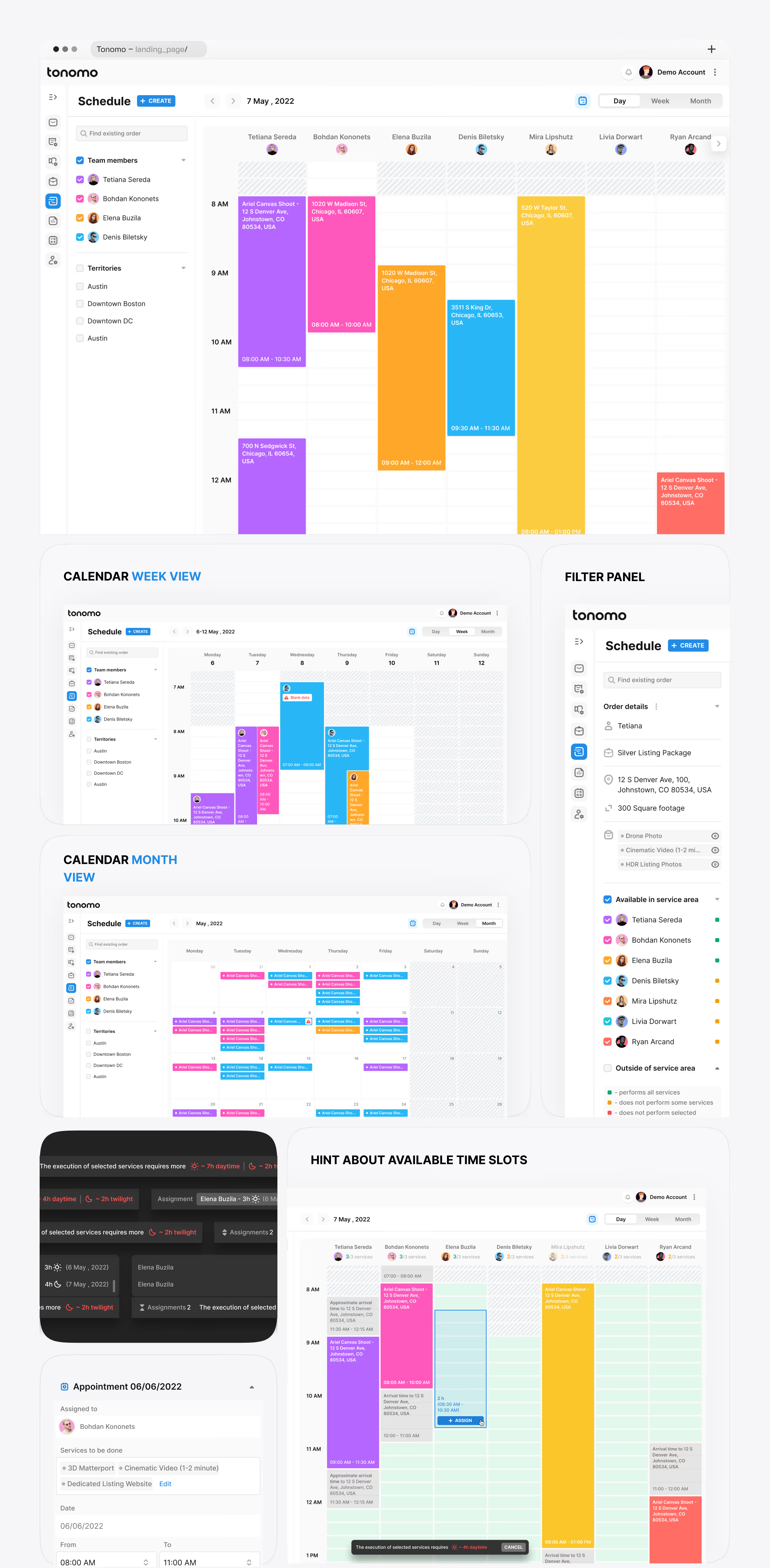
The Team Calendar Across Territories is the strongest single example of complex UX in the project. It holds more variables than any other screen: people, territories, availability, workload, the services each person can perform, capacity per week, orders, and the light conditions each service needs.
Problem. A manager scheduling a multi-territory team needs four answers in seconds. Who is free. Who can do this particular service. Whether the time of day works for it. How loaded each person already is.
Decision. Three views and a layered set of visual signals.
Day view puts each photographer in a column with color-coded appointments and hatched blocks for unavailable hours. Week view carries the same colors across seven days. Month view shows density per person per day. A sidebar filters by team member and by territory.
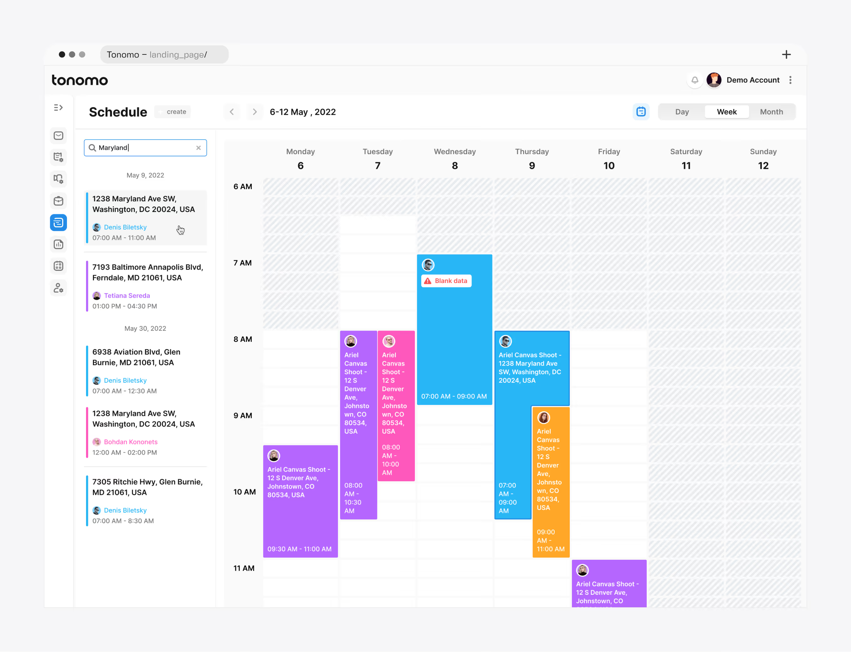
Search accepts an address, a service, a person, or an order. It lists matching appointments in the sidebar with date, time, and photographer, and highlights them in the grid at the same time.
Service-aware availability turns skills into color. Once an order's services are selected, each photographer is marked green, yellow, or red: performs all of them, does not perform some, or does not perform the selected ones. A count such as 3/3 or 2/3 shows how many of the order's services each person can cover.
Daylight arithmetic turns physics into a hint.
The design estimates how much execution time the selected services need under each light condition, about 7 hours of daytime and 2 hours of twilight for one order. It then marks slots that fit or conflict, including approximate arrival time at the property. Services that only work at sunrise, sunset, or specific tide conditions are flagged when a chosen slot does not match. Rather than drawing a calendar, we translated operational constraints into signals a manager reads without thinking.
Any appointment opens an Order Details panel without leaving the calendar. From the panel a manager edits customer, location, services, and the assigned photographer, or jumps into Order Management.
Part of this approach came from our own product. In parallel, Flatstudio was building Teamtopia, our internal tool for team availability and capacity, where the core question was who is free, when, and for what. Calendar patterns moved between the two projects.
The honest note. The calendar is the one module we did not adapt to mobile. The client decided that multi-territory scheduling is a manager's desktop task and kept it there. Every other key workflow in this article was designed for a phone.
System. The calendar reads the same appointments, services, and people as orders and jobs. Nothing is entered twice.
Why do jobs need a pipeline, a chat, and templates?
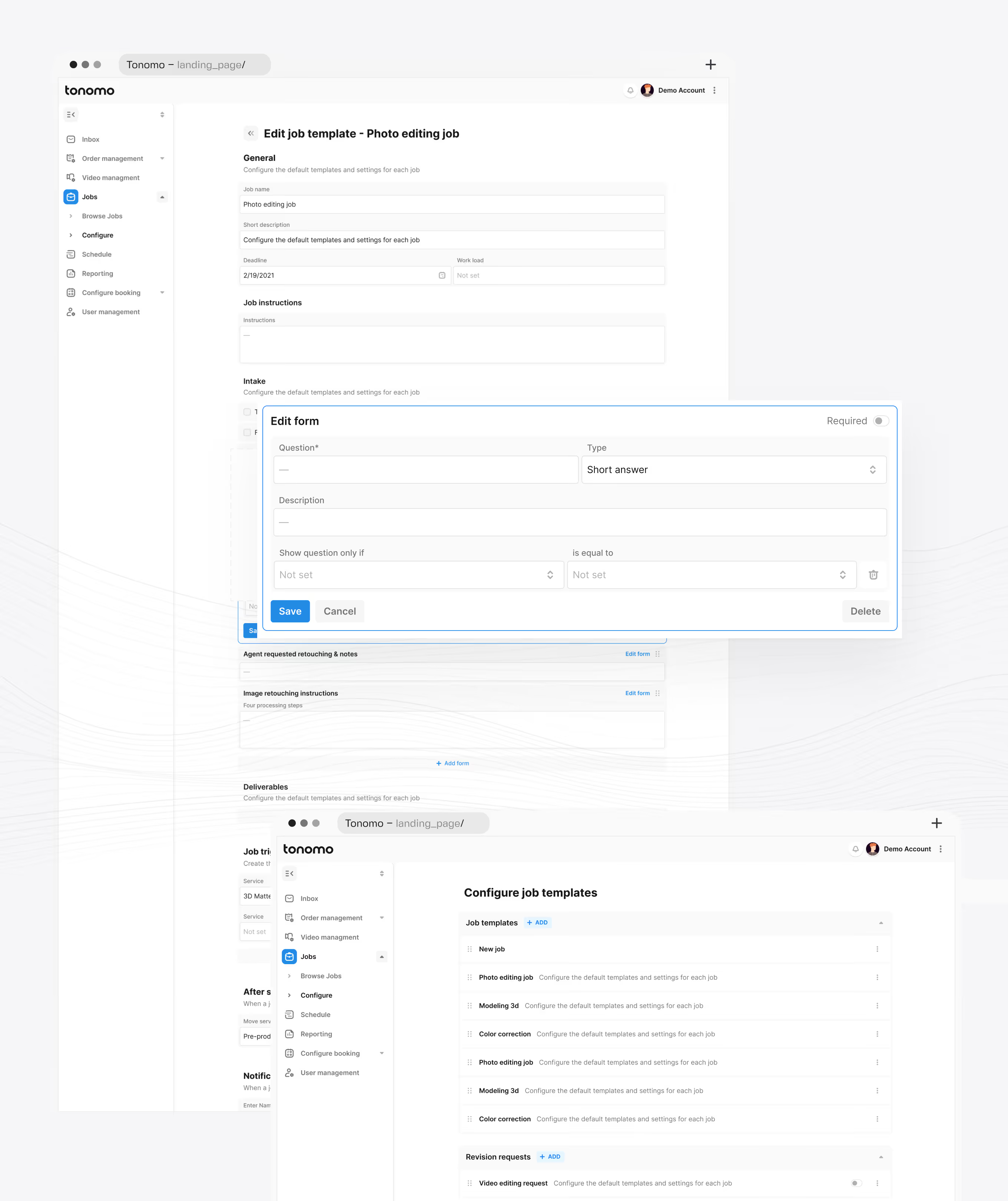
Problem. After the shoot, the work moves to editors, 3D modelers, video editors, colorists, and floor plan specialists. Staff think in queues of work, not in orders, and managers rewrite the same brief for every photo editing job.
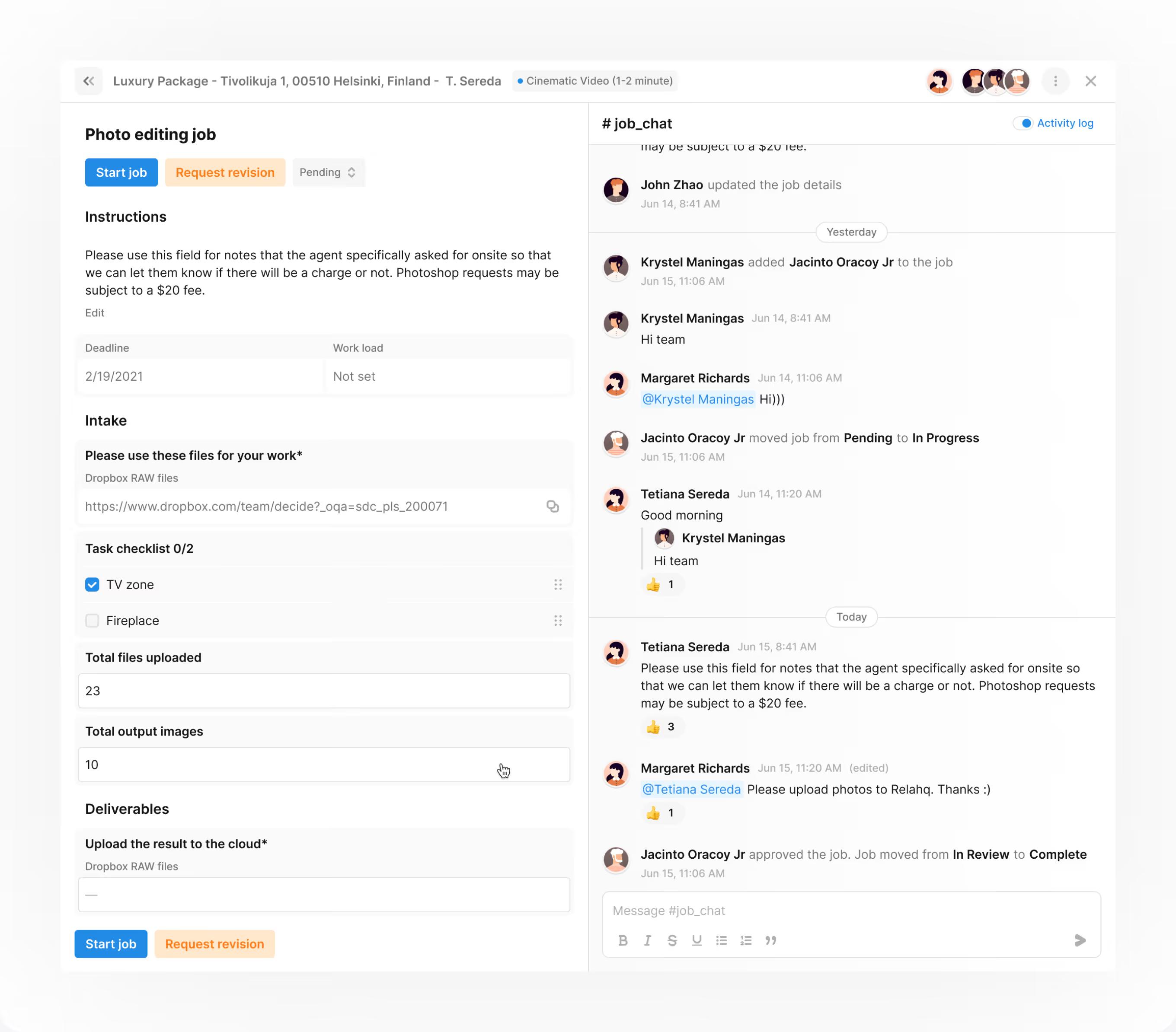
Decision. Three layers. Order Stages give each order a production pipeline: Pre-production, Production, Post-production, Complete, Archived. Jobs sit inside each stage, and every job has a chat with an activity log, service notes carrying production instructions and business rules, and checklists. The Jobs workspace lists every job across all orders by type (photo editing, 3D modeling, video editing, color correction, sound design, floor plans, retouch) and by status (Pending, In Progress, Review, Complete). Search, filters, sorting, and Excel export cover reporting. Job Templates define instructions, intake forms with conditional questions, and deliverables, so a manager creates a repeat job in one step.
System. Packages simplify the client's choice; templates simplify the team's repetition. It is the same idea, a preconfigured bundle that hides complexity without removing it, applied on both sides of the product. A job opens from its order, from the Jobs workspace, and from the calendar's Order Details panel.
How is money handled inside the same product?
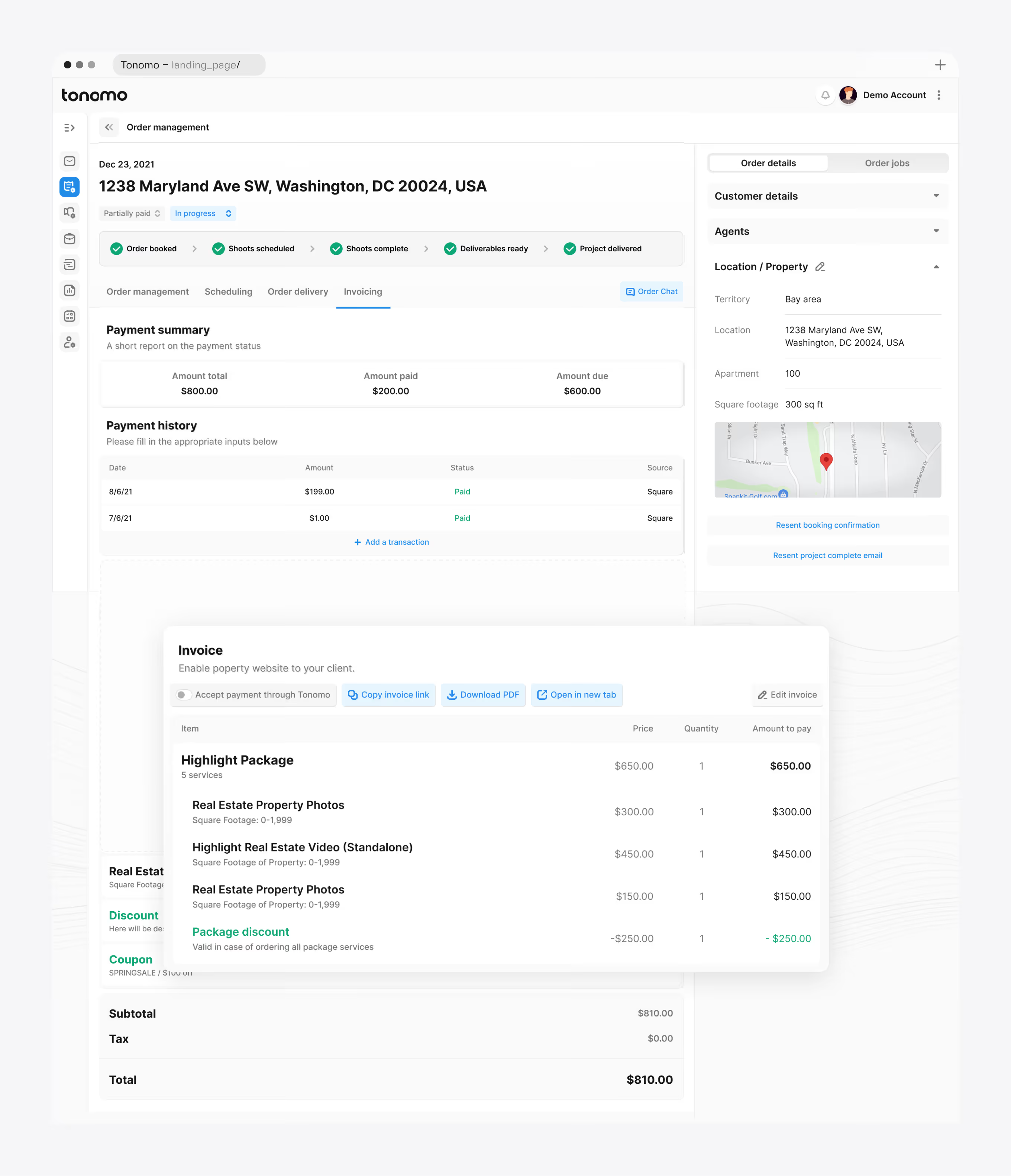
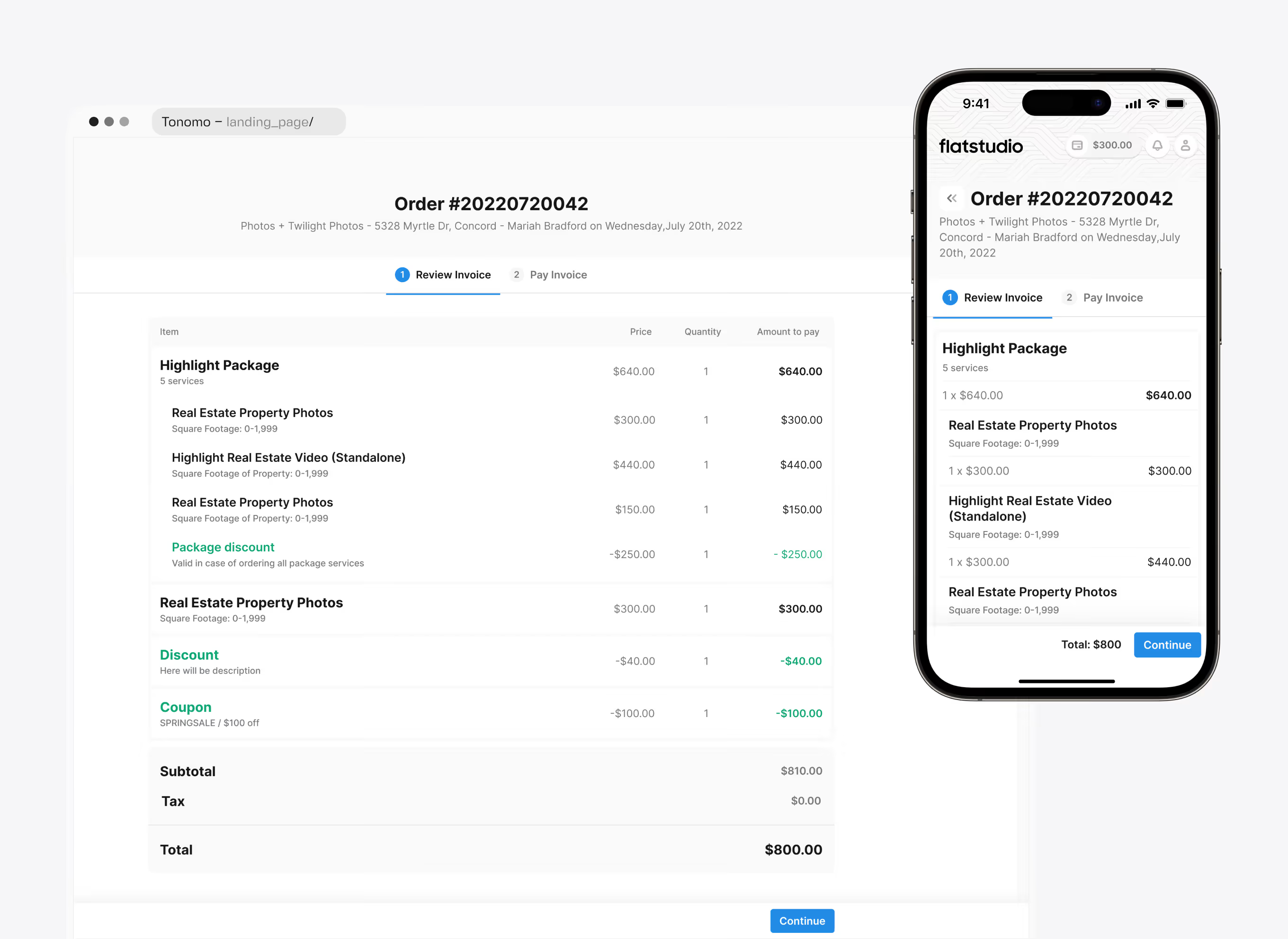
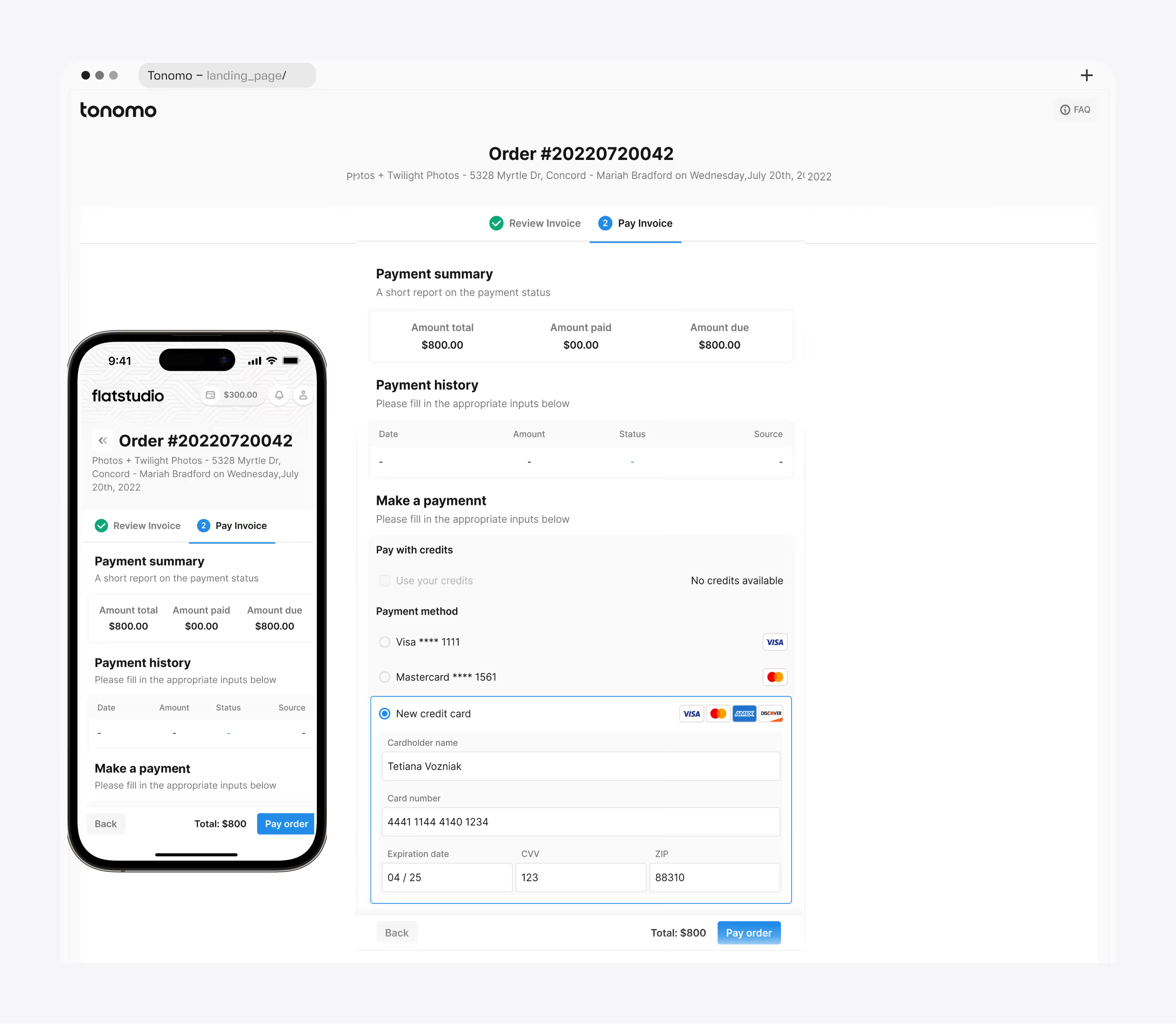
Problem. Deposits, partial payments, credits, referral discounts, coupons, and package conditions have to be visible to the manager and the client at the same time, on desktop and on a phone.
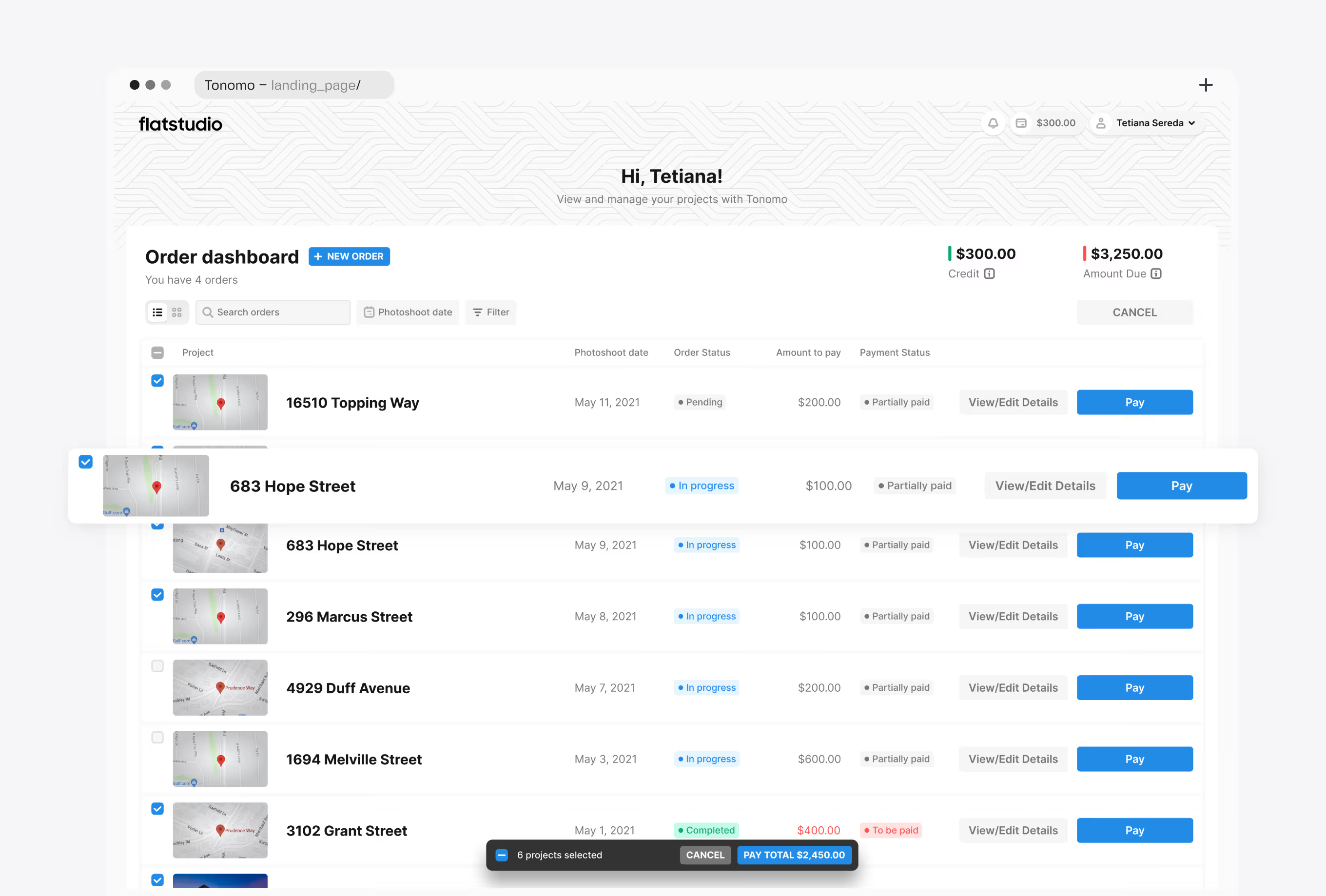
Decision. An Invoicing tab inside the order with a payment summary, payment history, and an itemized invoice that can be edited, shared as a link, or downloaded. Package discounts apply only when every service in the package is ordered, and the invoice line says so. On the client side, Review Invoice then Pay Invoice, with credits or a card. The agent's dashboard shows credit balance and amount due and supports bulk payment across orders.
System. In the design, payment status feeds delivery: files stay locked until the order is marked paid.
Why is delivery a customer experience rather than a file transfer?
Problem. For the agent, the delivery is the product. A cloud folder with 200 files can undersell the value of a four-figure order and tends to generate support requests about resolution and links.
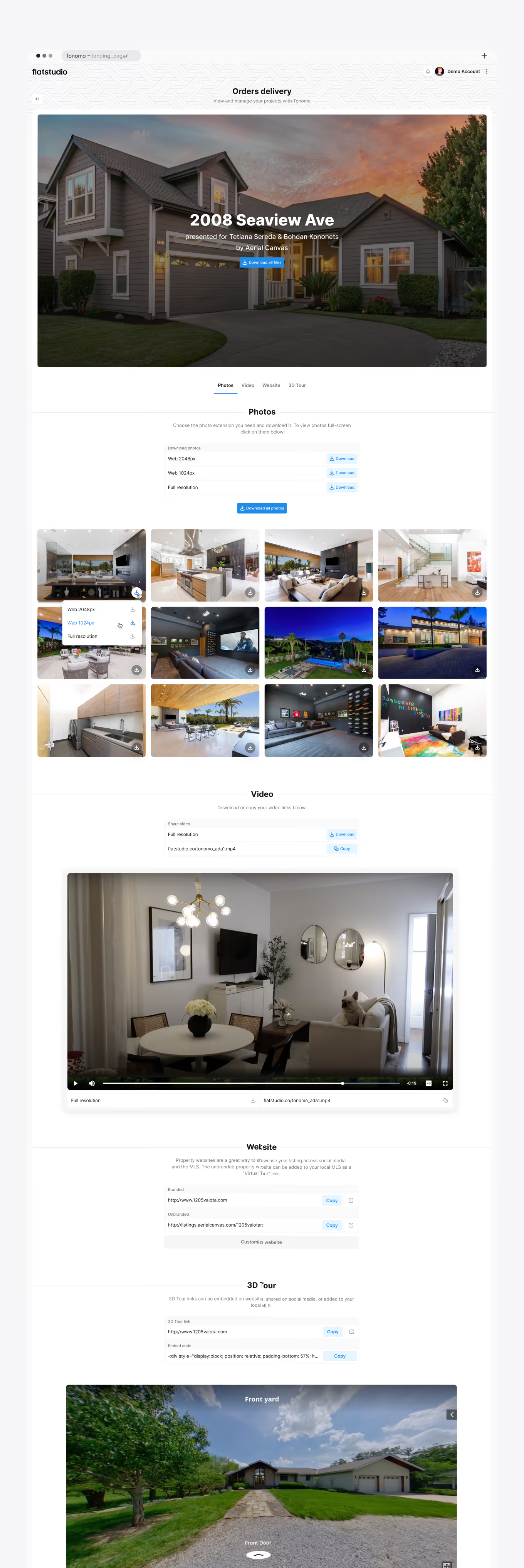
Decision. We designed a branded Final Media Delivery page per property, credited to the agents and the media company by name. Photos download at web or full resolution, individually or all at once. Video downloads or copies as a link. The Website tab gives two URLs: branded, and unbranded for submission to the MLS as a "Virtual Tour" link. 3D Tour ships with an embed code. Request revision sits in the header. On the manager's side, the Order Delivery tab syncs files from Dropbox and publishes everything with Sync & Deliver.
System. Delivery is the last stage of the same order, gated by the same payment status, credited to the same agents entered at checkout.
Why does an operations platform generate property websites?
Delivery did not end with handing over files. The same property data could power a client-ready website.
Problem. A property website is a second content model: cover, details, rooms, amenities, galleries, video, 3D tours, floor plans, documents, theme, domains, and listing agents. Without a dedicated admin, that model would need its own workflow outside the order.
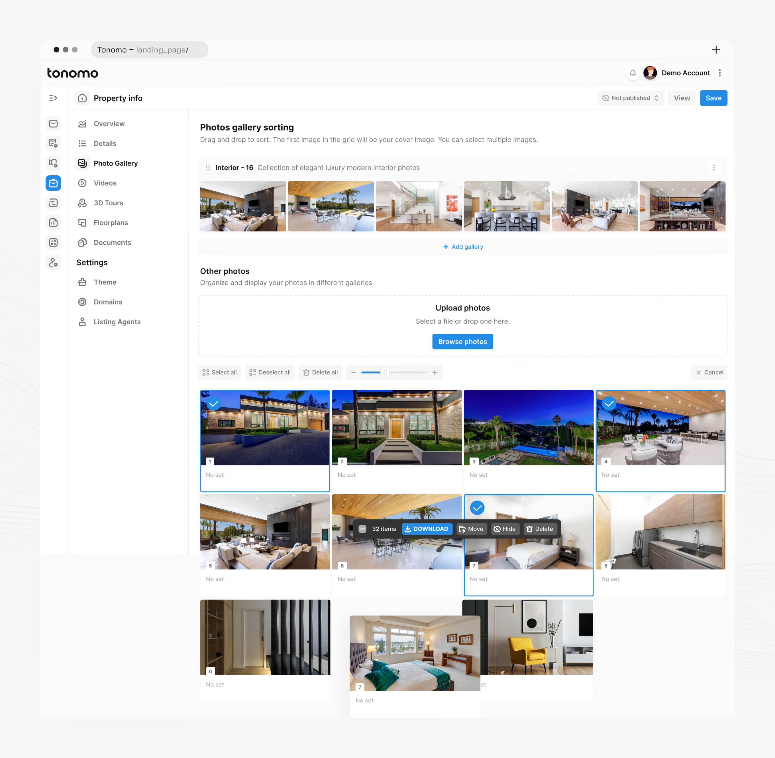
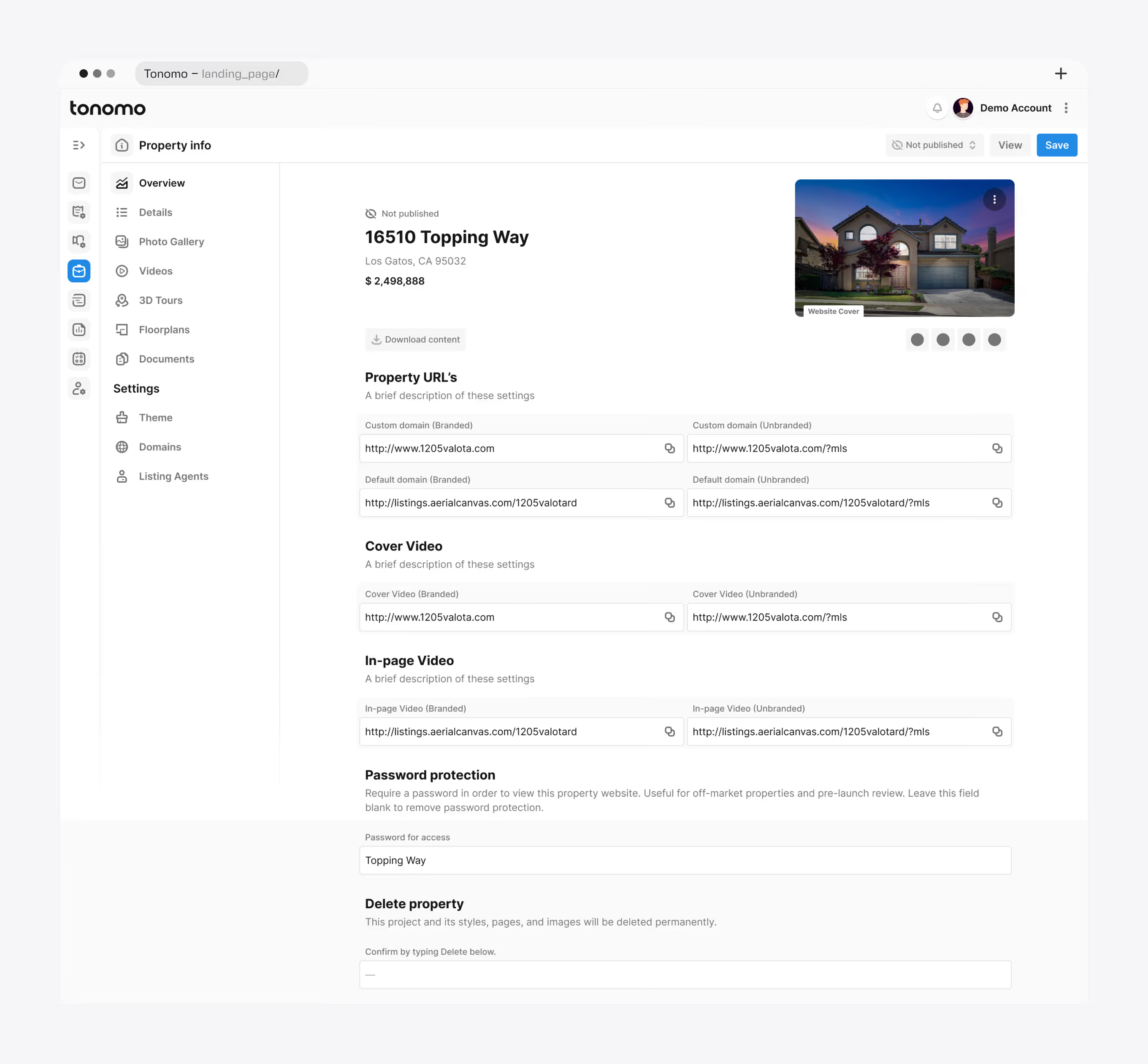
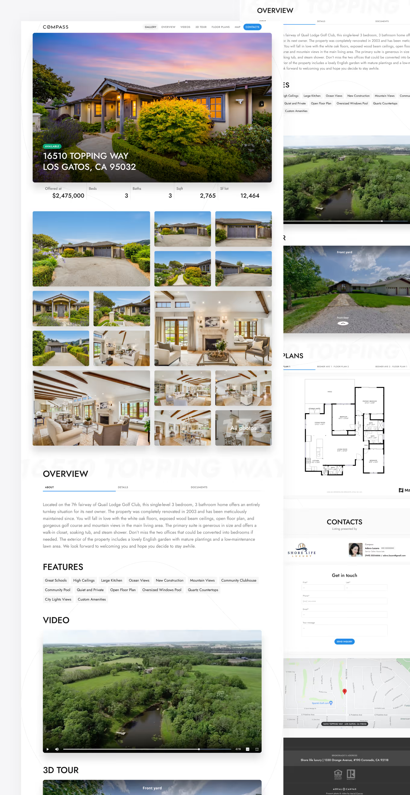
Decision. We designed a dedicated admin with a section per content type and settings for Theme, Domains, and Listing Agents. Galleries sort by drag and drop with bulk actions. Videos split into branded and unbranded versions. Documents and 3D tours can be hidden from the public site. Password protection covers off-market listings. Theme exposes accent color, font, block style, and a reorderable page structure. Three site templates were designed for the delivery.
System. Order, then Media, then Delivery, then Website. The admin opens from the Order Delivery tab, and the agents, address, and property data are the ones entered during booking. In the design, the workflow runs from the first booking to a finished digital presentation for the end buyer.
Why build a design tool inside an operations product?
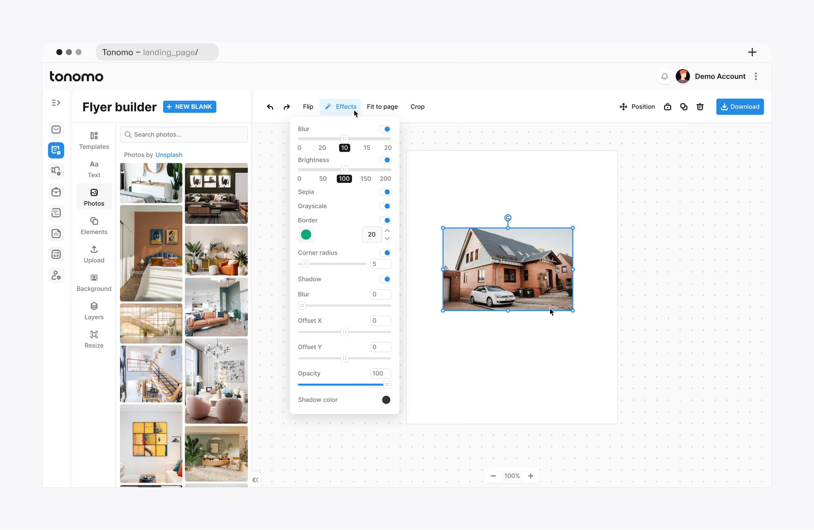
The Flyer Builder for Listings is a product within the product.
Problem. Agents regularly print flyers for their listings. The product already had the content needed to produce the marketing asset: photos, price, address, rooms, amenities, the agent's headshot and brokerage. The missing piece was the interface to turn that data into something publishable.
Decision. We designed the builder from concept and interaction model to graphics, controls, effects, example output, and a design system ready for implementation. Templates, text, photos (the listing's own plus a stock library), elements, layers, and an effects panel per image cover what a manager needs to produce a print-ready flyer without leaving Tonomo. Before implementation we produced a set of finished flyers in several layouts from real listing data, so the Tonomo team and future users could see the range the tool was meant to reach. Those examples became the templates.
System. The builder reads the same listing data as the property website and the delivery page. One order, three outputs.
How do you design a mobile dashboard for a complex operational product?
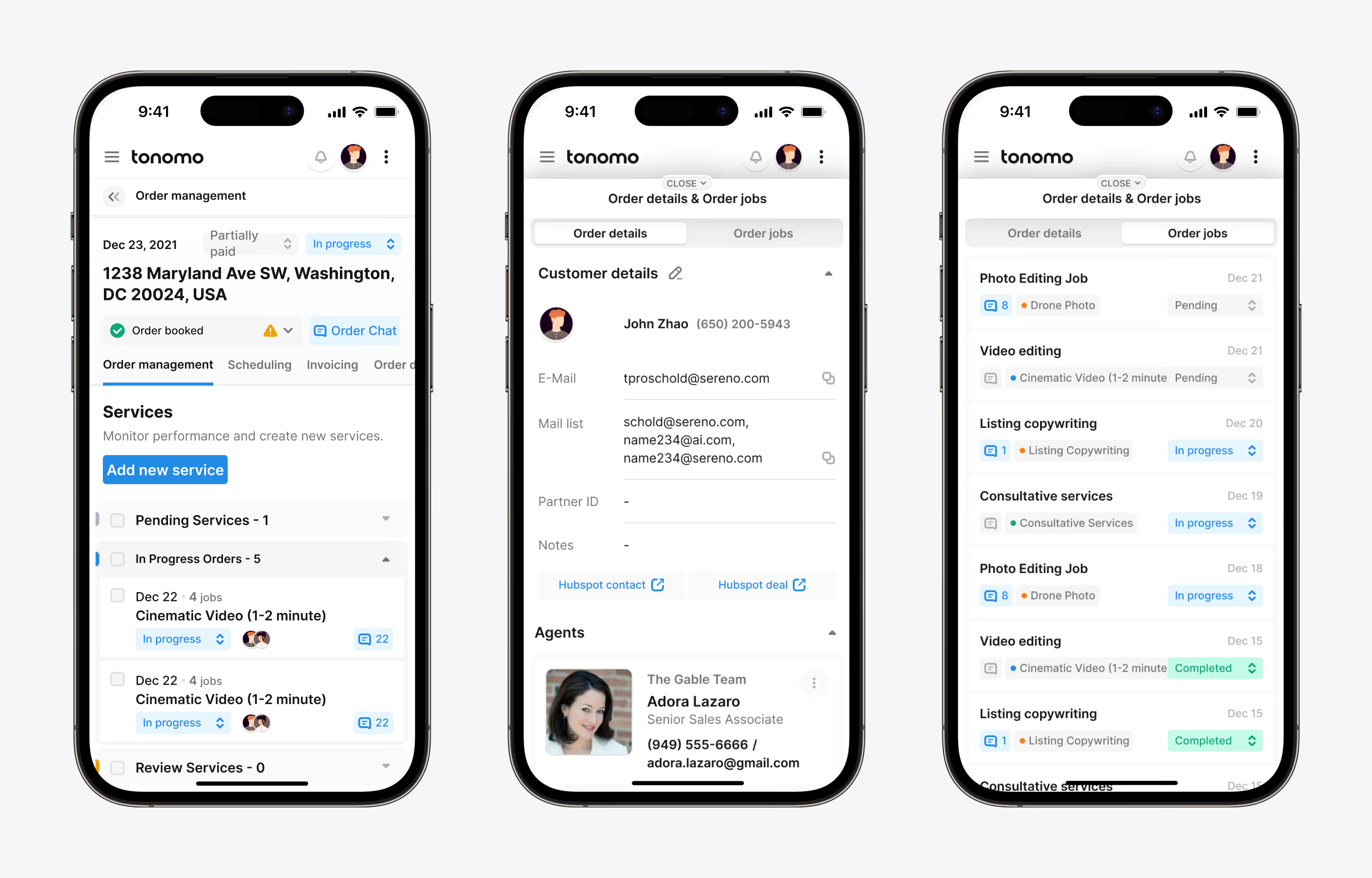
Problem. Managers plan on a large screen. Photographers, editors, and agents check and update from a phone, often while away from a desk, and agents pay from it.
Decision. We designed every key workflow except the calendar for mobile at full functionality rather than as a reduced view. Dense tables became stacked cards. Sidebars became switchable panels. Bulk bars stayed fixed at the bottom and followed the scroll. Photographers move an order through production tabs and check off sub-services as they finish. Order chat, job chat, invoicing, and delivery are all on the phone.
System. Mobile uses the same components and status vocabulary as desktop. A status changed in the field is the status the manager sees in the queue.
How do you make a complex dashboard feel like one product?
Two principles guided the system.
A shared design system across both sides. Client-facing and internal screens use the same components, status chips, steppers, bottom bars, and sidebars. A custom icon set covers concepts generic libraries do not, such as territories, job types, and property website sections. A component learned in the order flow is recognized in Order Management.
One-step navigation between related objects. A calendar appointment opens the order. An order opens its jobs. A job opens its chat. The invoice opens from the client's order detail. Delivery opens the property website admin. A blocked stage links to the module that unblocks it. In a product with this many features, every missing shortcut is paid for on every order.
The team's internal nickname for the project was "one more Atlassian." The joke was about feature count. The design challenge was real: the more the product grew, the more important the connections between modules became.
How did the engagement grow from MVP to a dedicated team?
Existing product with users. Research into the product and the market. A UX architecture that kept what worked. MVP design of the first missing modules. New modules one at a time, with old and new patterns coexisting in production. A design system to hold them together. The mobile experience. A year of continuous product design work by a team of about five people, from a scoped MVP engagement to a team embedded in the product.
The scope grew because each module made the next one necessary. Booking needed scheduling; scheduling needed the calendar; the calendar exposed the need for jobs; jobs needed templates; delivery needed a website; the website needed an admin and a flyer builder.
Deliverables over the engagement: information architecture map, Figma source files, high-fidelity mockups, an interactive prototype, the design system and component library, handoff documentation with Loom walkthroughs, a custom icon set, and a marketing asset library with flyer and website templates the Tonomo team runs independently.
The clearest signal of whether the system works comes from the businesses running on it. Customer feedback published on tonomo.io maps onto the modules above. Bear Karry of Bear Karry Productions singles out communication inside each project chat. Marcus Fleming of Listing Bees reports fewer cancellations through the booking system and more accurate pricing by home size and location. Tim Emmerton of Keyshoot describes scheduling the exact time each property needs, including travel to the next job. Jason Greer of Elevato Visuals reports average transaction value rising from $700 to $900. These are Tonomo's outcomes with its own product and engineering; the interface those businesses use is the one this article describes.
If your SaaS product is already live, your dashboard is carrying more than it was designed for, and the next modules are already on the roadmap, we can help you extend it without starting over. Talk to us about the scope, or see how our SaaS product design agency works with live products.

Frequently Asked Questions
What is Tonomo?
Tonomo is a real estate media operations platform for photography and video businesses serving listing agents. It combines online booking with pricing by property size, photographer scheduling across territories, a production pipeline with jobs and chat, invoicing, media delivery pages, a flyer builder, and auto-generated property websites in one system used by staff and clients.
Did Flatstudio design Tonomo from scratch?
No. Tonomo already had a landing page, parts of the dashboard, an existing UX, and a development team when Flatstudio joined. We researched the product and its competitors, kept the patterns that worked, and extended the system with new modules while it stayed live, growing from an MVP scope into a dedicated design team.
How do you make a complex dashboard feel like one product?
Two principles carried Tonomo: a shared design system across client-facing and internal screens, and one-step navigation between related objects. An order opens from the calendar, a job opens from the order, a chat opens from the job, and a blocked stage links to the module that unblocks it. Shared status vocabulary keeps screens consistent.
Was Tonomo designed for mobile?
We designed every key workflow except the team calendar for mobile at full functionality: ordering, scheduling, checkout, order tracking, payment, order management, jobs, job chat, invoicing, delivery, and the property website. The calendar remained desktop-only by the client's decision, since multi-territory scheduling is a manager's task on a large screen.
How long did the Tonomo design engagement take, and how big was the team?
About a year of continuous work by a Flatstudio team of roughly five people: design leads and interface designers. It started as a scoped MVP engagement for the first new modules and became a dedicated product design team as the system grew. Delivery ran module by module, with handoff documentation and Loom walkthroughs.
Can Flatstudio extend an existing SaaS product instead of redesigning it?
Yes. Most of our SaaS work starts with a live product and users. We map the existing logic, research the market, keep what users rely on, and add modules one at a time so old and new patterns coexist in production. Tonomo ran this way for a year, from MVP scope to dedicated team.
