






Journal. Digital Media Platform — Brand, IA & Editorial UI/UX.


Services
Editorial Design
UX Design
UI Design
Brand Identity
Deliverables
Visual Identity System
Figma Source Files
Engagement
Journal is a digital news publication.
We redesigned it as a digital news publication, covering editorial design and brand identity across the full site. The product needed to preserve the rhythm and authority of a print magazine on the web – and the grid, layout, and composition system now carries that authority digitally.
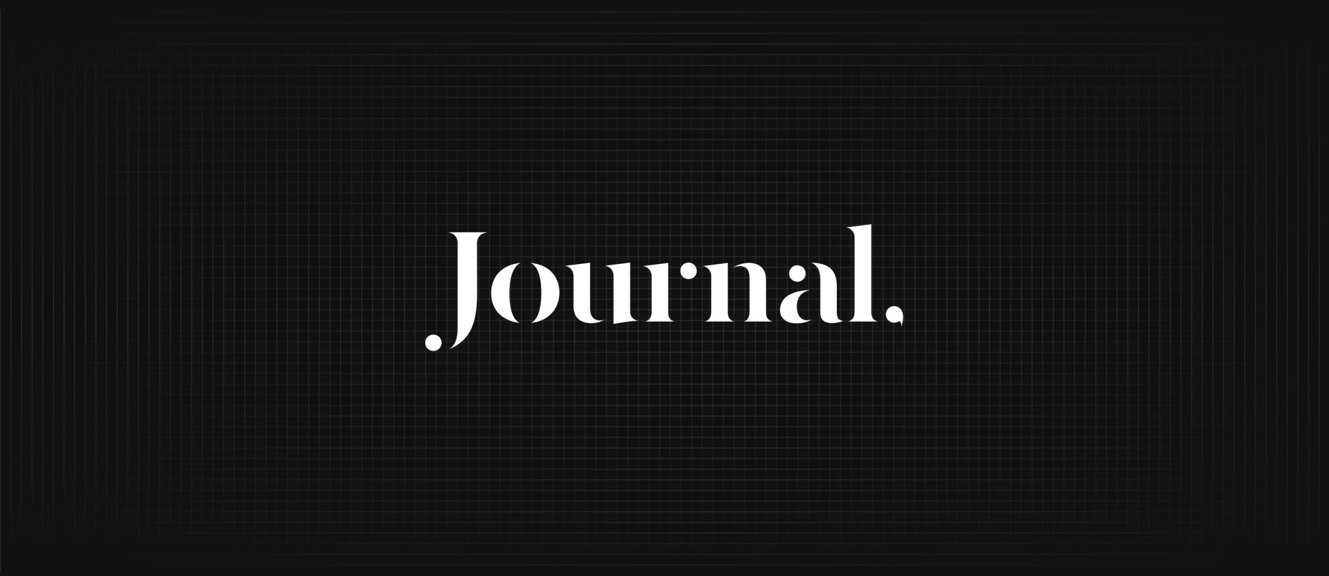
Wordmark for a Digital Publication
Brand identity work for a digital news publication, including the Journal wordmark. The custom logotype uses a serif ligature with a period, set against a dark editorial grid.
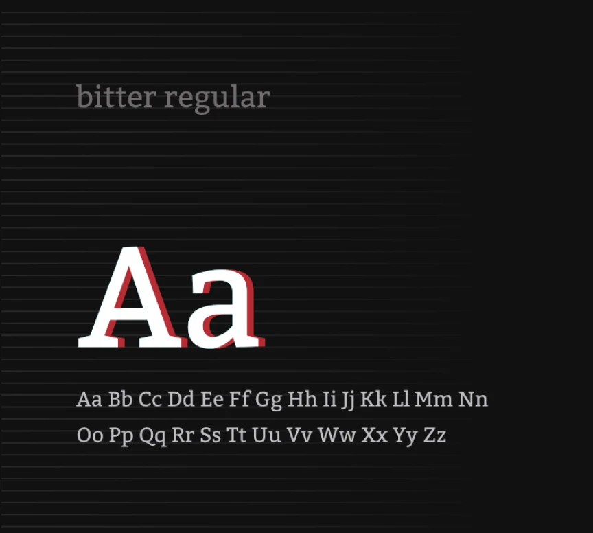
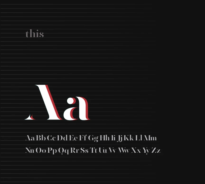
Typeface Pairing for Editorial Hierarchy
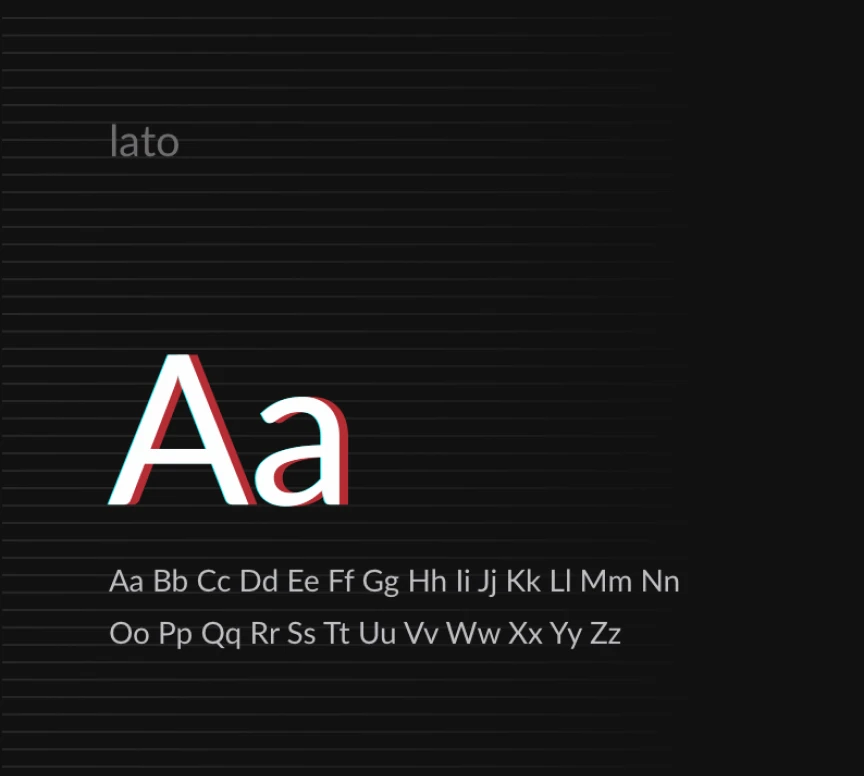
Typography system for the redesigned publication: a serif headline face (Bitter) paired with a sans-serif body face (Lato) for editorial hierarchy. A third, more decorative serif appears in the Journal wordmark itself.
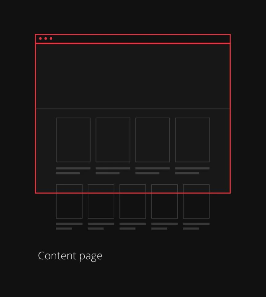
Information Architecture for a News Site
Information architecture blueprints defining the site's three core templates: main page, category page, and content page, mapped before visual design began.


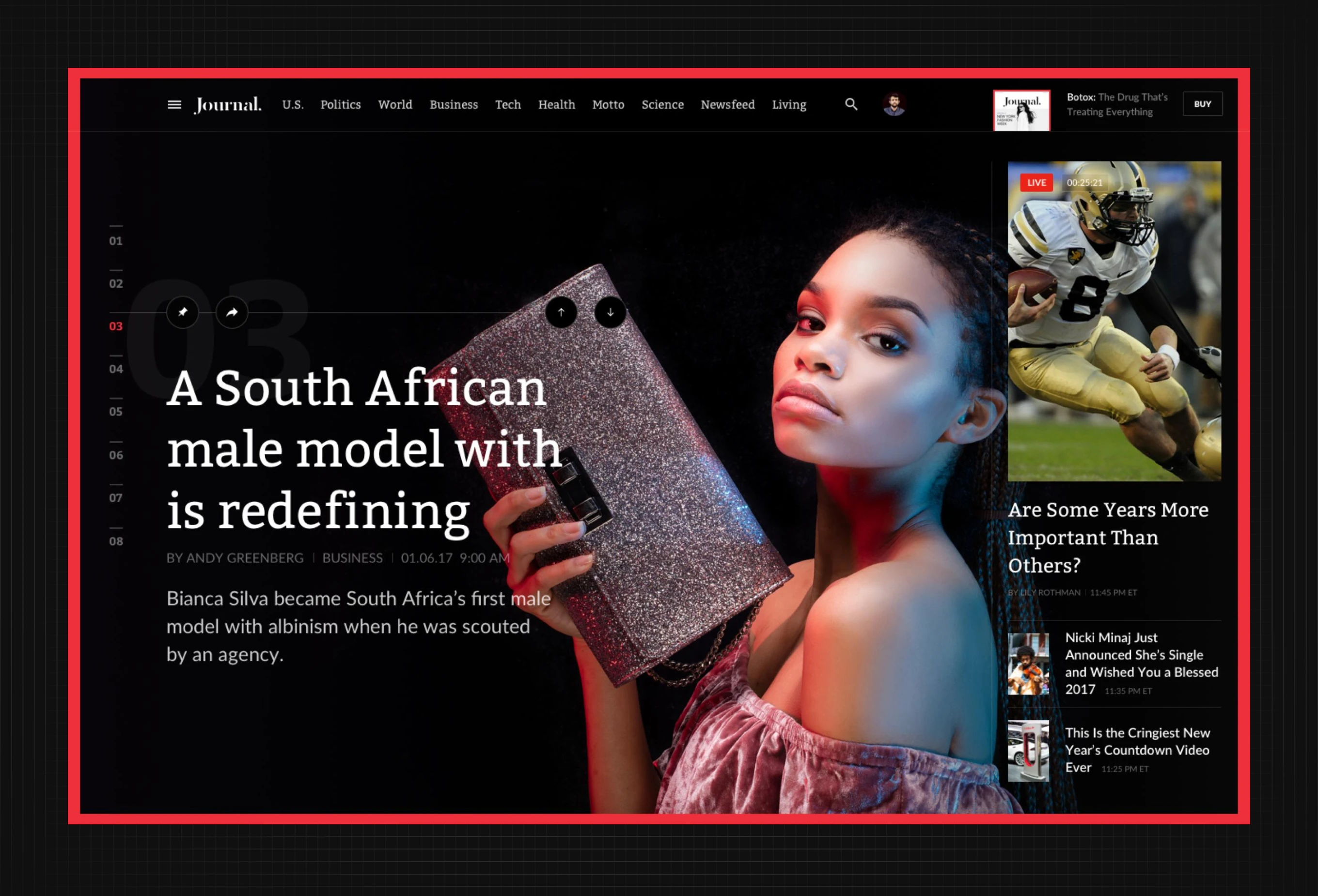
Homepage Hero for Story Discovery
The front page for the publication's homepage, structured around a numbered story carousel and a sidebar with live video and secondary headlines. Readers step through top stories in sequence.

Hero Layout Across Story Genres
The same front-page hero template adapts to different story genres, from breaking-news photography to fashion features, without changing structure or sidebar modules.

Homepage Grid for News Aggregation
A denser homepage view for the digital news publication, aggregating dozens of stories into a tiled grid of mixed image sizes for fast scanning across sections.

Section Tabs for Content Discovery
A tabbed homepage view separating Latest, Magazine, and Videos content, with a three-column story grid and a Just Posted sidebar for recent articles.

Scrolling Feed for Mixed Content
A continuous homepage feed mixing sports coverage, embedded video, and standard articles in one scroll, letting readers move between sections without a hard page break.

Native Advertising Inside the Feed
A branded article placed inside the same story list as regular news, using identical typography and layout so native advertising doesn't break the reading pattern.
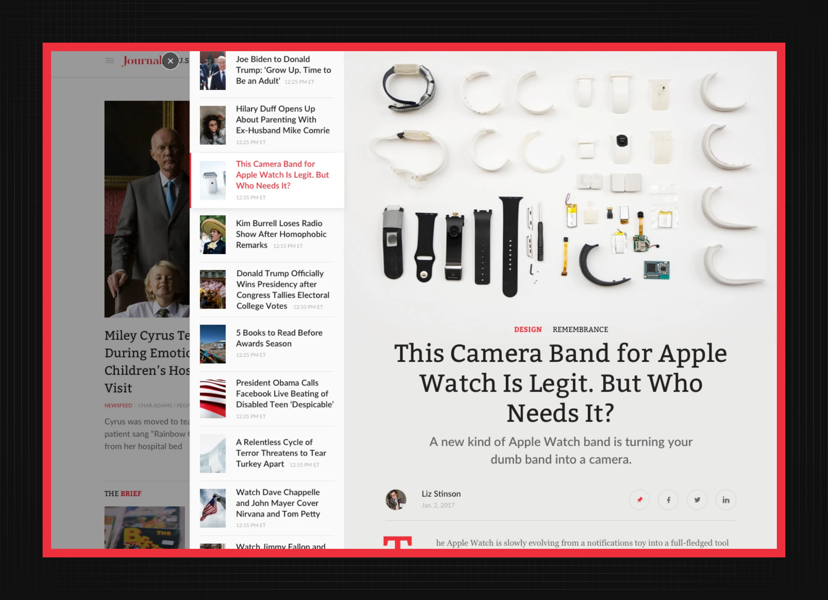
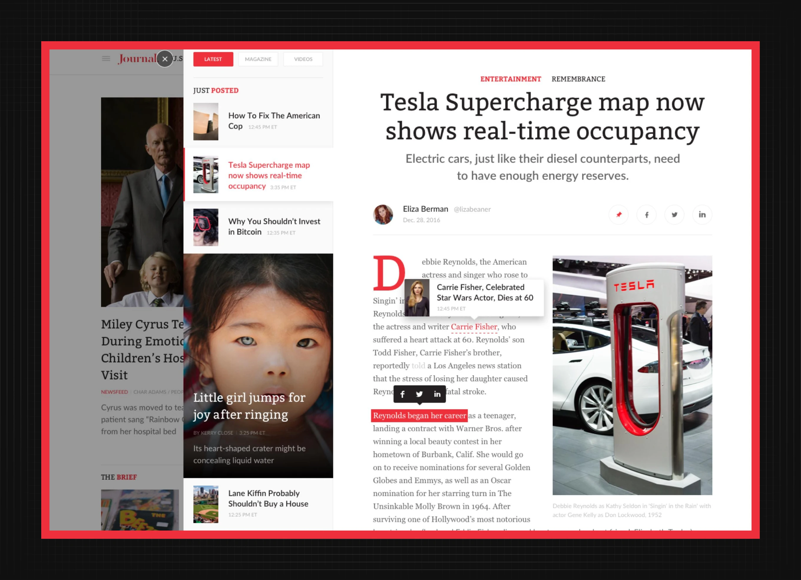
Article Template with Contextual Links
The standard article template for the digital news publication, with a highlighted inline term that opens a hover preview card linking to a related story, plus byline and share icons.
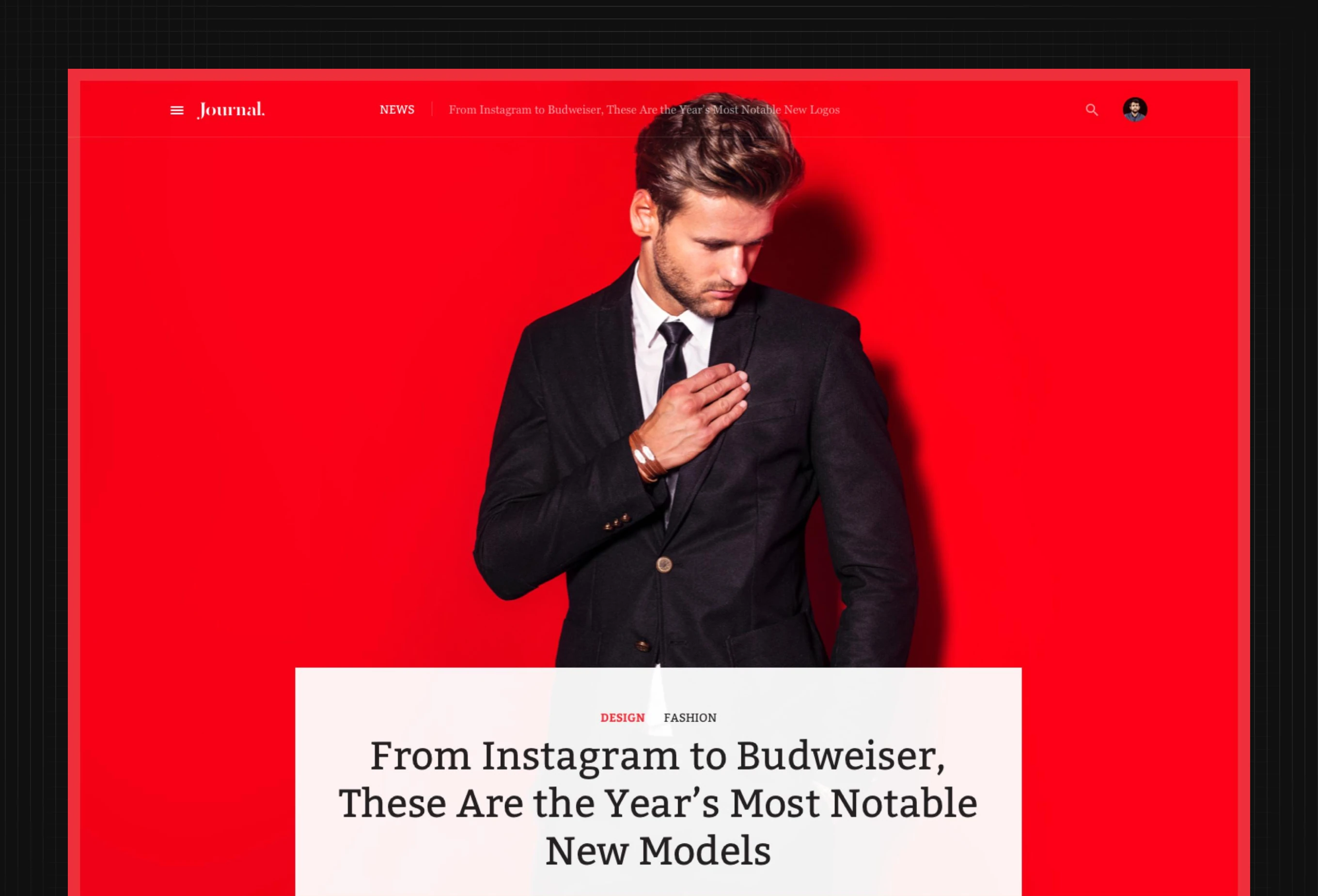
Full-Bleed Hero for Feature Stories
A full-bleed color-background hero for feature articles, with the headline set directly over the image and category tags marking the section.
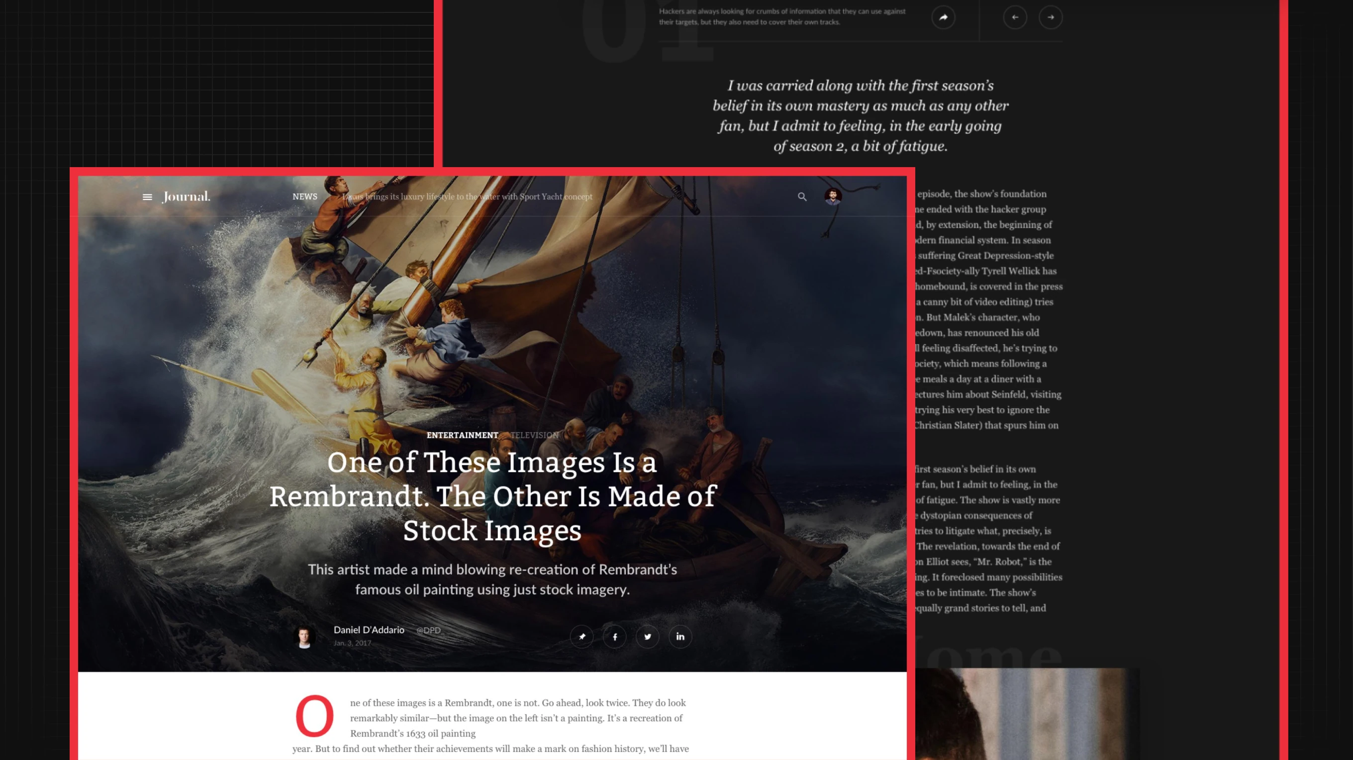
Article Header with Full-Bleed Media
An alternate article header using a full-bleed photograph or painting behind the headline and subheading, with a byline row and share icons for four platforms.

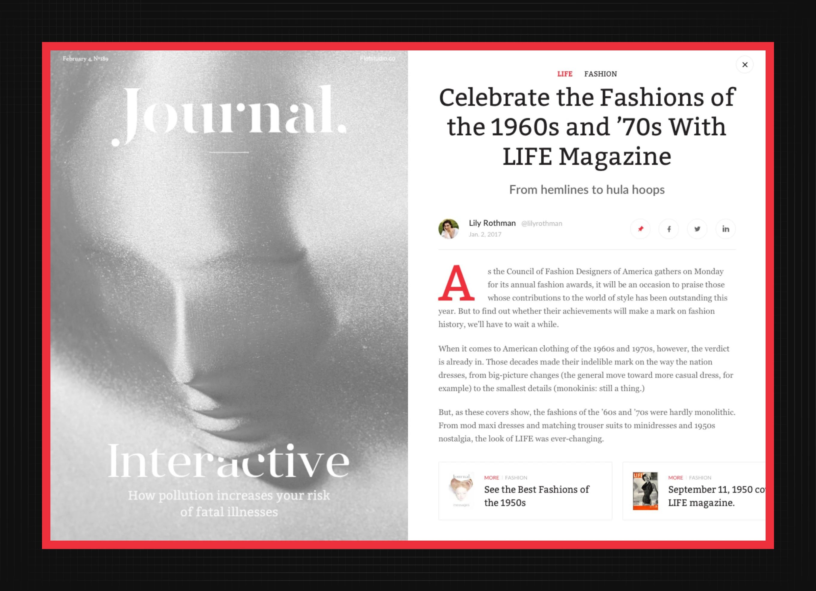
Print Cover Concept for the Site
A print-style cover concept numbered like a physical issue, shown next to the standard web article template it links through to.
Full-Bleed Layout for Luxury Features
The same article template applied to a luxury lifestyle feature, using a full-bleed product photograph with a layered text panel carrying the headline and dek below it.

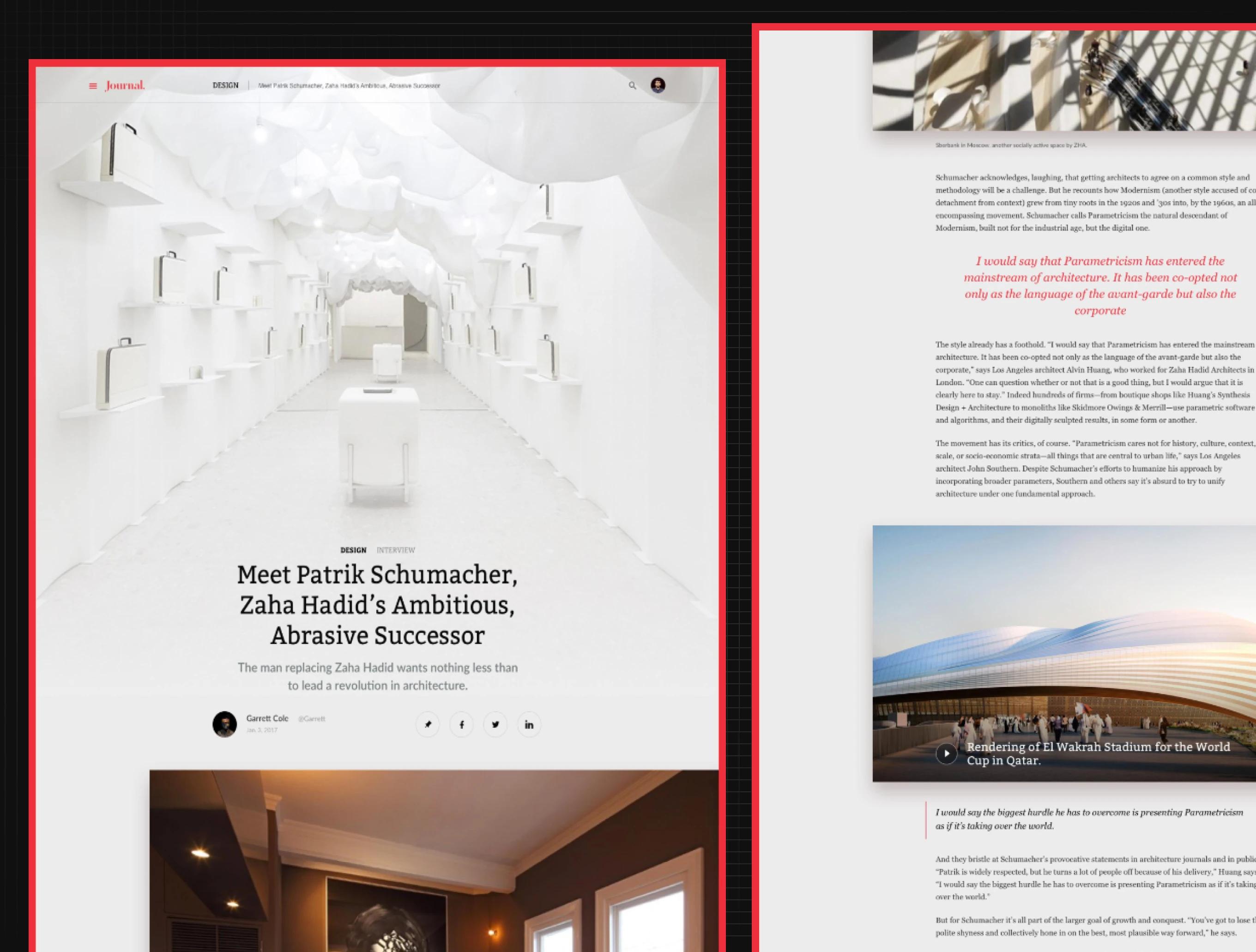
Interview Layout with Pull Quotes
An interview article format combining a full-bleed portrait hero with a body layout that isolates quotes in red italics and embeds video alongside the running text.
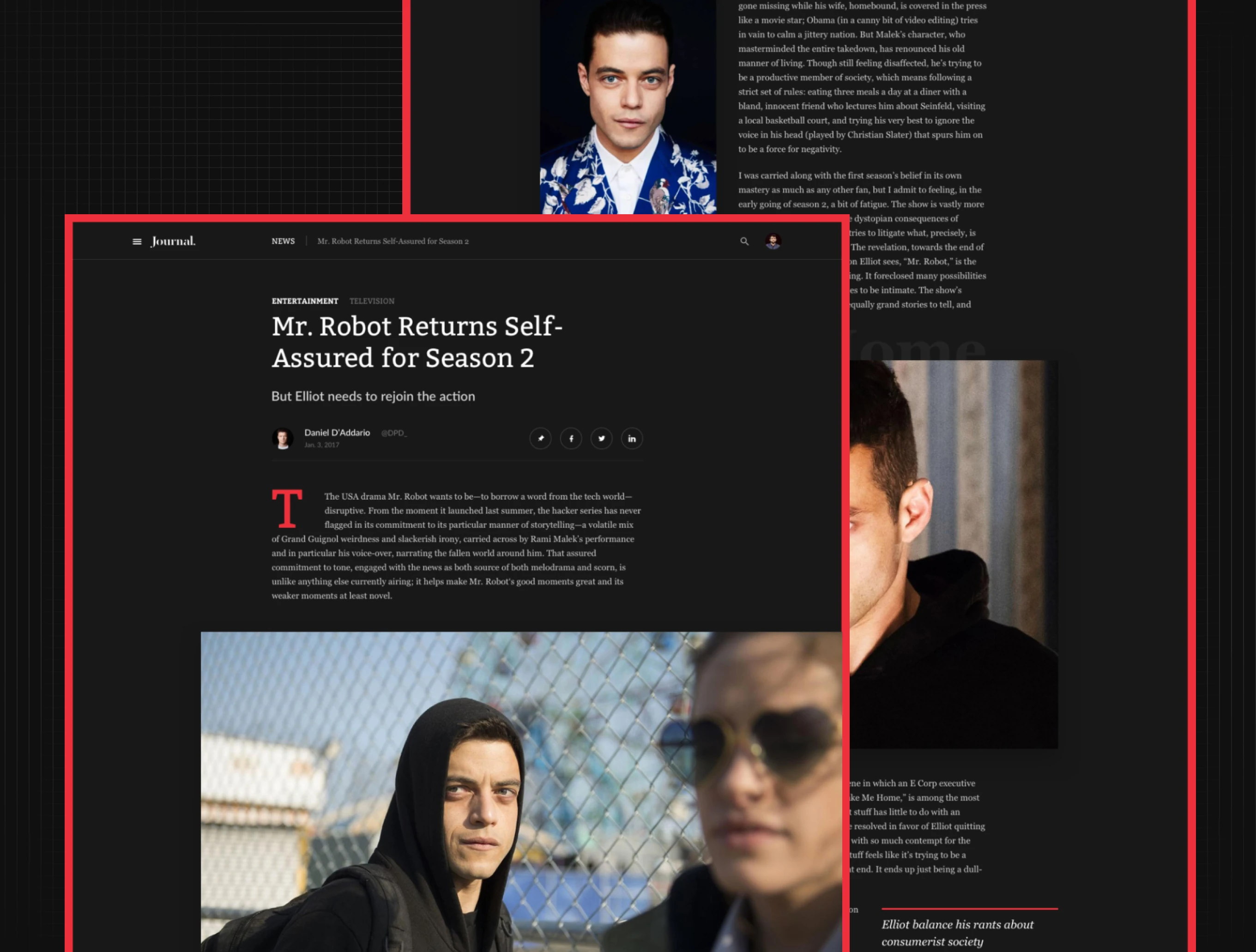
Dark Theme for Entertainment Stories
A dark-background variant of the article template for entertainment coverage, keeping photography and video stills bright against the darker page to hold reader focus.
Shared Grid Across Content Types
The same column grid holds an interior product shot and an interview portrait at different crops, showing the system adapts by content type without a new layout.

If your publication's authority lives in print and evaporates on the web, the grid and composition system is where it gets rebuilt. We design editorial systems – reach out.
Ready to start your own project?
