













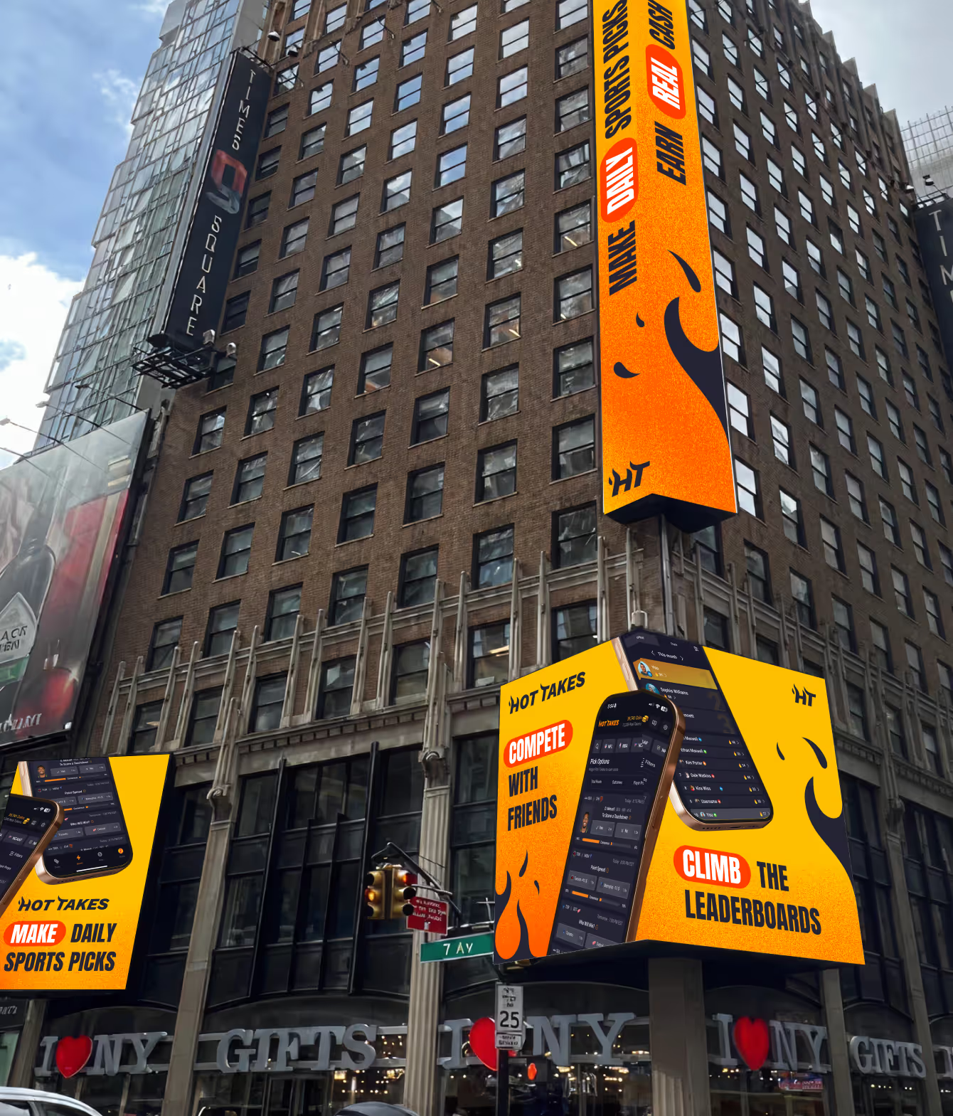
We designed it around a single tension – trust and excitement at once – covering brand strategy, visual identity, logo, and tone of voice. The brand had to cut through an overloaded sports content environment, up to the media noise of Times Square – and the identity carried the launch campaign there.
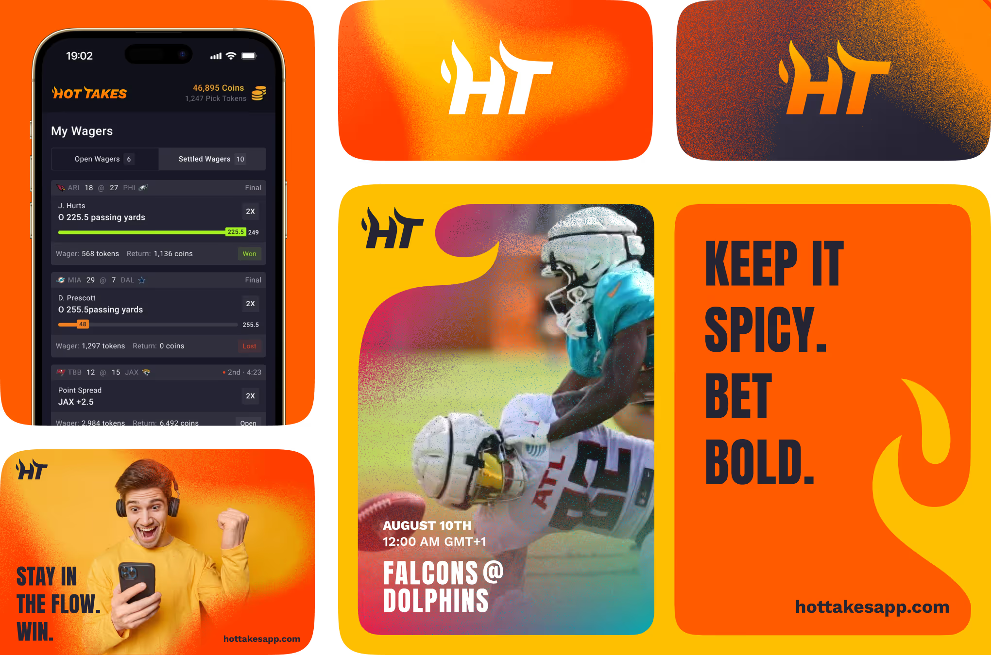
This section shows the identity of sports prediction app Hot Takes across product and marketing touchpoints. The same mark holds up on a wager-tracking screen, football ad creative, and gradient brand cards.
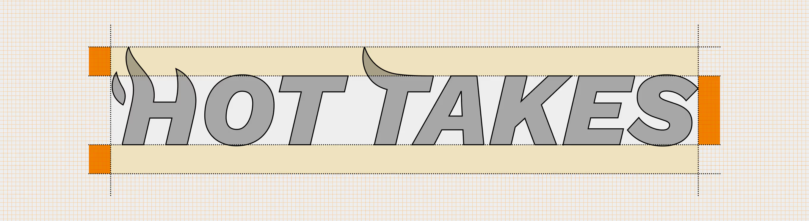
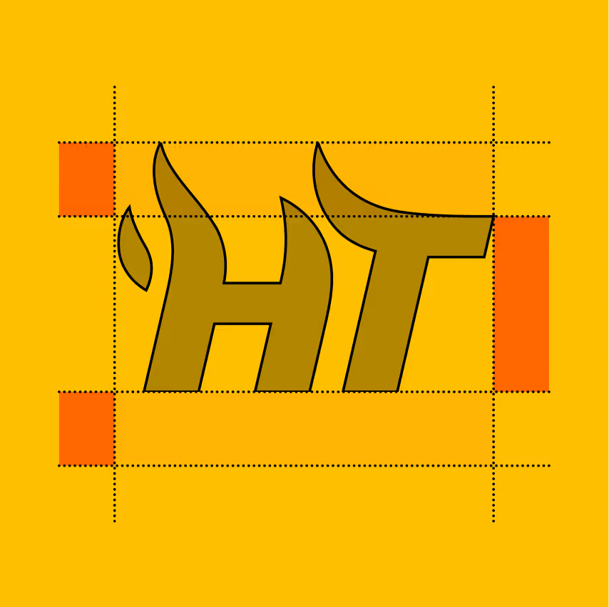
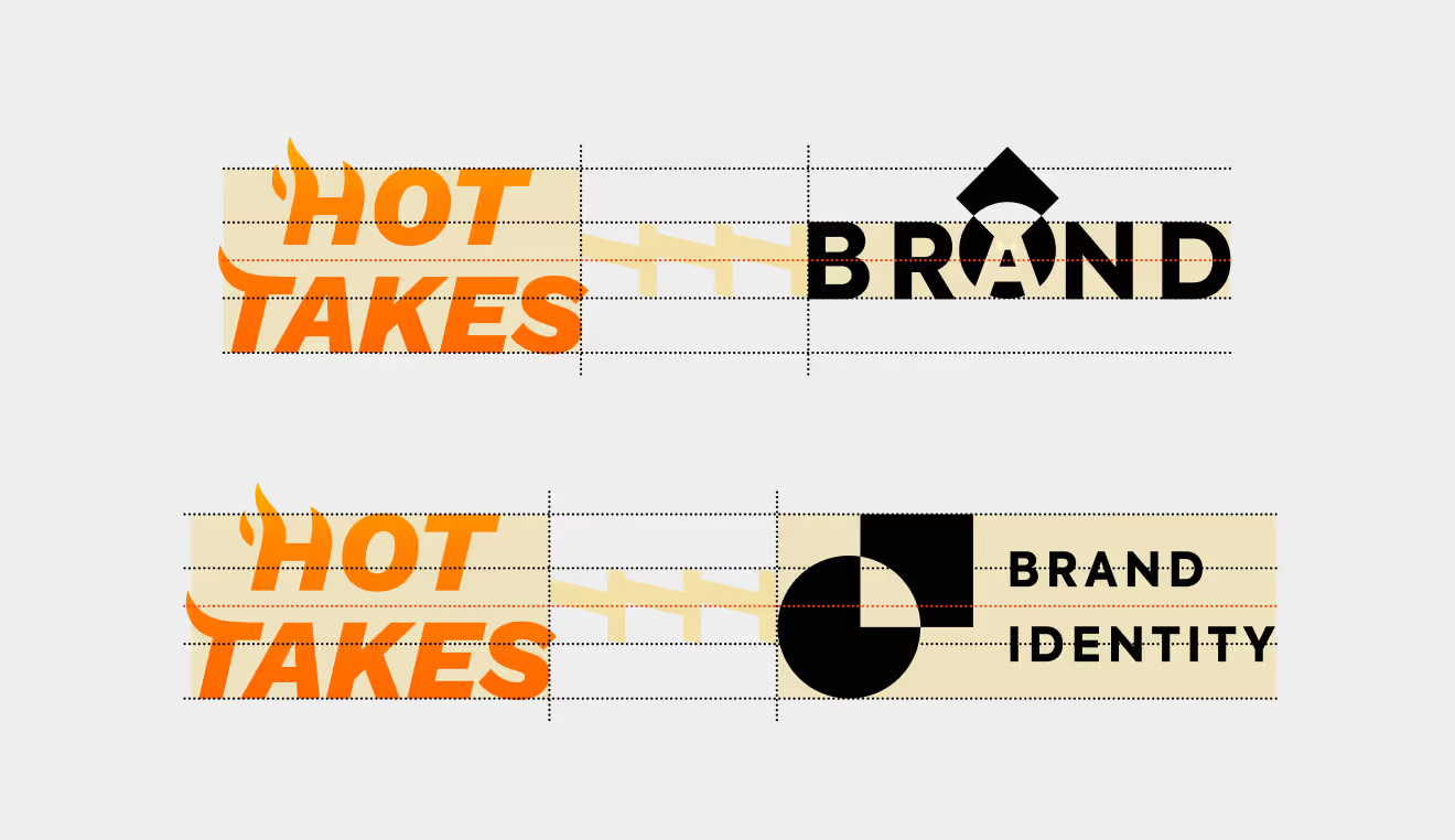
Logo construction rules for the wordmark, covering proportion and clear space across app and marketing use. Three lockups – the H mark, the HT monogram, and the full wordmark – share one grid system.


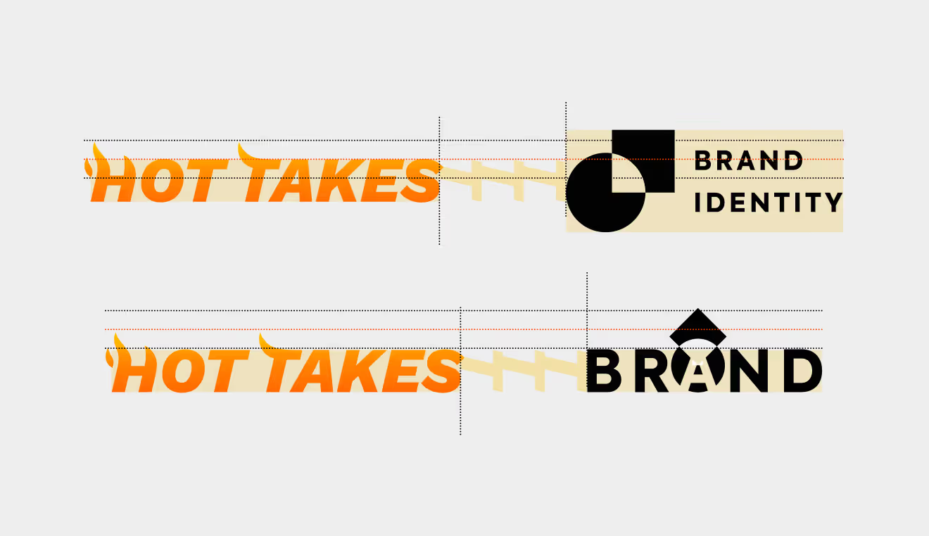
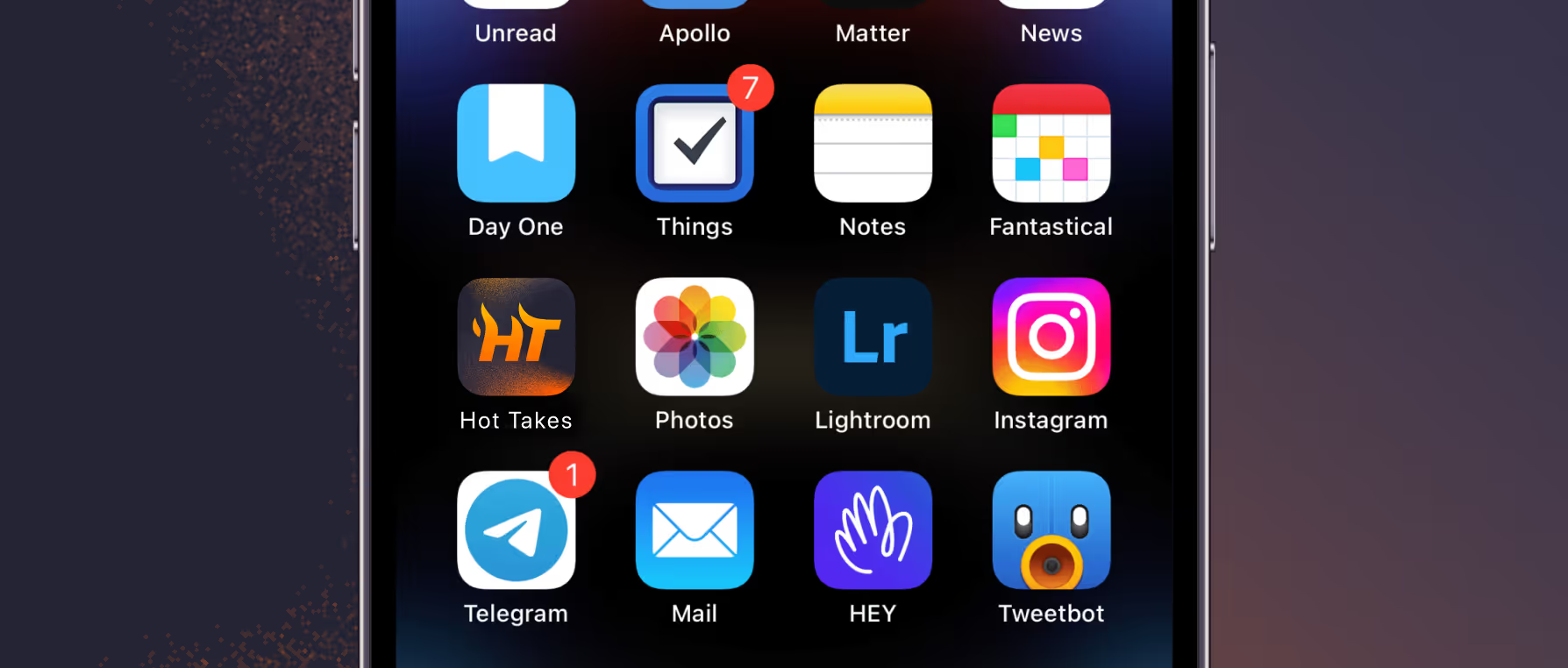
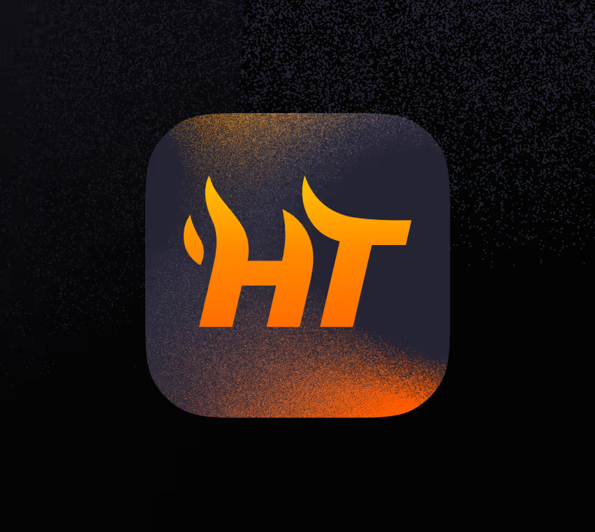
Approved lockup combinations pair the logo with a tagline, alongside the app icon as it sits on a home screen among other apps. Fixed alignment rules keep spacing consistent across every pairing.

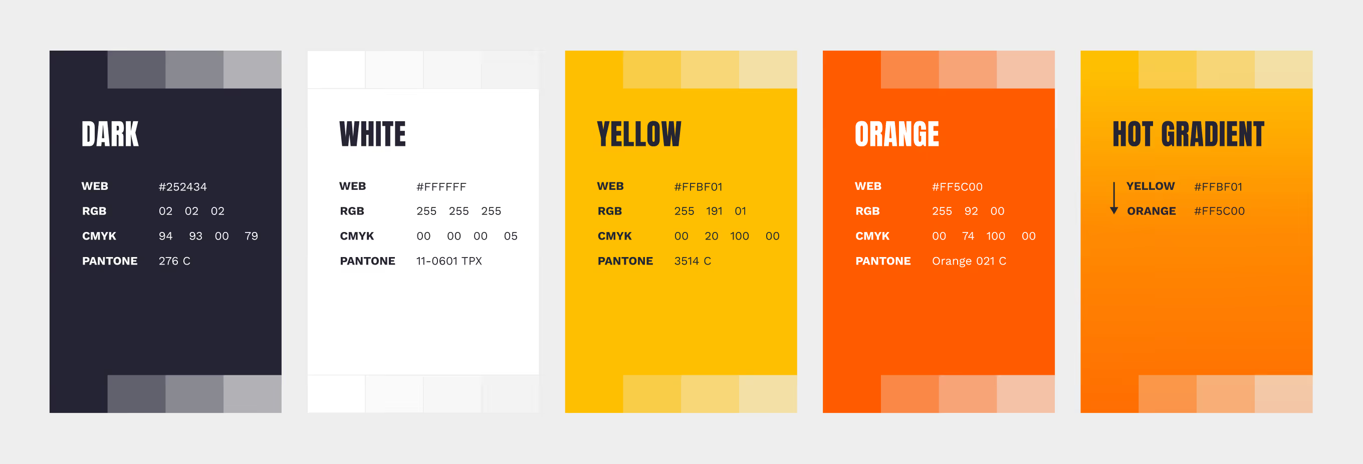
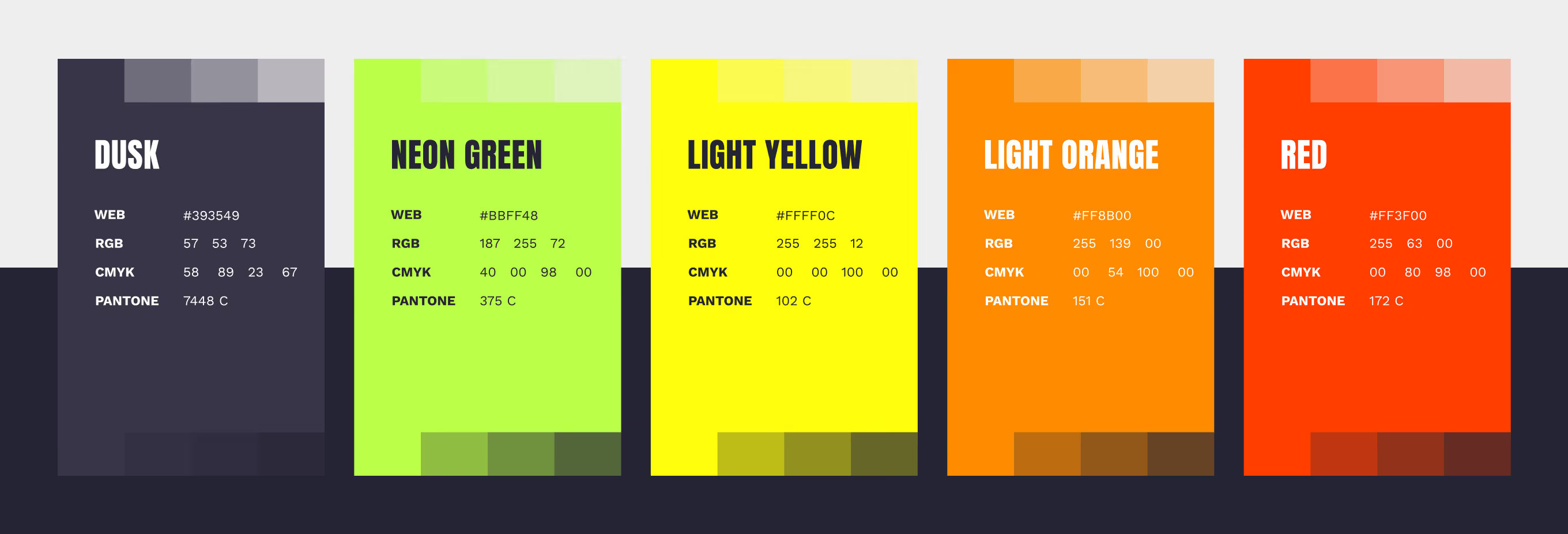
The full color system for the sports prediction app Hot Takes, with ten tones in Web, RGB, CMYK, and Pantone values. Dark, Yellow, and Orange anchor the mark; Neon Green and Red extend into gradients and ads.

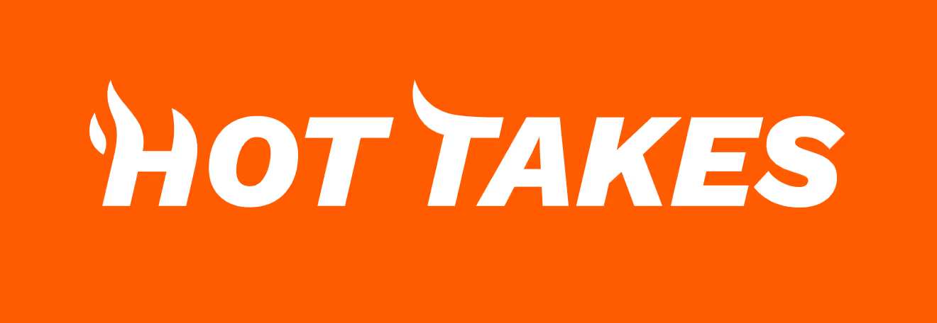
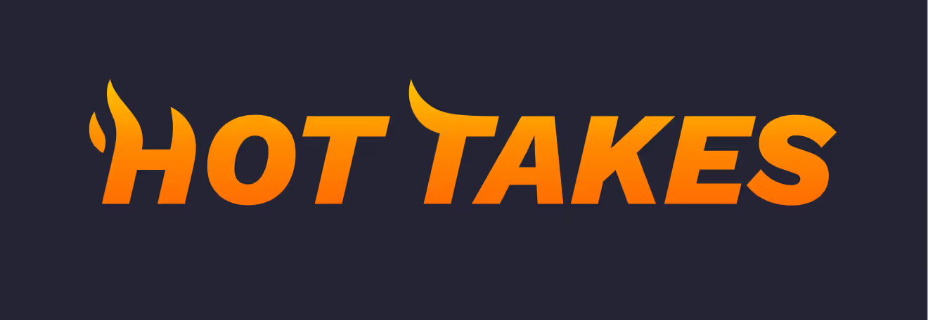
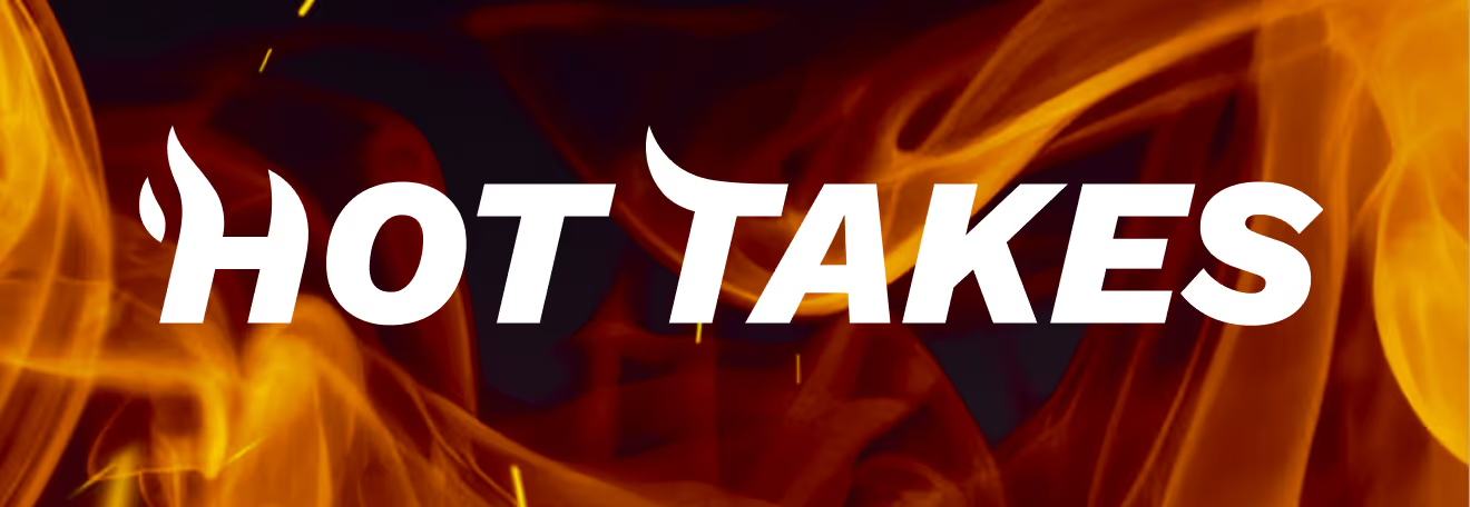
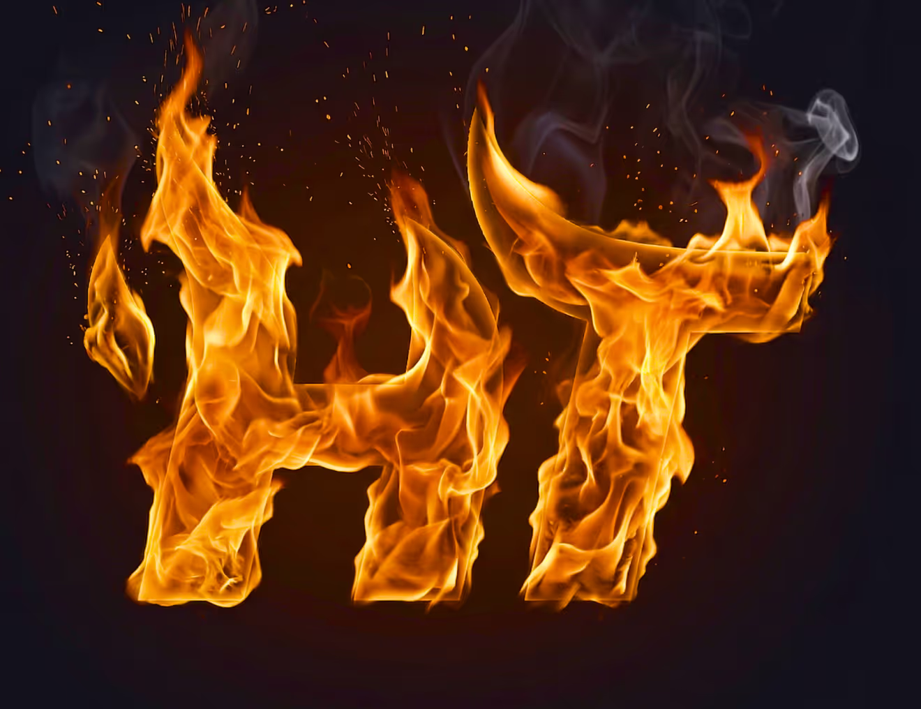
The logo tested across six background treatments, from flat orange and white to gradient and photographic fire imagery. The gradient system keeps the mark legible on both dark and light surfaces.



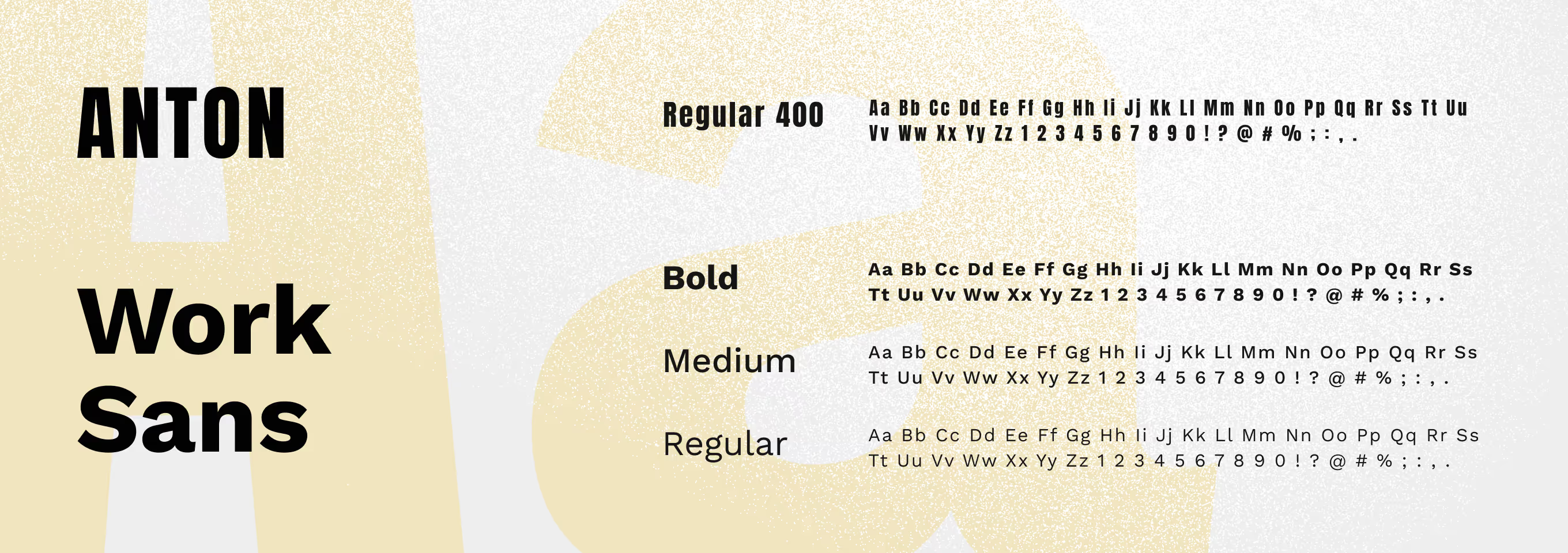
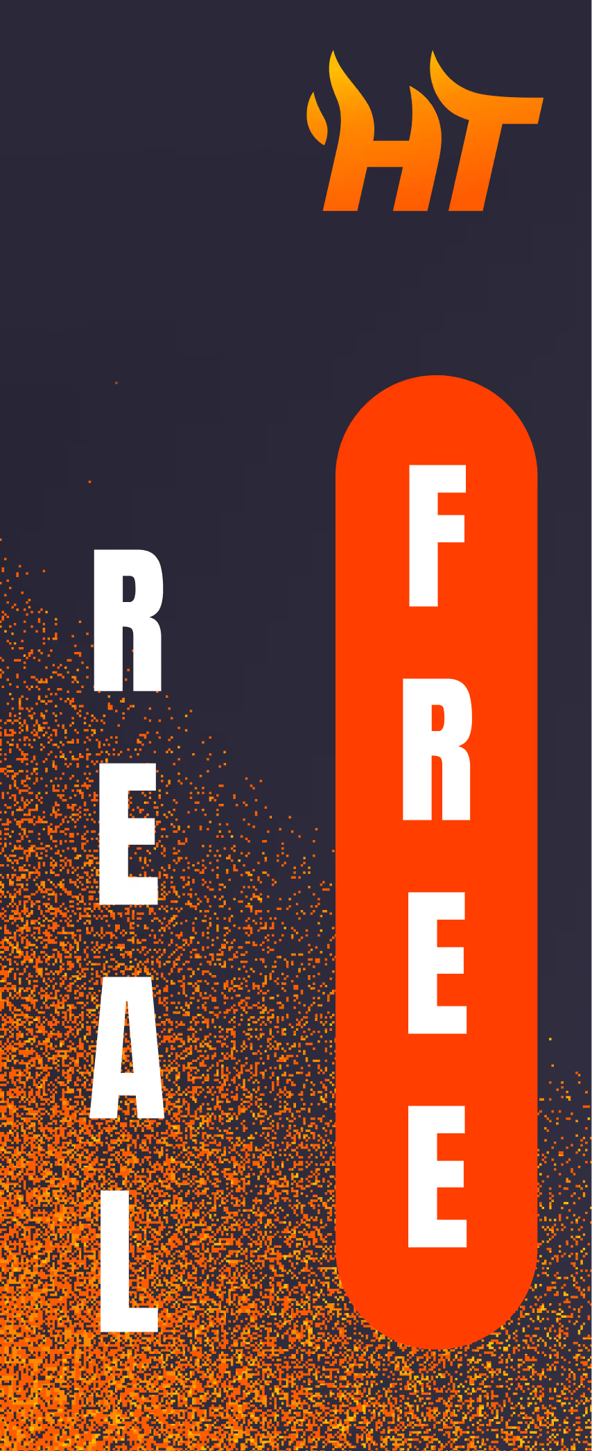
The typeface pairing: Anton for bold display headlines, Work Sans for body copy and UI text. The same pairing carries into ad headlines such as 'Make Free Picks, Earn Real Cash.'
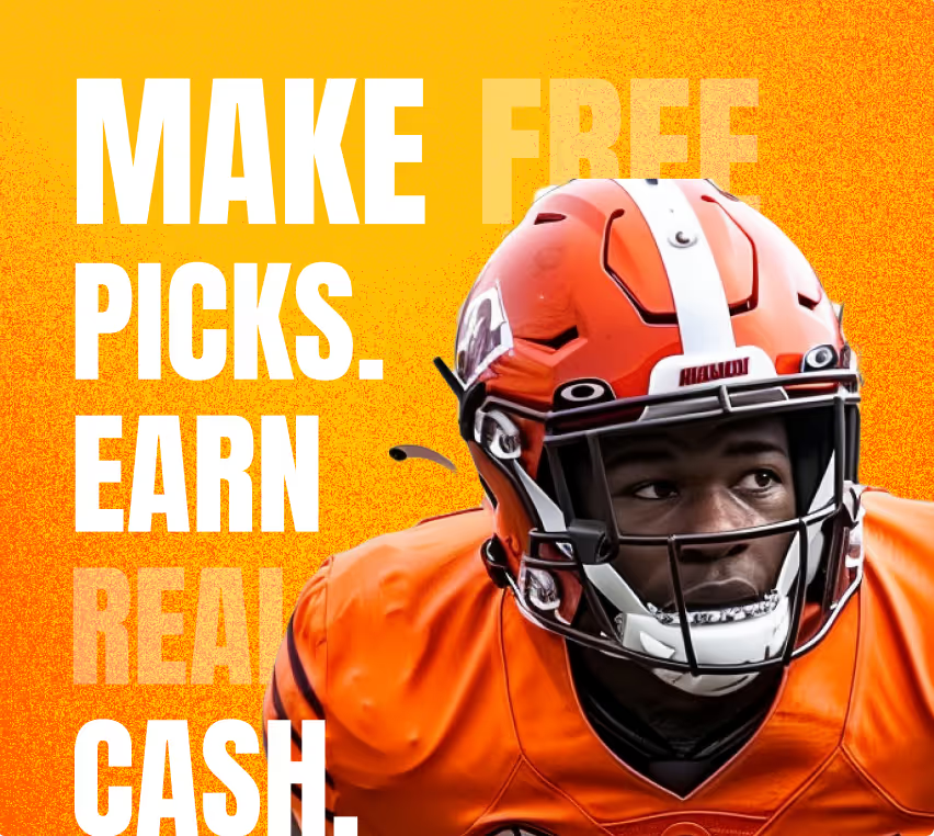
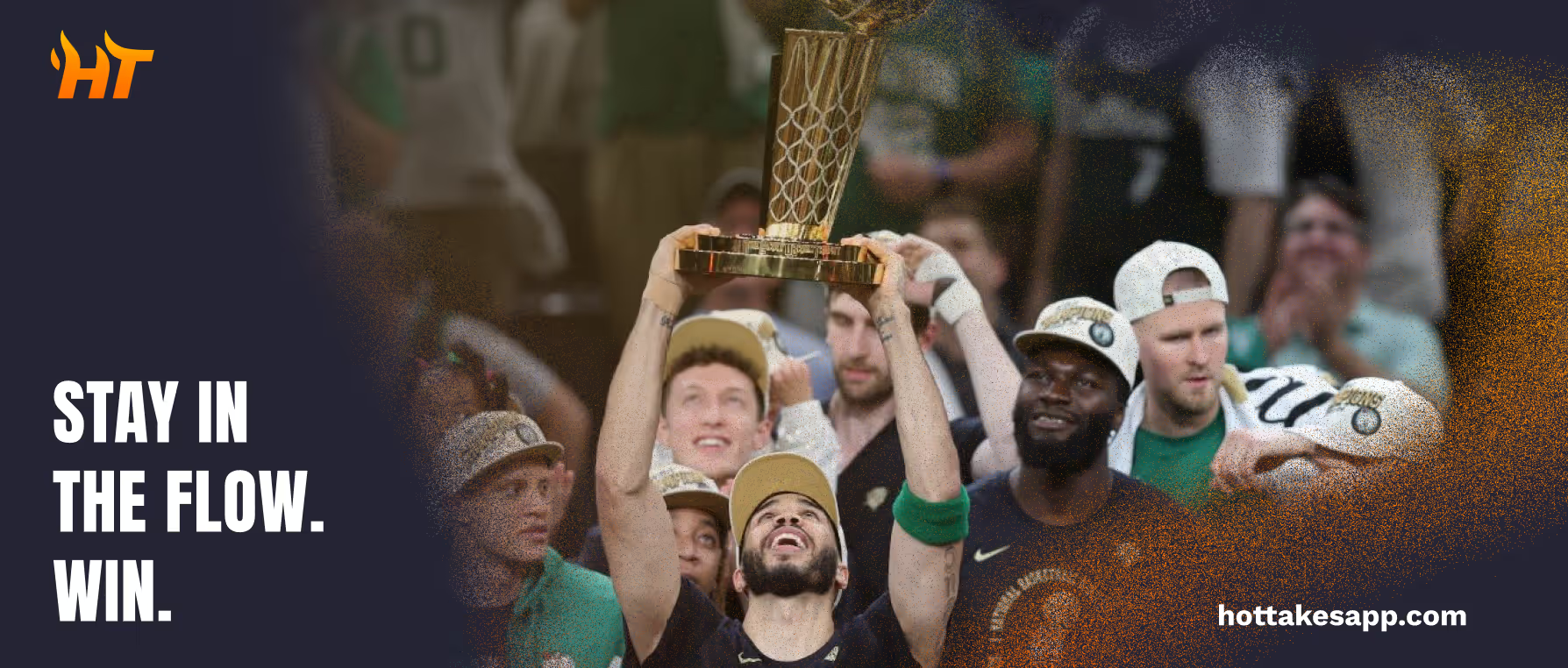
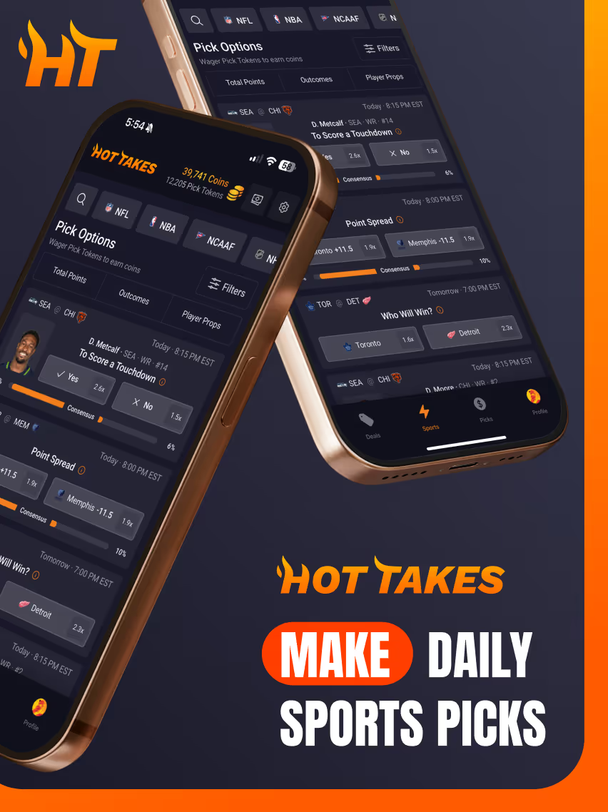
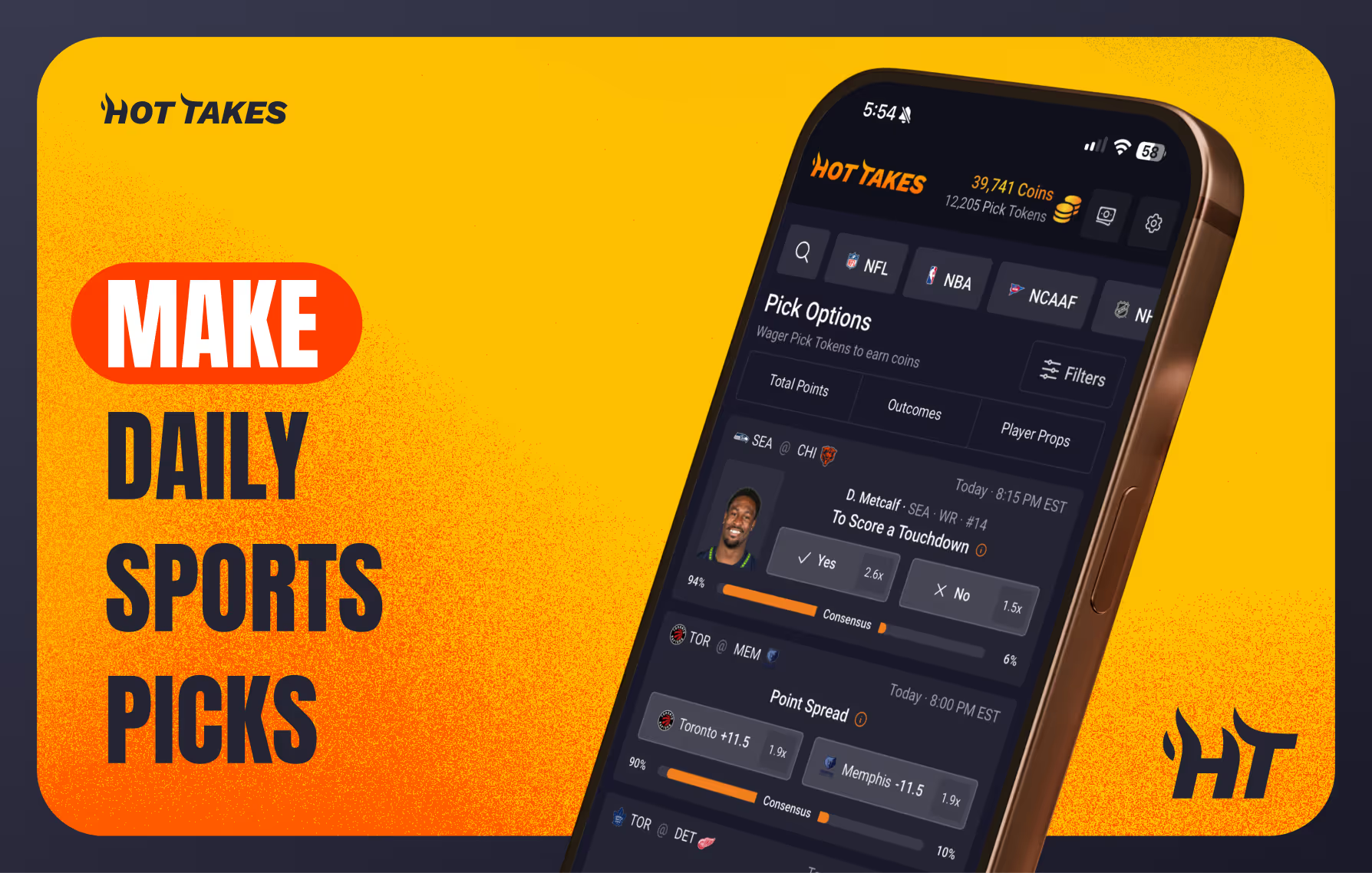
The Hot Takes identity reached out-of-home advertising, including a Times Square billboard, and the app's Pick Options screen for daily sports picks. The same launch drove 'Make Daily Sports Picks' social ads.
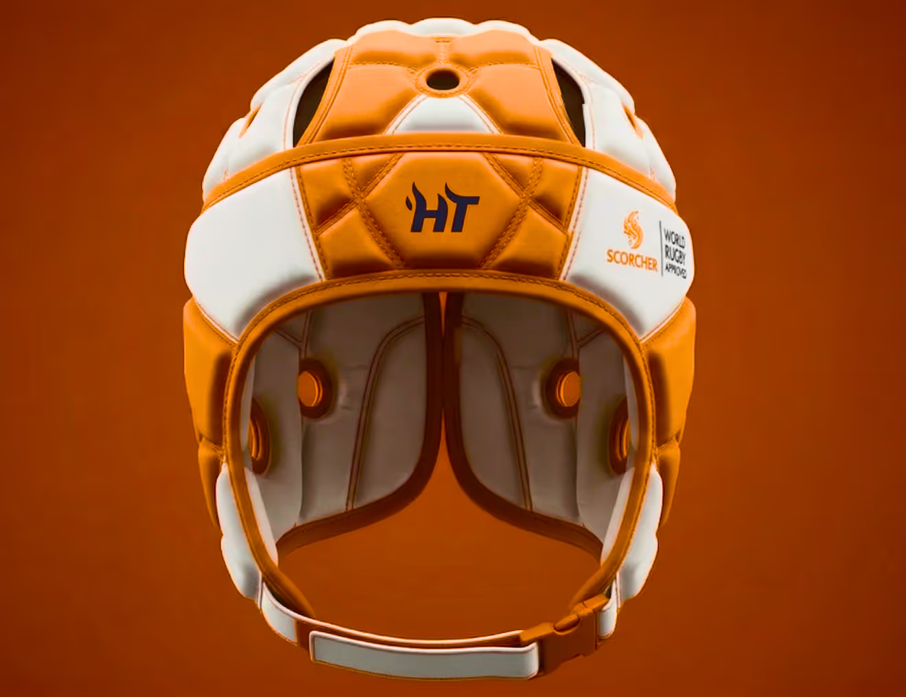
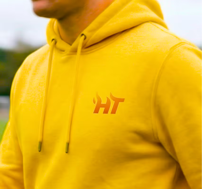
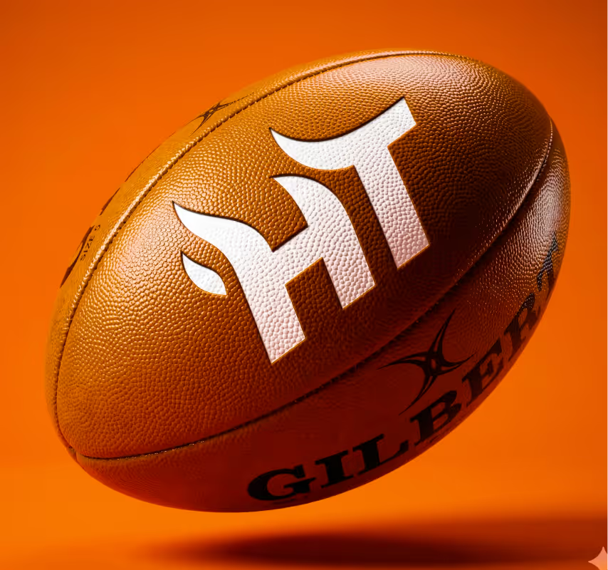
The mark applied to sports merchandise and gear, including a helmet, hoodie, ball, and water bottle. Jerseys in the brand's orange and dark tones show how the logo holds up on fabric.

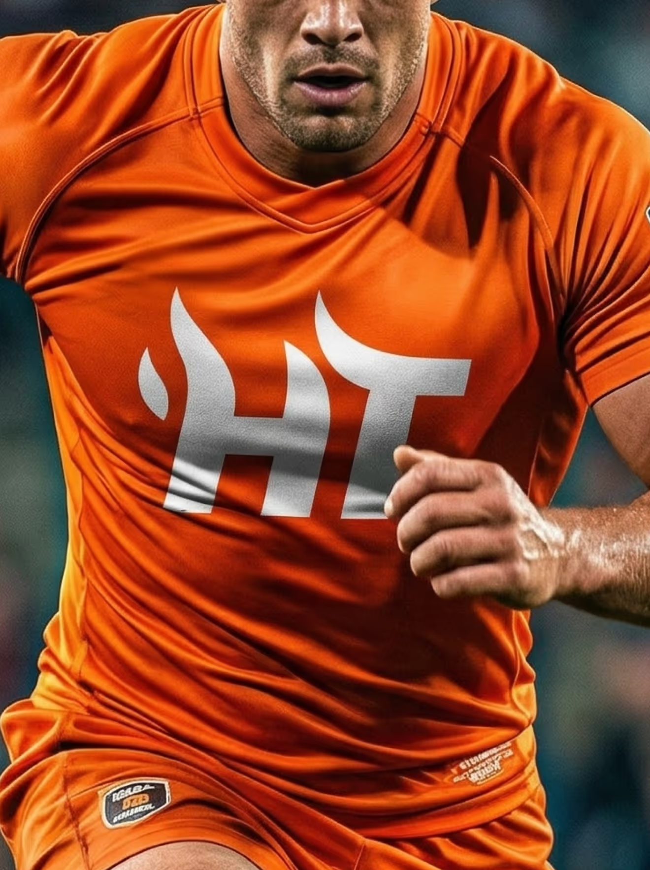
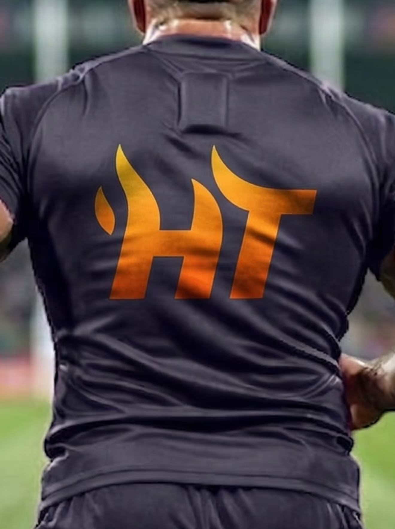
A set of six noise-gradient textures built from the brand's dark and warm tones. They appear as backgrounds throughout the identity, from logo cards to ad creative.






A set of flame-shaped corner accents used to frame photos and content blocks in marketing layouts. The shapes appear in both orange and yellow, echoing the flame mark in the logo.




If your sports product needs a brand loud enough for a launch campaign and credible enough to keep users, that tension is a strategy question first.
Bring us yours.
