










We designed it as a complete brand identity system for an iGaming operator, working within the limitations of a website design that was already completed. The brand needed to feel new and engaging despite that constraint – and the identity delivered distinctiveness without requiring a site rebuild. iGaming brand identity system — logo, colour, typography and motion rules — designed to scale across casino product, promo and social.
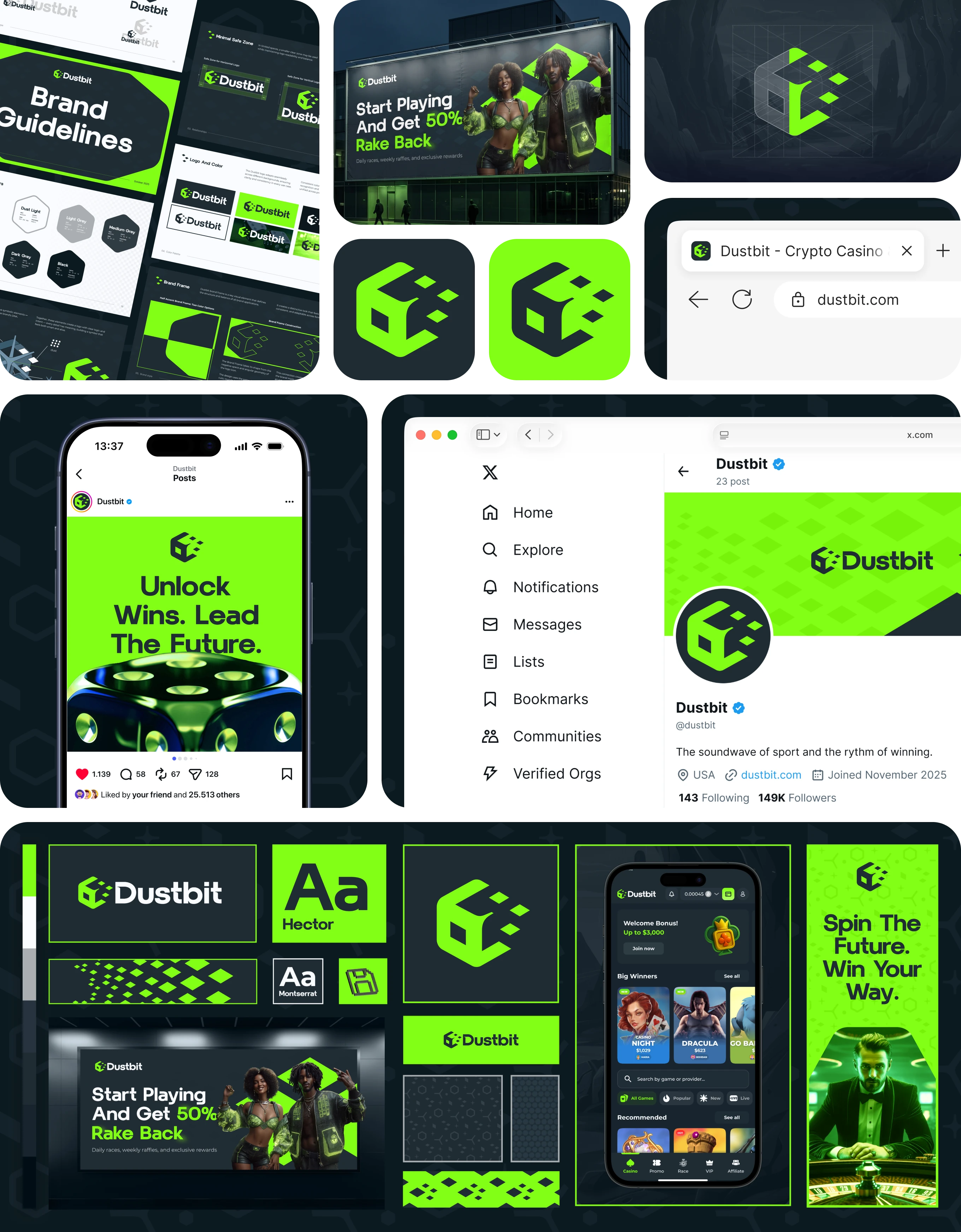
Dustbit's iGaming brand identity system spans app icon, browser tab, brand guidelines, social profile, and outdoor ads - built to feel new despite a website already locked in.
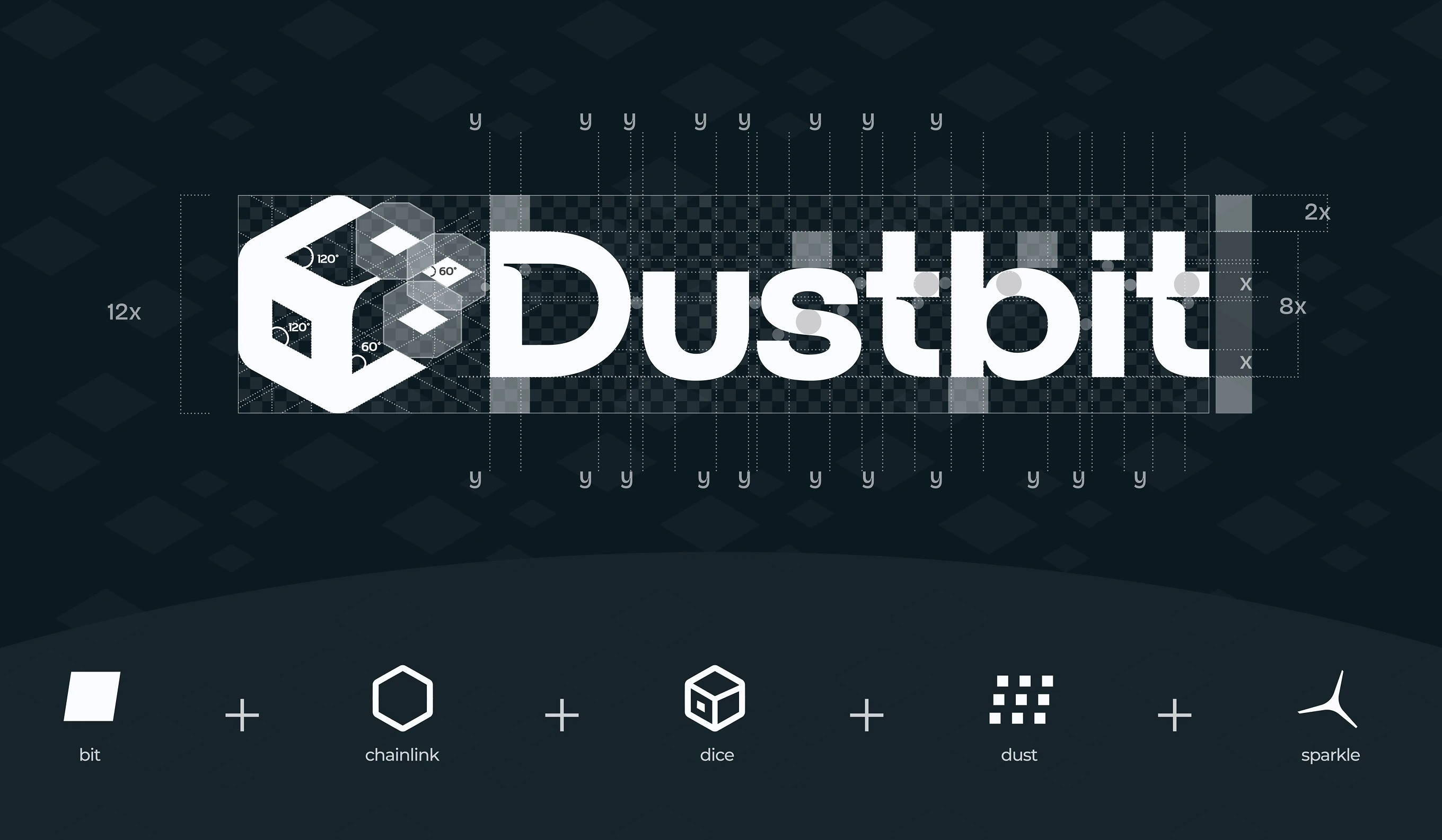
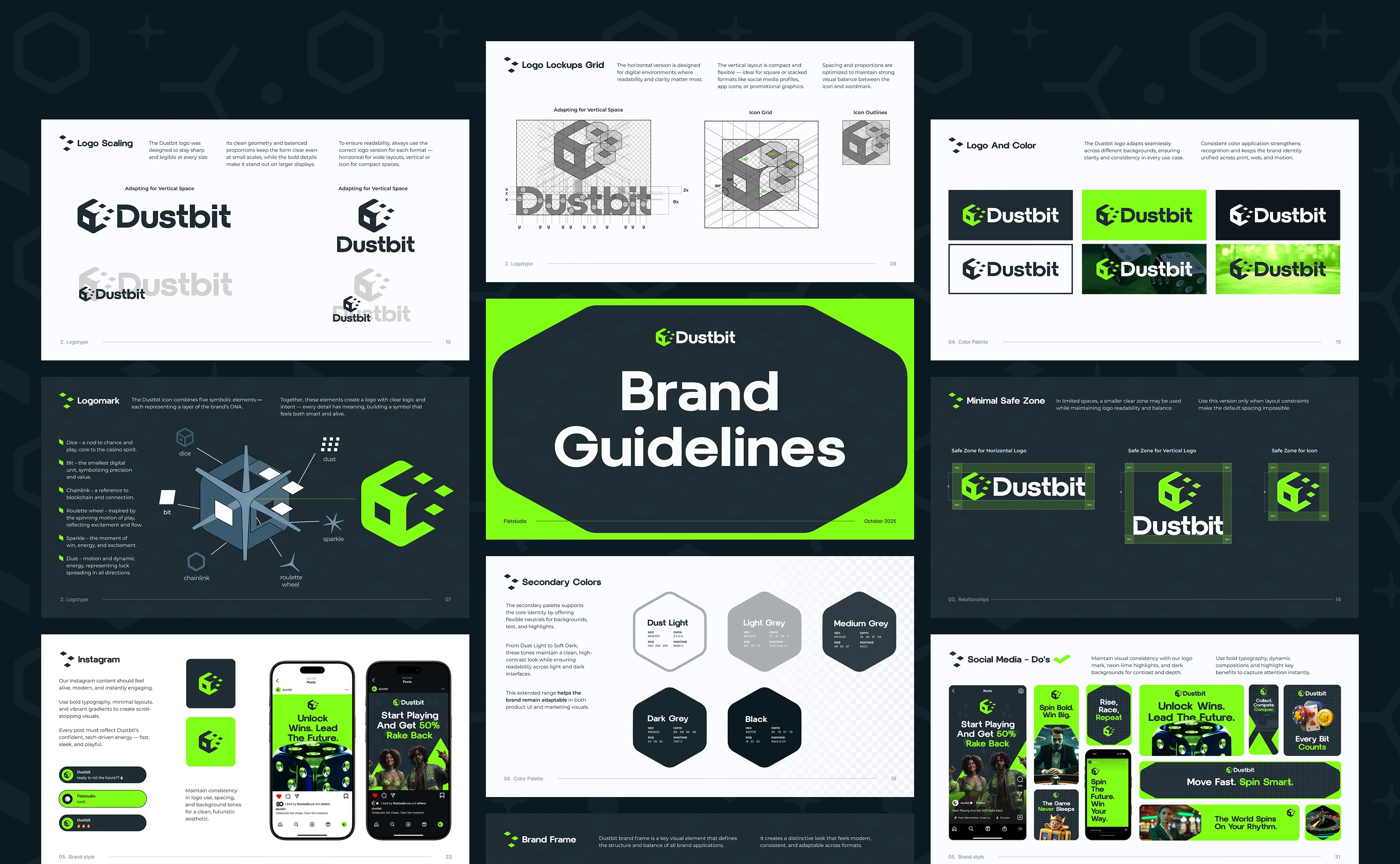
The Dustbit logotype pairs a five-symbol icon with a custom wordmark. The unit system locks proportions at any size.
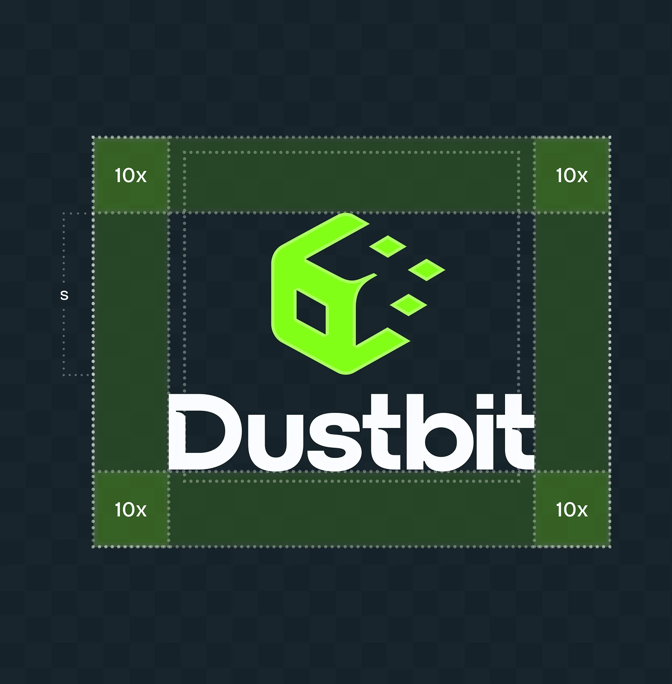
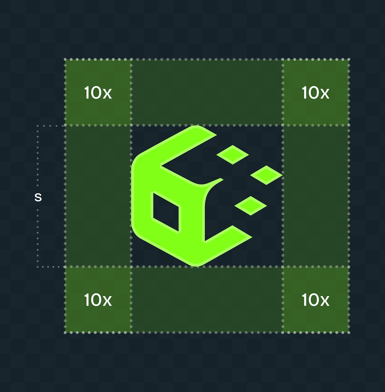
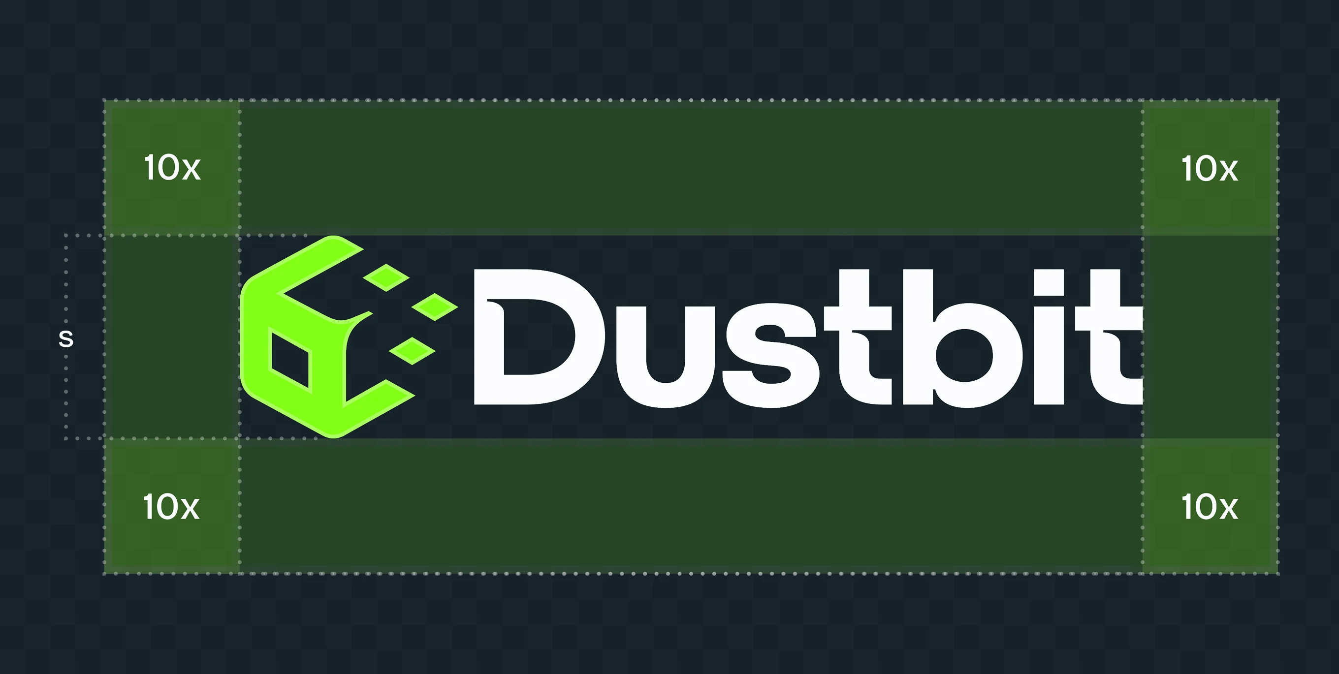
Minimum clear space around the Dustbit mark is fixed at 10x the icon unit, defined for horizontal, stacked, and icon-only formats. The rule keeps the logo legible next to other content.
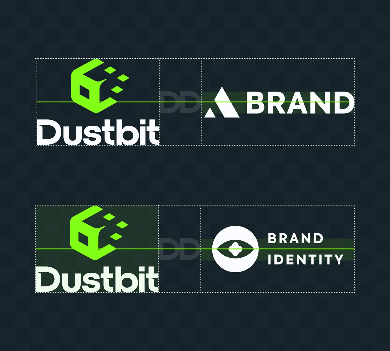
Dustbit's co-branding rules set a shared baseline and fixed divider spacing when the logo sits next to a partner mark. Two lockup examples show consistent alignment across formats.

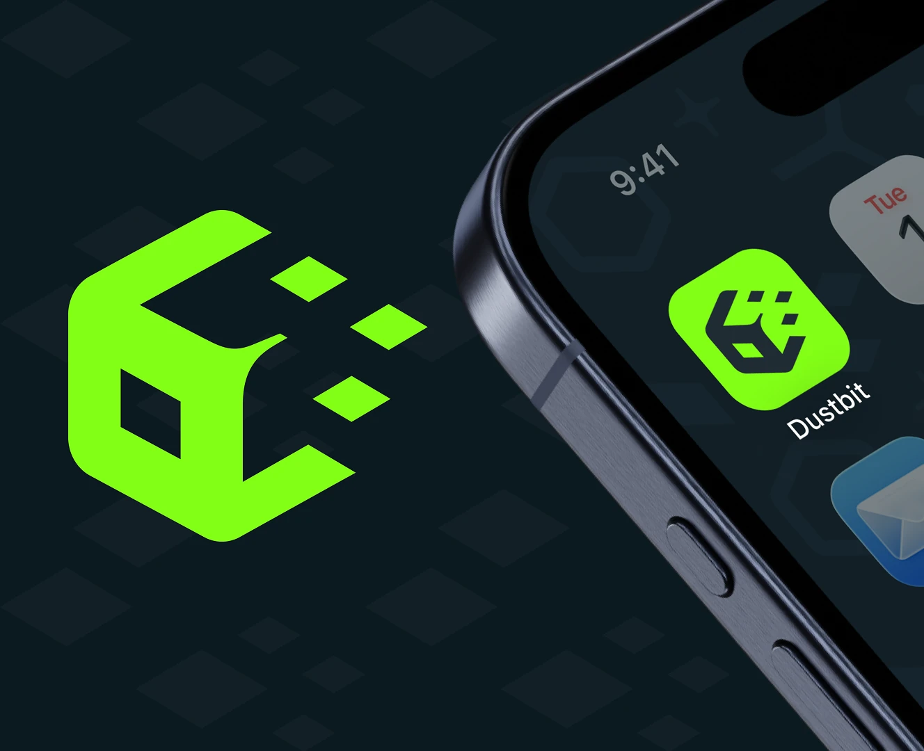
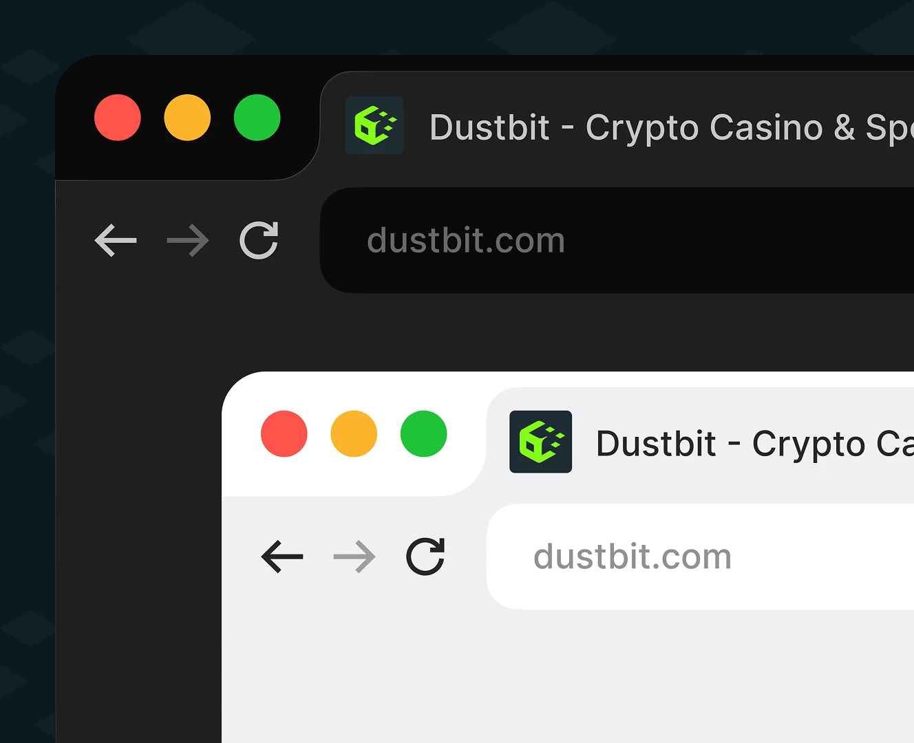
At icon size, the mark drops the wordmark and keeps only on a dark tile, tested on a phone home screen and browser tab favicon. Contrast holds at both scales.
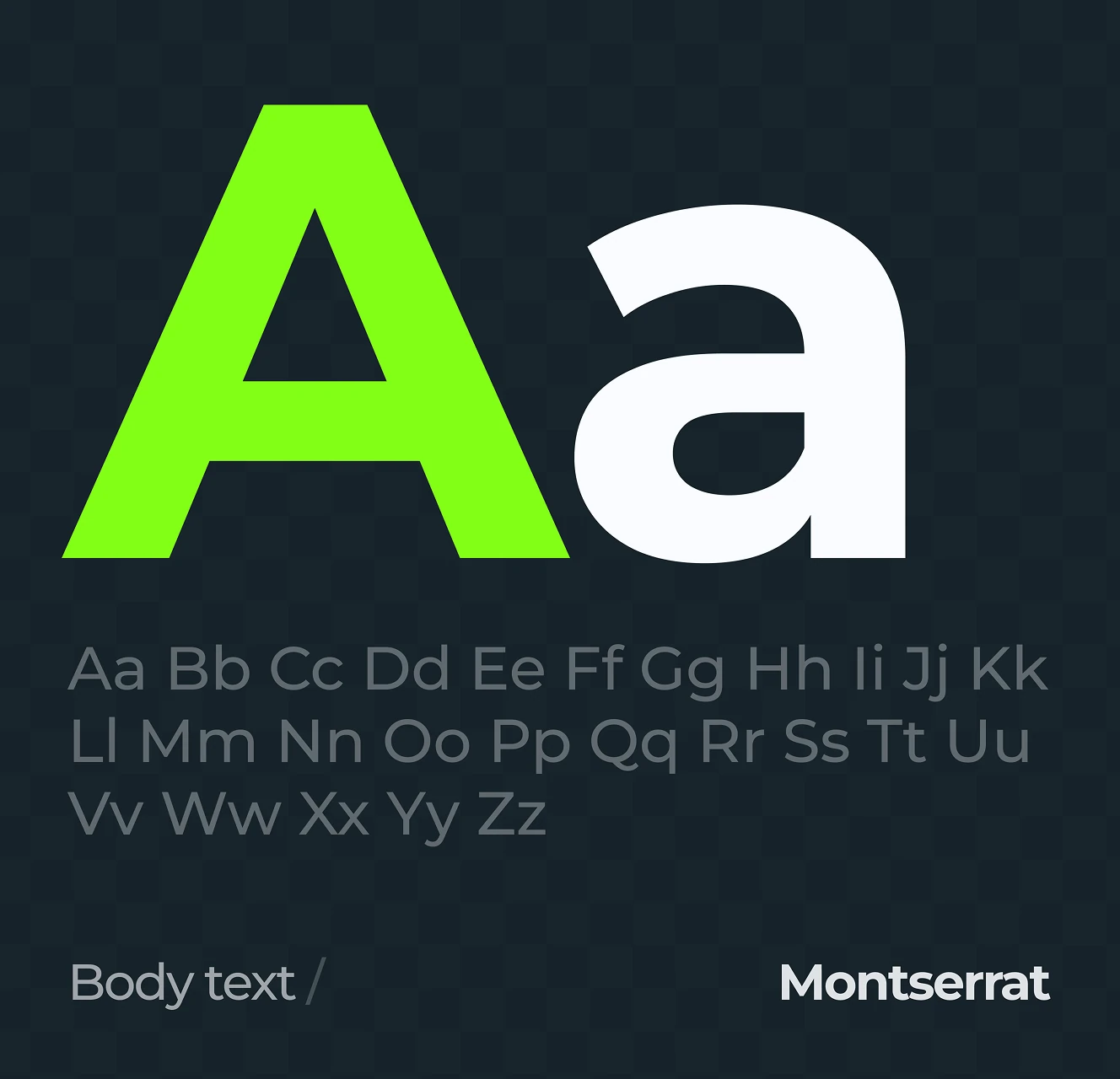
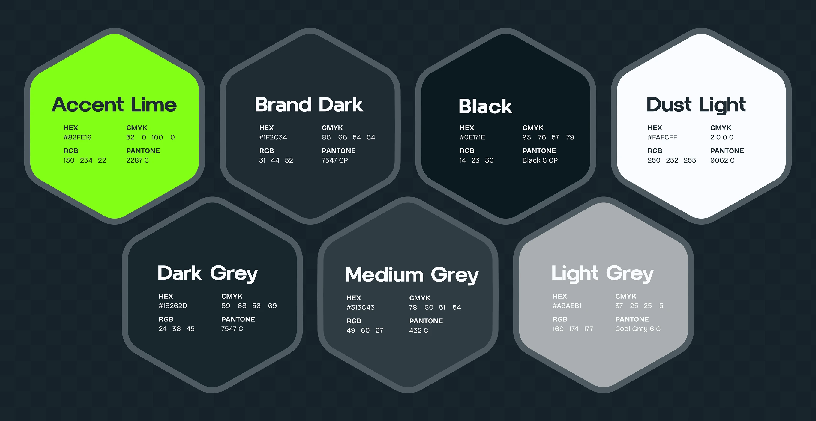
Headlines run in Hector, body copy in Montserrat. The palette centres on Accent Lime against Brand Dark and Black, with Dust Light and three greys for supporting UI.

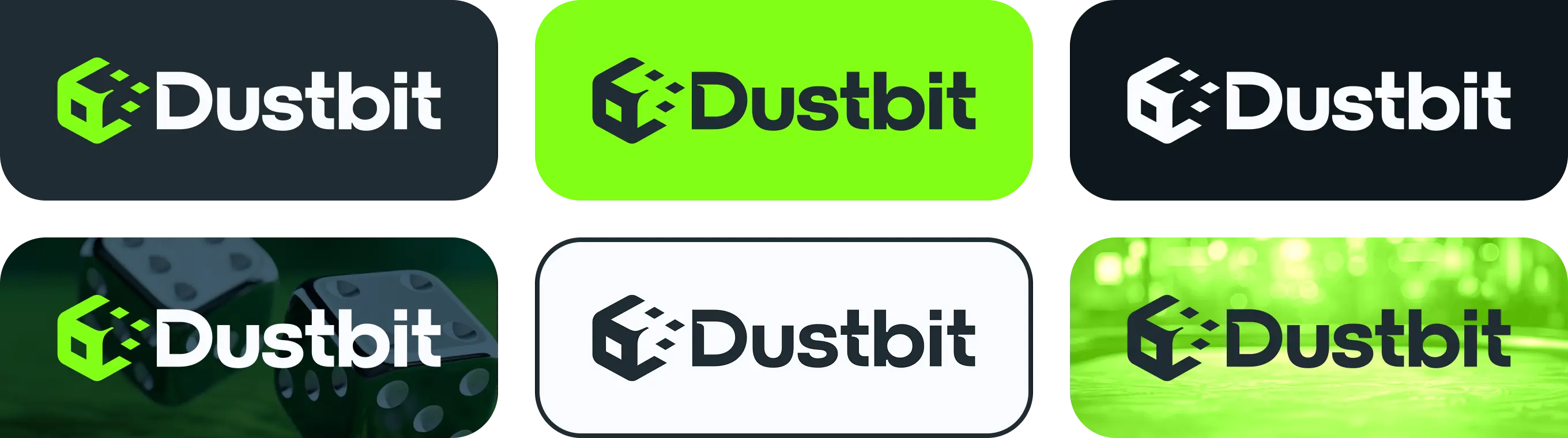
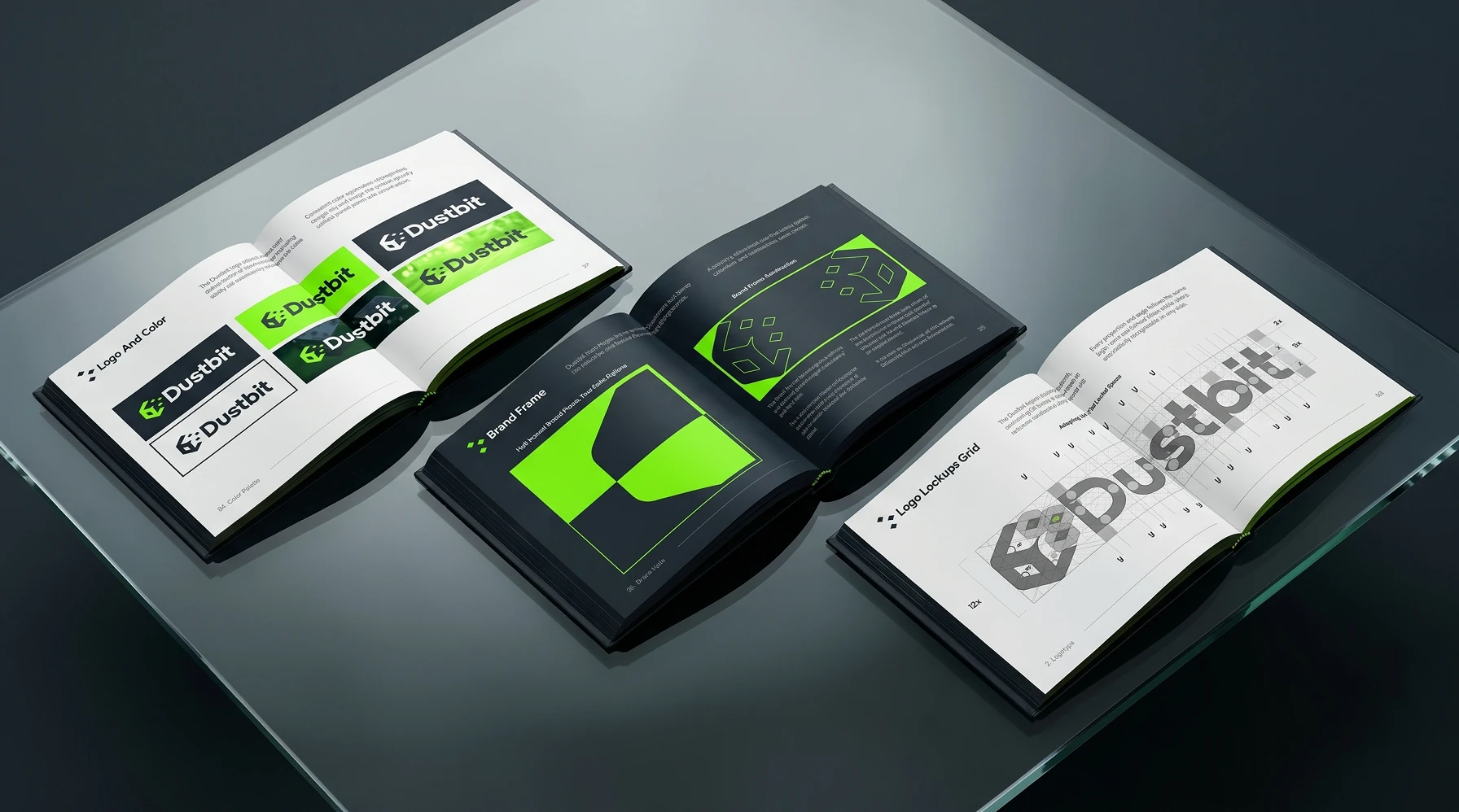
The full lockup ships in dark, lime, and white versions, plus variants for photographic backgrounds like a dice close-up and green bokeh. Contrast stays fixed, the mark never changes.
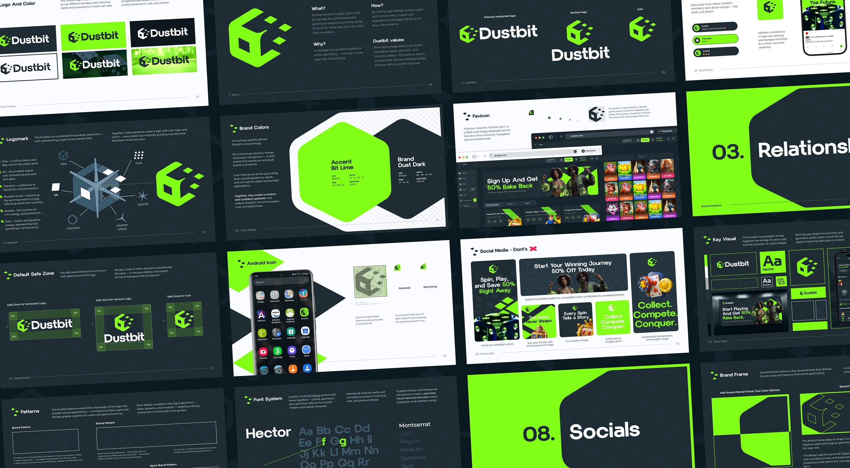
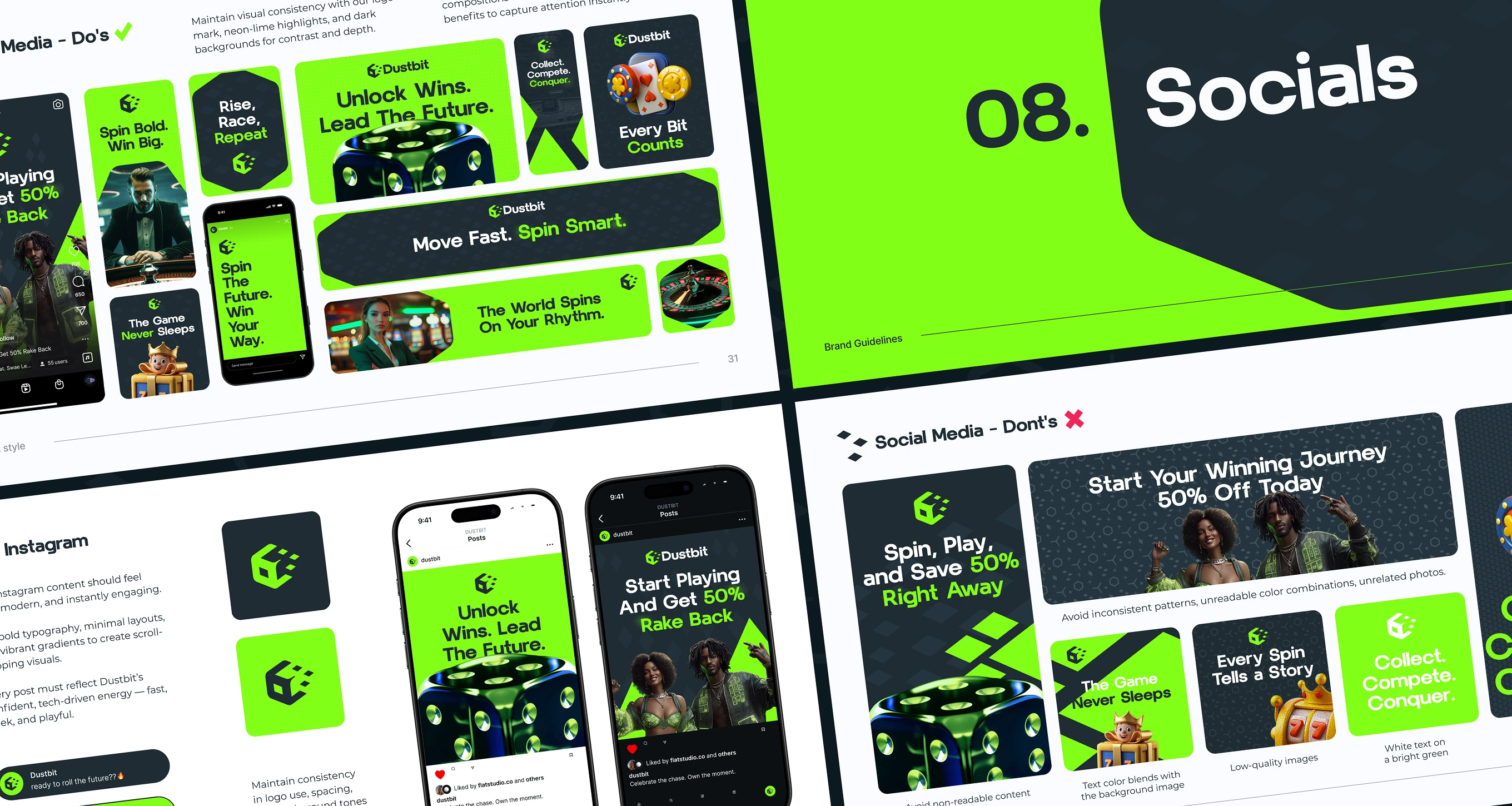
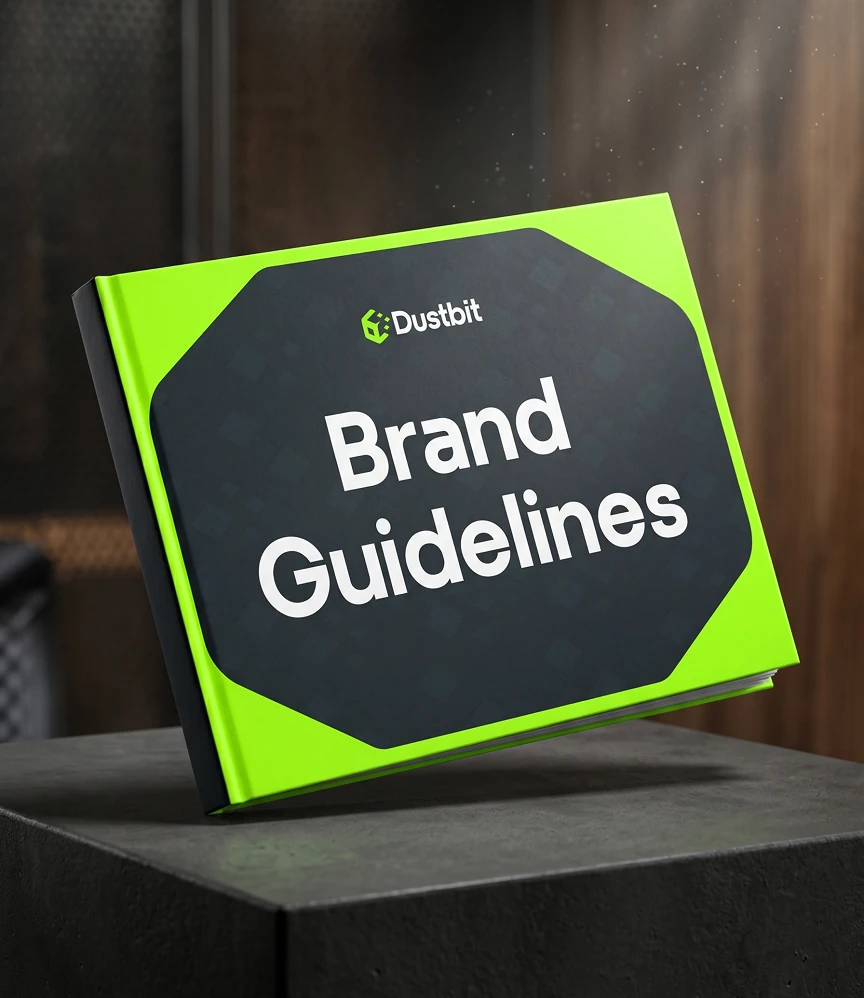
This Brand Identity & Strategy guidelines document runs from logo scaling and logomark breakdown to an Instagram section, lockup grid, secondary colors, and social media do's. One PDF covers every use case.
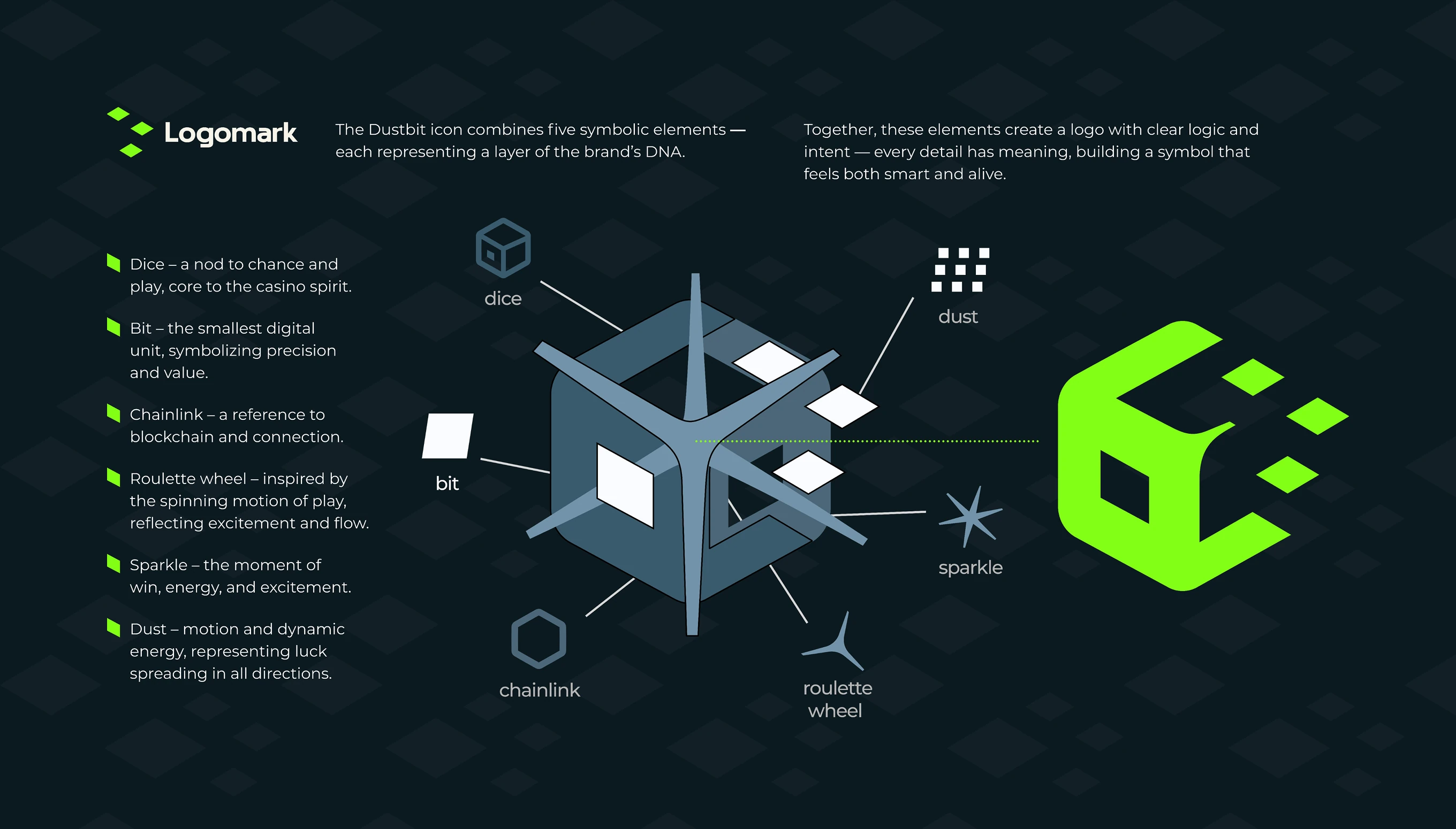
Dice, bit, chainlink, roulette wheel, sparkle, and dust - each shape in the icon maps to a casino, crypto, or luck cue, and the last two spell out the Dustbit name.
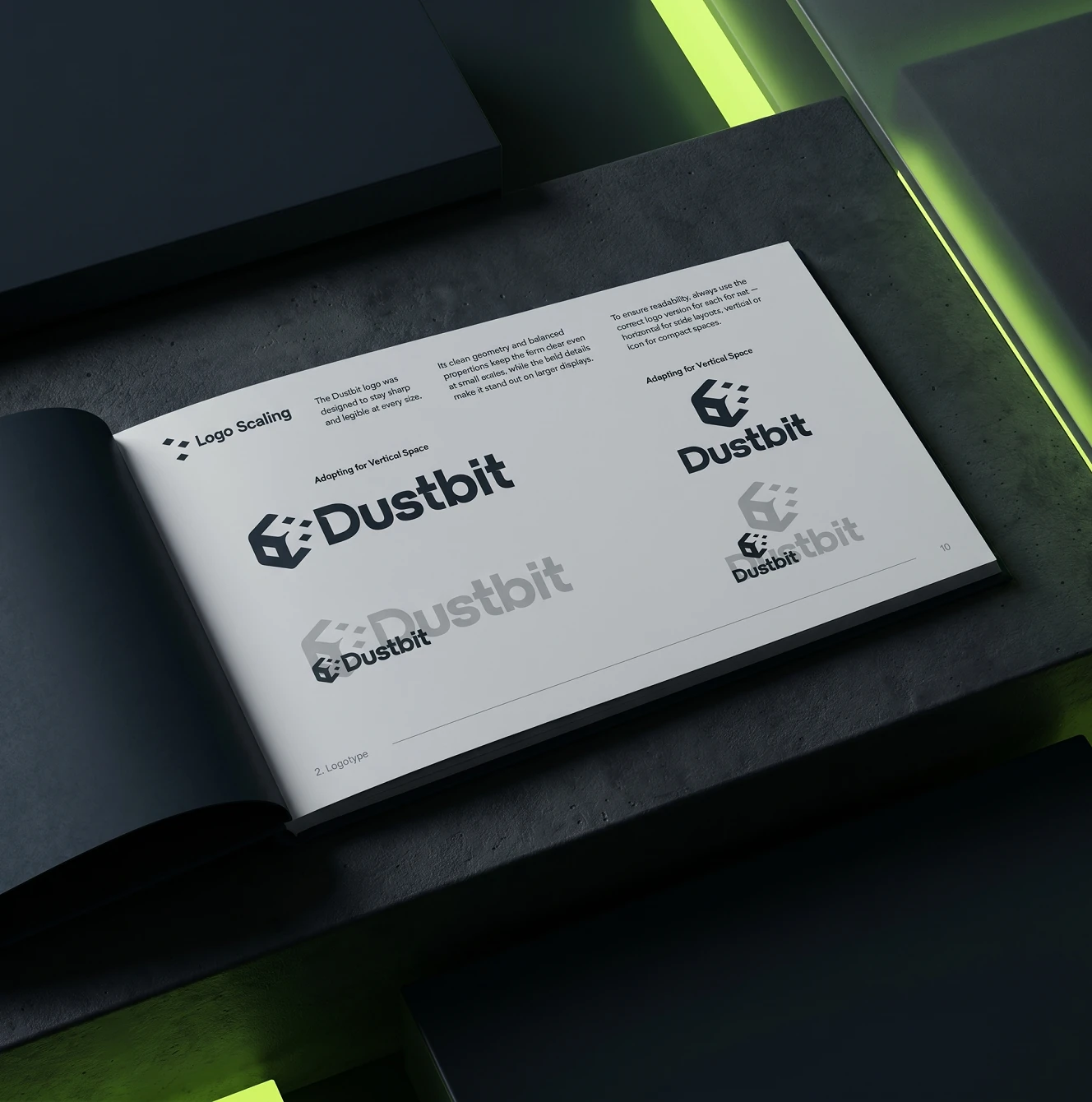
The horizontal lockup stacks into a vertical version for narrow or square placements, keeping the icon-to-wordmark ratio fixed so the mark reads the same at any size.

The guidelines extend into favicon and icon specs, background patterns, the two-typeface system, and a dedicated socials chapter with do's and don'ts for campaign posts.
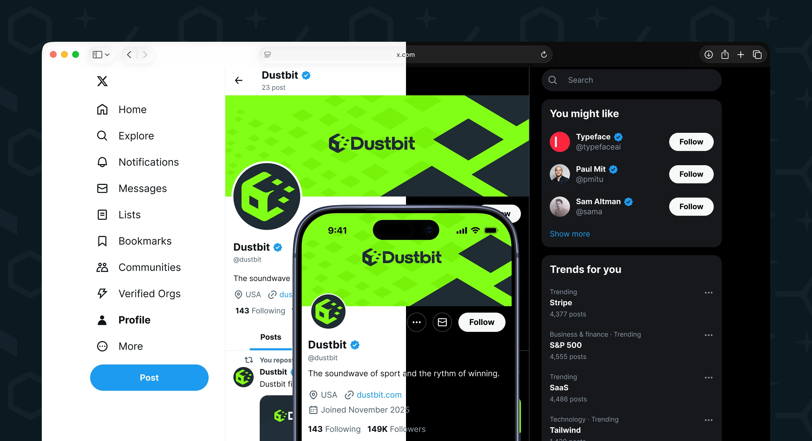
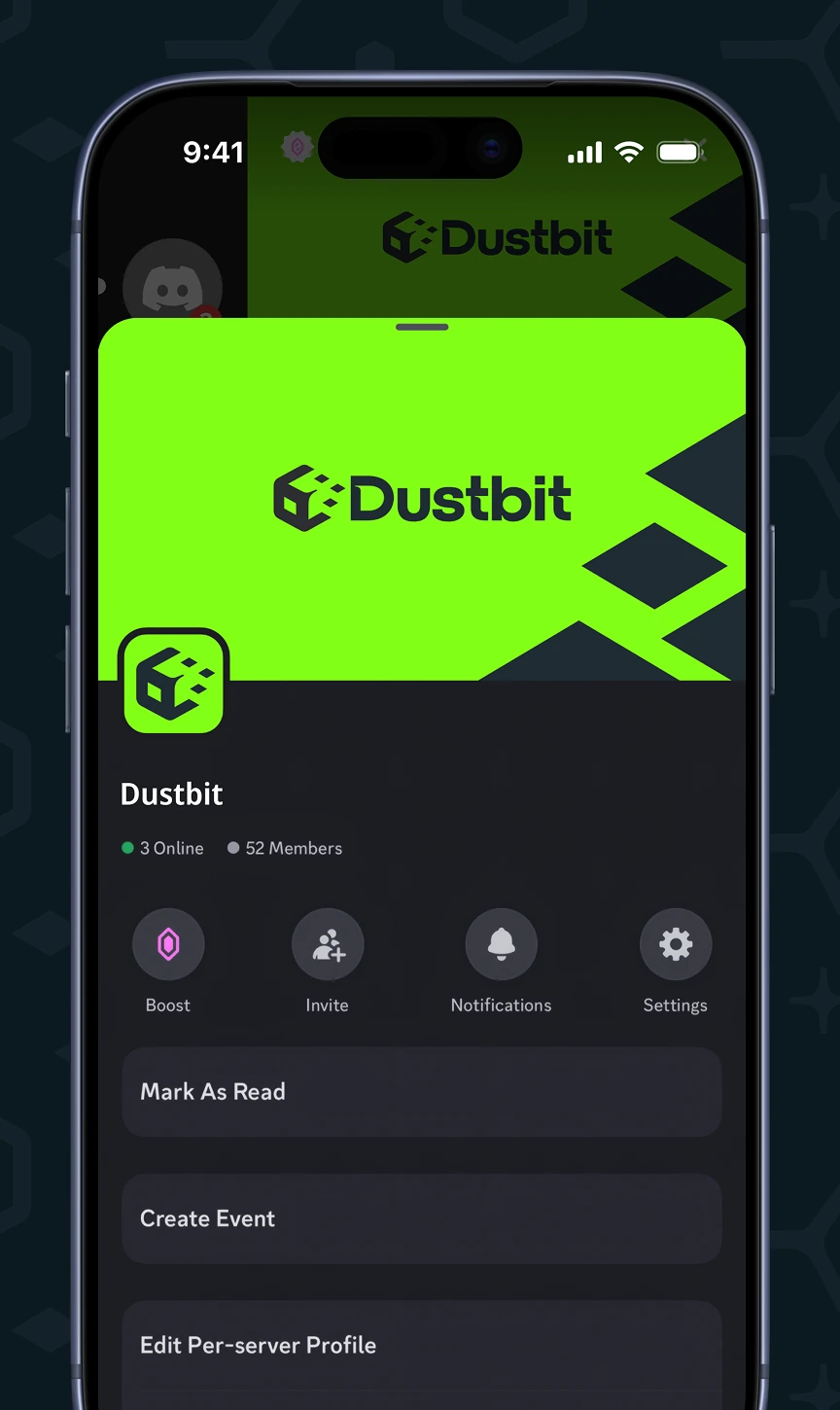
Mockups place the identity on an X profile and post, and on a Discord server with channel groups for welcome, verification, staff chat, and admin logs, desktop and mobile.

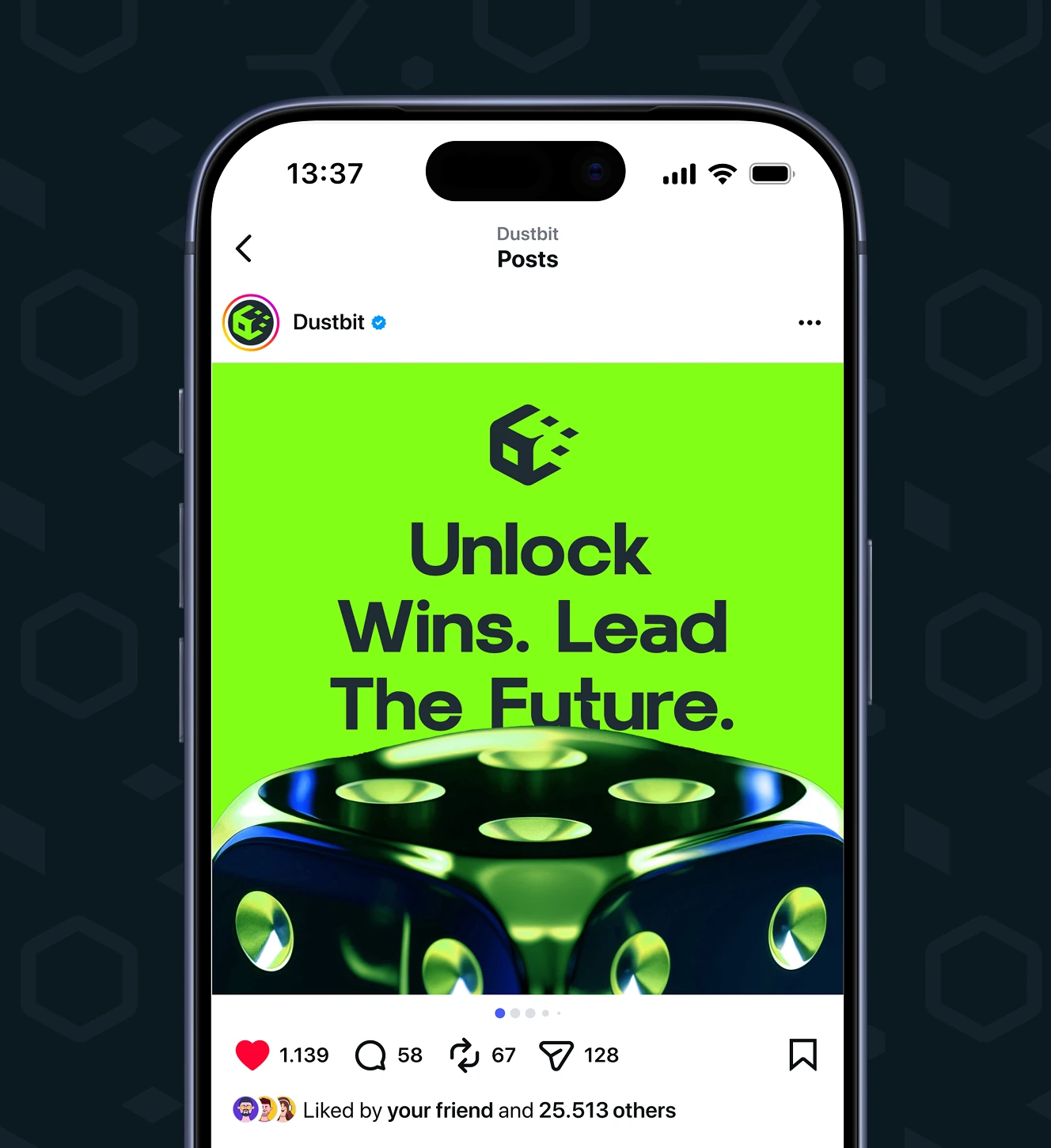
Approved posts use bold type on dark backgrounds with lime highlights; avoided patterns include low-quality photos and unreadable text on bright green. Two live post mockups show the standard.

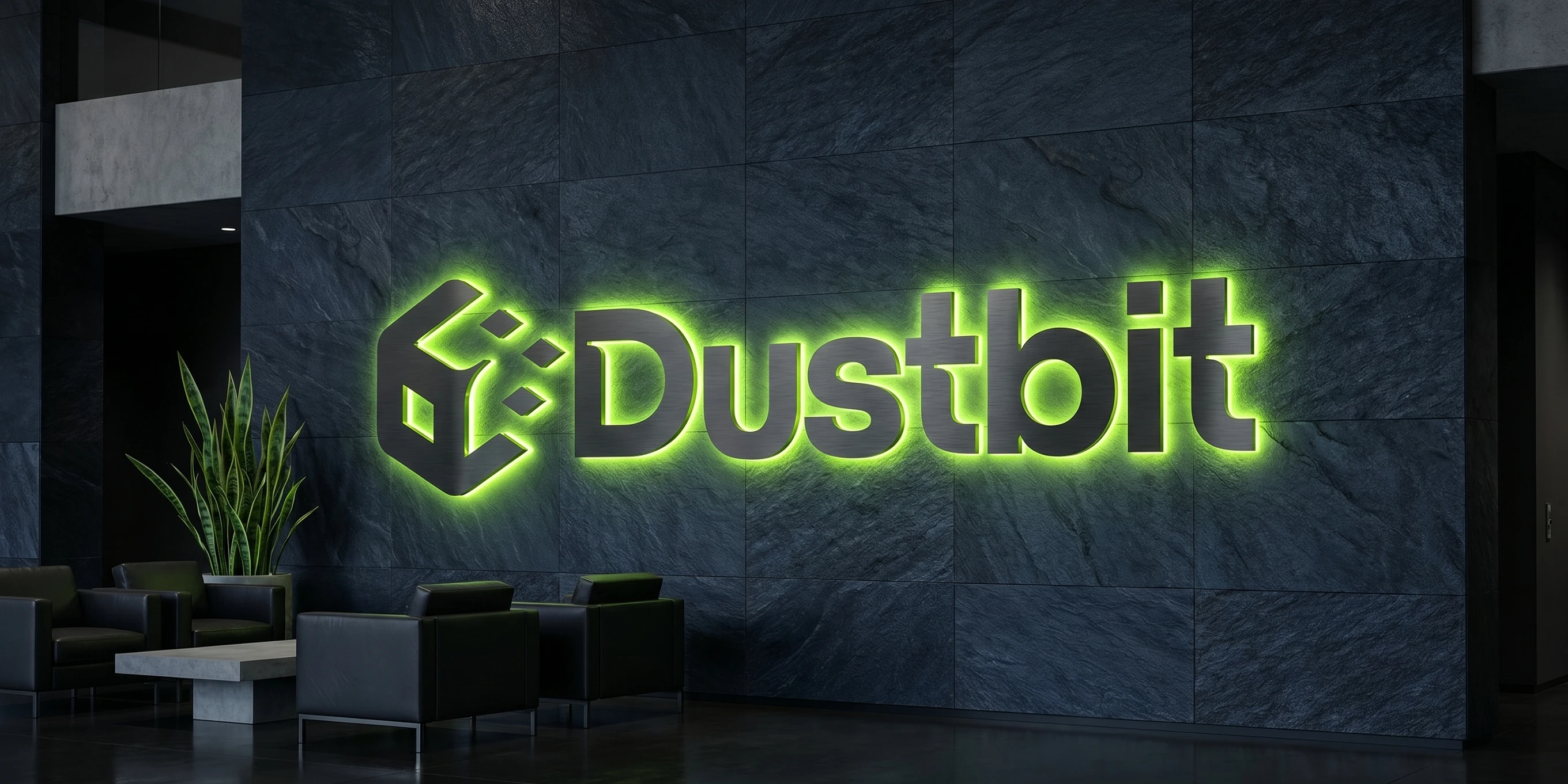
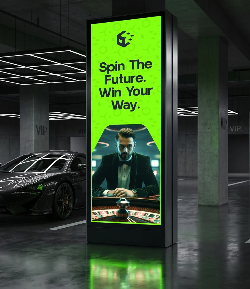
The mark is tested as illuminated office signage, a street-level digital billboard, an elevator standee ad, and a printed guidelines book - checking legibility beyond screens.


Already built the product and now need a brand that fits it – not the other way around?
Working inside a finished design is a constraint we know how to use. Tell us what's fixed.
